It sometimes seems we've seen every design trend possible. Minimalism, maximalism... minimal maximalism, or bold minimalism as it's also known. Design trends are a plenty.
Anti-design sounds like a trend to end all trends; a trend that wants to tear up everything that came before it – or at least take us back to the 1990s. But what is anti-design, where did it come from, and should brands be using it?
What it anti-design?
It sounds like a contradiction in terms – design that's opposed to design? At its heart, anti-design is a philosophy and aesthetic that rejects supposed design rules and norms and instead embraces chaos, asymmetry and noise. But the moniker can be deceptive. Anti-design is still design, and there's order and intention behind the apparent chaos.
The term isn't new. Anti-design was first used to refer to a European architectural movement in the 1960s and 1970s, represented by the like of Britain's Archigram and the Italians Archizoom and Superstudio. They opposed rationalism and the veneration of design over social and cultural function, instead promoting the study of individual needs. Many of their projects were commercially unviable, but they influenced new generations of architects.
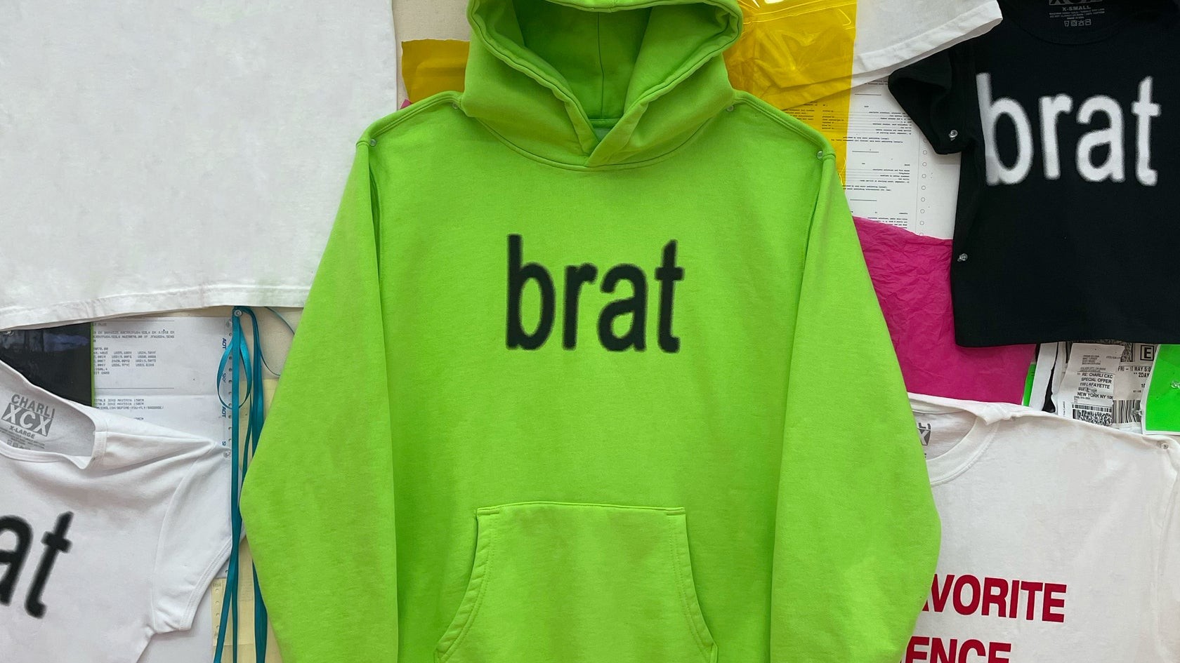
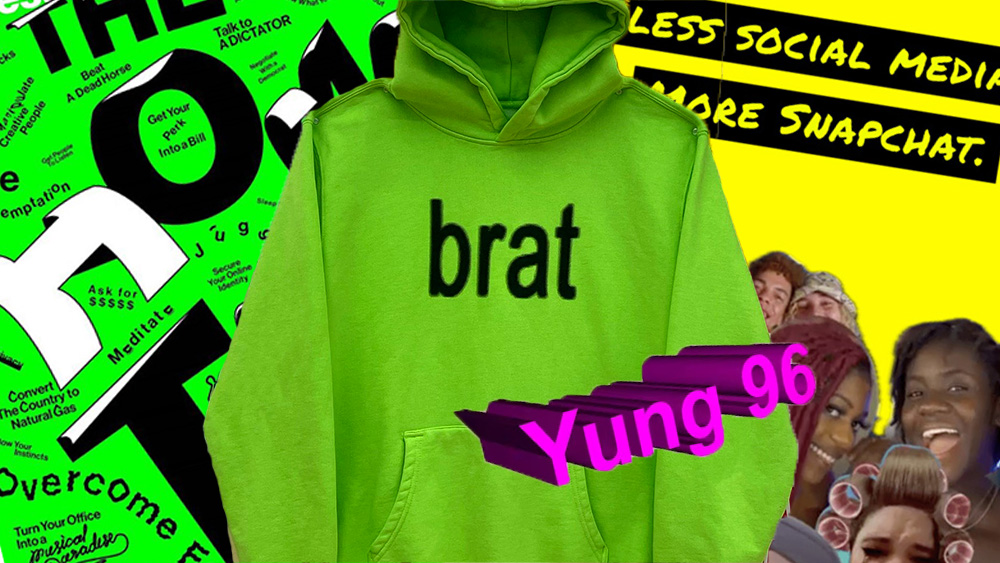
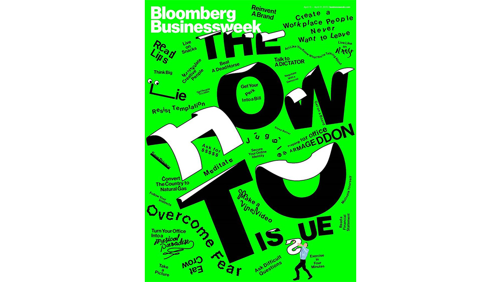
Anti-design has been creeping into branding in the form of messy, experimental and even deliberately 'ugly' aesthetics. The branding for Charli XCX's Brat album is often cited as a landmark example, but the trend is about more than just using an ugly shade of green and the cheapest-looking font you can find.
It's a general reaction against the perceived uniformity and perfection often seen in mainstream branding, and a search for something more raw and authentic.
Irwin Hau of Chromatix Website Design told us the idea of anti-design is to "defy expectations and create a unique, sometimes jarring user experience that exudes insouciance with a dash of ironic humour".
Why now? Anti-design could be a reaction to the artificial overly sharpened and highly airbrushed look of some digital photography (and now AI imagery), idealised 'spa-moment' advertising and the ubiquitous use of the bland corporate Memphis, globohomo or alregria art favoured by tech startups the world over (see our piece on outdated graphic design trends).
From web design and UI and social media posts and posters, anti-design aims to break free from the stale, cookie-cutter templates that are now so easy to make with myriad design apps. It adds intentional blemishes and glitches that tell us 'this was made by a human' even if it's digital.
How can you use anti-design? There is nothing new under the sun, they say, and many elements of anti-design will feel familiar, linking it to the more general 1990s and Y2K nostalgia that's been burgeoning over the last couple of years.
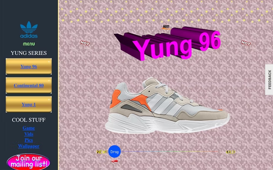
The traits of anti-design are fairly open since it stands against rules and templates, but you may find anti-design inspiration in old zines, 90s grunge and early web design (think Geocities). The idea isn't to approach it with nostalgia as the aim, though. It's not about being ugly just for the sake of it, either. It's strategic imperfection that aims to create a deeper emotional connection.
To play with anti-design elements, you could try forgetting the usual aesthetic rules and go to extremes: stretch images, break layouts, combine clashing colors, and then dial it back until it works.
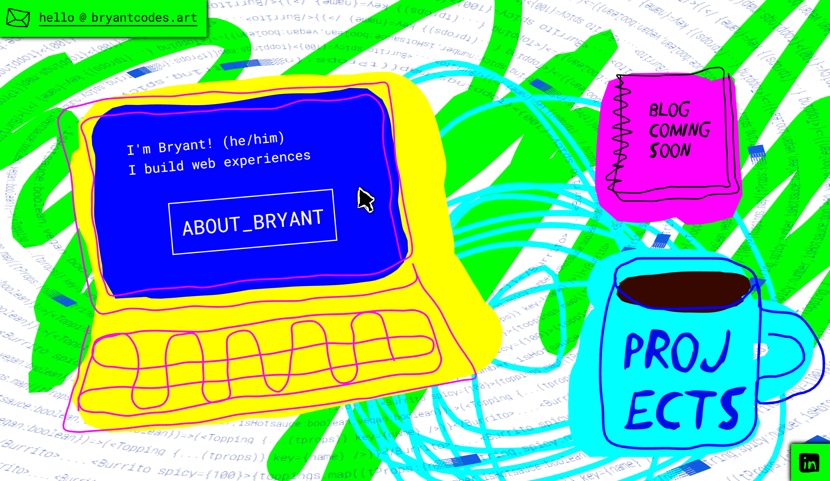
The idea is that it may may the viewer a little uncomfortable, creating an impactful experience. But anti-design introduces disruption, not confusion: the design still needs to communicate a message clearly. Check out the web designer Bryant Codes' site (pictured below). It's loud, it grabs attention, but the message (and UI navigation) couldn't be clearer.
For anti-design to make sense, it needs to align with a brand’s objectives and resonate with its audience. For brands whose identities are all about bold statements and defying conventions, it can set them apart. Brands that present a more polished and professional image should leave it alone. Inevitably, anti-design tends to be more suitable for youth culture brands, although that doesn't mean that elements can't be adapted for other audiences.
Will anti-design last? In the end, revolutions tend to become part of the mainstream, and if brands like Diesel and Balenciaga are using anti-design, it could soon no longer appear radical and edgy. In several years, the messy, raw approach that feels authentic today could have become so cliched that it loses its edge and will need to be replaced by something more radical – perhaps a return to polished visuals.
But anti-design can also be seen in the context of other current trends that celebrate the 'real' and unsanitised. From rougher, less air-brushed photography that looks like film or early digital (and avoids 'looking AI' to more honest advertising, like the recent Wilkinson Sword ads for women's razors that actually show hair. I hope at least part of this change in philosophy is here to stay.