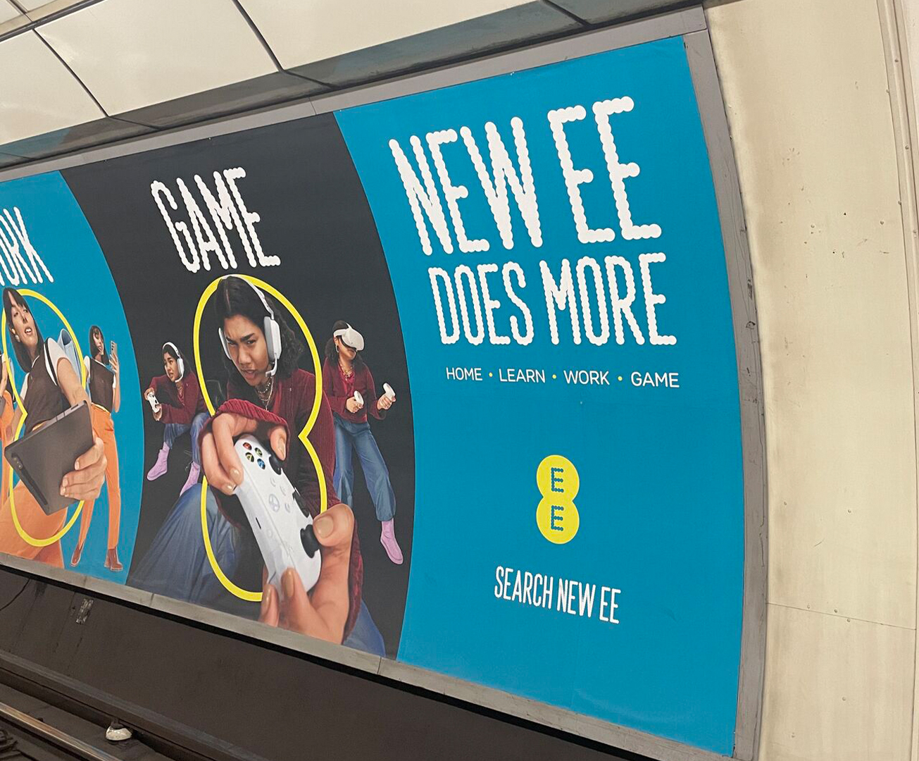
Marketing is a difficult art form to master. How do you boost your brand and sell without sounding too desperate? Well, by the looks of the latest advertising trend, the answer is to push for 'more'. Whether it's good old-fashioned hyperbole or sheer desperation, one thing's for certain, the word "more" is taking over the copywriting world for better or for worse.
The best examples of billboard advertising are simple, considered and clever, so this consumerist-pushing marketing trend feels a little brash, to say the least. Whether it's a new bold way to advertise or a disturbing reflection of our society, this sudden spike in 'more' marketing is certainly a jarring reflection of current design trends.
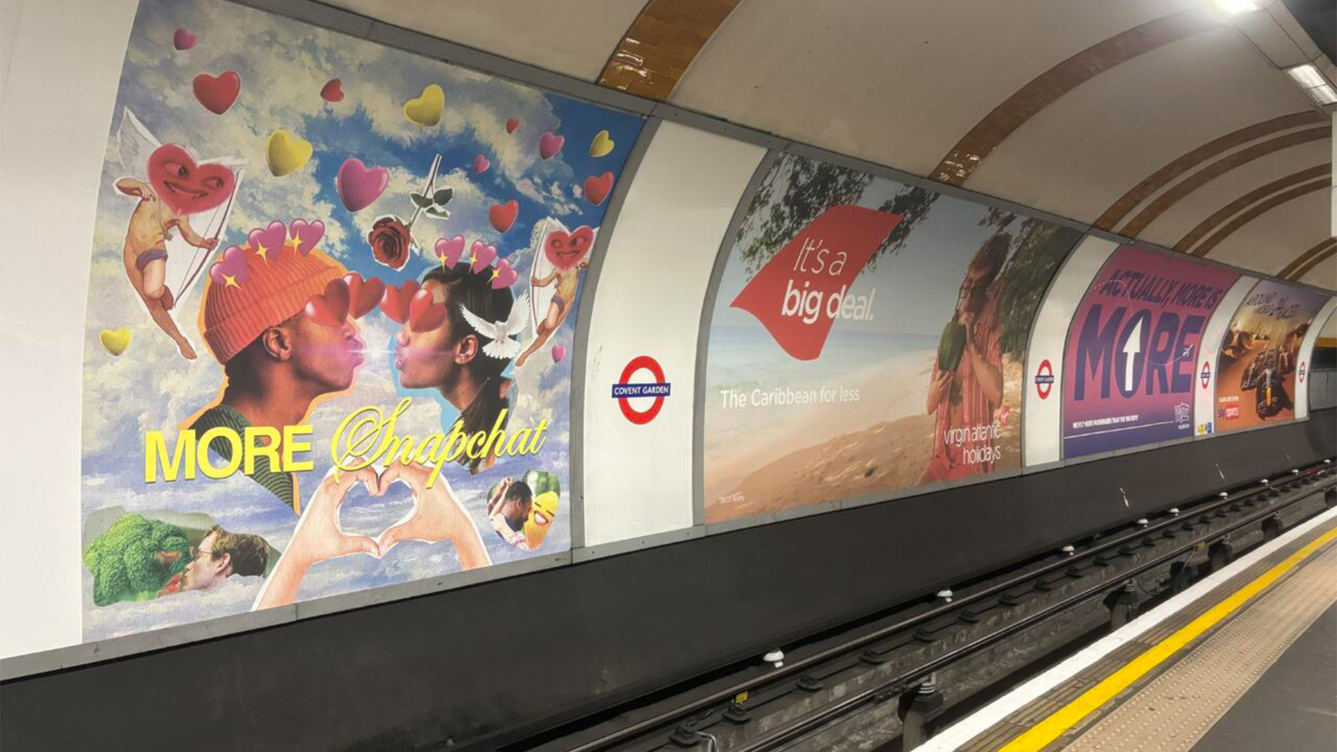
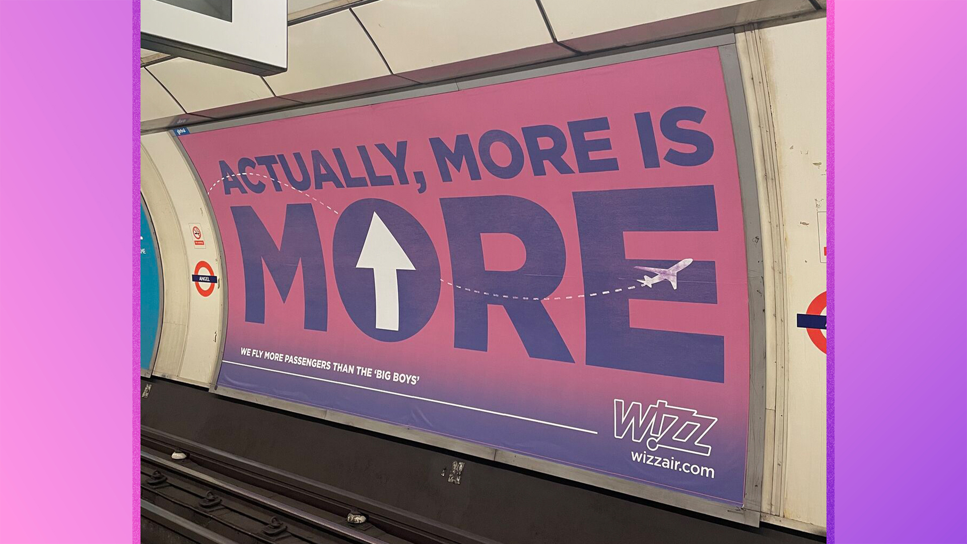
This marketing apocalypse was spotted by brand strategist and copywriter Jack Wimmer, who shared a series of these garish billboards via LinkedIn. From airlines to mobile networks, the slew of bizarrely excessive billboards points to a copywriting trend that signals a deficit in creativity. The concept of 'more' becomes a provocative buzzword that provides little context to the overall purpose of the campaign.
According to Jack, while it seems that this copy trend is taking over London Underground stations across the capital, it isn't all that new. "The ‘more’ concept has been used by brands for as long as I can remember, and it’s probably not going anywhere," Jack tells Creative Bloq. "It’s the corporation’s get-out-of-jail-free card when they don’t know what else to say," he adds.
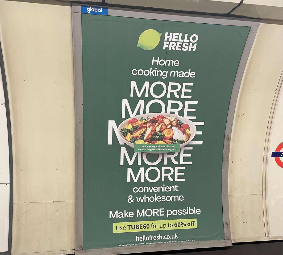
From a design perspective, it feels as if this 'more' copy trend predominantly plays the part of visual filler. It carries the weight of a provocative, brave or excitable tone without the need for considered and thought-provoking graphic design alongside it. Simply putting the word in bold text reads as thinly veiled insecurity – a lack of brand awareness and efficient marketing communication.
"When I see a brand strategy, campaign headline or tagline blankly promise ‘more,’ what I really see is fear; an unwillingness to say anything that someone, somewhere might find mildly disagreeable or irrelevant," Jack says. This fear of rebellion is what creates a sphere of vague uncertainty in the branding world, in turn making every billboard feel self-conscious and one-dimensional.
There's also a point to be made about overconsumption. In a world where materialism, fast fashion and fleeting trends are having an adverse effect on the planet – is it right to be promoting this empty concept of 'more'? While the trend might not disappear it's worth considering the power of copy and design. If used correctly, just a few words can effectively carry a brand. As for 'more', it promises us everything and delivers nothing.
For some brand language inspiration, check out our interview with Zosia Swidlicka, the founder of the verbal branding studio Opening Line. For some brilliant advertising, check out Surreal Cereal's hilarious billboards that (purposefully) commit every design crime.