‘The world ran out of pink,’ is what production designer Sarah Greenwood recently said, after their team hand-painted every physical backdrop for Greta Gerwig’s latest film: Barbie, causing an international shortage.
But while pink may currently be in short supply, Millennial pink continues to saturate our popular consciousness. Flooding the zeitgeist since the 2010s, we’ve seen it with Glossier packaging, Wes Anderson’s Grand Budapest Hotel, Harry Styles’ bubble pink Fine Line album cover, and the ‘rose gold’ iPhone. Reaching its zenith in 2016, ‘Millennial Pink’ was officially coined by fashion journalist Véronique Hyland in an article for The Cut.
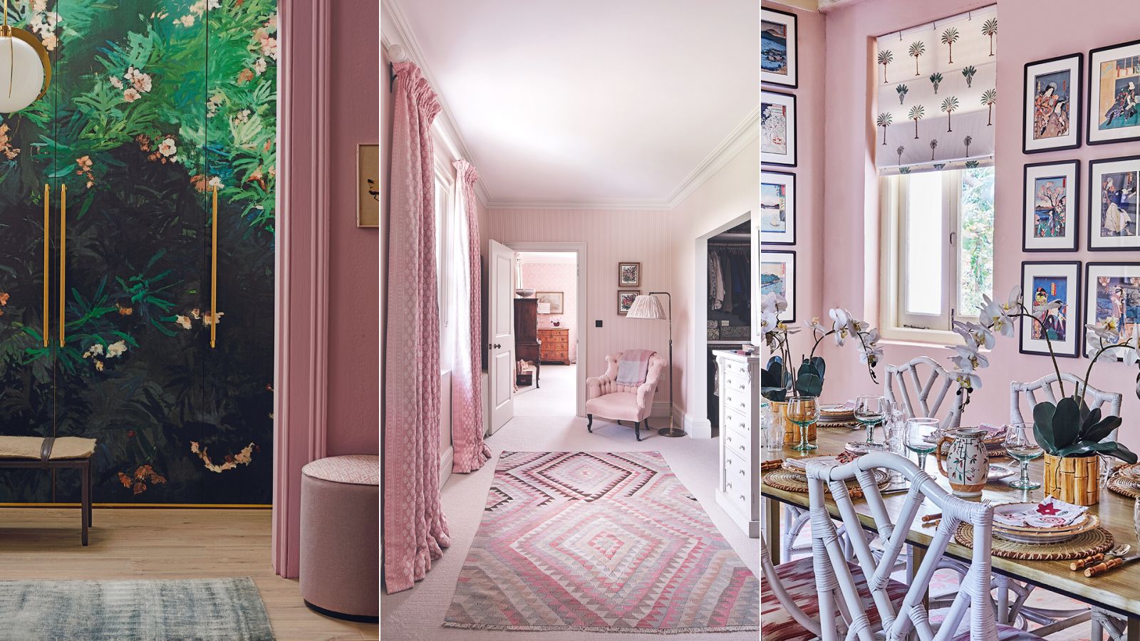
Decorating with pink once offered a pull of childhood nostalgia when Millennials were craving a sense of comfort and a return to child-like play during a financial recession. It worked also as a playful prod against restrictive gender norms of the 20th century; untethering pink to its exclusive notions of femininity, embracing instead gender-neutral ideas of playfulness and positivity.
But Millennial pink could be on its way out. ‘Rose-tinted millennial pink and rose gold finishes are falling out of favor due to oversaturation in the market’ Lauren Chiu, head of color & Materials at trend forecasting agency, Stylus, tells Homes & Gardens. ‘Rose gold’ as one example, has taken such a hit that a survey from 1st Dibs cited rose gold as the least popular design option for 2023. So what’s next?
What is the new Millennial pink in interior design?
‘Colors that feel overtly synthetic or jarring are unlikely to be popular in the current socio-economic climate, as they can feel unsettling, particularly in the home, when people want to surround themselves with colors that feels reassuring. Instead, there’s a growing fondness for rich earthen pigments like deep browns and reddish clay tones that are cocooning and intimate, providing cozy hideaways.’ It’s all about ‘grounding earthen tones,’ says Lauren Chiu.
These grounding, earth tones, what you might call ‘terra rustica’ is what another industry soothsayer and trend forecasting agency WGSN, picked up in conjunction with Coloro for A/W 24/25 choosing ‘Intense Rust’ as one of their key colors to watch. Its pull, WGSN explains, is a result of its ‘raw, earthy edge’, as well as being ‘reminiscent of soil, full of warmth.’ Its inspiration, could be a result of more people who value ‘sustainability over newness, resale culture, and products with the long-term appeal,’ says WGSN.
Burning, rusting, and grounding associations with the earth are hitting our colorway consciousness. In a survey by 1st Dibs on 2023 color trends, following 880 interviews, 20% of respondents chose ‘Burnt Orange’ – making it one of the three popular colors for this year.
‘Burnt Orange’ picked up an impressive +695% uptick in searches as a color choice for weddings on Pinterest. Matt Siberry, head of home at Pinterest, says that across this year it has ‘also reflected in the home, searches for ‘orange bathroom’ have increased by over 60% in the last six months as people make their way to the bold side.’
There’s also the viral TikTok trend for ‘sunset lamps’ that project and flood the walls with 'terra rustica' hues of burnt oranges and reddish terracottas – which have now garnered over 30.8 billion views.
‘Terra’ was also the theme for paint industry leader, Sherwin-Williams, for its 2023 Colormix Forecast – describing its selected shades as a way for us to ‘connect to the earth beneath our feet.’ One color in the selection is called ‘Reddened Earth’.
Decorating with orange evokes a primal sense of stability, like you’re fully grounded, and connected with the land beneath your feet. It elicits ancestral connections to the caves of Lascaux in France, or Pinnacle Point in South Africa, where cave paintings were made with dusty, earthy reds. There’s the distinctive Pompeii Red, named after the frescoes’, previously yellow, burned to a powerful, rich red, after Vesuvius’ eruption in 79 AD. Or maybe the red soil in paintings such as Rust Red Hills, by Georgia O’Keefe (1930). And it can also look to the future, like the exploration of Mars.
Beyond the industry experts, artists and interior designers have intuitively turned to this rusting, grounding set of colors. ‘I instinctively reached for my burnt sienna ink for this new wallpaper design,’
Katie Brigstock, creative director of Style Your Spaces has similarly noticed this move away from the pinky pastels, and ‘towards earthy tones like browns, and reds. I’m drawn to their rich pigments, their inherent warmth, and grounding effect.’
What can I paint walls with instead of pink?
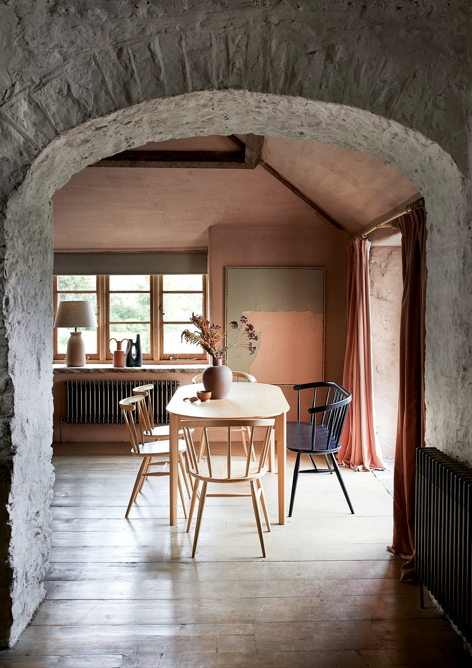
If you are after a contemporary replacement for Millennial pink, then look to the sun-baked walls of ancient civilizations, and take inspiration from the earth tones of terracotta. Evocative of North Africa to Italy and South-East Asia, this clay-inspired color is named from ‘terra cocta’, which in Latin means ‘baked earth’.
Terracotta clay is a centuries-old material that has been widely used for sculptures and pots, as well as architectural decoration. Today, terracotta is a giving burnt orange shade, either playing its part as an accent color, or as the main backdrop in a decorating scheme. Its generosity of character means that terracotta has the ability to wrap its arms around your home with its all-year-round mood of warmth.
How to decorate with a burnt orange color palette
When it comes to the best color trends, orange might not be an obvious choice, but its warming and cocooning effect is certainly something to consider. Here's how the experts get it right...
1. How to use burnt orange in a hallway
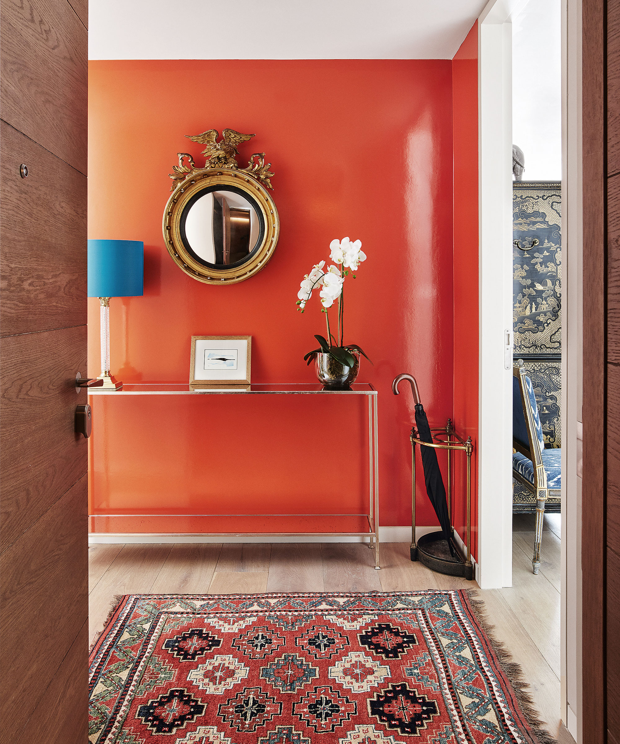
If you want to make a statement, use burnt orange at your entrance. Vibrant and inviting, deep orange packs a punch and is full of cheerful optimism.
‘For me, the home should be filled with bright colors and bold patterns as they add personality to a space,' says Emma Deterding, founder, of Kelling Designs. 'Orange shades are a great choice to replace Millennial pink with – they bring an uplifting feel during the day and can help create a cozy, relaxed atmosphere in the evening, showing how versatile this color is in a different light.’
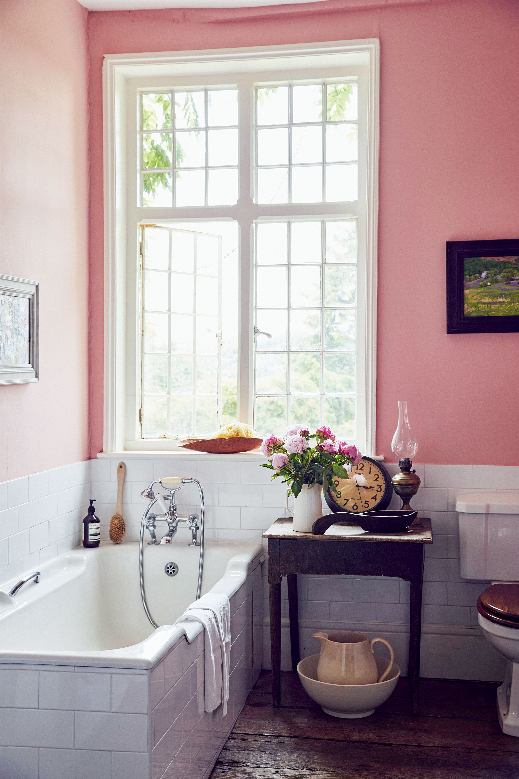
2. How to use burnt orange in a bathroom
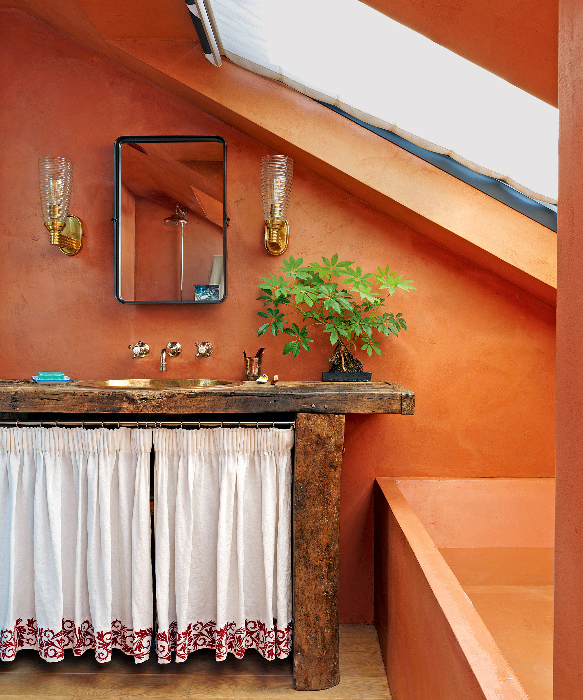
Burnt orange is a wonderful color choice for small rooms. In this main ensuite by interior designer Beata Heuman, carrying the same burnt orange color tones over the fifth wall and other surfaces helps to blur out awkward angles and sloped ceiling lines.
‘All the walls and the bath are clad in Béton Ciré, which is a micro concrete paste and totally waterproof,’ explains Beata. ‘The idea here was to make the space feel warm and earthy, unlike most bathrooms.'
3. How to use burnt orange in a kitchen
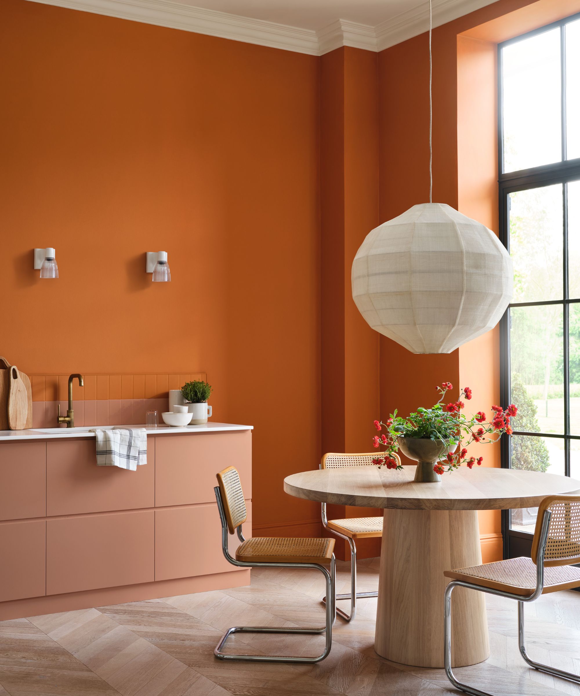
‘Orange is the perfect color for an open-plan kitchen, providing a dramatic yet familiar backdrop to a hive of activity,' says Andy Greenall, creative director, of Paint & Paper Library. 'Rather than opt for the habitual white on kitchen cabinets, consider a warm pink hue such as Roben’s Honor, which will provide a playful touch when paired with orange.’
4. How to use burnt orange in a bedroom
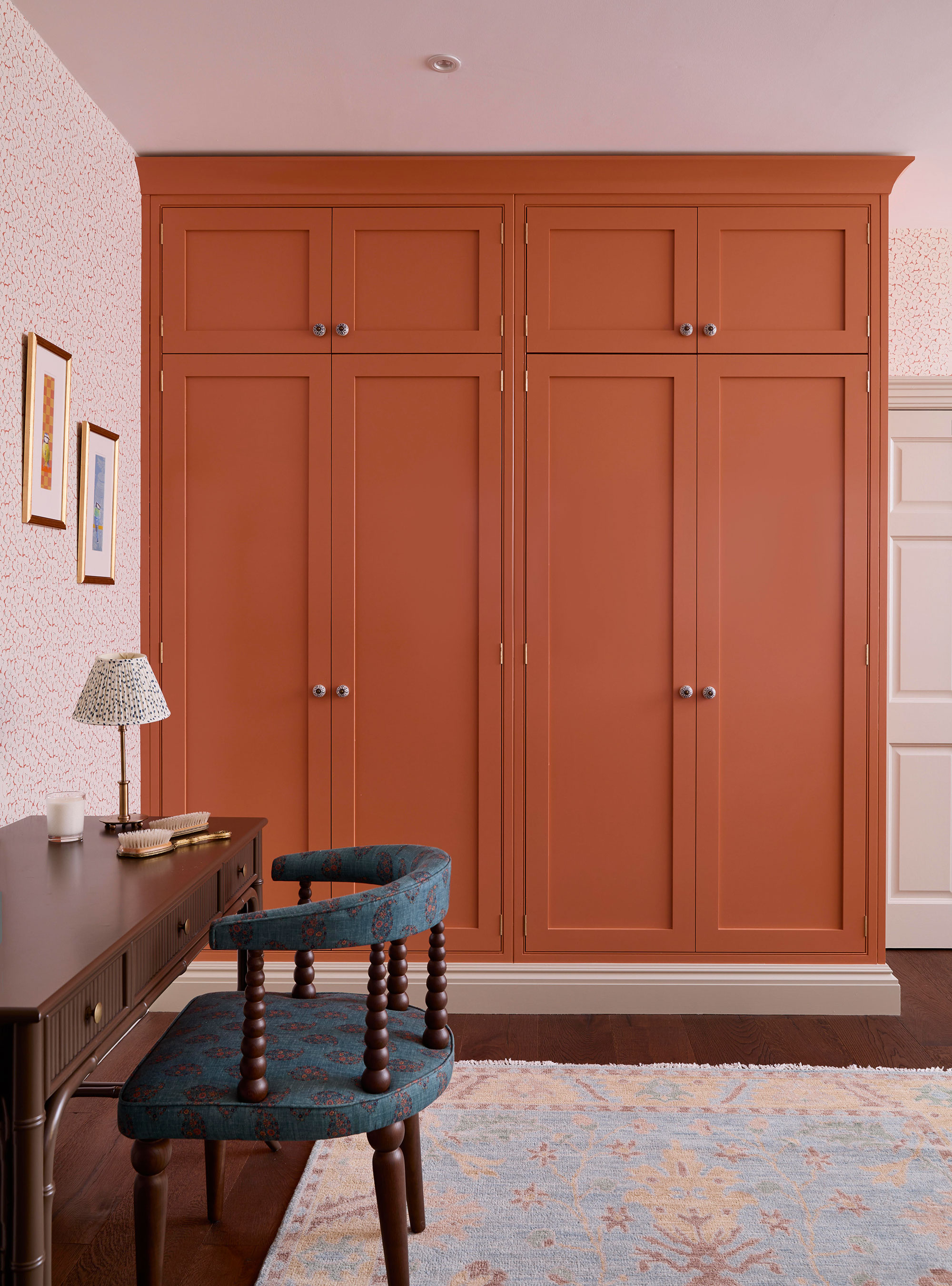
When it comes to a bedroom color scheme, we are often told to play it safe. But orange doesn't have to be garish or loud. In fact, this version of burnt orange is particularly warm and welcoming – just be careful to balance your palette to perfection.
‘Color will always look great when scaled and balanced correctly, ' says Tess MacGeachy, interior designer, Amber Yard. 'We incorporated orange elements in the rug, pattern on the chair, and artwork to make the tangerine wardrobe feel suitably at home in the room.’