When it comes to transforming a space, nothing has quite as immediate an impact as the right paint color. And for that, Lick, a British paint brand, has quickly become a favorite among interior designers for its curated palette of modern, versatile shades.
To help you navigate Lick's paint offerings, we've chatted with interior designers and color experts to highlight the 10 best Lick paint colors; the standout shades that not only reflect current design trends but also demonstrate their versatility across spaces and design styles.
Whether you're looking for a statement paint color idea, or something to create a soothing backdrop in your space, these are the designer-approved Lick paint colors to consider for your next project.
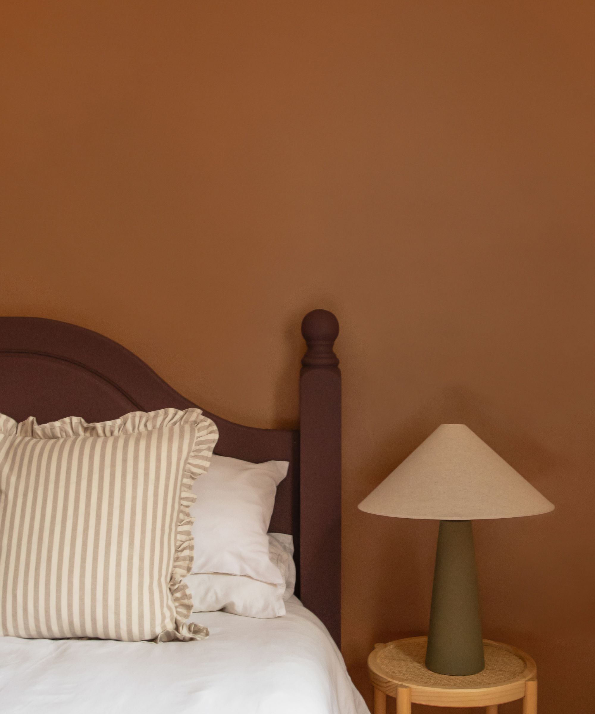
1. White 06
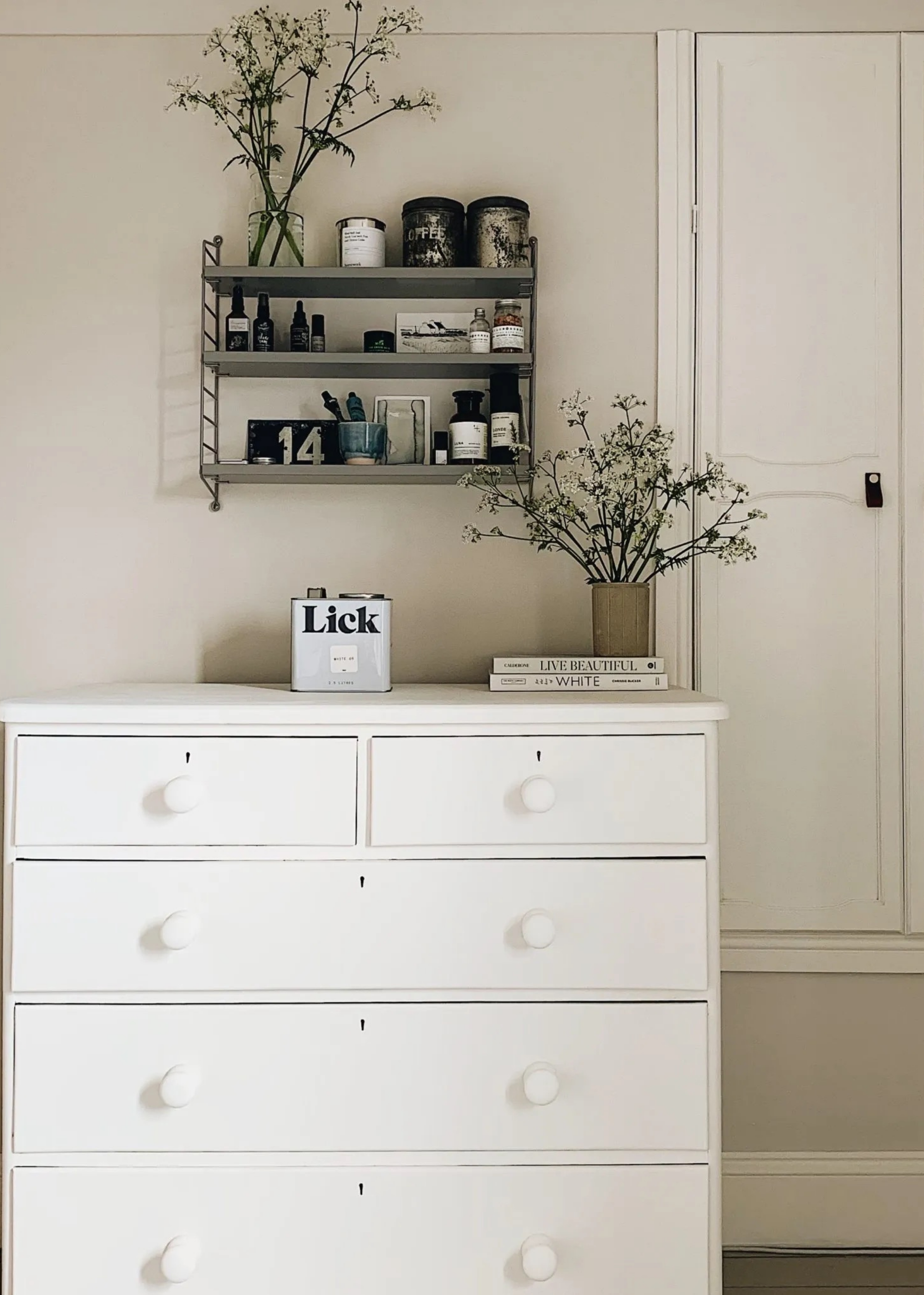
Described by Tash Bradley, Lick’s co-founder and director of interior design, as “a warm, timeless white with a delicate drop of pink in its undertones,” White 06 is a quietly powerful shade that adapts to virtually any setting.
Its softness avoids the clinical starkness of cooler whites, making it a go-to for spaces in need of gentle uplift.
Interior stylist Jane Day of Tea with Ruby used Lick's White 06 for a guest bedroom refresh, painting furniture, woodwork, and walls in the soothing shade to create a calm, beach house feel, providing a fresh, delicate finish.
2. Taupe 03
A well-balanced mid-tone, Lick’s Taupe 03 blends soft red and gray undertones to create a grounded neutral. When decorating with neutrals like this, it's best to pair with raw textures and materials, such as linen upholstery, rattan accents, and stone flooring.
Taupe 03 has been used throughout Soho Roc House in Mykonos. In collaboration with Lick, the entryway was painted in Taupe 03, chosen specifically to complement the relaxed, Mediterranean architecture. The result is stylish entry that balances luxury with a sense of calm — perfectly in line with Soho House’s laid-back atmosphere.
3. Greige 01
Greige 01 is a soft, earthy beige with gray and yellow undertones, creating a cozy yet subtle base that works exceptionally well in a variety of interiors.
"Interior designers often use Greige 01 as a canvas that invites personalization," shares Tash. "It pairs beautifully with brighter accent colors like sky blue and mint green, which add a refreshing twist without overwhelming the base color. These pops of color bring a sense of vitality to the space, balancing the neutral with a lively edge."
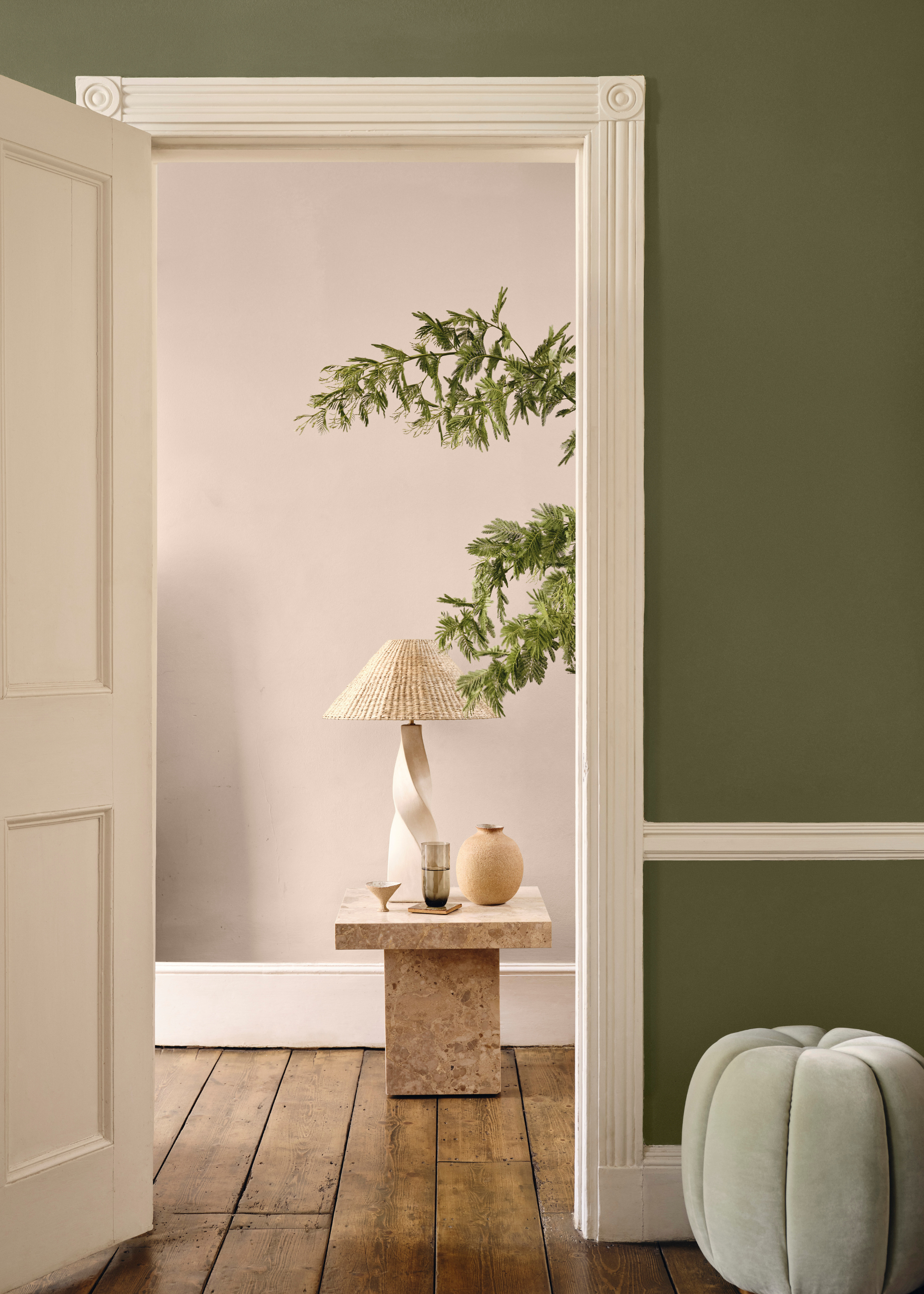
4. Brown 02
In another collaboration with Soho House, Tash curated a bespoke paint collection that includes Brown 02, which taps into a trend they call ‘New Nostalgia’.
This collaboration aimed to bring the distinctive style of Soho House locations into home interiors, and Brown 02 was chosen for its ability to evoke a sense of comfort and luxury.
It's a versatile shade, that layers beautifully with other colors from the palette, including Purple 03. When used alongside different colors from the same palette, it leverages the depth of each individually, creating spaces that are both nostalgic and contemporary.
5. Teal 01
Lick’s Teal 01 is a warm, mid-tone teal that perfectly balances blue and green undertones. This color also appears different under different lights, shifting throughout the day — sometimes appearing more vibrant and energizing, other times more muted.
Interior designer Tina Norden used Teal 01 in a contemporary London flat project she worked on. "The rich teal shade created a striking first impression while maintaining an inviting warmth," she explains.
"It adds unexpected intensity and personality to transitional spaces without overwhelming them," she continues, noting that it was paired with brass accents and natural wood flooring to amplify the depth of character of the apartment.
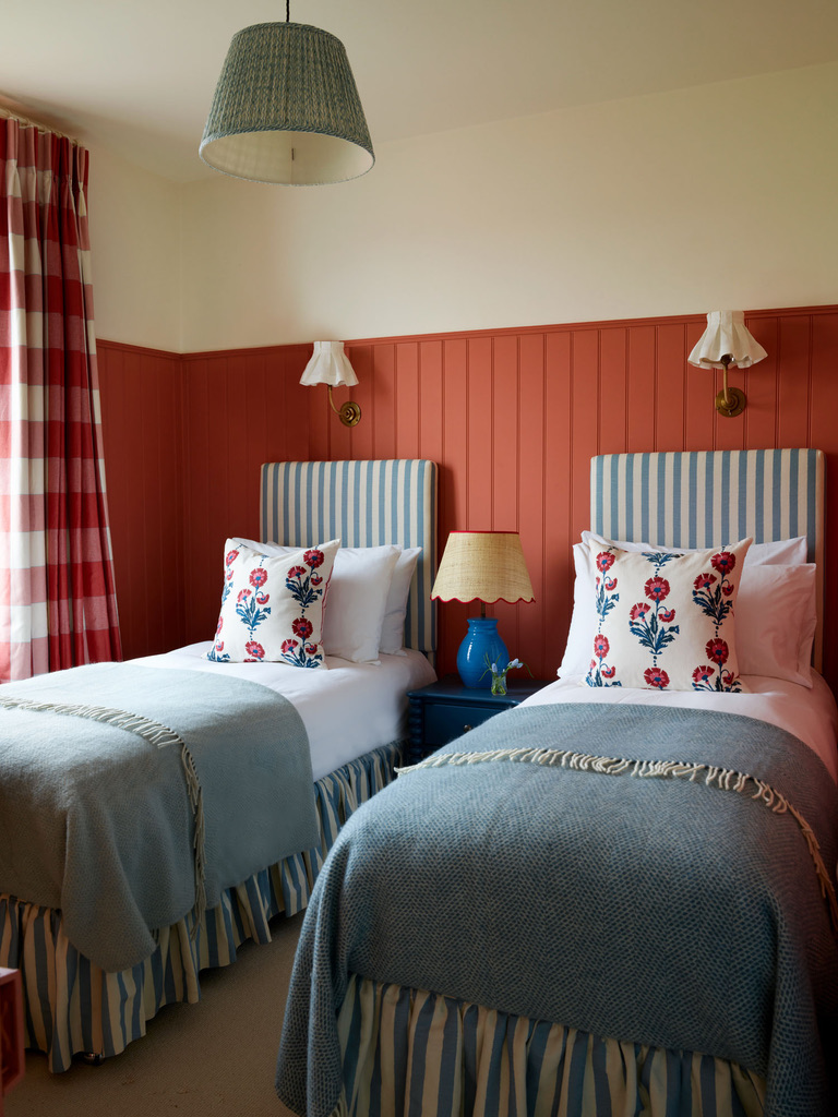
6. Pink 13
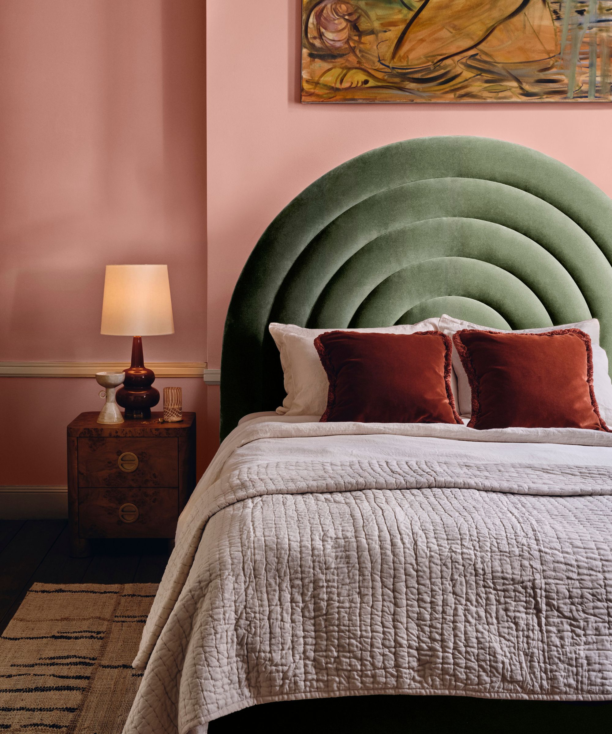
Pink 13 is a dark pink with both dark yellow and gray undertones, offering an earthy, toned-down coral that creates comforting spaces.
It's ideal for color drenching in living rooms or bedrooms to achieve a luxurious feel, especially when paired with finishes like antique brass and bronze.
Interior designer Lucy Barlow of Barlow & Barlow used this shade in a recent bedroom project, painting the walls and ceiling to create a cocooning effect. The color was paired with deep raspberry-toned velvet upholstery, vintage-inspired brass light fittings, and a bespoke headboard with scalloped edges for a modern take on classic glamour.
7. Blue 04
Blue 04 is a soft, muted blue with subtle gray hues, offering a calming ambiance. This shade is versatile, making it suitable for various spaces, including living rooms, bedrooms, and kitchens. By not being too dominating as a colour it allows itself to be used alongside both warm and cool tones, providing a balanced backdrop for different interiors.
Interior designer Alex Glover from Austin James Design Studio utilized Lick's Blue 04 in a kitchen renovation project. Alex painted the cabinets in this shade to complement a blue/green/grey veined marble worktop and an existing dark green Lacanche cooker. He noted how well the Blue 04 paired really nicely White 03 on all the walls, highlighting its adaptability and ability to blend with other colours.
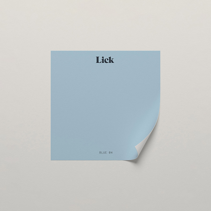
Price: £2.00/sample pot
8. Red 03
Red 03 is a deep, dusky red with deep pink and brown undertones, highlighting a terracotta hue that's bold yet not overstimulating. This shade brings warmth and energy to a space, making it particularly effective in rooms lacking natural light.
Interior designer Elizabeth Stanhope incorporated Lick's Red 03 in a recent project, pairing it with Blue 04 to create a dynamic and contrasting palette. The combination of the rusty red and cool blue tones added depth and vibrancy to the space, demonstrating the versatility of the color when used alongside other bold shades.
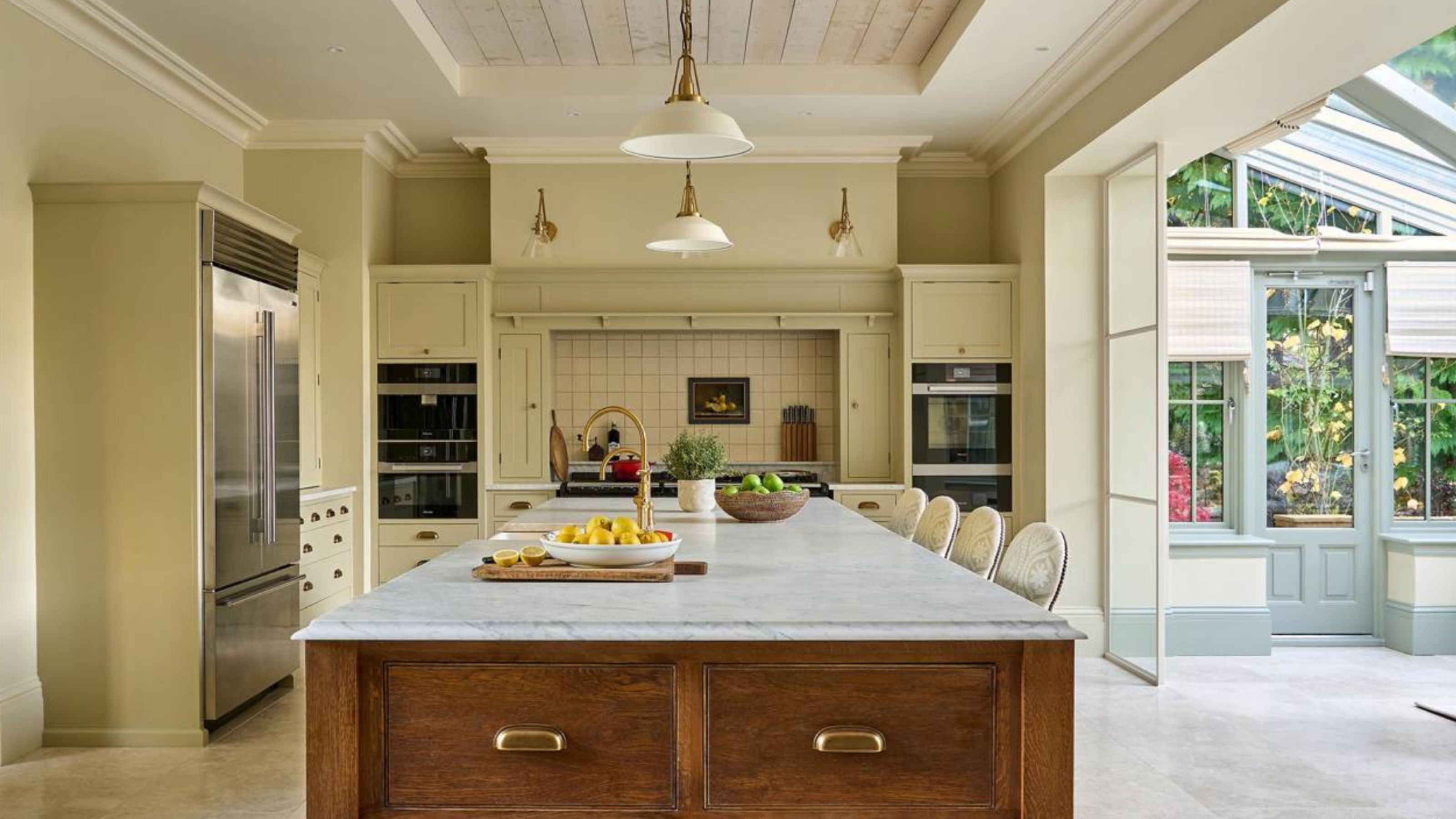
9. Yellow 08
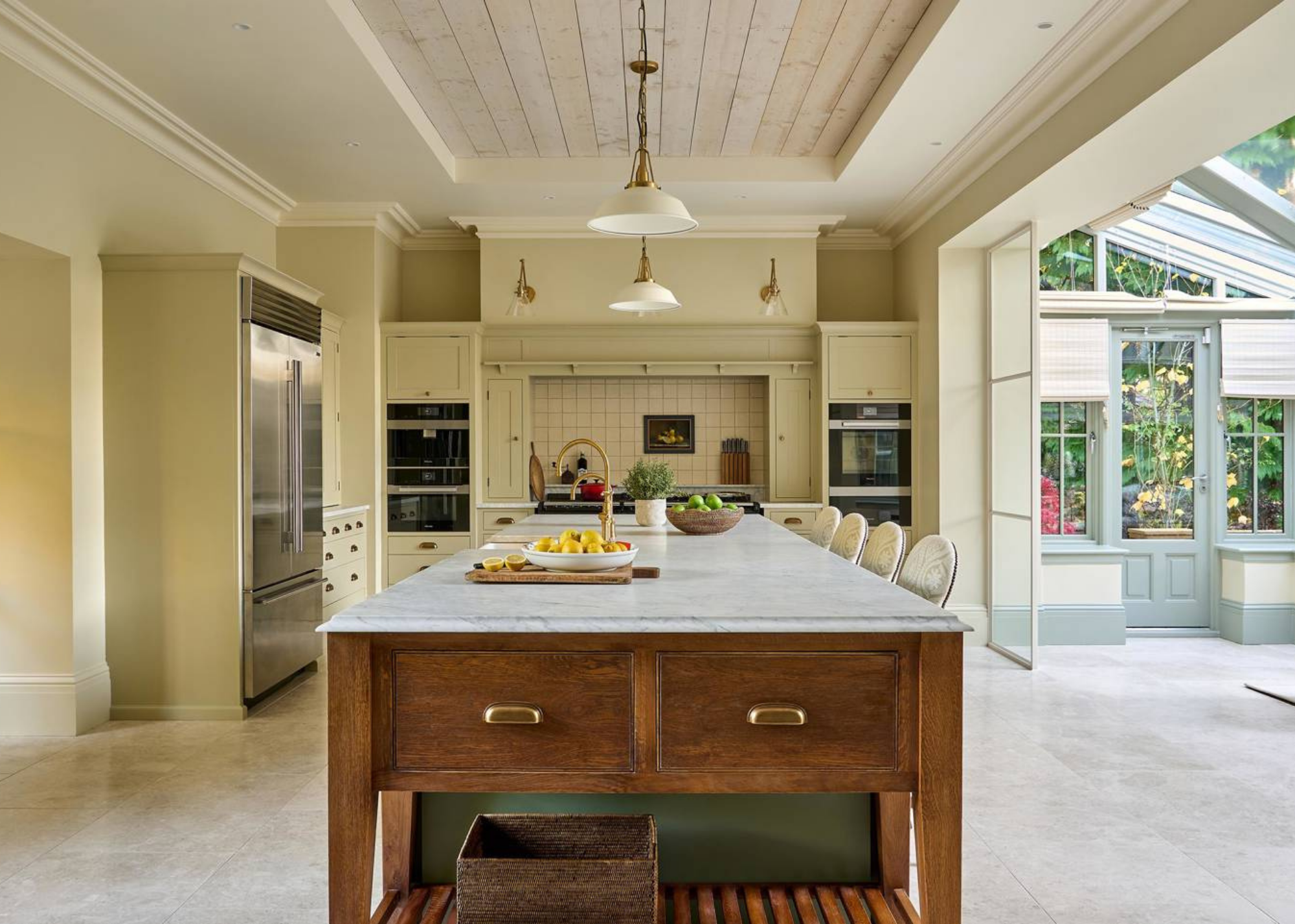
Yellow 08 is a muted mid-yellow with gray undertones. It's a versatile choice that goes with complementary colors like blue, creating a vibrant and characterful palette.
Interior designer Emma Sims-Hilditch used Yellow 08 in a country kitchen project (shown above), applying it to the cabinetry to infuse the space with a sunny, welcoming atmosphere. She complemented the color with natural wood elements and soft blue accents for a harmonious look.
10. Green 05
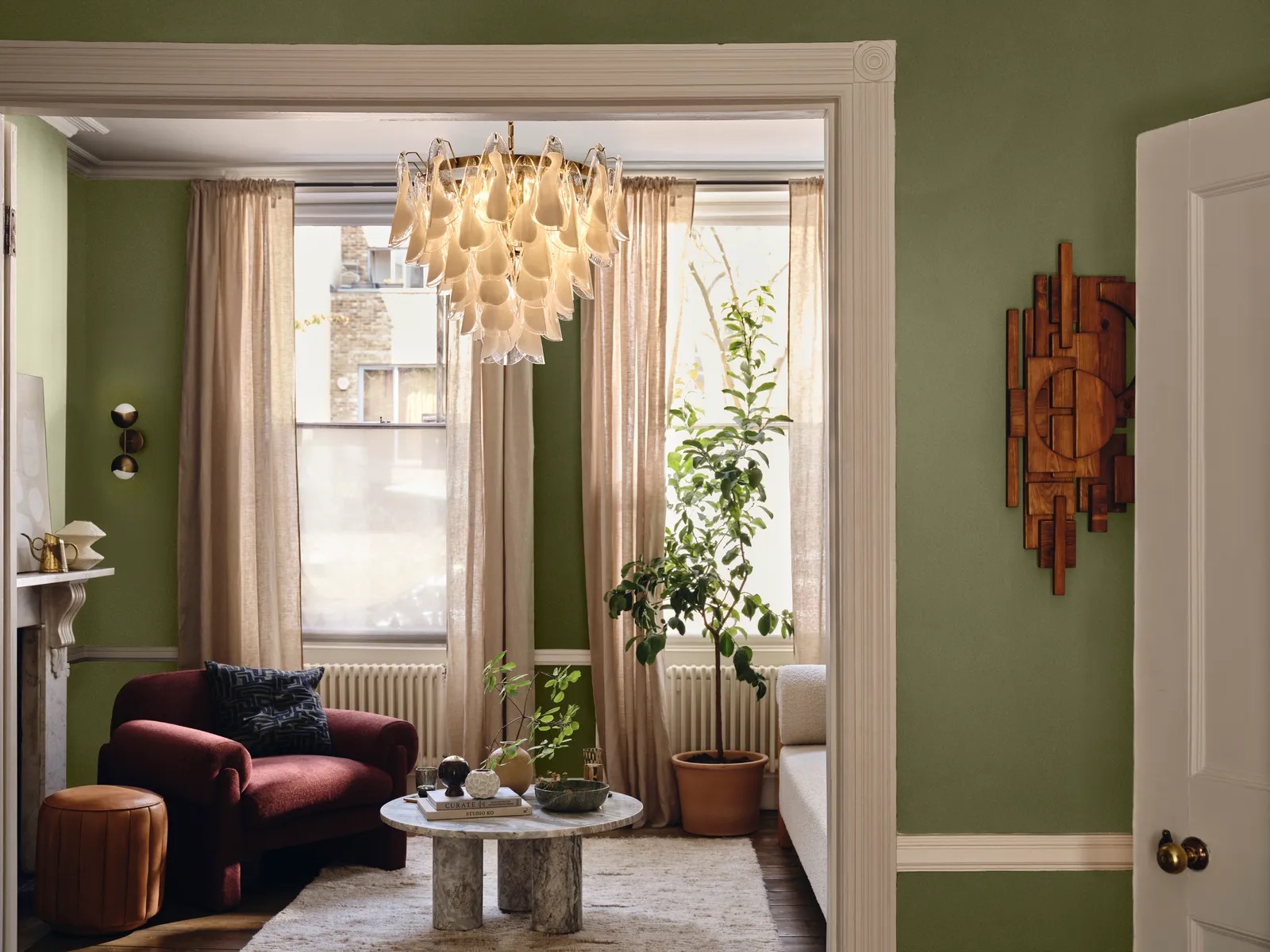
Lick's Green 05 is a dusky olive green with golden yellow undertones that pairs well with rust, burgundy, and mustard colors, also enhancing architectural features when contrasted with whites.
In the Lick x Soho House collaboration, this shade was used in the Rome House project, and was inspired by an olive green car spotted in Rome, and therefore chosen to reflect the character of the San Lorenzo district.
FAQs
What Are the Three Most Popular Lick Paint Colors?
From a best-selling perspective, Tash says the best Lick paint colors are Beige 03, Red 03, and Green 05.
“Red 03 stands out as Lick's most searched-for and purchased color, a notable achievement for a red shade,” she adds. “Green 05 is another one of Lick’s bestsellers due to its versatility so that it can be used in various spaces. And designers love Beige 03 because it complements a wide range of styles — from modern minimalism to cozy traditional spaces — making it a reliable choice.”
Whether you're after a bold statement wall or a subtle backdrop that lets your furniture shine, the best Lick paint colors offer something for every space.
These designer-approved shades prove that choosing the right paint isn’t just about color — it’s about creating the right mood and flow for your home.