When it comes to decorating our homes, color is more than just visual; it’s used to help shape the mood and character of a space. And when it comes to crafting a home that’s design-led, the best Graham & Brown paint colors continues to be a go-to for designers.
Known for their beautifully curated palette and design-forward approach, the British heritage brand has mastered the art of paint that does more than just sit on your walls. It's about comfort, character, and just the right amount of edge — whether you’re cocooning your space in a rich brown or brightening a room with an optimistic green.
So, what are the best Graham & Brown paint colors? The ones that get the interior designer seal of approval? Well, we asked them, and below, we've rounded up eight of the best shades, perfect for any paint ideas — handpicked for their wow factor and effortless elegance.
1. Elderton

Graham & Brown’s Color of the Year 2025, Elderton, is a sophisticated mid-tone brown that exudes homeliness and versatility. Described by Paula Taylor, the brand's senior stylist and trend specialist, as a "chameleon color," Elderton adapts seamlessly to various design styles, from rustic to contemporary. Its earthy tone reconnects us with nature, making it an ideal choice for creating cozy, grounded spaces.
Elderton is further showcased in Graham & Brown's own design project, shown above, where it complements the brand's more intricate 'Rivington Folly' wallpaper — a hand-drawn pattern inspired by the intertwining of ancient architecture and pastoral landscapes.
2. Alizarin

Graham & Brown’s Color of the Year 2023, Alizarin, is a deep auburn red. Inspired by the natural pigment derived from the Rubia plant, it offers a rich, earthy hue that serves as a creative alternative to traditional neutrals like gray and beige.
Its tones allow it to create a cozy, cocooning effect in smaller spaces or to add glamour and depth to larger rooms.
In a recent design project, interior designer Francesca Loasses from 155 Interior Design used Alizarin to create a sultry, romantic bedroom. She shares that the depth of Alizarin pairs well with dark color schemes like navy or anthracite, or can be balanced with lighter neutrals to suit various design preferences.
3. Adeline

Another one of the best Graham & Brown paint colors is Adeline, an opulent bottle green that draws inspiration from a connection to nature. It's a rich shade that has a heritage depth, and one which interior stylist and photographer Lily Sawyer used to dramatic effect in a period-style bathroom transformation.
"I wanted a color that felt bold but calming — something with historic resonance that wouldn’t feel old-fashioned," Lily shares. "Adeline gave me all of that."
The walls were drenched in the rich green hue, allowing the space to feel immersive, without losing a refined touch. Lily paired the green paint with Graham & Brown’s ‘Bloomsbury Neo Mint’ wallpaper to add softness. Brushed brass fixtures and lighting further enhanced the vintage-meets-modern aesthetic, making the room feel more like a private sanctuary than a standard bathroom.
4. Breathe
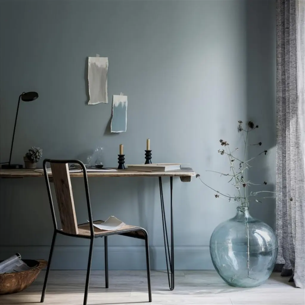
Graham & Brown’s Breathe is a tranquil mid-blue designed to create calm and peaceful spaces. Dark enough to add color and depth, but light enough to remain refreshing, this shade can be used almost anywhere in the home. Pair it with crisp whites and cool grays for an airy feel, or partner it with deeper blues to create a moody hideaway.
"Breathe was used in one of Graham & Brown’s own design projects in combination with the our Restore Midnight wallpaper," says Paula. "This pairing creates a layered, dramatic look that brings a connection to nature within the home."
Breathe's versatility and soothing qualities make it an ideal choice for bedrooms, living rooms, or any space where you want to promote relaxation.
5. Tiru

Tiru is a rich teal hue inspired by the Japanese Kabuki theatre, known for its bold and dramatic aesthetics, which makes it one of the best Graham & Brown paint colors for creating statement spaces.
In a real-world application, Tiru was used by interior designer Ann Porter to paint a front door, providing a striking contrast against the traditional brick facade of the home.
"The bold teal color adds a contemporary touch to the classic exterior, showcasing Tiru's versatility in both interior and exterior design," says Ann. "Whether used on walls, furniture, or architectural features, Tiru offers a suitable option for those looking to infuse their spaces with a touch of drama."
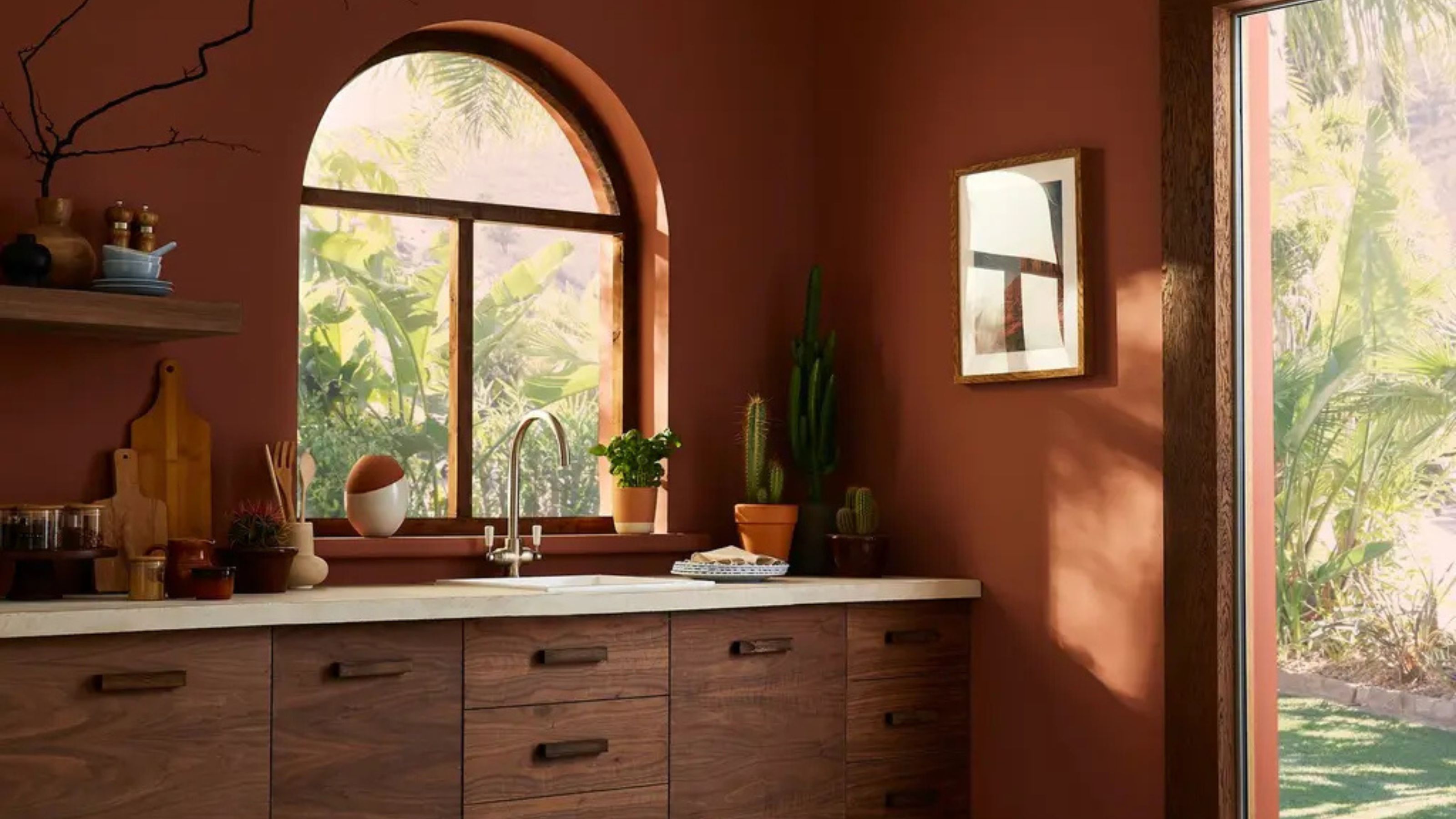
6. Arizona Sky

Blending red and orange undertones, Arizona Sky evokes the striking beauty of southwestern landscapes, where terracotta hues are deeply rooted.
“The color works beautifully when paired with natural elements like wood, stone, and metal,” recommends Paula. “This makes Arizona Sky a great addition to various design styles.”
Arizona Sky was used in the living room design shown above to create a cozy and inviting atmosphere. The tones of the paint complemented natural wood furnishings and earthy textiles.
Whether used as a primary wall color or as an accent, Arizona Sky works great with warm neutrals and natural materials.
7. Penelope

Penelope is a delicate pink paint color inspired by the Greek goddess known for her faithfulness and patience. This soft hue offers a modern twist on traditional pinks, making it an attractive choice for various interior styles.
Penelope was used in a bedroom makeover by interior stylist, Linsey Lindley. She opted for this shade as a spring update to add warmth and freshness to the space with the paint's subtle tone complementing the room's existing accessories.
8. Rhapsody
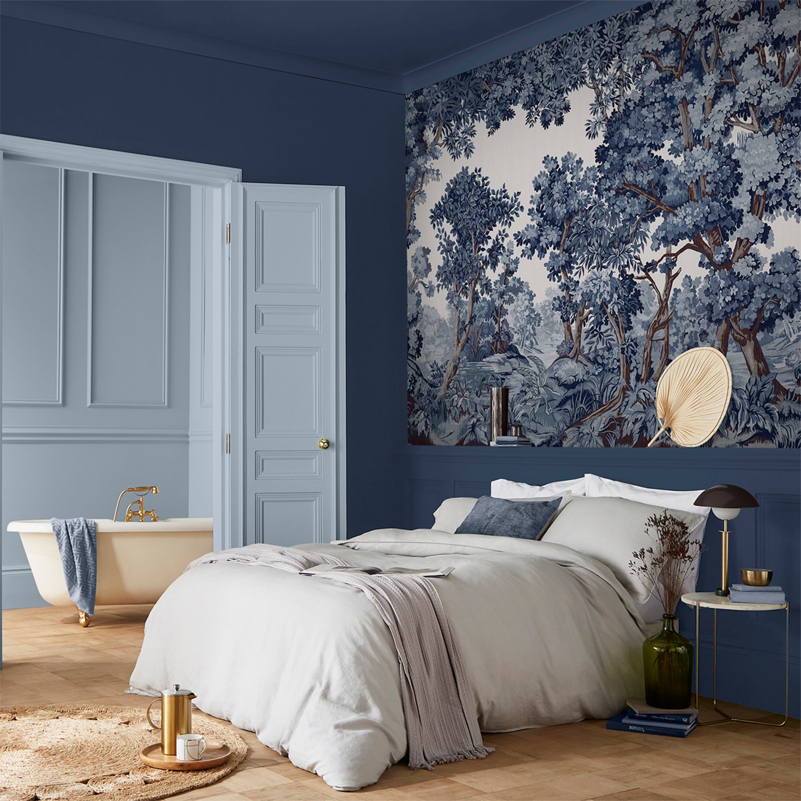
Rhapsody, a rich deep navy blue from Graham & Brown, is designed to create the perfect setting when styled with copper accessories. This luxurious color brings depth and sophistication to interiors, making it an ideal choice for those looking to infuse their spaces with a touch of drama and elegance.
Paula emphasizes the importance of color layering in creating a sense of space. "While Rhapsody is a deeper hue, pairing it with lighter neutrals can balance the space, creating a sophisticated and expansive feel," she says.
FAQs
What Are the Most Popular Graham & Brown Paint Colors?
According to Ellen Cartwright at Graham & Brown, the three most popular colors are Elderton, Adeline, and Rhapsody.
"Proudly our Color of the Year for 2025, Elderton takes its name from the humble Elder Tree," she shares. "Adeline was our 2020 Color of the Year and remains a strong community favourite. It's a deep rich bottle green with an intense, vibrant look that reminds you of the deep forests and works to pull together any room in the home."
"Rhapsody, another popular choice in the UK is a rich deep navy blue that is timeless and will create the perfect modern backdrop," she continues. "It can be used in large open spaces, this paint really brings a rich, deep color to your home. Perfect for color drenching and perfectly partnering with vibrant wallpaper designs or exterior use to create a bold statement."
The best Graham & Brown paint colors include a diverse range of shades that can cater to various interior design trends — it's no wonder designers continue to turn to the heritage British paint brand for inspiration.