Designing for other creatives has got to be one of the hardest tasks out there. It's a challenge we took on last year when rebranding our very own Brand Impact Awards, and in 2025, JKR has created a new identity for one of the biggest events of the design year, D&AD Awards and Festival.
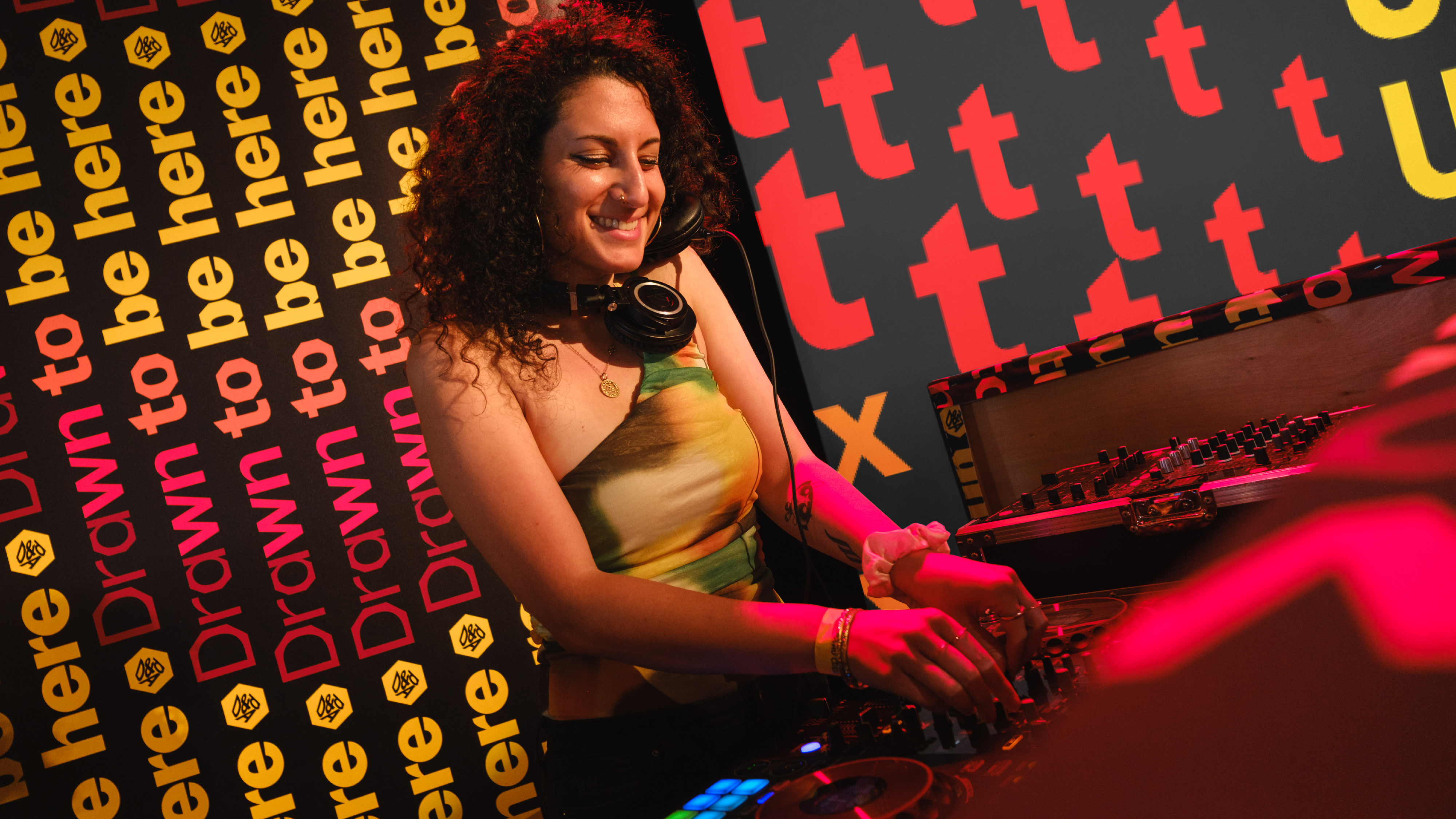
Everywhere you went at D&AD Festival and Awards, you were surrounded by riffs on the idea of Drawn to Create. The identity centres around the iconic Pencil (how could it not?) and a bold new typeface created with Studio DRAMA, Pencil Gothic. The typeface and identity morphed into different shapes on stage, lent itself to signage, backdrops and was front and centre of the glitzy awards ceremony.
I sat down with Lisa Smith, JKR's global executive creative director, and D&AD Trustee, to discover more about the project. Elsewhere, you can catch up with my highlights from D&AD Festival including a talk on sonic branding, the worst professional mistakes ever made and why you just need to start creating according to Aardman's Gavin Strange.
“One of the things we’ve talked about post-pandemic is that D&AD have had three years of bringing the festival back.” Lisa explained, adding how in the past few years D&AD has been a little more conservative.
“It’s taken a little while to get back to what we’re great and known for,” she said. “So that’s why we went back to what the core of the idea of D&AD is and the idea of being drawn to create, and being drawn to D&AD.” It’s not just being drawn to create though, it’s about being "drawn to write, drawn to make, drawn to have impact, drawn to all that,” said Lisa.
“It felt more welcoming... We wanted it to feel like an expression that was really inviting for all types of creative.”
This work wasn’t just one campaign though, explained Lisa, who said she was "maybe a little naive when I took this on". It was essentially two campaigns, "a festival experience and then the Annual, so it’s quite multi-faceted. The first campaign was all about getting people to enter the awards and then it ties very heavily to the awards ceremony.
"So at the awards you’ll see it all in black, yellow and white and that’s a set of assets that were created specifically around the awards. And then for the D&AD Festival we introduced a wider range of colours born from the black, white and yellow.”
“It’s very word-led,” said Lisa. “We had a mini moment in a pub in New York where Studio DRAMA were over… we were just riffing. And I was like, ‘I think we're going to do this typographic campaign for D&AD. Could it be born of the pencil? Could we make different weights that correspond to the weights of the pencil weights, and could it be variable in that way, but also come from the shape where you look down at a pencil?’ And so, we collaborated on making a typeface.”
"It’s been a game-changer to have a display typeface that you recognise, or could start to recognise... Eventually you would start to recognise it as something that only D&AD could do,” said Lisa who mentioned having enjoyed seeing the branding everywhere from in the jury rooms to in full motion on the stages at the festival.
I asked Lisa if there has been any touchpoint that she enjoyed designing in particular and she pointed to the films made for the ceremony. “I don't know if you remember the animation sequence that was in Dumbo where the elephants multiply. It's kind of like how the type multiplies. The type kind of blooms, as flowers. It comes in as aggregated teeth. It's just, how can you use typography and motion to bring all these words and expression to life? And then we worked with a drummer who did custom music."
Overall, the identity has been a great success, with this year's event bringing in a record number of award entries and the highest ever participation from countries around the world. Has Lisa enjoyed the project? “It’s been an absolute ball," she said. "It’s been a palette cleanser from more traditional clients.”
Find out more about D&AD
Find out more about JKR