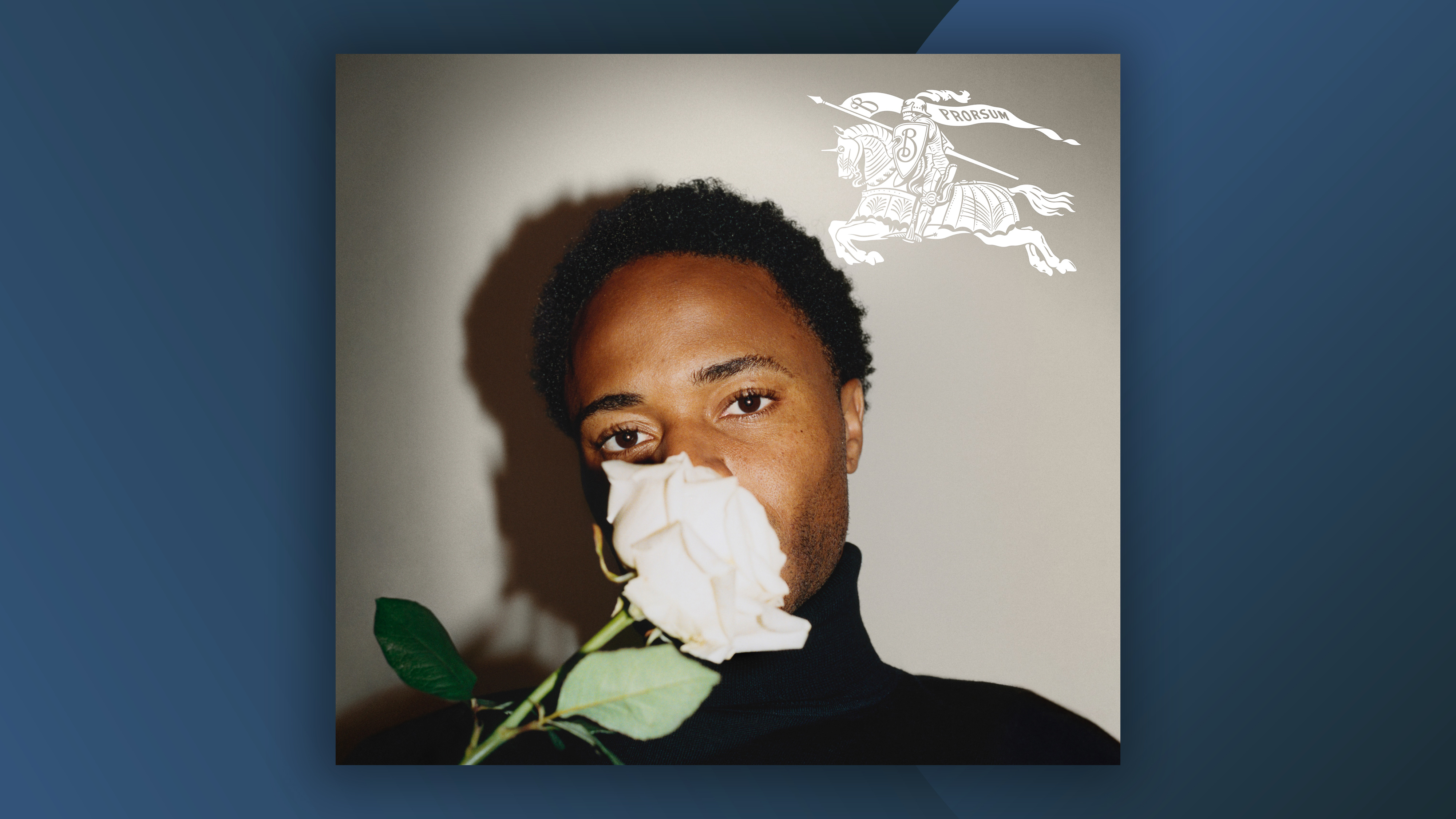
When Burberry dropped its latest rebrand back in 2023, we were particularly fond of the new logo. One of the strongest examples of the heritage logo trend we'd seen at the time, the return of 1901's 'equestrian knight' design signalled an overdue shift away from minimal, sans-serif wordmarks. But the designer of the previous logo has recently called the rebrand "reckless".
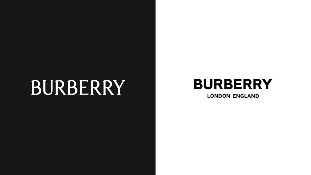
In 2018, Burberry revealed a new wordmark designed by Peter Saville. Derided by many as part of a minimal logo trend that some said was 'killing brands', the plain logotype was about as straightforward as it gets. But Saville thinks it was done away with too soon.
In a recent interview with Dezeen, Saville called the 2023 rebrand "totally and utterly irresponsible". But it isn't because of the design itself. Indeed, Saville calls chief creative officer Daniel Lee's throwback logo "really nice".
Rather it's the timing of the rebrand that troubled Saville. In what he calls a "management mistake," the 2023 branding was allegedly rolled out before Saville's own had even hit all stores. As a result, there was a time when Saville claims customers could have found "three different Burberrys" in the world.
Saville's comments raise an interesting practical question about rebrands; namely, how soon is too soon? Take Jaguar's controversial rebrand from last year. Many were called for that one to be rolled back or replaced, and reports have suggested Jaguar has already replaced the ad agency responsible. But even with a much-maligned identity like that one, perhaps confusion would be even worse. In other words, perhaps one divisive identity is better than two confusing ones.