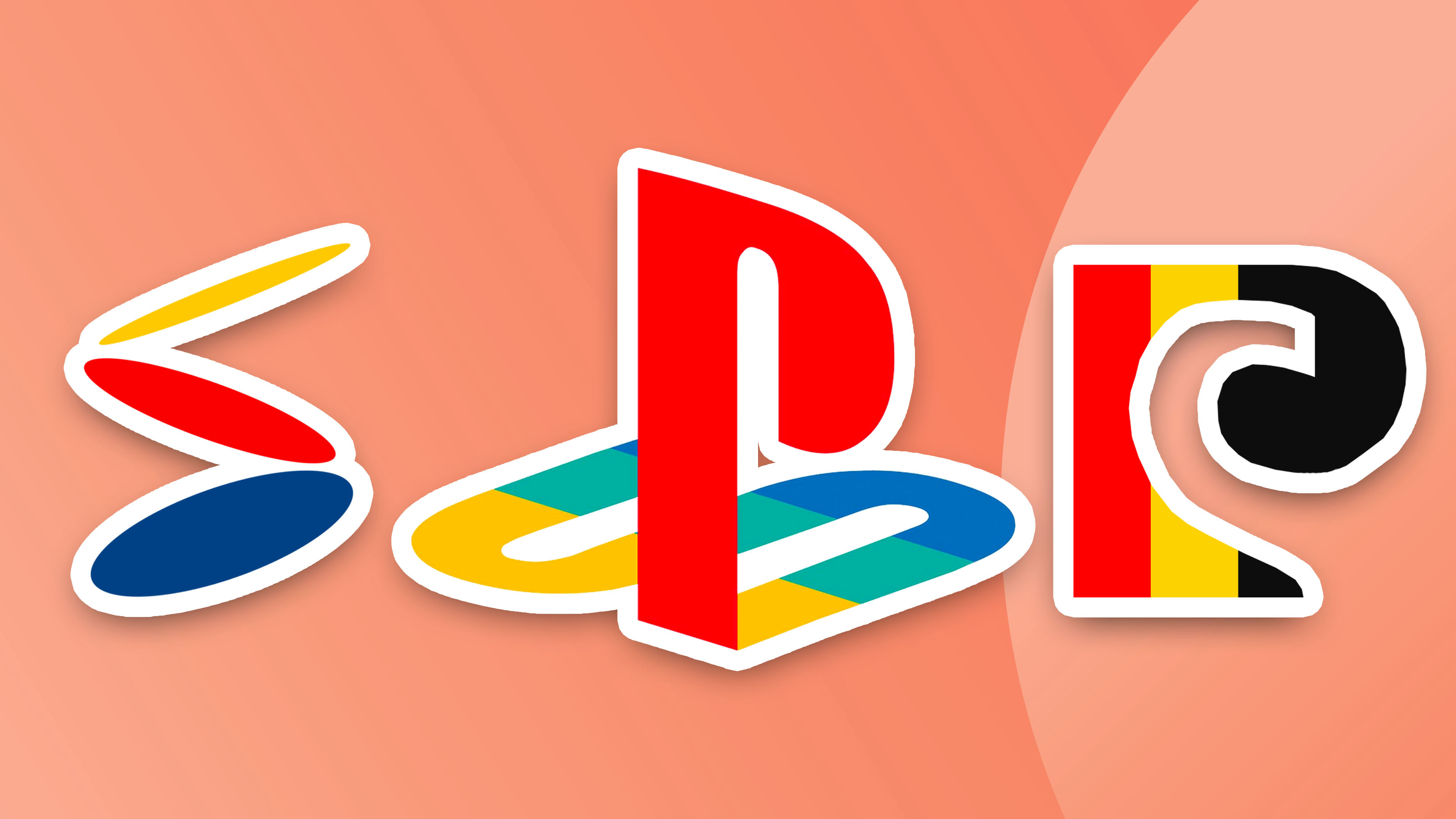
Nostalgia is at the forefront of PlayStation branding – those four bold colours paired with the familiar lettering is a combination any gamer would instantly recognise thanks to the logo remaining pretty much unchanged since the release of the first console. And now we get a glimpse at how this iconic logo came to be – and how different it could have looked.
Recently shared on Twitter, we have a detailed look at a variety of original concepts for the PlayStation Logo. Most are pretty similar to the design we know and love today, but there are a few bizarres picks that we're glad didn't make the final cut. (Looking for some other iconic branding? Make sure to check out the best logos of all time.)
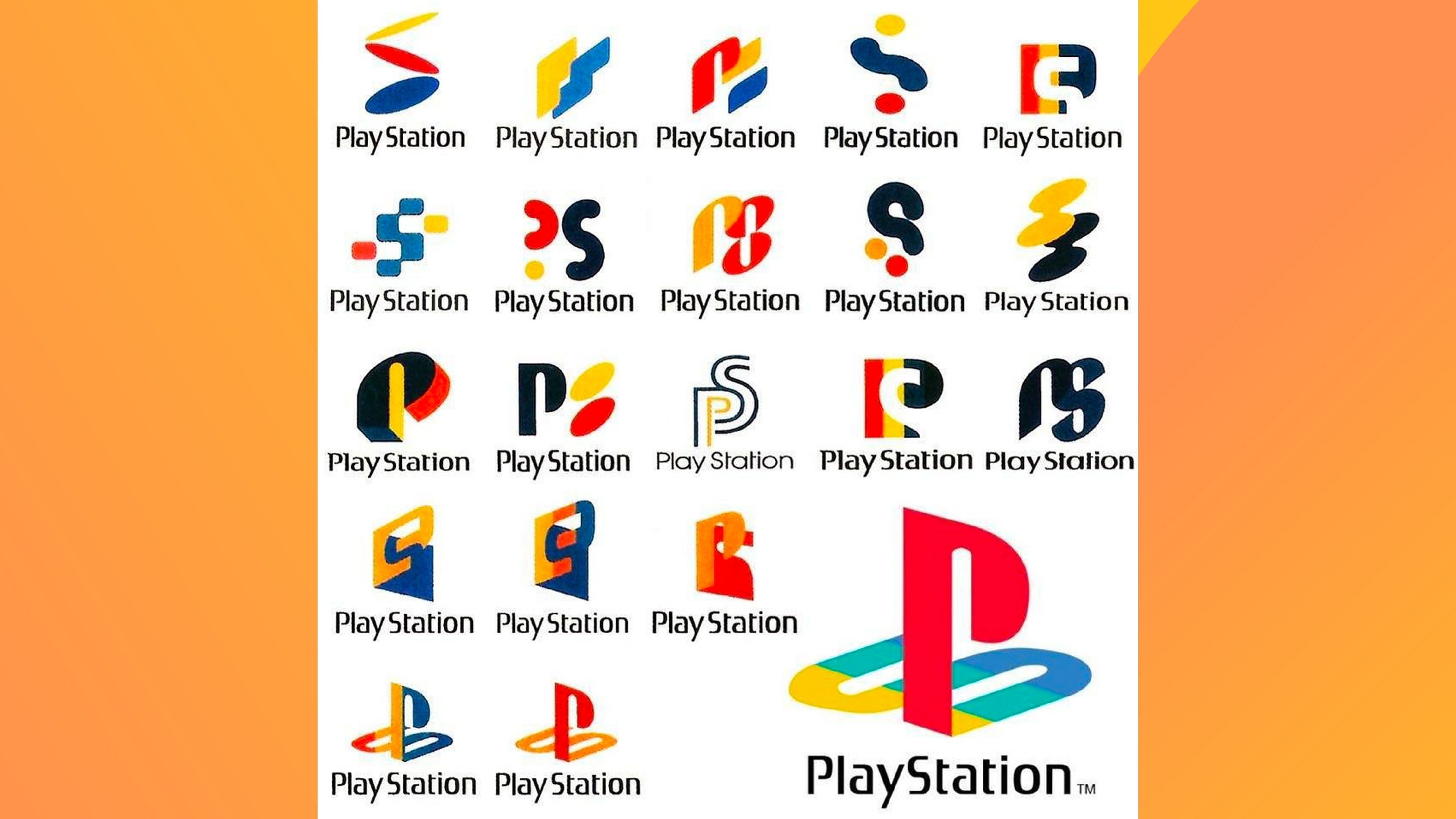
In the tweet shared by Twitter user ComputerLove_, we see a page full of the original concepts for the Playstation logo. Generally, most of the concepts seem to include the P and S lettering in the form of abstract shapes or varying font types. Whilst most are pretty recognisable as PlayStation branding, there are some really unique designs amongst them that are really out there, and I'm glad we ended up with the design we did.
The PlayStation logo was originally designed by Manabu Sakamoto ahead of the first console's release back in 1994. When talking about his creative process, Sakamoto states he conceptualised the logo around the base P and S letters, and according to site BrandCrowd, he wanted each design to convey a sense of depth to represent the console's 3D capabilities.
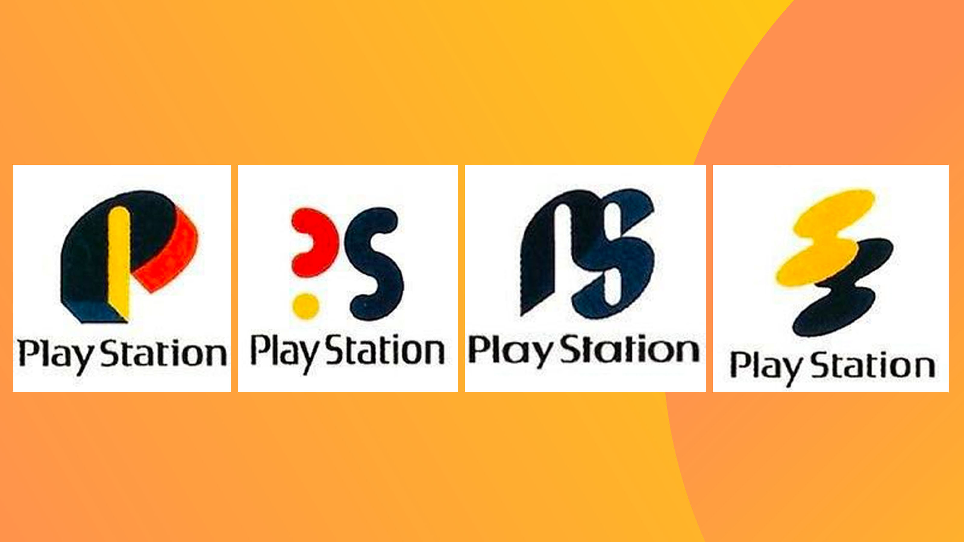
A few of the designs feature a rather jarring shade of black. It feels less playful than the other colourful variations and considering the grey shade of the original console, I'm relieved that Sakamoto went with a brighter design. The inclusion of rounded shapes throughout also feels more child-friendly, which was important as the original console was mainly marketed towards the younger generation of gamers. As a group of designs, they definitely feel more cohesive than those unused Nintendo Wii logos that resurfaced last year.
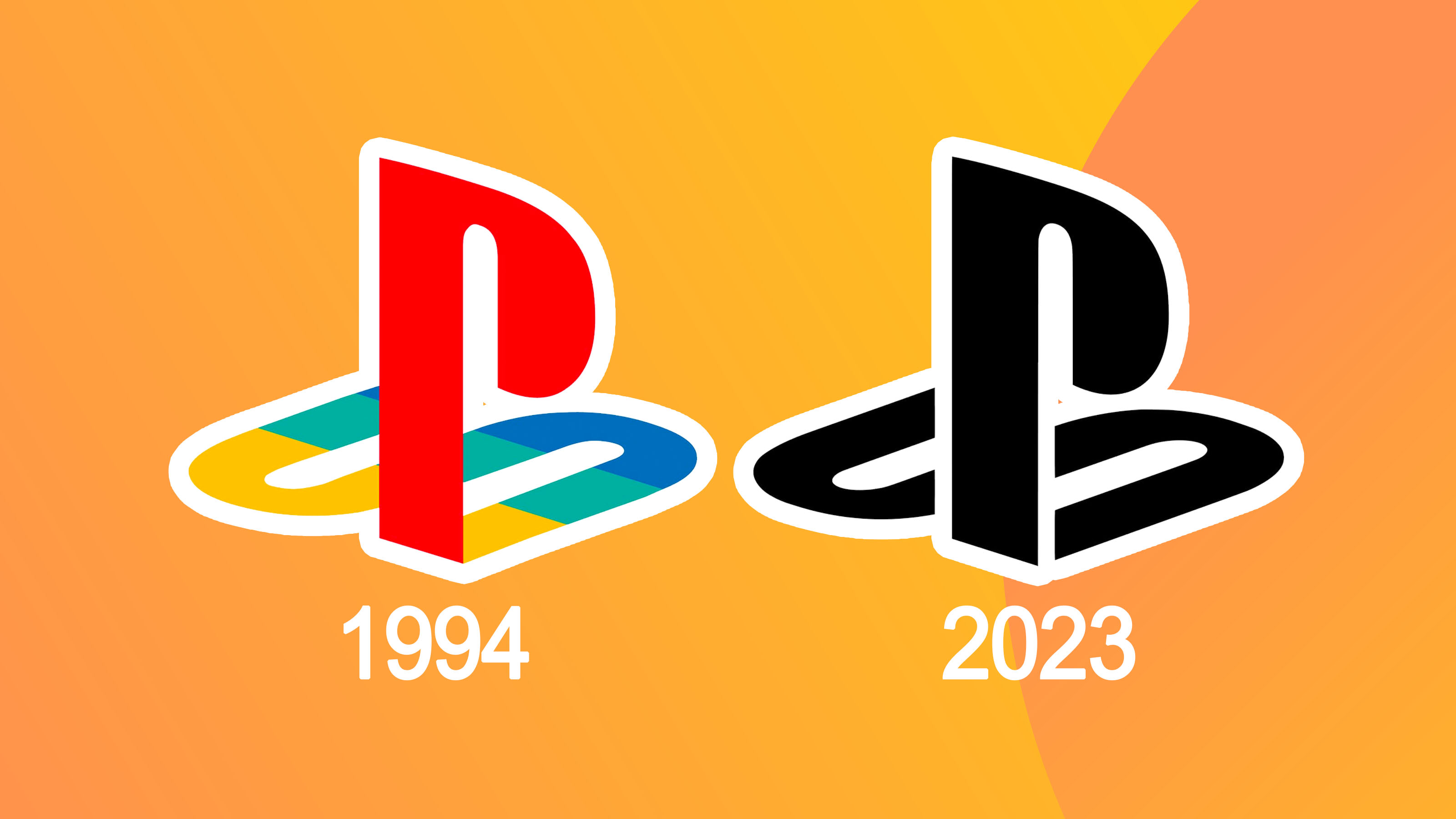
Looking at the original concepts, I'm thankful for the logo we have today. It's simple, clear and a staple symbol of many of our childhoods. And even now, nearly 30 years later, PlayStation still uses the same logo (albeit without those stunning colours). If it isn't broke, don't fix it.