We may already be half-way through 2025, but WGSN, a leading consumer trend forecaster, and Coloro, a leader in color excellence, just announced 'Luminous Blue' as the Color of the Year for 2027. Yes, 2027. But how can we use it in our homes right now? I'm glad you asked.
While we've all enjoyed the calmer tones that have dominated color trends for the last however many years, it's clear that now is the time to amp things up and have a bit of fun — "We’re finally ready," Livingetc's color expert Amy Moorea Wong aptly puts it.
This alluring, pigment-heavy hue nods to the interior design world's segue into more experimental styles. "It feels like it’s practically dripping with color, which gives it incredible intensity, life, and a bit of a celebratory spirit," says Amy. "I absolutely won’t be waiting for 2027 to bring more of it into my home."
Its color of the year title might be on hold until 2027, but designers are already gearing up for the Luminous Blue takeover. Below, I've shared how to decorate with this audacious azure, so you can get a jump start on the trend.
What Color Is Luminous Blue?
"Luminous Blue is pure glory," says Livingetc's color expert, Amy Moorea Wong. "It’s energy, excitement, confidence, and joy, all rolled into one ecstatic, wondrous hue. It’s endless positivity in color form (can you tell it’s my favorite color and I’m a bit excited to see it getting the recognition is deserves?)"
The energetic color could be compared to Yves Klein’s International Klein Blue — a similar deep ultramarine tone developed in the 1950s to evoke the infinite and be akin to an introspective and immersive experience.
You could also treat it as you would decorate with cobalt blue, or even ultramarine, which contributed to the color renaissance in the fine art world; one of the most expensive-looking shades of blue.
But today, "Our Luminous Blue is a little brighter, fresher, and more approachable, with a lighter, more optimistic mood," says Amy.
Compared to other popular colors right now, like the ever-present butter yellow or Pantone's Color of the Year, Mocha Mousse, this bright shade of blue is quite the contrast. It’s imbued with punch and power, compared to the calmness and zen that has come before it.
"If the colors we’ve gotten used to have been 'come-in-and-relax-after-a-hard-day’s-work', Luminous Blue is more like 'turn-up-the-music-and-invite-some-friends-over," describes Amy. And the best way to decorate with blue at this vibrancy level is about embracing the innate energy that comes with it.
How to Style Luminous Blue in Interiors
So, how can we stylishly incorporate this bright, bold blue into our homes? "In all of the ways!" says Amy. "From drenching a small spare bedroom to peeking out at as highlights dotted through a blue living room idea, Luminous Blue really is versatile."
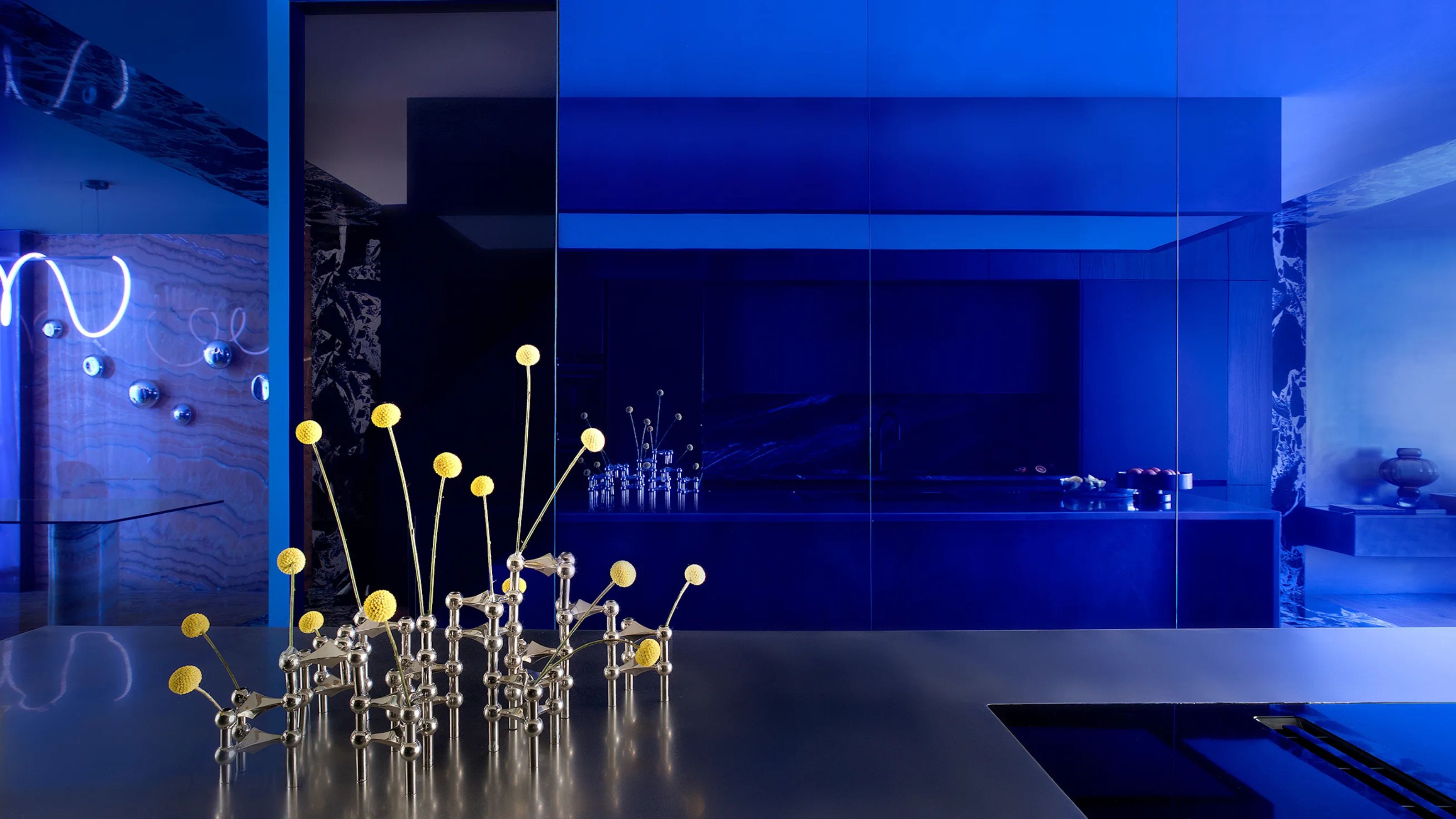
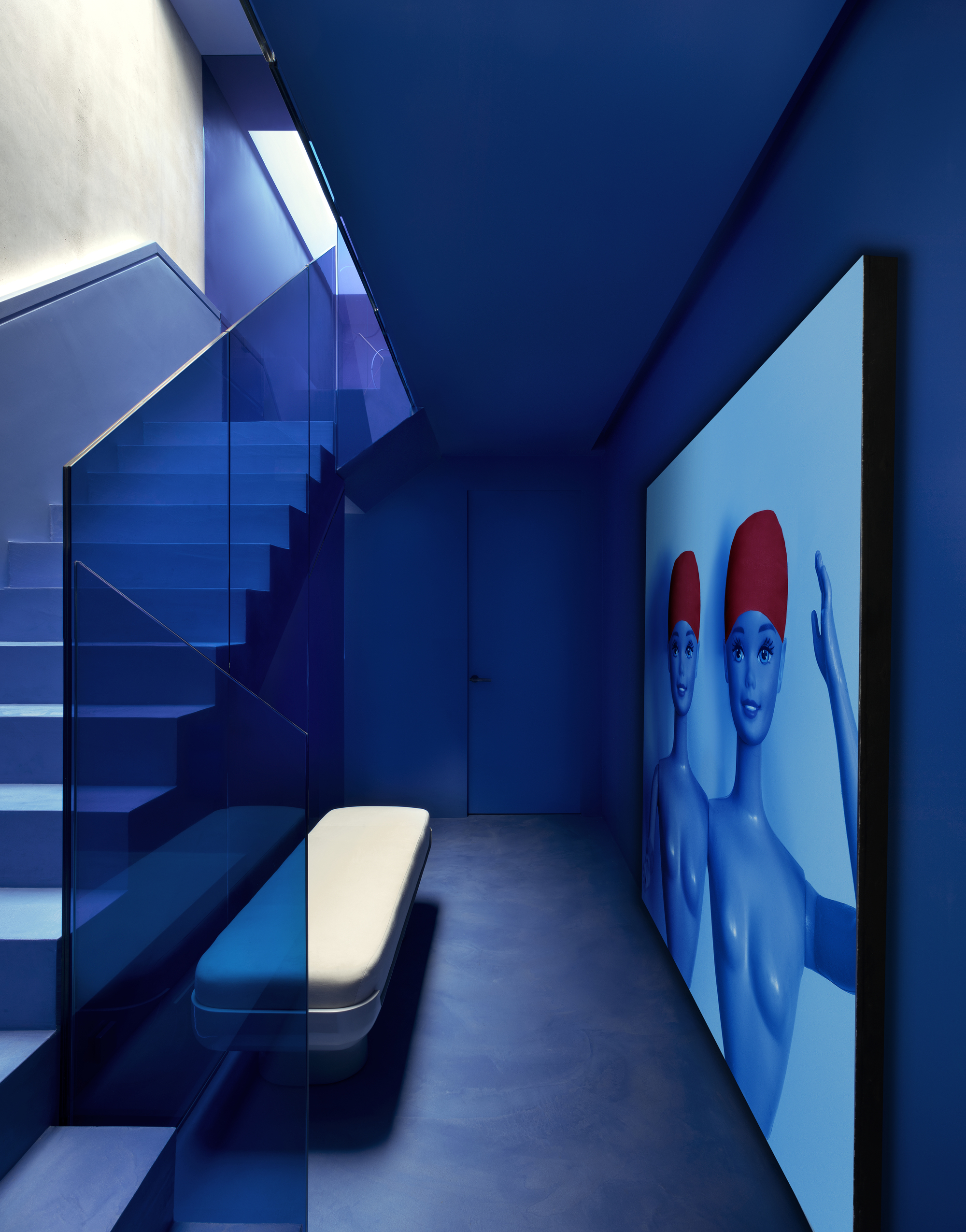
As a bold hue, it does, of course, require a bit of careful thought and planning as to not overwhelm the space. But don't be intimidated by its vividity. "The dynamic, positive color works really effectively as a color-drenching method to transport you to a different world, creating a bold, saturated, all-encompassing feeling," says Dublin-based interior designer Róisín Lafferty, who created the space shown at the top of this article.
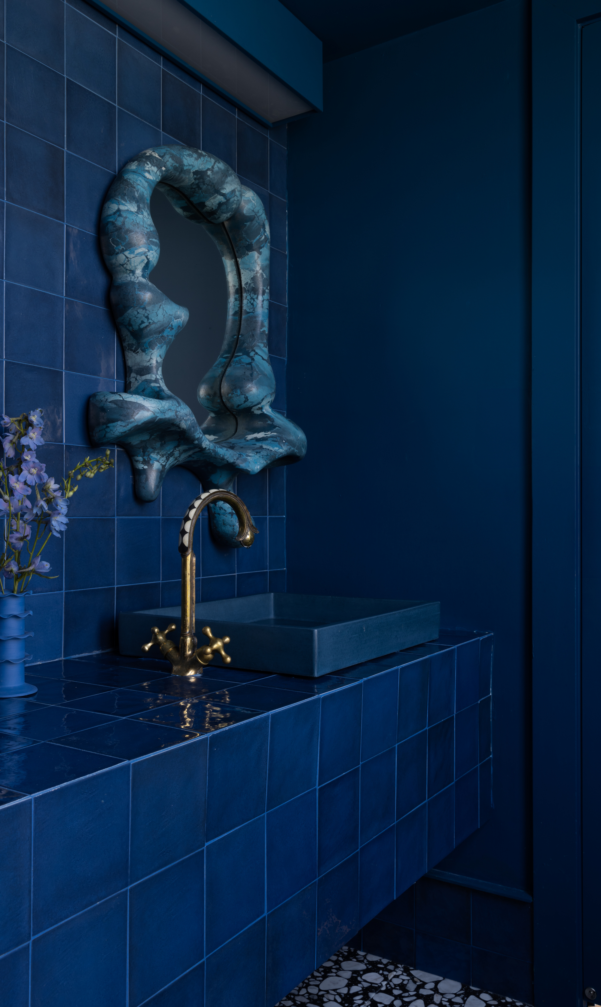
But a drenched space is certainly not the only way. Guila Minozzi, senior designer at Visual Display, an Italian design studio, says that in a home, blue is often better used as an accent color.
Perhaps that's a particular wall (or ceiling) in the bedroom, or just in a small room like a powder room, making it feel precious and unexpected. "Or it can be used on a piece of furniture or a detail of the interior we want to emphasize," adds Guila.
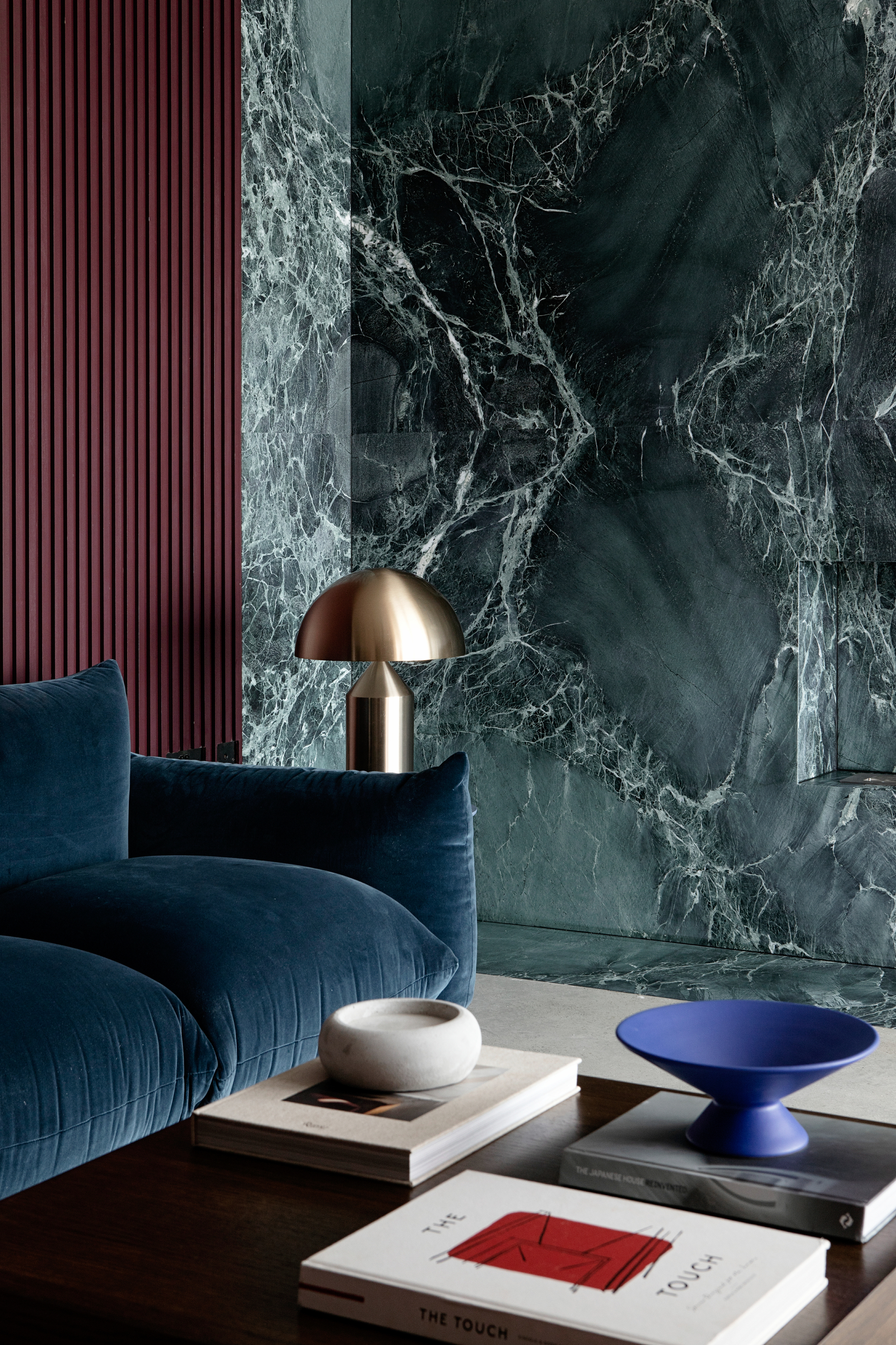
"The key to using saturated colors as accents is to try and use them in multiple locations to draw your eye around the space," adds Róisín. That contrast in interior design adds vibrancy and drama to any interior.
"I’d start with the small — cushions, tableware, general objects, art — and work your way up," adds Amy. "Once your comfortable with the color, there’s something very appealing about a Luminous Blue lounge chair or rug to really bring the room to life."
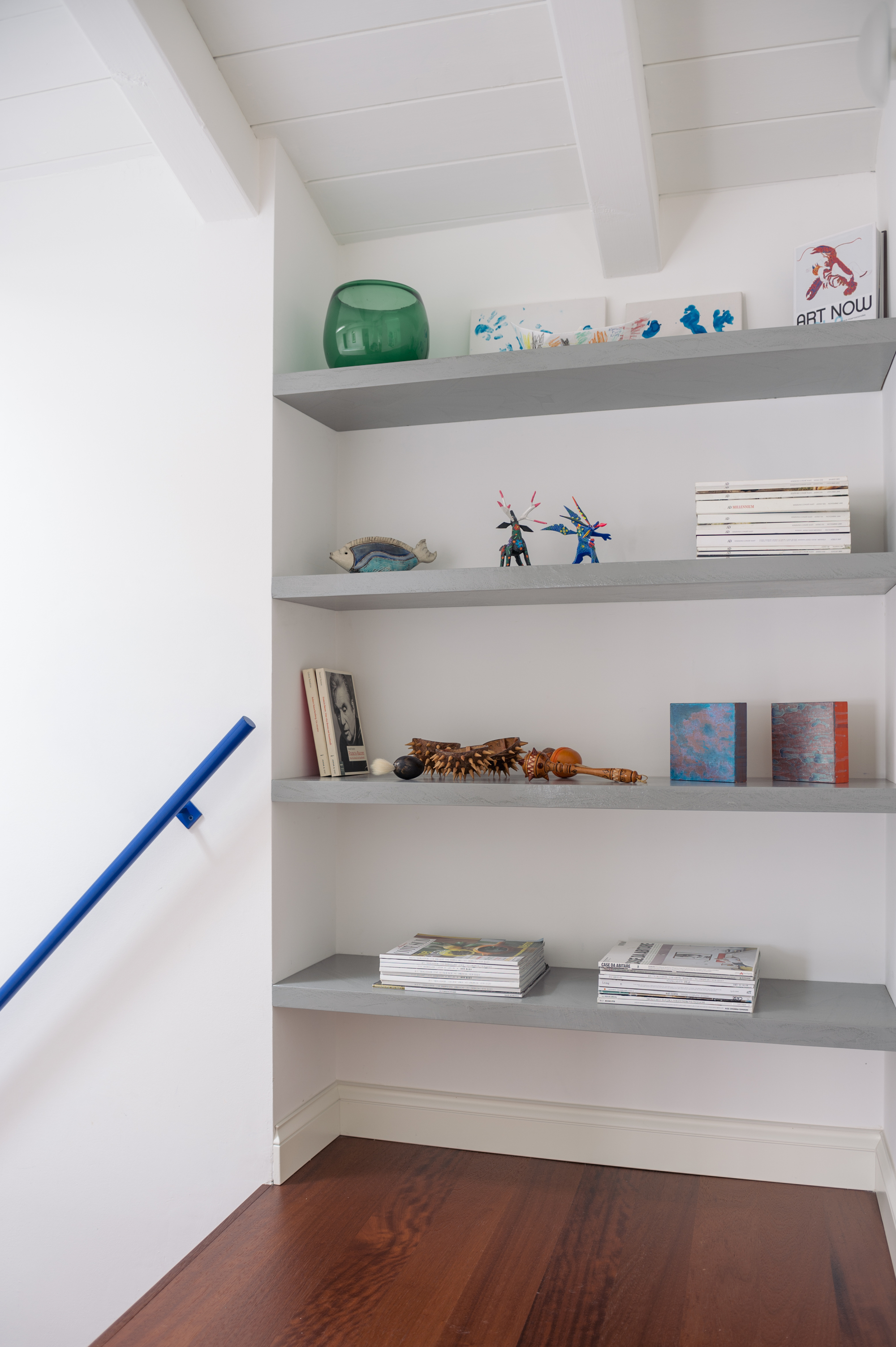
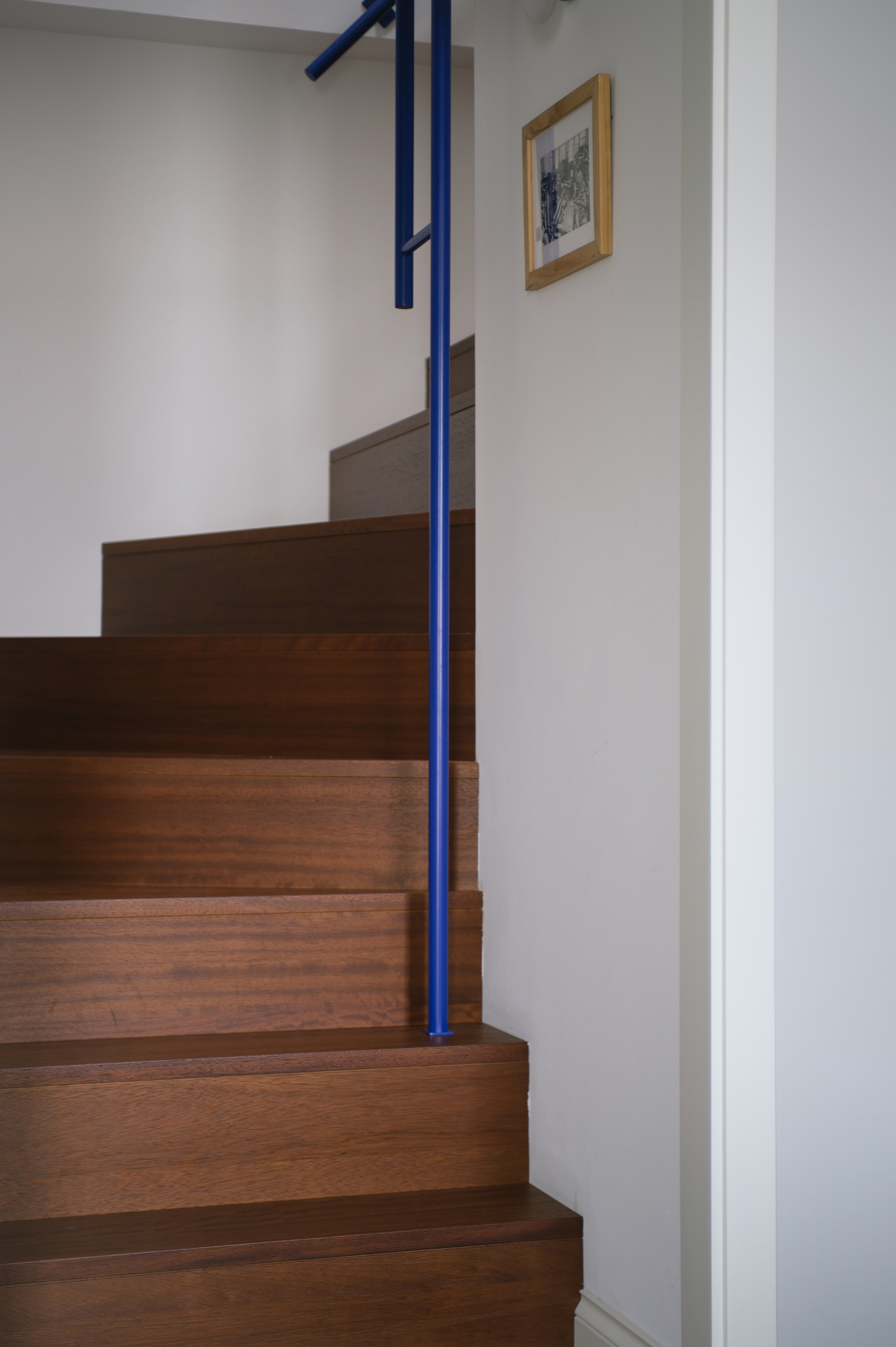
Another thing to think about is creating balance in interior design. Luminous Blue works best when used to introduce strategic pops of boldness throughout a space, moments of surprise that add energy, which means it's best combined with neutrals and texture to ground and soften it (a little), making it easier to live with.
Imagine a living room with a neutral color scheme and natural textures, but there is a side table in Luminous Blue creating drama and capitalizing on the appeal of the 'one amazing thing' theory.
Again, if you’re not sure where to start, small touches are the way to go. "A detail here, an accessory there, a highlight over there, all drawing the eye and adding intrigue," says Amy.
Luminous Blue is an explosive, powerful color and should be handled with care in the home, but that's not to say it can't be fun (or easy to incorporate).
Of course, homes should nurture and soothe us, but they should also enrich the soul and empower us. "Which is where the thrill of decorating with Luminous Blue comes in," says Amy.