It's a big moment for Italy's Unione Sportiva Livorno 1915. The club is returning to pro football for the first time since its bankruptcy in 2021. Having been promoted to Serie C for the 2025/26 season, a team that once flew in the Serie A can finally reclaim its pride... or at least it could if it weren't for a drastic logo redesign that has fans hanging their heads all over again.
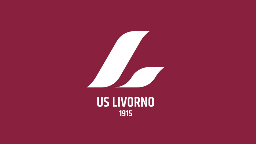
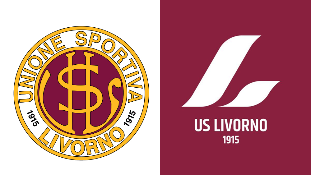
The club unveiled its new logo on social media this week, and all that remains of the old identity is its maroon colour. The traditional roundel with its monogram insignia are both gone, replaced with a slanting stylised 'L'.
One of the best sports logos, it is not, and fans did not hold back.
"It represents cosmic nothingness, and it's making us look ridiculous through all of Italy," one fan wrote on Instagram. "Everything that stood for Livorno has been removed. No identity, no history and no respect for the club and its past. Shame and lack of respect for all members and fans of Livorno," another person wrote.
Even worse, some fans feel that the slope of the 'L' recalls the shape of a certain famous leaning tower in the city of their team's arch rivals. "Mamma mía, who did this? Someone who supports Pisa?" one person demanded to know. That's a reminder to consider local context when designing a logo if ever their was one.
Since then, things have gone from bad to worse as the club struggled to manage the fallout. A day after the unveiling, it defended the design, noting that a new logo was necessary due to ownership issues.
"About the logo: we acknowledge the criticism. But things need to be thoroughly understood. We are the only Italian professional club with a name and logo owned by different parties. That flaw forced us to find a solution," it wrote.
The next day, the club caved in to the pressure. It's too late to change the design for this year, but it opened a poll inviting fans to vote for a new logo for the 2026/27 season. Fans are boycotting the vote.
"I cant vote. It's like spitting on our shirt and our history. Just the thought that from now on the Livorno will be represented in the world by one of these logos makes me cringe," one person wrote.
"Throwing random pictograms out there is absolutely not the right solution" another person commented. "Sorry for the studio that got in the middle of this colossal shit storm. I'm sure they put in their effort and professionalism. All of this indicates poor management of the marketing and communications part of the company."
While the club had no choice but to choose a new logo, the debacle serves as a reminder that it's sometimes not wise to stray too far from tradition for a brand that has a loyal following. Drawing out the controversy with a poll after the fact seems to be making things worse.
Don't forget that today is the last day of Amazon's Prime Day sale. See our Apple Prime Day round up for bargains.