
Bold colors fade in and out of trends, but one color seems to persist no matter the year: red. From Diana Vreeland's 'garden in hell' living room in the 70s to Taylor Simon's 'unexpected red theory,' the color is always a favorite among the world's most glamorous tastemakers. Images of Walt Disney's home provide an even earlier example.
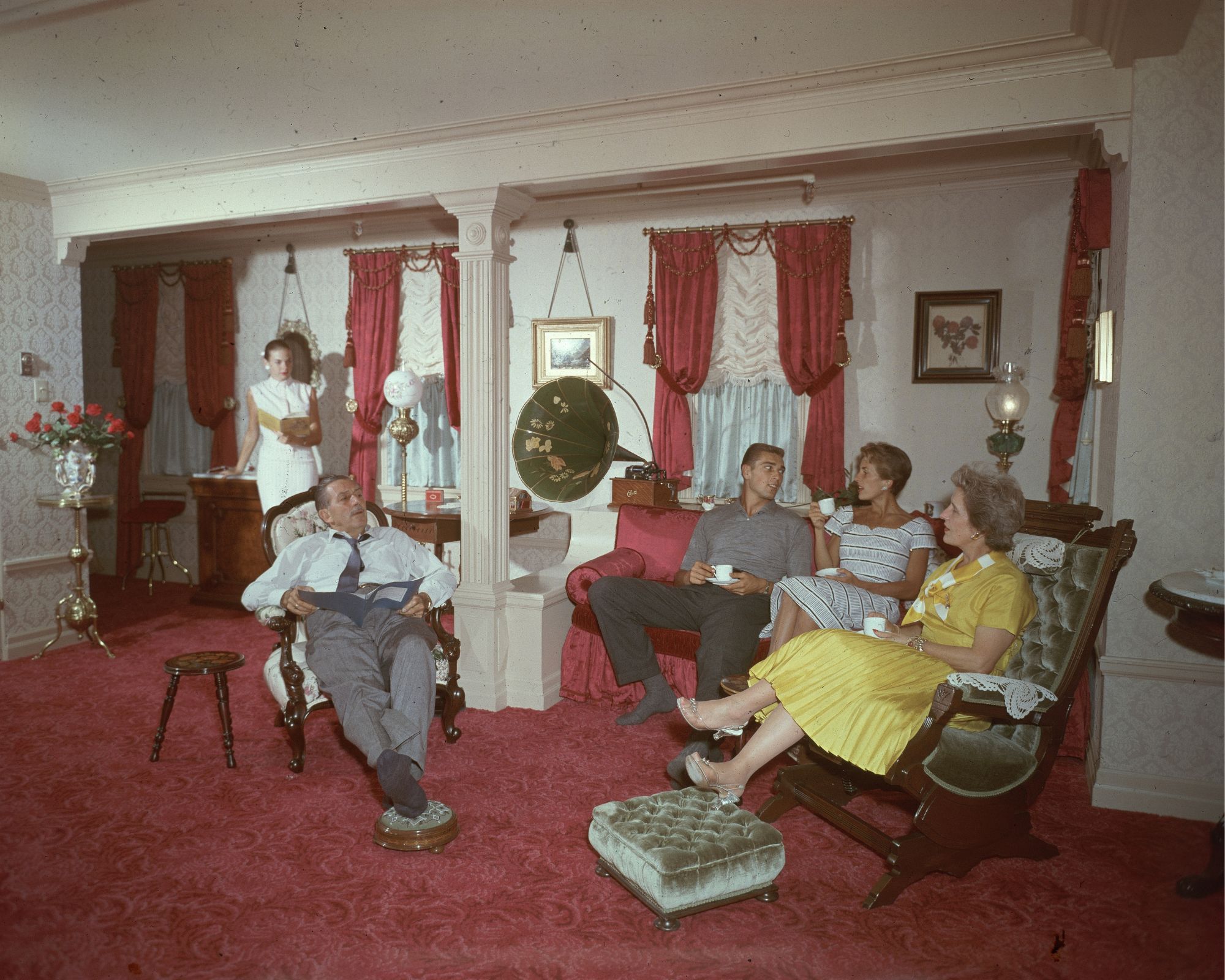
An archival image of the animator's living room from 1955 shows that his space was bathed in red. The grand space has white walls and pillars, accented with a red brocade carpet, red drapes, and a silky red armchair. The rest of the furniture is wood and gray velvet. Period details like a phonograph add 50s interest.
Luckily, decorating with red in your own home is exceedingly simple. While recreating Walt Disney's living room precisely might feel a bit dated, there are many subtle ways to incorporate the shade that feel at once current and timeless.
Shop the red edit
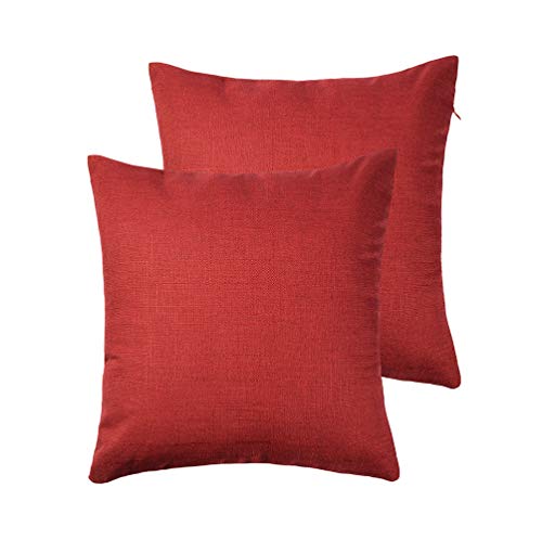
Bring a splash of red to your sofa with these stylish linen pillow covers. They are sold in a pack of two to create easy cohesion across your space.
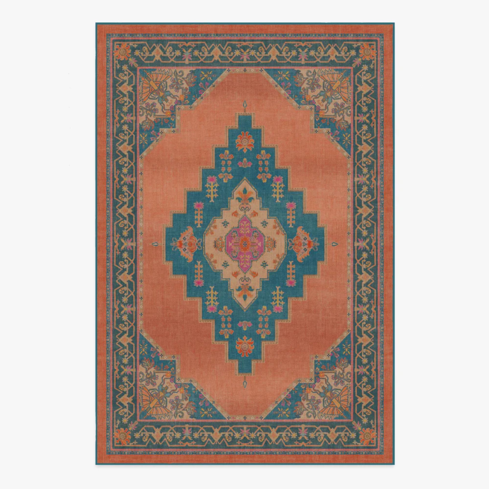
This stunning rug from Matthew Williamson's collaboration with Ruggable looks as ornate as the one in Loren's living room, with the added benefit of being durable and washable. Its orangey red shade feels like a sunset on your floor.
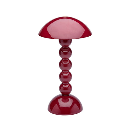
Have you ever seen something cuter than this bobbin lamp from Addison Ross home? It's the perfect size and rechargeable for unlimited styling possibilities.
Flora Hogg, color designer at Craig & Rose advises: 'Consider starting with subtle touches, like red-woven textures, small mirror frames or other accessories in small doses. Pay attention to the lighting, both natural and artificial, as it can guide you in selecting the most suitable shades of red for your room.'
However, she cautions that not all shades of the timeless color are created equal.
'Observe how specific shades of red evoke different emotions,' recommends Flora. 'For instance, a deep burgundy can convey a sense of classic elegance, while a glossy post-box red exudes energy and warmth. Consider placement and proportions.'
Touches of red can be the perfect living room paint color idea, putting a modern spin on Disney's choice of red brocade drapes.
Flora states: 'Painting woodwork or joinery is often less daunting than tackling all four walls when working with impactful colors. Whether it’s a shelving unit, kitchen cabinets or a window frame, applying a subtle sheen enhances the play of light – making red appear brighter and less imposing within the room.
Furthermore, choosing the right colors that go with red is an ideal method for making the shade stand out all the more.
Flora suggests: 'Consider the layers and colors that complement red. I love pairing reds and pinks for a harmonious feel, where the warmth of red is tempered by the gentle allure of pinks. Then I’d opt for either a striking blue or a rich, deep green to give the space a contrast.'
No matter how color trends evolve, from the beginning to the end, red will always be in style. Starting with Walt Disney and moving to the present day, the dramatic tone makes a statement every time.