"What's a walkshed?" I (metaphorically) hear you cry. It's the walkable area around a particular point of interest and, for those interested in modelling urban land-use, a very helpful concept.
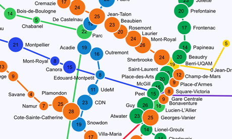
This example, taken from the Montreal rail network, visualises the population living within 800m a station. The larger the circle, the more people within the walkshed, the less likely people will rely on other modes of transport to reach the rail station.
800m might not provide a perfect comparison since walksheds depend on how attractive the point of interest (in this case, the station) is and how walkable the area is. But using data taken from the 2011 Canadian census to find out the concentration of people in each walkshed does suggest how efficiently the network has been constructed.
In the Montreal example above, many of the rail stations towards the end of the line are far less populous. According to Anton Dubrau, the creator of this visualisation, "some stations are directly next to highways, others are surrounded by a sea of parking, others are in the middle of nowhere", all of which can disincetivise rail use.
What do you think is the most important data for planning transit routes? How might it be visualised? Share your thoughts by posting a comment below.
More open data
Data journalism and data visualisations from the Guardian
World government data
• Search the world's government data with our gateway
Development and aid data
• Search the world's global development data with our gateway
Can you do something with this data?
• Flickr Please post your visualisations and mash-ups on our Flickr group
• Contact us at data@guardian.co.uk
• Get the A-Z of data
• More at the Datastore directory
• Follow us on Twitter
• Like us on Facebook