Abstract: The article discusses the application of coloristics principles in floral design, emphasizing the key role of color in shaping aesthetic perception and the communicative function of floral arrangements. The relevance of the topic is associated with the growing demands on the professionalism of florists and the importance of color as a tool of non-verbal communication. The purpose of the study is to systematize the theoretical foundations of coloristics and analyze practical approaches to choosing optimal color combinations in floral design. To achieve this goal, the tasks of analyzing basic color models (including Itten's color circle), color characteristics (tone, saturation, lightness), the basic principles of constructing harmonious color schemes (monochromatic, analogous, complementary, etc.), as well as studying the psychophysiological impact of color and the factors influencing its perception in the context of floristry (texture, shape, proportions, light, purpose, cultural aspects) are solved. The results of the study show that the successful application of coloristics requires a synthesis of theoretical knowledge and practical skills in taking into account the context. A well-reasoned choice of color combinations based on scientific principles increases the aesthetic value and communicative potential of floristic works. The practical significance lies in providing florists with a systematic approach and well-reasoned tools for creating harmonious and expressive color solutions applicable to a wide range of floristic design tasks - from commercial bouquets to event decoration.
Keywords: coloristics, floristry, color harmony, color combinations, color wheel, color psychology, floristic design, visual perception, color theory.
The visual perception of floral arrangements is largely determined by their color scheme. The choice and combination of colors are key factors influencing not only the aesthetic appeal of bouquets and arrangements, but also their ability to convey a certain mood, symbolic meaning, and match the context of an event or interior. Coloristics as a scientific discipline that studies the nature and interaction of colors provides a theoretical basis and practical tools for creating harmonious and expressive color palettes. The relevance of this topic is due to the growing demands on the professionalism of florists, the need for a well-founded approach to design, and the importance of color as a means of non-verbal communication in various socio-cultural situations. The purpose of this article is to systematize the theoretical principles of coloristics and analyze practical approaches to choosing optimal color combinations in floral design based on modern scientific data and established models.
Theoretical foundations of coloristics and color models
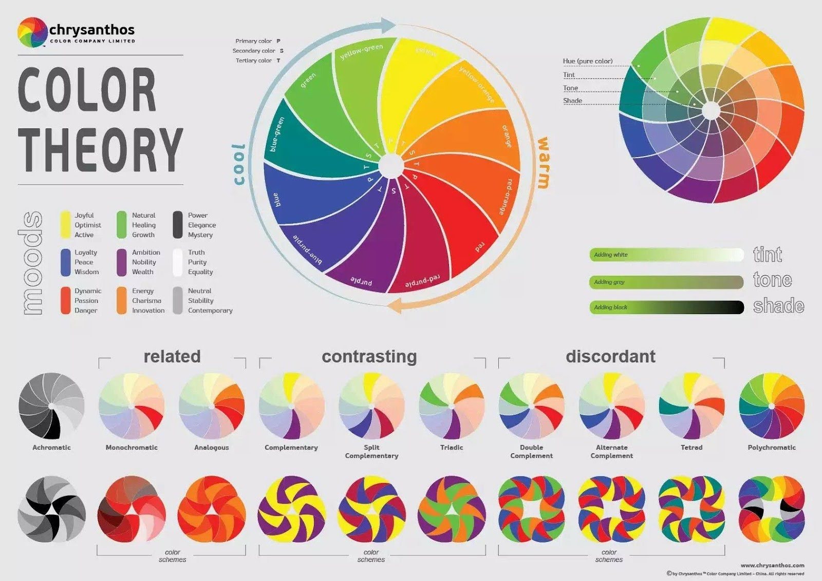
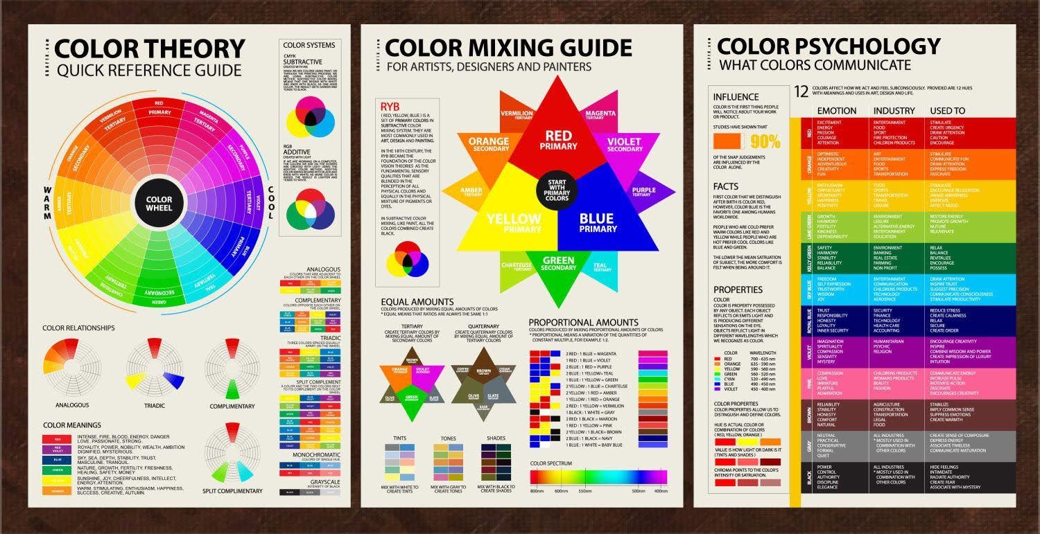
The basis for working with color is color theory, which systematizes knowledge about its physical nature, physiology, and psychology of perception. The central tool for analyzing and selecting color combinations is the color wheel. The most common model in design and art remains the twelve-part color wheel developed by Johannes Itten. This model clearly demonstrates the relationships between primary (red, yellow, blue), secondary (orange, green, violet), obtained by mixing primary, and tertiary colors (the result of mixing a primary and an adjacent secondary) [1]. Understanding the structure of the circle allows us to systematize the relationships between colors and identify harmonious combinations.
The main characteristics that determine a specific color are: hue, corresponding to its position on the spectrum or color wheel; saturation, reflecting the purity or intensity of the color, its difference from the achromatic (gray) color of the same lightness; and value or brightness, characterizing the degree to which the color approaches white or black [1]. By manipulating these three parameters, one can obtain a wide range of shades (with the addition of white), tones (with the addition of gray) and shadows (with the addition of black), which significantly expands the florist's palette. In addition, colors are conventionally divided into warm (yellow-red part of the spectrum) and cold (blue-green part), which affects their spatial and emotional perception.
Principles of constructing harmonious color combinations
Based on the mutual arrangement of flowers on the Itten circle, several basic schemes of harmonious combinations are identified, actively used in floristry:
- Monochromatic harmony: using shades of the same color tone of different lightness and saturation. Creates an effect of sophistication, unity and tranquility.
- Analogous harmony: a combination of 2-4 colors located next to each other on the color wheel. Provides smooth, natural transitions and a feeling of comfortable harmony.
- Complementary harmony: using two colors located on opposite sides of the color wheel (for example, blue and orange). This scheme creates maximum color contrast, giving the composition dynamism and brightness [1].
- Split complementary (split complement): two colors adjacent to its complementary color are selected for the main color. This scheme maintains contrast, but looks less tense than direct complementary.
- Triadic harmony: a combination of three colors equidistant from each other on the color wheel. Forms a balanced, but at the same time lively and varied palette.
- Tetrad harmony (rectangular or square): the use of four colors that form a rectangle or square on the wheel (two complementary pairs). The most complex scheme, requiring careful balance, but allowing for rich and multifaceted compositions.
The choice of a specific scheme depends on the task at hand, the desired effect and the context of application of the floral arrangement.
Psychophysiological impact of color and contextual conditioning of choice
Color has a significant impact on a person’s psycho-emotional state. Research in the field of color psychology confirms the existence of stable associations between certain colors and emotional reactions [2, 3]. Thus, warm colors (red, orange, yellow) are often perceived as exciting, energetic, active, and cold colors (blue, light blue, violet) are perceived as calming, stable, restrained. Green, associated with nature, often evokes a feeling of harmony and freshness [3].
These psychophysiological effects are actively used in floristry to create the necessary mood and convey a certain message. For example, shades of pink and red are often chosen for romantic bouquets, combinations with yellow and orange are used for festive and energetic compositions, and blue and green tones are used to create an atmosphere of calm and tranquility. White traditionally symbolizes purity and innocence (for example, in wedding floristry), while dark, deep shades can be used to add elegance, drama, or in funeral compositions. It is important to consider that color symbolism may have cultural differences [3], which requires additional attention when working in a multicultural context or creating compositions for representatives of other cultures. The context of use (occasion, type of event, recipient characteristics, interior features) is a determining factor in choosing not only the color scheme, but also specific shades and their proportions.
Practical implementation and factors influencing color perception
Успешная реализация выбранной цветовой схемы во флористической композиции требует taking into account a number of practical aspects. The proportional relationship of colors plays an important role in achieving balance. The principle of dominant, subdominant, and accent is often used, where one color occupies the largest area, the second supports it, and the third is used in small quantities to create focal points or contrast.
An integral element of most floral works is greenery. Different types and shades of greenery serve not only as a background or filler, but also act as a link between other colors, help to neutralize the excessive brightness of contrasting combinations and give the composition a natural harmony.
The perception of color is closely related to the surface texture and shape of the plant material. Glossy petals reflect light differently than matte or velvety ones, which affects the intensity and shade of the perceived color. The interaction of color and texture enriches the visual experience [4]. Josef Albers's research showed how much the perception of the same color can change depending on its environment [4]. This phenomenon of simultaneous contrast is especially important in floristry, where different colors are in close proximity to each other.
It is also necessary to consider the lighting conditions under which the composition will be displayed. Artificial light of a warm or cool spectrum can significantly change the perception of the original colors of the plants [3]. Seasonality also often influences the choice of palette, reflecting natural color cycles.
Thus, the effective use of color in floristry is based on the synthesis of theoretical knowledge in the field of coloristics and practical skills in their application. Understanding the structure of the color wheel, the principles of constructing harmonious combinations (monochrome, analogous, complementary, etc.) and the psychophysiological impact of different colors allows the florist to consciously approach the choice of palette. The success of the color solution is determined not only by following formal schemes, but also by competent consideration of proportions, texture, shape of plant material, as well as contextual factors: the purpose of the composition, lighting conditions, cultural characteristics and individual preferences. It is recommended to use a systematic approach, including analysis of the task, selection of a suitable color scheme, careful selection of plant material taking into account its coloristic and textural characteristics, as well as an assessment of the interaction of colors in the finished composition. A reasonable choice of color combinations based on the principles of coloristics increases the aesthetic value of floristic works and their communicative potential. These principles are universal and applicable in various areas of floral design, from commercial bouquets to complex art objects and event decoration.
References
- Itten, J. The Art of Color : The Subjective Experience and Objective Rationale of Color / J. Itten. – New York : Van Nostrand Reinhold, 1973. – 155 p.
- Eiseman, L. Color Messages & Meanings : A Pantone Color Resource / L. Eiseman. – Gloucester, MA : Hand Books Press, 2006. – 176 p.
- Mahnke, F. H. Color, Environment, and Human Response : An Interdisciplinary Understanding of Color and Its Use as a Beneficial Element / F. H. Mahnke. – New York : John Wiley & Sons, 1996. – 244 p.
- Albers, J. Interaction of Color : New Complete Edition / J. Albers. – New Haven ; London : Yale University Press, 2009. – 208 p.