A good logo design and capsule art are essential parts of the branding and marketing for indie games. With Steam wishlists vital tools for gaining visibility and gauging the potential success of a game, the right graphic design and art can help a title stand out in a crowded market.
But what makes a good game logo and capsule art? And how accurately should it reflect the game itself? Those are questions that generate debate as a trend emerges of indie devs sharing before-and-after images of their assets on Reddit (see our guides to the best laptops for game development and the best places for free game assets if you're working on your own title).
Finally the new Steam Capsule Artwork is finished! from r/IndieDev
What a difference a professional artist makes from r/IndieDev
A lot of devs posting on Reddit have been pleased with the improvement in their logos and capsule art after hiring professional artists and graphic designers. The results often show night and day differences, with the pro artwork giving a much more polished and professional look, and a well-balanced composition that draws the eye.
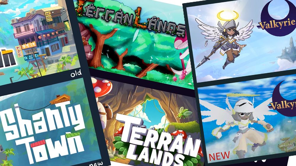
That includes CubeLegal, who were fortunate to have a friend who could upgrade their capsule art for survival adventure game TerranLands.
But the verdict from fellow devs is rarely unanimous. Of the logo design and artwork for Axelstems' craps-inspired roguelike 6 Ways to 7 above, many feel the new version looks sleaker and stands out more, but others like the readability of the original.
Updated my game's logo to make it pop a bit more. Is it an improvement? from r/IndieDev
On the before-and-after comparison for Erik Rempen's diorama-building game ShantyTown above, some feel the new design is more readable and pops more because of the white text. But some feel that the 'after' artwork looks more generic and lacks balance.
But the biggest debate raises an eternal question about capsule art: should it look like the actual game? Devs tend to fall into two camps divided by how much liberty they think is acceptable to take.
We've all seen capsule art that looks very different from the title it's promoting. While some say it's misleading, I think most players accept it. Even going back to the days of ZX Spectrum cassettes, cover art for games has often looked nothing like their graphics. It's accepted that it's an artistic interpretation of the the game's theme.
But some say that today's players have grown more cynical and that with so much choice, many appreciate art that tells them what the game looks like.
That was the aim of Public Void for the upcoming retro platformer Valkyrie Saga. Some think its updated capsule art (below) stands out more by showing real graphics, while others think the images are hard to interpret or recommend adding shading or other post processing to make the game's character pop more.
I updated my Steam logo to better reflect the actual game. What do you think? from r/IndieDev
There's no right approach to game logo design and capsule art since it depends on the type of game, the intended audience and an analysis of what competitors for the same target are doing. That said, many agree that the graphic design and art should at least reflect the 'feel' or genre of the game if not the actual art style.
What do you think? Should a logo design and capsule art look like the real game? What aspects are most important to help a design stand out? Let us know your thoughts in the comments section below.