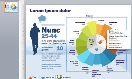
This interactive course will teach you how to maximise PowerPoint’s true potential. Both within a single slide and across an entire deck, innovative charts and graphs can help to transform data sets into compelling infographics. This course will teach you how to tell powerful visual stories using PowerPoint’s built-in features.
You’ll learn the basic principles of data visualisation, and how you can use it to craft narratives and create eye-catching designs. You’ll also get involved in a practical exercise where you create a sample slide using pen and paper. With detailed handouts and opportunities for feedback, this fun and informative course will be of long-term benefit to your communications.
This course is for you if...
- You have to present as part of your job and want to learn how to create better PowerPoint slides
- You work with data and want to learn more about turning it into something visually compelling
- You’re a team of designers looking to learn the basics of creating infographics
- You’re a group of journalists who are interested in creating more elegant PowerPoint presentations
Course content
- An introduction to the principles of data visualisation
- Storytelling with PowerPoint
- How to design using PowerPoint
- Practical exercise: create a sample slide using pen and paper
- Tools and further reading
- Q&A and group discussion
This comprehensive course can be tailored to the needs of your team. Please contact alastair.price@theguardian.com with the name of this course in the subject line for more details.


