
University branding can be hard to get right. At once designed to appeal to younger generations and convey a sense of heritage, it can have several plates to spin. In 2015, Warwick University unveiled a 'modern' rebrand so divisive that students petitioned to reverse it. But now, ten years later, the university has revealed a new look that gets the balance just right.
Guided by insights from over 10,000 opinions including staff, students and alumni, Warwick's new branding includes a modernised crest, a bold new wordmark and a fresh colour palette. Like many of the best rebrands, it's one that, thanks to its focus on heritage, feels both contemporary, and like it's always been there.
The rebrand was created in collaboration with branding agency Mammoth, Illustrator Tobias Hall who modernised the Warwick crest, and Photographer Megan Eagles.
"Refreshing Warwick’s identity is a bold but natural step as we celebrate our 60th anniversary and look to the future," Ajay Teli, Chief Communications, Marketing and Content Officer at The University of Warwick told Creative Bloq. "Evolving the brand is one of our key ambitions to ensure it is fit for a digital-first world. The updated logo symbolises both continuity and progress, honouring our heritage, while embracing the global outlook that defines the University of Warwick today."
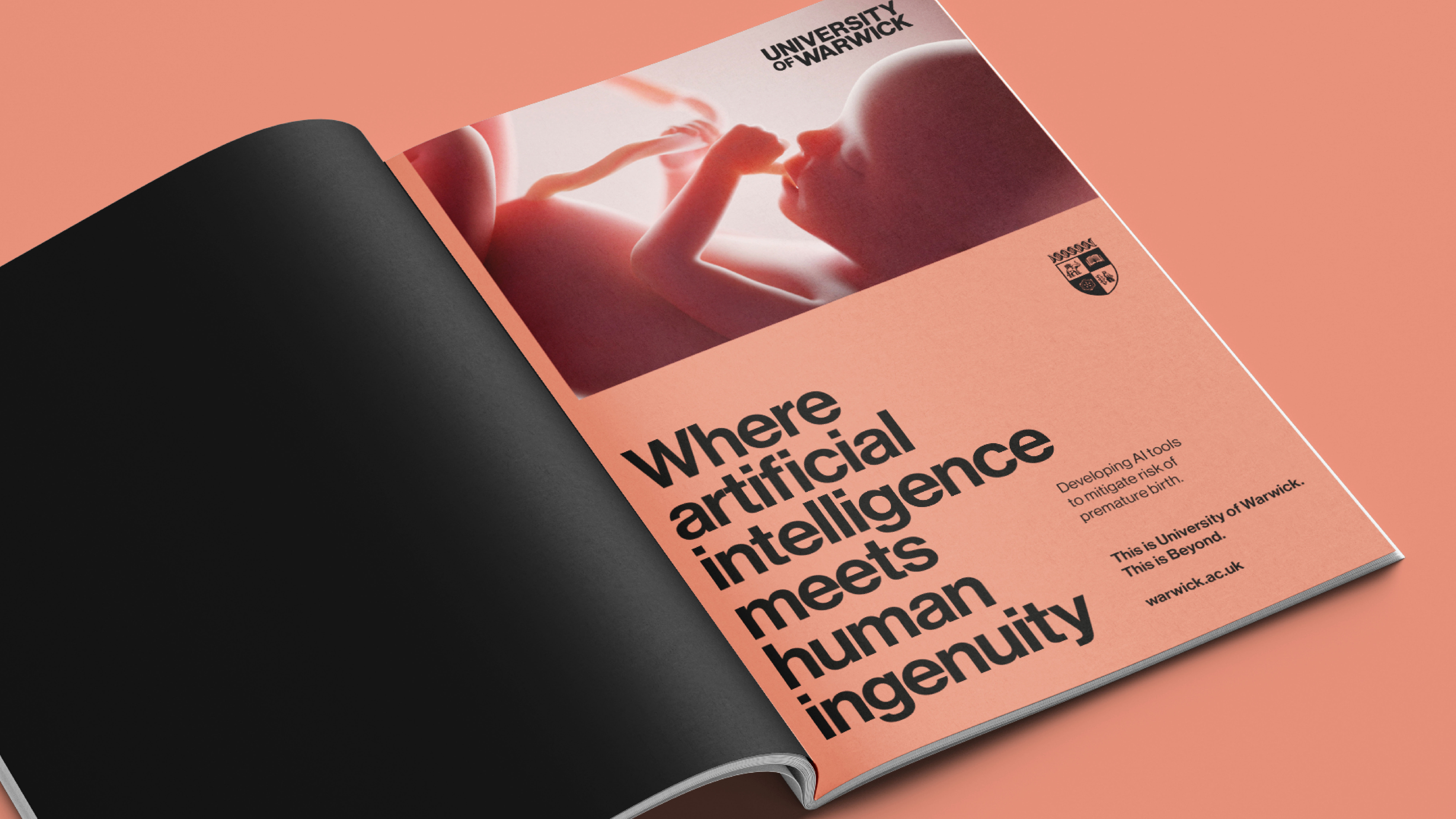
"What makes this evolution so meaningful is the fact it’s been shaped by our community. Guided by over 10,000 insights from staff, students, alumni and prospective audiences, we’ve developed a brand that resonates with who we are today and what we aspire to be. This isn’t change for change’s sake, it’s a purposeful evolution that will enable us to stand out, build stronger relationships and keep challenging convention well into our next 60 years."
From The Archer School for Girls to the IIT College of Architecture, we've seen plenty of educational institutions unveil branding that straddles the line of modern and classic in recent months. By doing away with its minimal 'gradient' logo and leaning into its heritage branding, Warwick is taking a bold step in the same direction.