Picking a color scheme for your interior is easier said than done. It might seem as simple as picking your three favorite colors, but it rarely works that way. Typically, a case of poorly matched colors can be reduced to mismatched undertones placed side by side — a cool white with a very warm brown, for example. One way to prevent this is by understanding the difference between warm vs cool colors. But how?
Warm colors sit on the yellow, orange, and red side of the color wheel, while cool colors include the blues, greens, and purples. The former tends to create a feeling of comfort, coziness, and intimacy; they can make a space feel instantly more inviting and grounded. While the latter typically evokes a sense of calm and clarity, and is often described as refreshing or restorative.
But how you choose to use warm vs cool colors in your interiors depends on how you want a space to feel, rather than just how you want it to look. Implementing a little color theory can go a long way in terms of cohesion and aesthetic, and learning the difference between warm vs cool colors is the perfect place to start.
What Are Warm Colors? And How to Use Them In Interiors
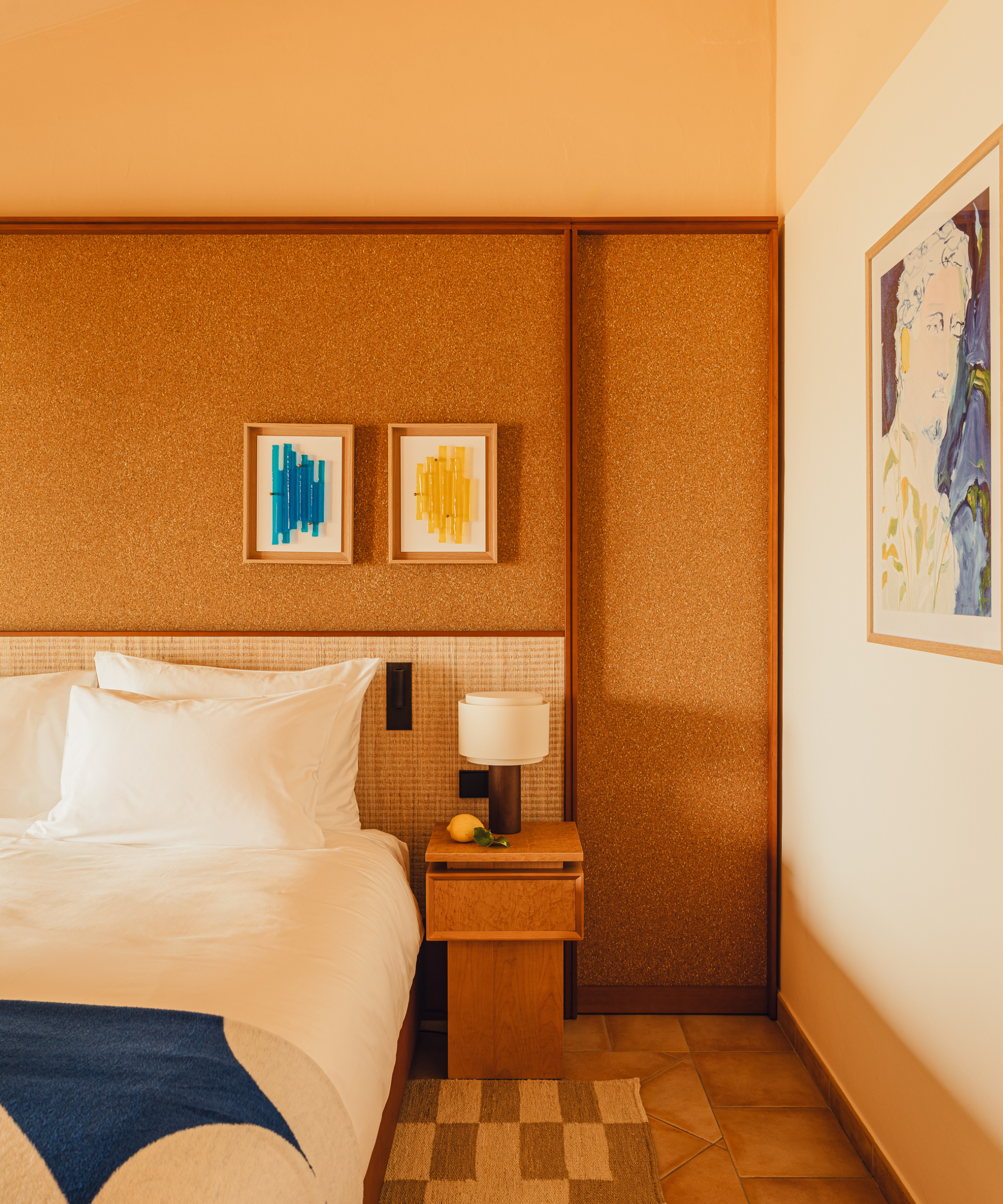
"Warm colors embody the energy of reds, yellows, and oranges," says color expert and forecaster Jane Boddy. "They tend to appear more saturated, more vivid — radiating a sense of light, heat, and emotion." They are the fiery, cozy, and energetic colors on the spectrum.
And if you tend to lean towards these colors, you're in luck, they are dominating today's trends. London-based interior designer Sophie van Winden says, "Warm tones like peach, oxbloods, cherry reds, terracotta, and soft yellow are everywhere right now; they bring such great energy to a room."
Warm colors are perfect as paint colors for north-facing rooms, as they counteract cooler light and make spaces feel cozier and more inviting. "They’re also naturally relaxing, so they work really well in living rooms and bedrooms, anywhere you want to slow down and feel comfortable," adds Sophie.
Dominant shades, like red, are often used in smaller doses, while softer variations are less intimidating as wall colors. However, leaning into the bold and opting for a fully red interior is certainly bold, but it can look incredible. "It’s such a bold, confident statement," says Sophie.
What Are Cool Colors? And How to Use Them In Interiors
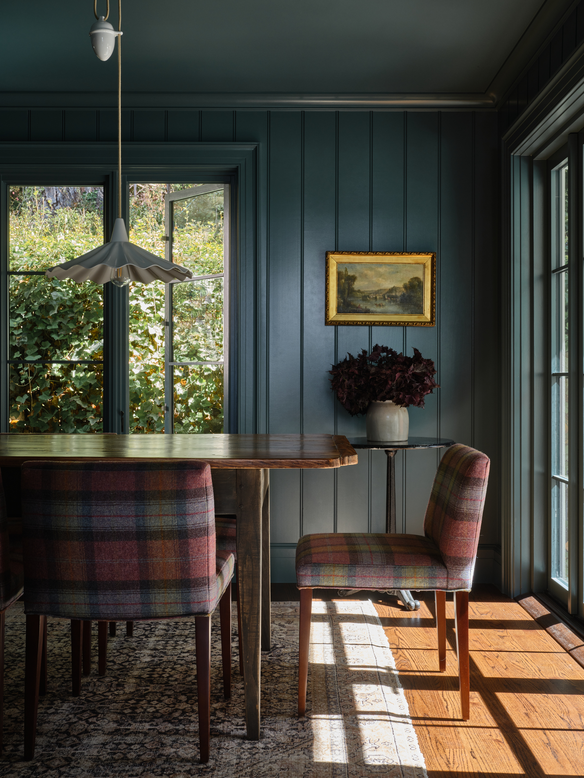
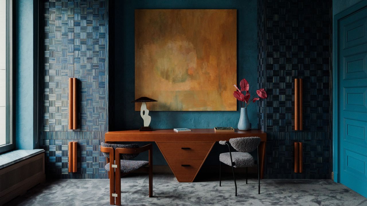
Cool color schemes, on the other hand, are curated using blues and greens. "They’re calmer, softer, and often less saturated, creating a feeling of distance or stillness," says Jane.
In interiors, blues and greens are especially popular, while purples are slowly gaining momentum (just look at the purple sofa trend and the current obsession with aubergine shades, which prove that cool colors can be more dynamic than their cold label suggests).
As for how and where to use them, Sophie explains, "Cool colors feel serene and uplifting, so they work beautifully in bathrooms, helping you wake up in the morning or unwind in the evening. They’re also great for workspaces, as they can help improve focus and clarity."
The calming effect leans into the sensory-conscious paint color and the wellness-oriented side of cool tones. Use these where you value relaxation and well-being.
In south-facing rooms, cool tones are ideal because the natural sunlight balances out their freshness, "so a south-facing bedroom in shades of blue or green can feel both calm and comforting," says Sophie.
Using Warm and Cool Colors Together
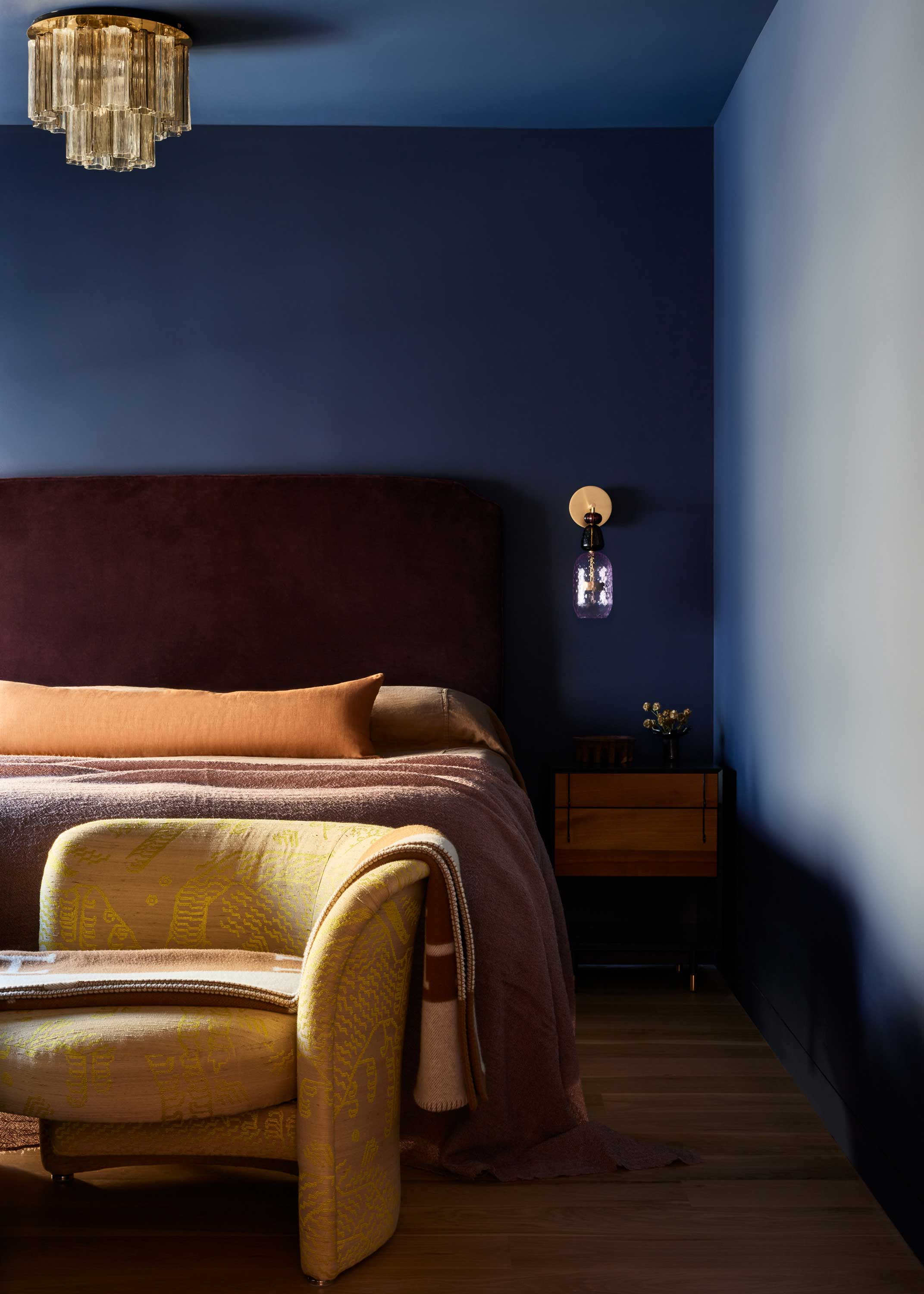
But color isn’t always that straightforward. Some greens lean towards yellow and feel much warmer, while others head into blue territory and feel cooler. The same goes for purples; a blue-purple will feel crisp and cool, whereas a pink-purple feels soft and warm.
Then there are a few key chameleon colors to look out for when decorating with color. "Gray, for instance, is typically considered cool, yet add a hint of brown and it begins to seem warmer and more complex," says Jane. "It’s these subtle combinations — the balance between warmth and coolness — that I find most intriguing."
These colors often react to one another in unpredictable ways, adding depth and tension to a composition. White, too, is shifting in perception. As minimalist design becomes softer and more sensory (cozy minimalism, as Livingetc likes to call it), "we’re seeing whites with yellow or cream undertones that feel warmer and more inviting," notes Jane.
It’s all about finding the undertones of a paint color and using it to balance the mood of a room. "A green with warm undertones can make a space feel more inviting, even if it’s a large, open room, while a cool blue-green might be better suited for a minimal, calming environment," explains Sophie.
Start with the light — it’s everything. Then think about how you want the space to feel. For example, "a south-facing bedroom would work beautifully with deep blues and greens if you want a serene, cocooning feel, while a north-facing living room might come alive with soft peaches and pops of yellow to make it feel bright and happy," says Sophie.
And once you've done that, for more ideas on mixing warm and cool colors, Livingetc, of course, has a guide.