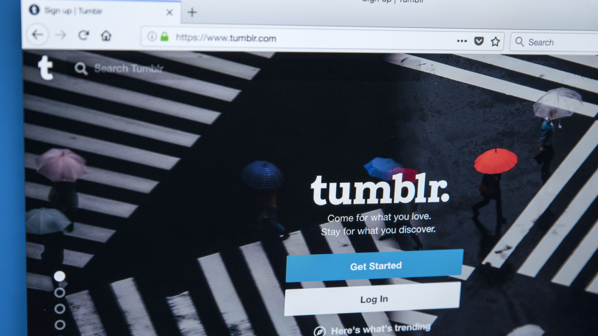
Tumblr has officially rolled out its new desktop interface to all its users, despite the fact that selected users who first received the updated layout had plenty to say about the changes.
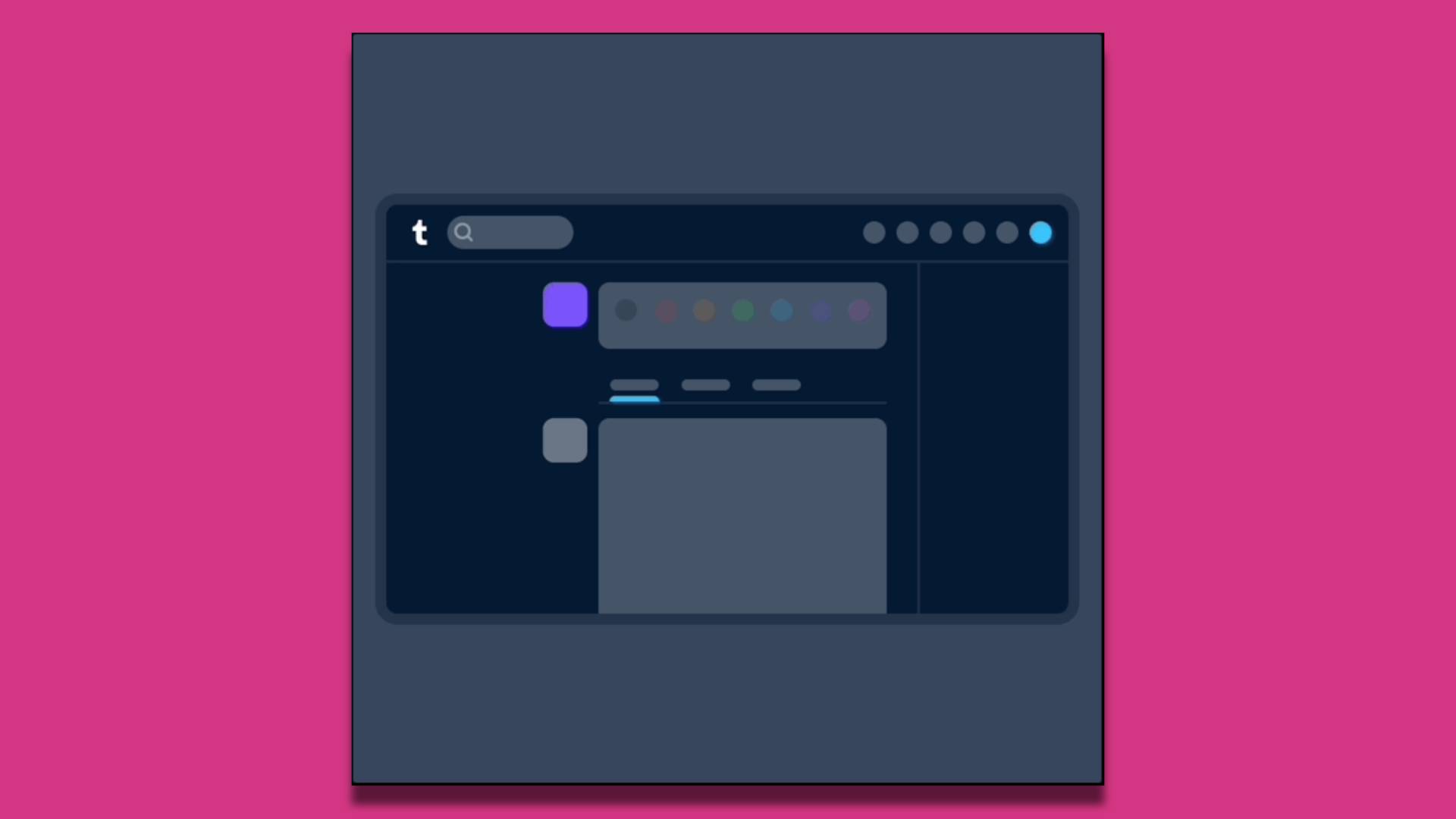
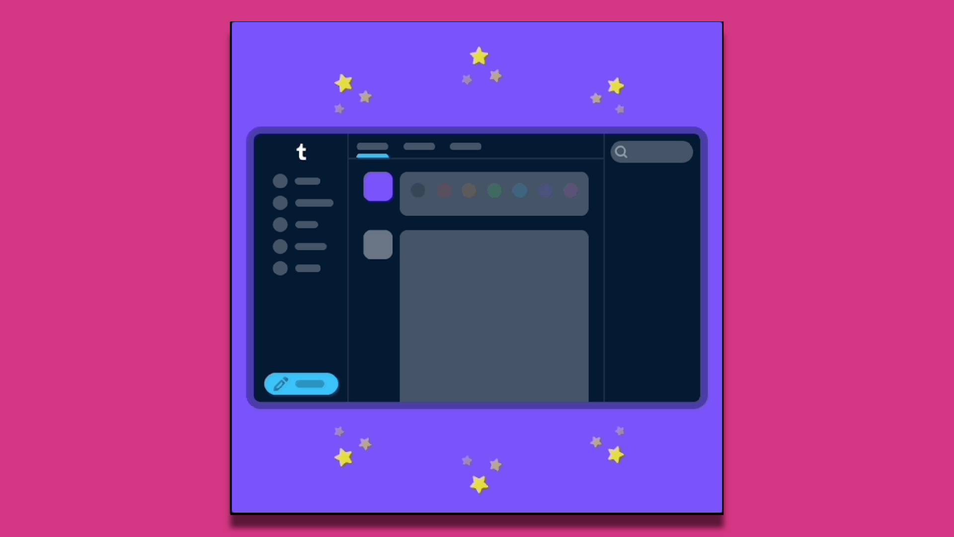
The update was announced in an official blog post from the ‘Changes’ Tumblr account, explaining the meaning behind the overhaul. In the previous layout, navigational icons were located at the top, with a simple pencil logo button at the bottom right that could be pressed to create a new blog post.
With the new changes, the iconic icons have been moved to the left side as a column and largely overshadowed by labels stating each button’s purpose. And now the ‘create new post’ button has been labeled and moved to the bottom left instead. Tabs that alternate what’s seen in the Dashboard (Tumblr’s content feed) have been moved to the top and even the Search box is now in a different spot.
According to the ‘Change’ blog, this was done to better inform users of what each icon does. “So now, where there’s space, the navigation includes text labels. Since adding these, we’ve noticed more of you venturing to previously unexplored corners of Tumblr.” However, it’s clear that these changes have been almost completely inspired by X, formerly known as Twitter, right down to the label names and order.
Meanwhile, even before this layout change was pushed to every user, there have been plenty of posts decrying the changes. The Notes (or comments) section of the blog post announcing the interface change has a disproportionate number of negative responses to the overhaul. In addition, some popular circulating posts even link to various methods for reverting back to the original layout on the desktop.
Tumblr is making a mistake
As a longtime Tumblr user, I’ve seen a number of changes to the site, most of which are inconsequential at best and actively harmful to the site at worst. Not to mention that for years users have been asking for basic fixes to the site, like making the Search bar functional, an option to post higher quality videos, a better blocking and report system, and more.
There’s also the fact that Tumblr has been rolling out other updates to make the blog website resemble trendy social media, like the addition of Tumblr Live (which isn’t available anywhere but in the US due to privacy issues) or Tumblr Marketplace. Not to mention the adult content ban that was so unpopular that it drove away one-third of Tumblr's user base. Tumblr hasn’t been shy about trying to become profitable either, especially since every sale of the site has seen a catastrophic decrease in its value.
This new layout change, which is largely unnecessary, is clearly another way to appeal to Twitter (X) users who have been fleeing from the site post-Elon Musk’s buyout. However, it’s doomed to fail as the two websites couldn’t be more different in their user bases, cultures, content curation styles, and so many other nuances.
In other words, this is yet another change that will serve to alienate Tumblr's already dissatisfied user base. Though it's rather ironic that even with all the controversy concerning this layout change, Tumblr is still a much calmer and drama-free place than the likes of X.