Watch out for the Apple TV / Skydance animation of The Search for WondLa, which is expected to appear on our screens in the autumn of 2022. Based on Tony’s books and artwork, you may detect hints of his 1980s art influences here, including Moebius and Brian Froud.
It didn’t feel like a pivotal moment when an art director at Wizards of the Coast contacted illustrator Tony DiTerlizzi about creating a card for Adventures in Forgotten Realms, the new Magic: The Gathering set. Not at first, anyway.
The set celebrates the mash-up of M:TG and Dungeons & Dragons, and Tony worked on both fantasy games back in the 1990s. Since then, he’s become a world-leading author and illustrator creating his own fantasy worlds in The Spiderwick Chronicles and The Search for WondLa books. The former has already been adapted into a feature film and the latter will soon become a series on Apple TV.
Why would he go back to illustrating fantasy games? For Tony, it’s all about imagination. The more he found out about the Forgotten Realms set, the more it tweaked the young artist inside him. The card he was asked to draw enabled him to reminisce about his childhood in Florida playing D&D with his friends. Unlike your average M:TG card, Hive of the Eye Tyrant is presented like a 1980s D&D module cover. It actually feels like a piece of gaming history.
The 1980s was a wonderful decade for anyone interested in fantasy and sci-fi. Comic books and tabletop fantasy games were booming. Epic films, from Alien through to Conan the Barbarian, took fans away to other worlds. Heavy Metal magazine brought us monthly doses of otherworldly artwork and stories. Computer games and the internet were yet to compete with the imaginations of fantasy obsessed kids.
Sharing Tony’s excitement about Hive of the Eye Tyrant, we asked him to take us on a journey through his 1980s inspirations with a focus on the artists themselves. For him, the decade was all about discovering and learning from artists who did things a little bit differently.
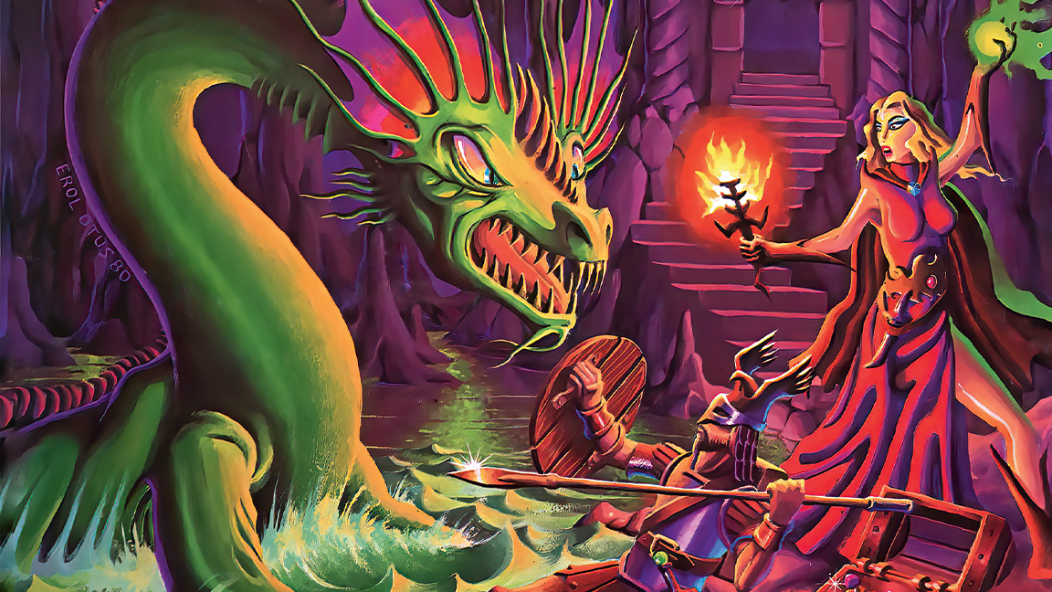
01. Erol Otus brought an unexpected style to D&D
Fantasy in the 1980s was dominated by Tolkien-esque imagery, with a look that was heavily influenced by medieval Europe. This was evident in D&D, but the game’s founder, Gary Gygax, regularly confounded expectations. The young artist Erol Otus worked in a style that was far from the accepted norm, and his work on D&D still resonates today. To him, a wizard didn’t have to be an old man with a long beard, wearing grey robes and a pointy hat, and his palettes were anything but dark and earthen.
“I can only theorise about what inspired him – perhaps pinball machine art and Day-Glo posters, things that would have been part of the everyday environment of a young artist back in the 1970s,” says Tony.
While others painted orcs, demons and ogres, Erol designed bizarre monsters that would become classic D&D beasties like the remorhaz and the ankheg. Giant killer bugs, essentially. During the pandemic, Tony spoke with Erol and found out that both creatures were based on his collection of rubber monsters and gumball machine prizes.
“Embracing childlike and imaginative play opens up a lot of ideas for an artist,” explains Tony. “Especially as an adult, where you have the technical craft to convey those concepts and ideas through illustrations.”
02. David Trampier and the monster manual
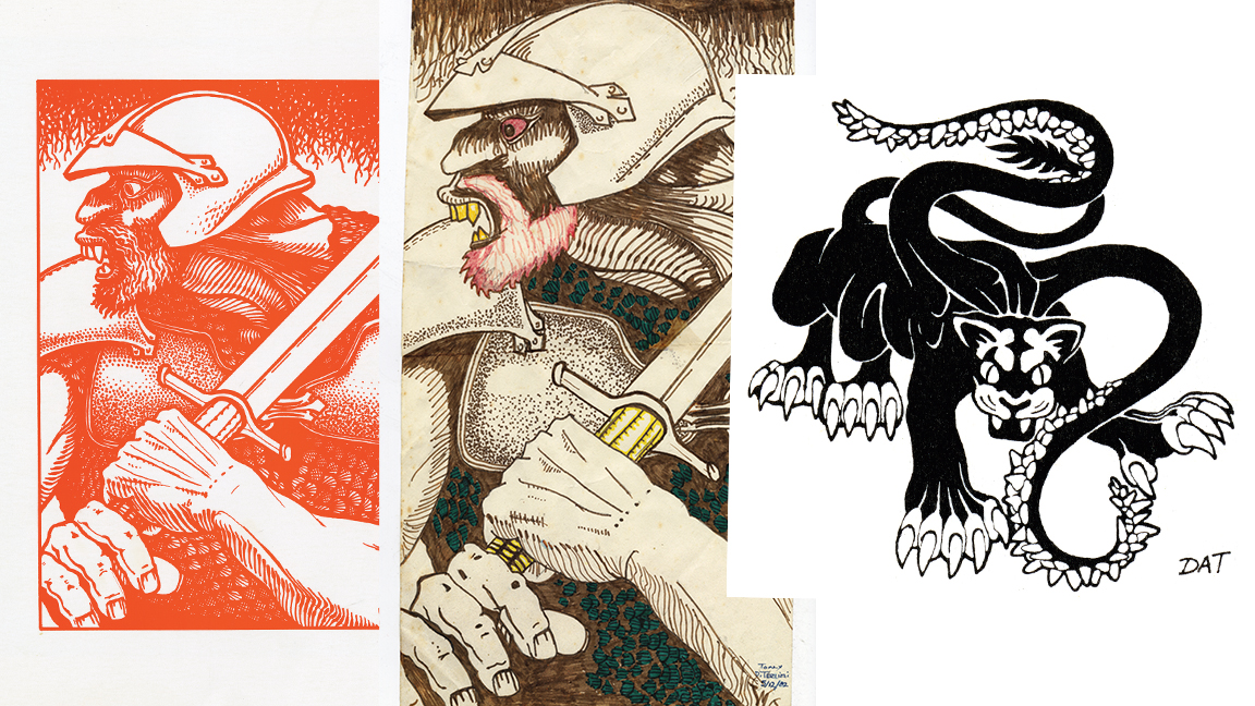
“In the early ’80s there was a lot of artistic inspiration to choose from, but Dungeons & Dragons was absolutely one of the big ones for me,” says Tony. “The art wasn’t as slick and professional as the Frazetta, Hildebrandt or Vallejo imagery that dominated back then. D&D had an abundance of pen and ink drawings, and I thought, ‘Maybe I could draw that!’”
One of Tony’s favourites was David Trampier. His work featured in numerous D&D modules, especially in the 1977 Monster Manual. “He did this iconic drawing of a fire giant.
Even by today’s standards, it’s such an amazing piece,” explains Tony. “He did a great rendition of a goblin, and his pseudo-dragon is amazing. It’s this tiny dragon looking out a window, but there is storytelling there. He used heavy, thick lines. It wasn’t really tattoo style, but it had a graphic, woodcut look to it. My guess is that he was influenced by underground comics.”
03. Jim Roslof captured complex of combat
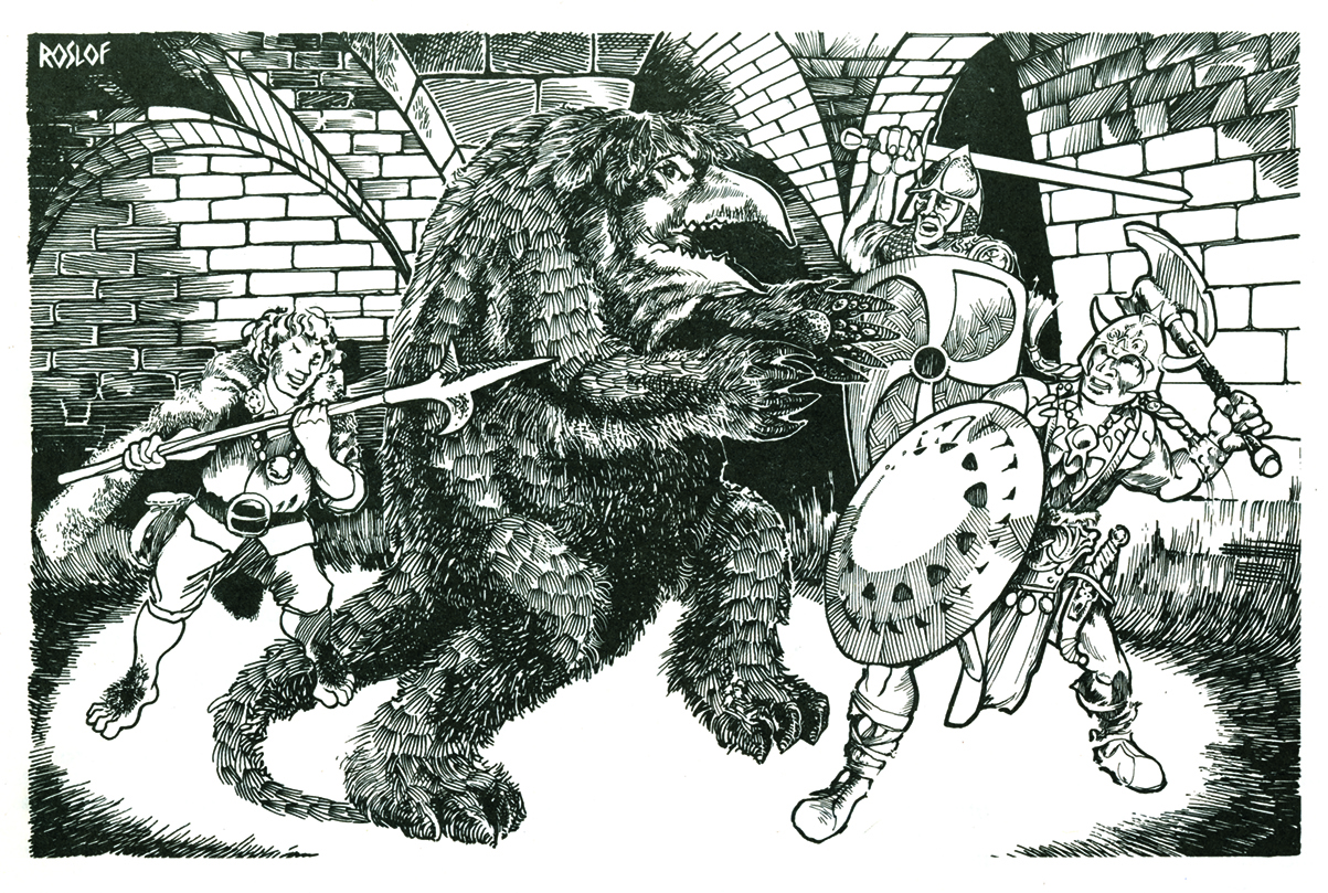
Players who turned to page 31 of the 1980 D&D rulebook Deities & Demigods would have been bowled over by Jim Roslof’s depiction of The Wild Hunt – terrifying hounds charging in attack formation ahead of their horned master. The image has stayed with Tony DiTerlizzi to this day.
“He used pen and ink in a sketchy style, and he painted module covers as well – like 1979’s ubiquitous The Keep on the Borderlands,” says Tony. “There was a lot of movement in his work. It was very gestural. He had a clear understanding of the medium and was a notch above some of the other contributing artists.”
Jim was unafraid of the challenges of drawing combat in confined spaces, as seen in his artwork of a party battling an owlbear on the pages of Keep on the Borderlands – another favourite image on Tony’s list.
04. Brian Froud's enchanting art

“If you were to track my growth as a young artist on a timeline, I would have been copying D&D art in middle school, then I would have started copying Brian Froud’s art books in high school. I was immediately attracted to his character designs rendered in those rich earth tones, and was obsessed with his work,” says Tony.
“As far as design goes, his mastery lies in his sense of caricature and exaggeration in that he could take something that’s really scary and either inflate it or deflate its intensity based on how he rendered it. He might draw a goblin, but it has these ridiculous, tiny eyes (which are cross-eyed), and a big goofy mouth.
"It felt spooky to me, but never dangerous and I craved more. Artistically, Froud showed that a creepy monster did not have to be muscular, as often depicted in a Frazetta or Vallejo painting.”
05. Moebius changed the paradigm

The French illustrator and writer Jean Giraud, otherwise known as Moebius, is another 1980s world builder who Tony greatly admires. “He was a unique visionary who seemed to know no bounds,” Tony explains. “He was emboldened to draw just about anything: a Wild West story, space stories, fantasy stories and weird stories that just existed in some surreal plane of existence.”
While convention in the world of comics followed on from the likes of Jack Kirkby and Stan Lee, it was Moebius who Tony gravitated towards. “His was another world and I wanted to explore every inch of it. I didn’t always understand what I was reading, but it was effortlessly rendered. His technical skill was unique and instantly recognisable,” says Tony.
06. Don Bluth and the hand of the artist
Striking the right balance of mood between light and darkness is important when you’re painting an image, and equally important in how the story and world are conveyed. Tony grew up watching Disney classics, but the studio had lost its way in the 80s. For him, it was former Disney artist Don Bluth who nailed it – tonally and aesthetically – in the Dragon’s Lair arcade game and the feature film, The Secret of NIMH.
“I haven’t read Mrs Frisby and the Rats of NIMH in a long time, so maybe now I’d be more sceptical, but at the time I felt Bluth captured the weirdness of Nicodemus, the spooky scene with the great owl, and the humour of Jeremy the crow. It was so full of life,” says Tony.
He also loves the sketchy quality of the animation and how you can see the construction lines momentarily, here and there on cels, echoing Disney’s xerographic animation process of the 60s and 70s. “It’s not so polished. You feel the artist’s hand in it,” adds Tony.
07. Rankin and Bass, the Hobbit that wasn't
To this day, Tony loves the style of the characters drawn for The Hobbit movie made by Rankin and Bass. Released in 1977, the film enjoyed repeated showings on American television during the 80s, even though it looked nothing like the Middle-earth art fantasy fans were used to.
“The features [of the hobbits] border on the grotesque, but I think they were looking at Arthur Rackham, Edmund Dulac and maybe Kay Nielsen,” says Tony. “When I watch it, those dreary watercolour landscapes seem Rackham-inspired and they have that same linear quality to them.
"However, the overall visual language is so cohesive, and everything interlocks nicely, so the character designs and landscapes all look like they’re from the same world. That’s not an easy feat.”
08. Ralph McQuarrie and the dirty Star Wars

In 2014, Tony wrote and designed Star Wars: The Adventures of Luke Skywalker, Jedi Knight. The book was illustrated using original concept art by Ralph McQuarrie. It’s McQuarrie’s ability to combine global and the specific concepts that Tony finds so inspiring.
“He was exceptional at conjuring and rendering scenes. Although he did design creatures, like Chewbacca and C-3PO, his mastery was taking separate components – as the world was being visually developed – and compose them into a single image,” says Tony. “I don’t know who came up with it – George Lucas, Ralph McQuarrie or one of the other artists – but the idea of the ships being grungy and timeworn is such an essential aesthetic to Star Wars. Up to that point, nobody had done that in sci-fi films.
This content originally appeared in ImagineFX magazine, the world's leading digital art and fantasy art magazine. ImagineFX is on sale in the UK, Europe, United States, Canada, Australia and more. Limited numbers of ImagineFX print editions are available for delivery from our online store (the shipping costs are included in all prices)
Alternatively, you can access us instantly through our digital options:
• Apple app (for iPad or iPhone)
• Pocket mags (multi-platform app, great for Android users)
• Zinio (multi-platform app for desktop or smartphone)