Oh, the annual Met Gala extravaganza! The evening marked the opening of Superfine: Tailoring Black Style, the Costume Institute’s exhibition focusing on men’s fashion, and the first to place black style at its centre.
As such, there was a distinctly masculine, tailored and achromatic aesthetic this year, with many choosing to wear tuxedos, suiting and opting for structure, but of course we were treated to all the extravagance, glamour and oftentimes ostentation we very much have come to expect.
Yes, it's the most anticipated night in the fashion calendar, but for those of us keeping our fingers on the pulse with interior design trends, it’s also a night of trend setting and trend forecasting that will affect the design world as a whole. Fashion and interiors have always had a symbiotic relationship, and the Met Gala is a wellspring of color, pattern, and design inspiration for our homes.
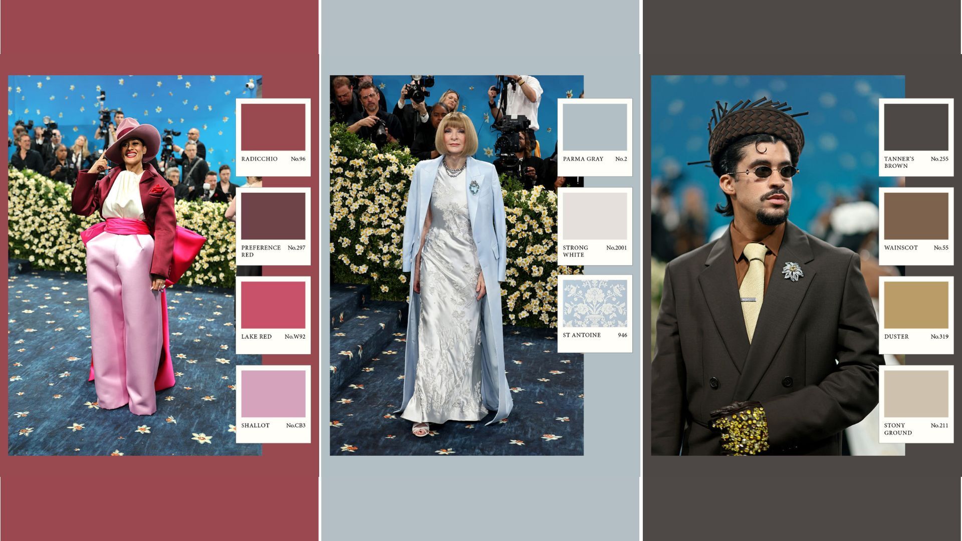
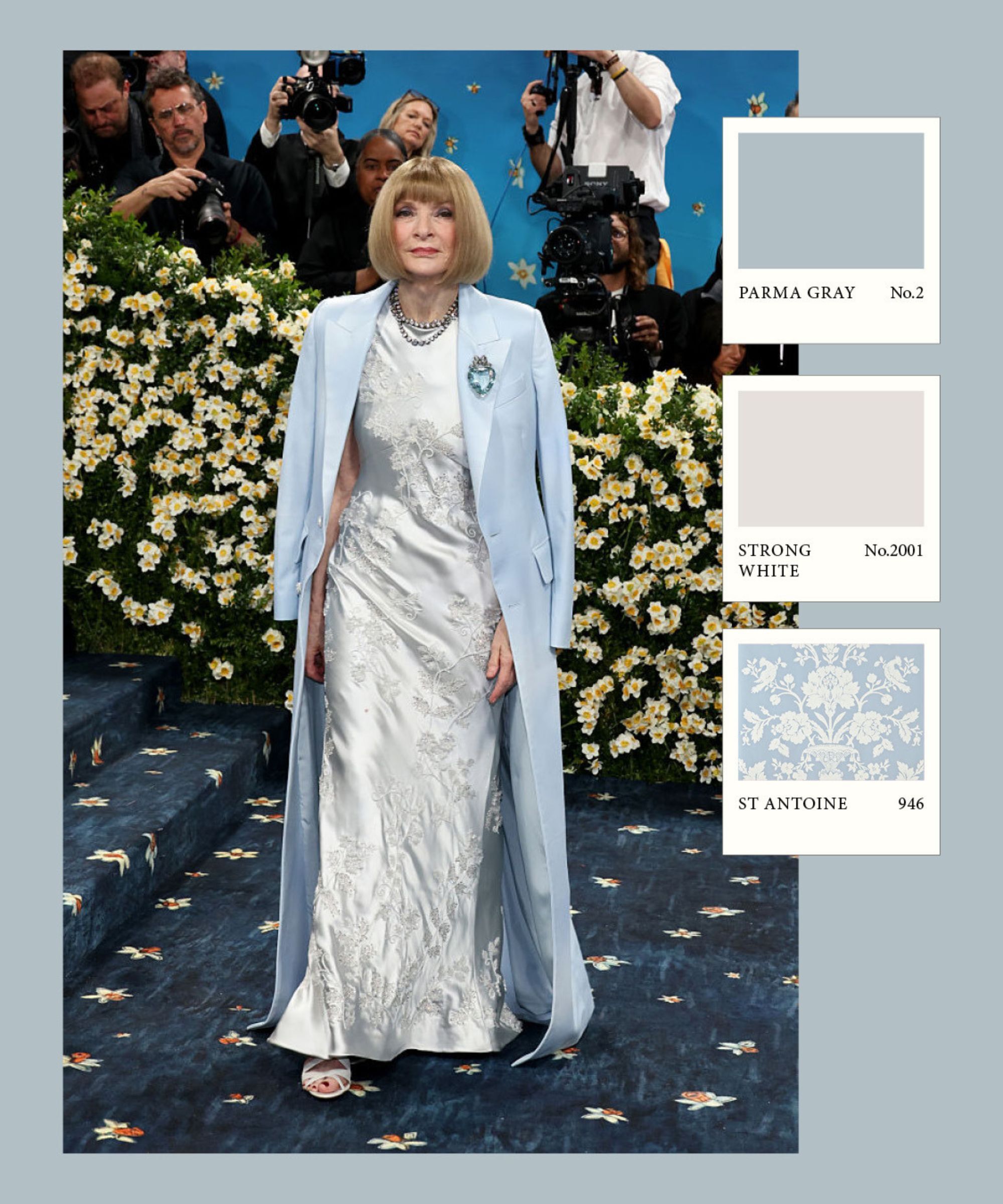
So if you’re scrolling through the seemingly endless entourage of exquisitely dressed superstars, wondering what this means for interiors, and what inspiration can be extracted from this dazzling, glittering spectacle, happily Farrow & Ball, a market leader in color and paint, have created color and pattern palettes from the best looks of the Met Gala 2025. My personal favorite? Anna Wintour's soft blue and cool-toned look has me considering the very chic palette for my living room remodel.
4 Farrow & Ball color schemes inspired by the Met Gala 2025
Admittedly, it can be hard to envisage just how to translate the full-throttle, diamond-studded glam of the Met Gala outfits to the world of interiors. Look closely, though, and not all outfits were a riot of spangles and drama; certain celebs treaded in more elevated terrain, and the colors, patterns, and designs were a true reflection of the biggest color trends, pattern trends, and the overarching aesthetic narrative of interiors as a whole.
Patrick O’Donnell, International Brand Ambassador for Farrow & Ball, highlights that ‘Trending colors come from a plethora of starting points. Whether that be a recurring theme in the world of interiors, a zeitgeist moment, or even high fashion.'
I spoke to our head of celebrity here at Homes & Gardens, Megan Slack, who, as her job title suggests, is very much in the know with celebrity style and how they heavily influence interior trends. I asked her what Met Gala look caught her attention, and it was the comparatively low-key and classic look that Anna Wintour, the evening’s host, chose to sport that Megan felt was particularly chic.
Simple, fresh, and classic, baby blue is absolutely everywhere at the moment and this throw will definitely fit the bill this spring.
If the easy, breezy, coastal-chic look has captured your heart, then you don't need us to help you fall in love with these dainty sheer curtains. You can almost feel the salty sea air drift in just by looking at them.
Sat on a bedside table, coffee table, or sideboard, sporting a glass jug overflowing with tulips, this is darling scalloped tray is a great way to hard launch Spring in your home!
'Gentle gray-blue is a perennially popular colorway, often serving as the backdrop to period dramas, with Farrow & Ball’s Parma Gray being the most relevant example of this. However, despite its nostalgic qualities, celebrities consistently find ways to keep the hue feeling contemporary,' says Megan.
'Looking at Anna Wintour's (inevitably) impeccable Met Gala look, I am reminded of Miley Cyrus’s dining room, designed by her mother, Tish Cyrus, which exhibits a similar tone. The space feels youthful and modern, which may seem contradictory considering gray-blue’s age-old undertones, but this emphasises the hue’s ability to evolve and transcend fleeting color fads. It’s utterly timeless, just like Anna Wintour’s style.’
So far, it’s all feeling rather serious and pared-back. Perhaps not what we all expected when we are so used to the theatre of the whole event. There was something distinctly slick and sharp about the looks this year; some have even gone as far as to say the overall looks were somewhat solemn.
Of course, there were some a little more playful and optimistic, which felt fresh and seasonal. It's uncoincidental that many of the palettes mirror those seen throughout this year’s interior spring trends and the popular spring color ideas we are seeing flourish in the interiors world.
Fresh, modern, and pleasingly angular, this contemporary chair would suit any modern living space.
An inspired gift for an interiors-loving friend, or just dotted around your kitchen for small accents of happy color.
Warm clay colored linen bedding will be sure to set the whole scene; cozy, relaxed, and unerringly chic.
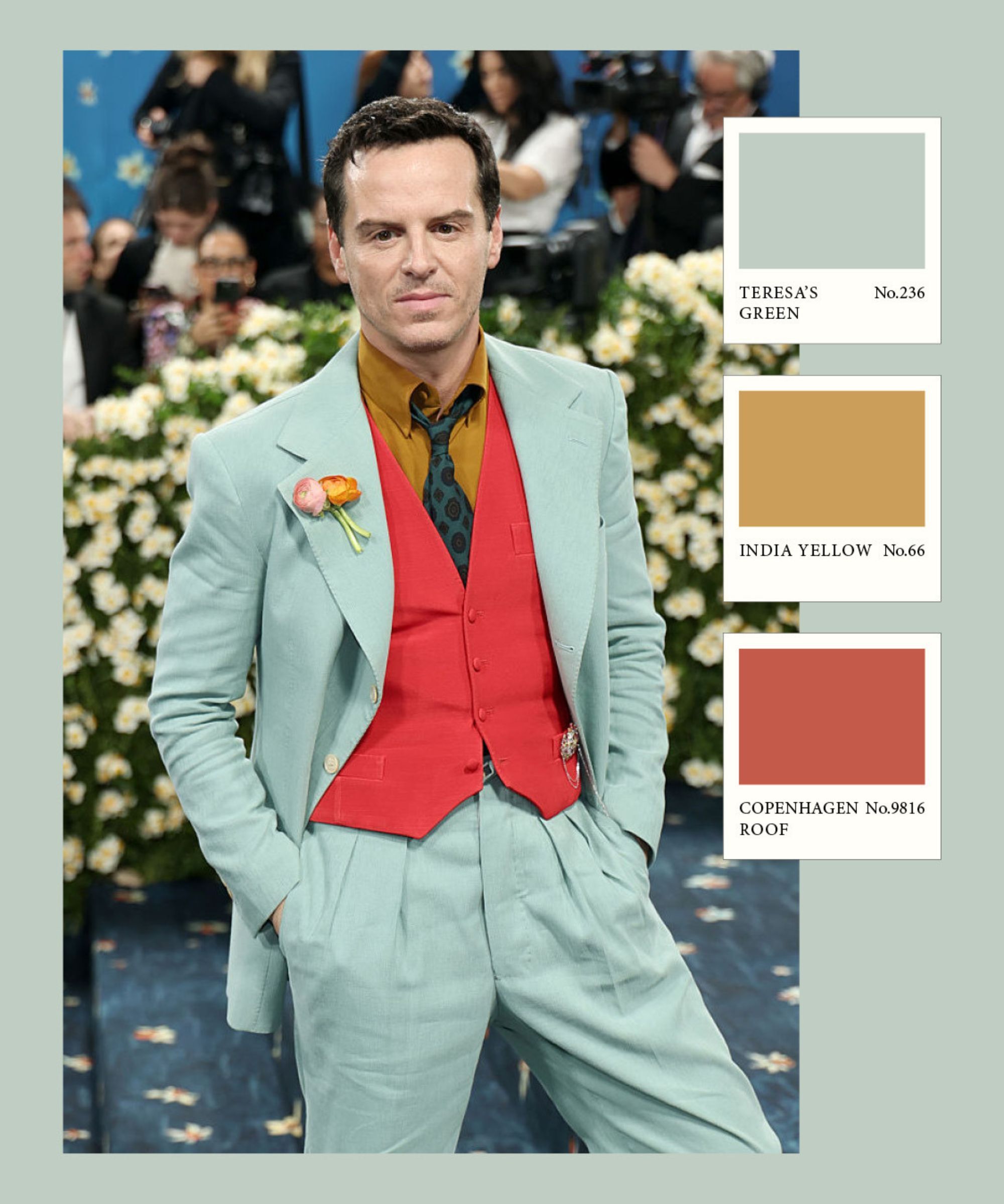
Penny Morrison has become a leading name in the world of interior design, and her homeware brand continues to be at the forefront of color, pattern, and design trends, creating deeply flattering and tasteful designs for over forty years. Shauna Dennison-Taylor, creative director at Penny Morrison, is particularly keen on this fresh look sported by Andrew Scott.
‘These colors evoke the freshness of spring and the warmth of summer,' explains Shauna. 'Green brings in tones like moss, olive, sage, and mint, while straw yellow adds a soft, sunlit contrast. This palette comes to life through layered interiors rich in texture and pattern, where floral and geometric prints are often combined. Green botanicals, leafy motifs, and intricate designs are woven throughout, creating spaces that feel both vibrant and grounded.’
A truly unusual and unique piece. It's intricately woven from strips of supple leather in a tactile-rich basketweave – a real talking point in any room.
Dark oxblood velvet is having a real design moment, and is overflowing with cool-girl energy. This chair is refreshingly modestly priced for the design-forward design.
An impossibly soft cashmere blanket from Ralph Lauren is one of life's little luxuries. It's an investment piece, but genuinely sumptuous in every sense.
How can we discuss the emerging color trends in fashion and interiors without mentioning the unseating of white and gray as the go-to neutrals, and the proliferation of organic, natural, deep earthy colors within our homes. There has been a collective mindset shift in the interiors world over the last few years, that warm neutrals, olives, ochres, and terracottas, are just as easy to use as the ubiquitous gray and white.
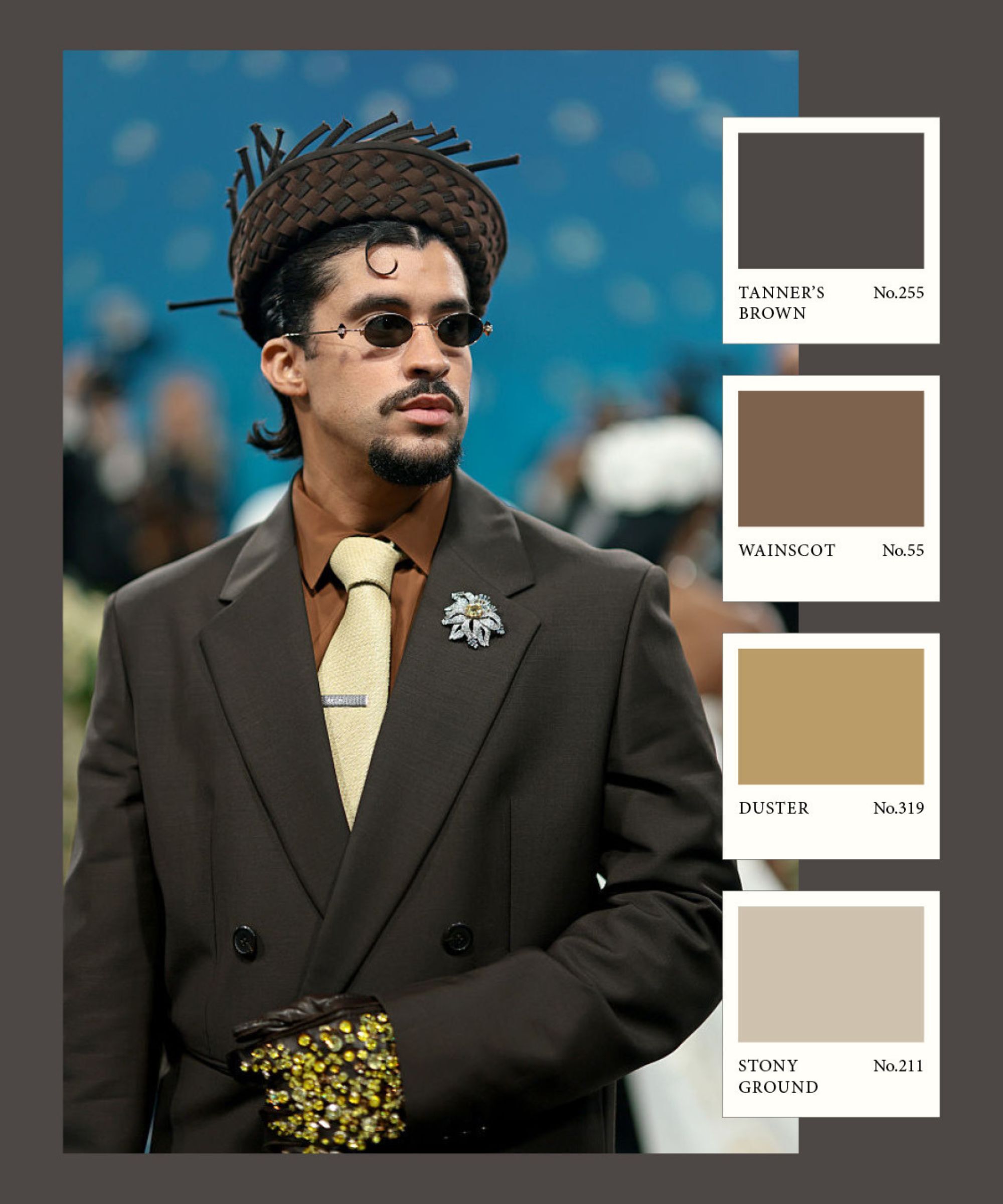
Head of Interiors, Hebe Hatton is not surprised warm, earthy browns continue to dominate the color and design scene.
‘Brown has been a huge color trend in the world of fashion over the last year, and as someone who has never liked to dress in the cooler neutrals, I am happy the interiors world is shifting to warmer, softer colors too,' she notes. 'It's a color you want to layer, just as Bad Bunny has done here. Combine a rich dark brown with lighter beige and mustard tones for a color scheme that feels both incredibly chic and incredibly welcoming.’
If you love this feminine colorway but feel the dusky pink look is a little oversubscribed, this linen bedding is just that bit braver, a true berry color.
Playful, fun, not-so-serious, this colorful little table is made from cast aluminum, so can double as a plant stand.
If you are attending a wedding or celebration this year and have it jotted down on your to-do list to buy a suitable gift, these exquisite designer cups and saucers are an extremely wise buy.
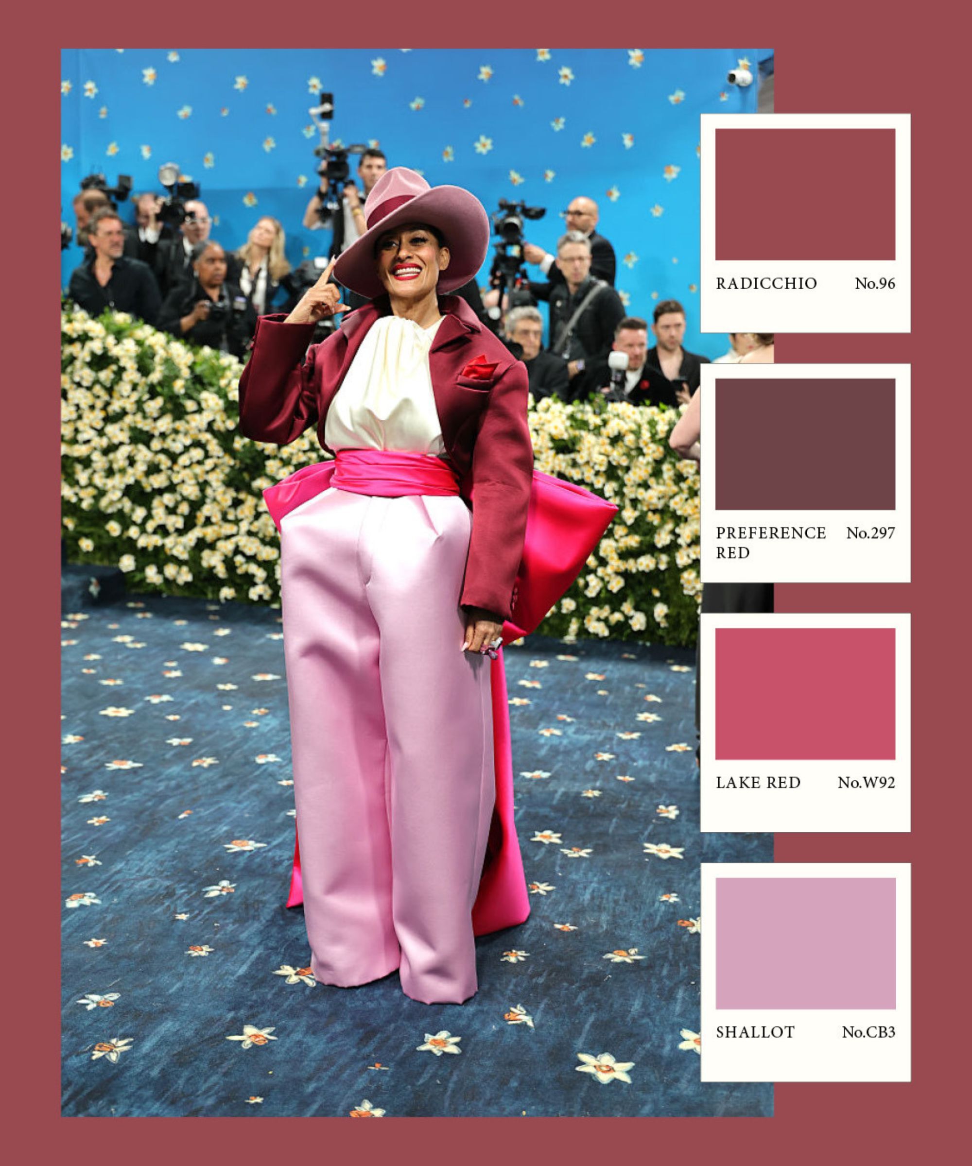
A vision in pink! These happy and vital berry colors are refreshingly optimistic, and often colors like these are used in spaces within the home that are meant to feel energetic, playful, and cheerful. Here, Tracee Ellis Ross showcases how to layer these colors superbly.
UK-based Interior Designer Sean Symington explains that the personality of the pink you use is entirely dependent on the companion colors it's paired with.
'Berry is such a rich, versatile shade. It brings depth and elegance and can really anchor a space, or an outfit, for that matter.’ Sean notes. ‘What makes it so compelling is how it transforms depending on what it’s paired with.'
'When layered with soft pinks and a pop of hot pink, the palette takes on a new life – it becomes joyful, youthful, and a little bit unexpected, yet still holds onto a refined sensibility. The balance of softness and bright hues creates a harmony that feels both playful and poised. It's a classic yet unexpected combination that brings personality and sophistication. We recently used this palette of berry, soft pinks, and a touch of hot pink in a playroom that could adapt into a study over time. The result was a space that felt fresh, fun, and cohesive with the home’s overall sense of refined charm.’
Farrow & Ball is well-versed in curating and producing stunning paint ideas, and these celebrity styles prove that color, in all its infinite variety, is the bridge language between these two worlds. Set amongst the glitz and the glam, this year's celebrity guests and their jaw-dropping attire generated lots of color ideas and, in particular, creative color combination inspiration that we can bring into our interiors.