When you think of versatile paint shades, it isn't a deep chocolate brown that typically springs to mind. At first glance, this deliciously indulgent shade might feel bold and brash, but it has become one of my favorite paint shades to use in my home.
Warming, grounding, and surprisingly adaptable, decorating with brown is, of course, nothing new. But it's certainly having a moment, and we're seeing a big return to rich, enveloping brown paints like chocolate, espresso, and tobacco.
Luxurious and rich yet traditional at the same time, Little Greene's Ganache took me totally by surprise. And then I returned to it again and again for almost every room in my home.
My love for chocolate brown naturally started in the kitchen. Then it slowly crept its way into my wardrobe, and some of the chicest pieces I've bought recently have been wrapped in this sweet cocoa shade. But no one was more surprised than I to find myself drawn to its enveloping tones for my home, too.
'Chocolate brown shades are perfect for creating smart spaces that bring indulgence, comfort, and warmth to the home,' says Ruther Mottershead, creative director at Little Greene. 'With their earthy tones, rich chocolate browns are a subtle nod to nature and work wonderfully with natural materials such as stone, wood, wicker, and rattan finishes.'
It shares the versatility of black but with a warm, welcoming undertone and inherently luxe feel. And what makes Ganache especially appealing is its softness. Unlike black, it doesn’t dominate; instead, it enhances whatever it’s paired with.
Unveiled in 2023 as part of their 'Sweet Treats' collection, Ganache is part of a palette of shades good enough to eat and creates a real showstopper in your interiors.
'Brown is a great tone to incorporate in your space. It's moody, it's cozy, and it looks good in both neutral rooms and colorful spaces,' said designer Taylor Simon in a recent TikTok video. 'It provides a deep, moody color without being too stark like black, while still providing great contrast against lighter walls,' she explained.
With a nod toward retro color schemes, it can feel delightfully nostalgic yet still sits just as lovely in contemporary spaces as it does amongst more traditional interior design styles.
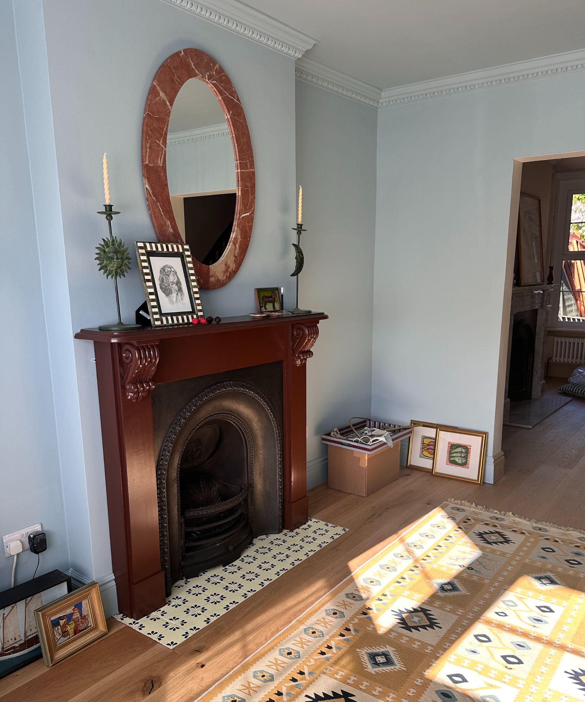
As a long-term neutral lover, I've been slowly trying to lean into bolder colors in my current home. It is Edwardian with tall ceilings and full of character, so it can handle a little fun! I color drenched my living room in Farrow & Ball's Parma Gray (a misleading name, it hasn't a hint of gray within it) and then needed to find a complementary color for the fireplace.
After consulting with the experts – I even asked for Farrow & Ball's tips on decorating my blue living room – I learned that browny-red tones would work beautifully, and the winning swatch was unsurprisingly Ganache, seen above in my work-in-progress living room.
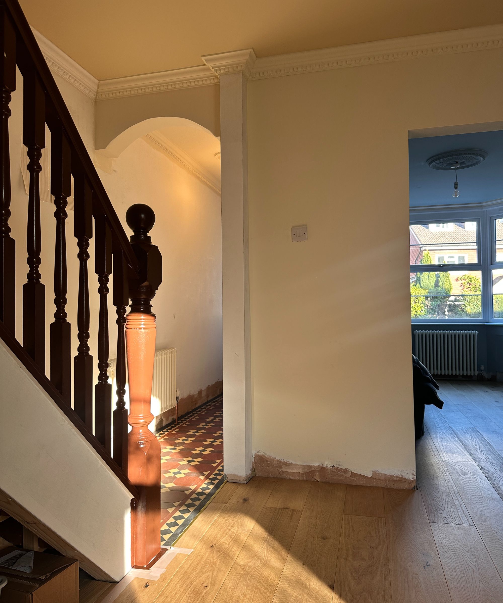
The next victim was my staircase. It's a big surface area, and the chosen color would be in your sightline immediately from the front door through to the dining room, living room, and all of upstairs. So it had to be perfect.
Leaning into the colors in my Victorian-style mosaic entryway floor – which as you can see above has tones of traditional brick red, butter yellow, brown, and black – I wanted to pick something that would feel contemporary, cool, but also work with a traditional palette. A hard brief.
I chose to pick out the brown in the tiles, giving the stairs a glossy, chocolatey wash of paint that somehow feels equal parts traditional (like a rich mahogany wood might) and stylish at the same time.
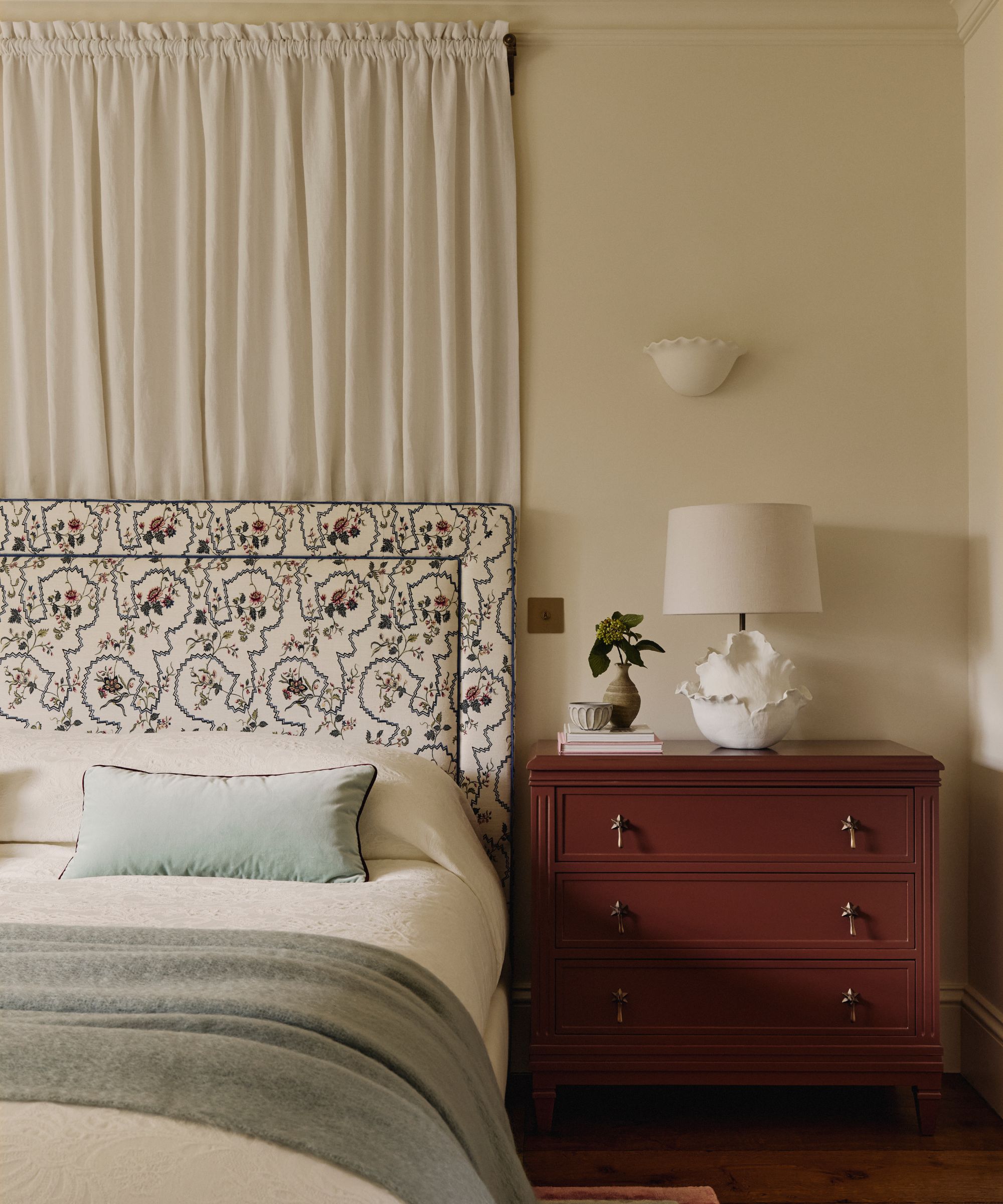
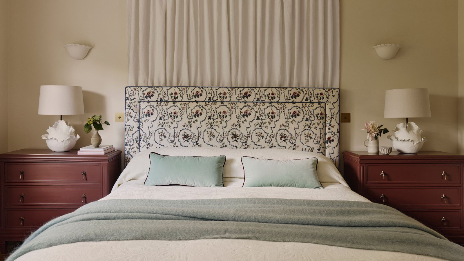
People often think of dark colors as dramatic or moody, but they can also be wonderfully grounding. If you balance them with lighter elements and tactile finishes, they bring real depth to a scheme, just like the nightstand in this neutral bedroom designed by Emma Ainsbough above.
'When used across all elements, they can really envelop a space, adding impact and drama to a space as well as partnering beautifully with neutral hues and natural finishes for a tonal contrast,' Ruth adds. 'Try color drenching Ganache in a scheme across walls, woodwork, and the ceiling for a truly impactful, cozy finish.'
In my case, Ganache has become the 'red thread' that tied everything together – from the living room to the hallway, to unexpected spaces like the cupboard in the corner of my kitchen and a bar cart in my dining room. It's now my go-to hue for making a space feel warm, layered, and with the right amount of contrast.
Shop chocolate brown home decor
If you'd prefer to introduce your cocoa hues with smaller details, I love this handcrafted vase from Pottery Barn. Made from clay in the Philippines, it has been hand-painted and given a glossy glaze to finish.
Chocolate brown already brings so much warmth to a space, but there's no better way to truly envelope yourself in its cozy color than with a super soft throw blanket. The slub-weave fabric is textured yet breathable and finished with fringing.
Designed by Shea McGee for her Threshold™ designed with Studio McGee range at Target, this fluted nightstand will bring so much depth to a bedroom. It has multiple drawers for ample storage, and the natural brown finish feels both rustic and contemporary.
Choosing Little Greene's Ganache for multiple surfaces in my home felt like a bold move, but it has turned out to be the most grounding decision in my entire remodel. It's certainly proof that dark colors don't have to feel heavy or oppressive, and in the right tone or sheen, they can be endlessly versatile and totally chic.
So, next time you're faced with a color chart, why not give brown a go? You might be surprised by just how much you love it. And if you're thinking, 'what colors go with brown?', check out our dedicated feature for all the complementary colors.