In street style, there's a color combination that's almost inescapable right now, and one that I think will be everywhere this summer — light blue and brown. Well, more specifically, a powder blue shirt with a conker brown trousers. Now I've said it, you'll see it everywhere.
However, it's not only a fashion color moment, it's a design idea we're seeing in interiors, too, whether directly through light blue and brown paint colors or textiles, for example, or through a mix of blue with a certain color of wood.
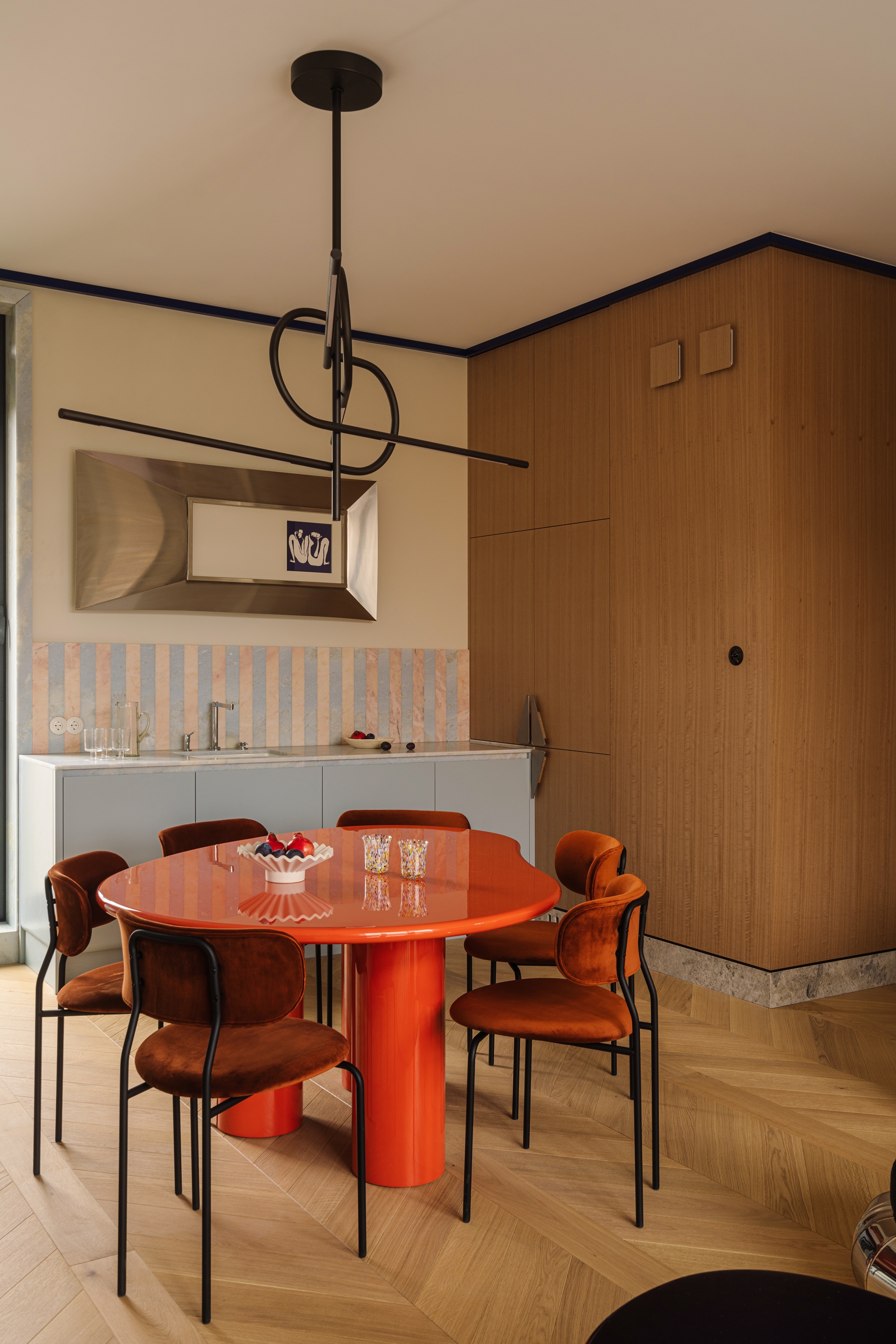
It's one of those color trends that I think works because the colors sit a little bit uneasily together, because "they have the same tonality and depth," explains interior designer Celine Erlam of Indie & Co. There's a contrast that, while a little jarring, makes for a tension that makes each color more than the sum of its parts. Light blue and brown, by themselves, are safe, inoffensive, by most measures neutral — so why does this combination have such a different energy?
As a color to put with light blue (a trending shade in its own right right now), browns are probably the most exciting option. But how do you get it right?
Light Blue and Brown
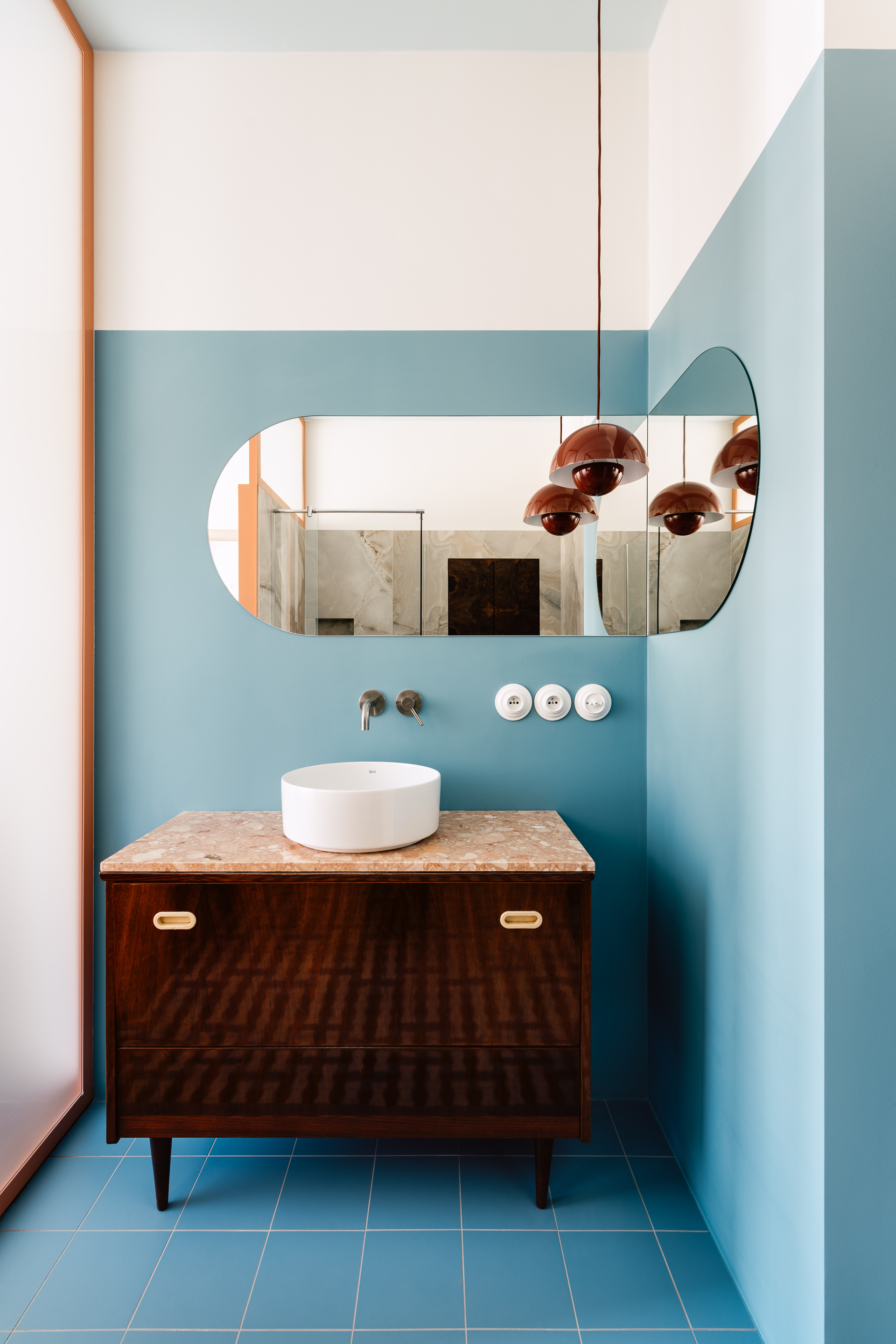
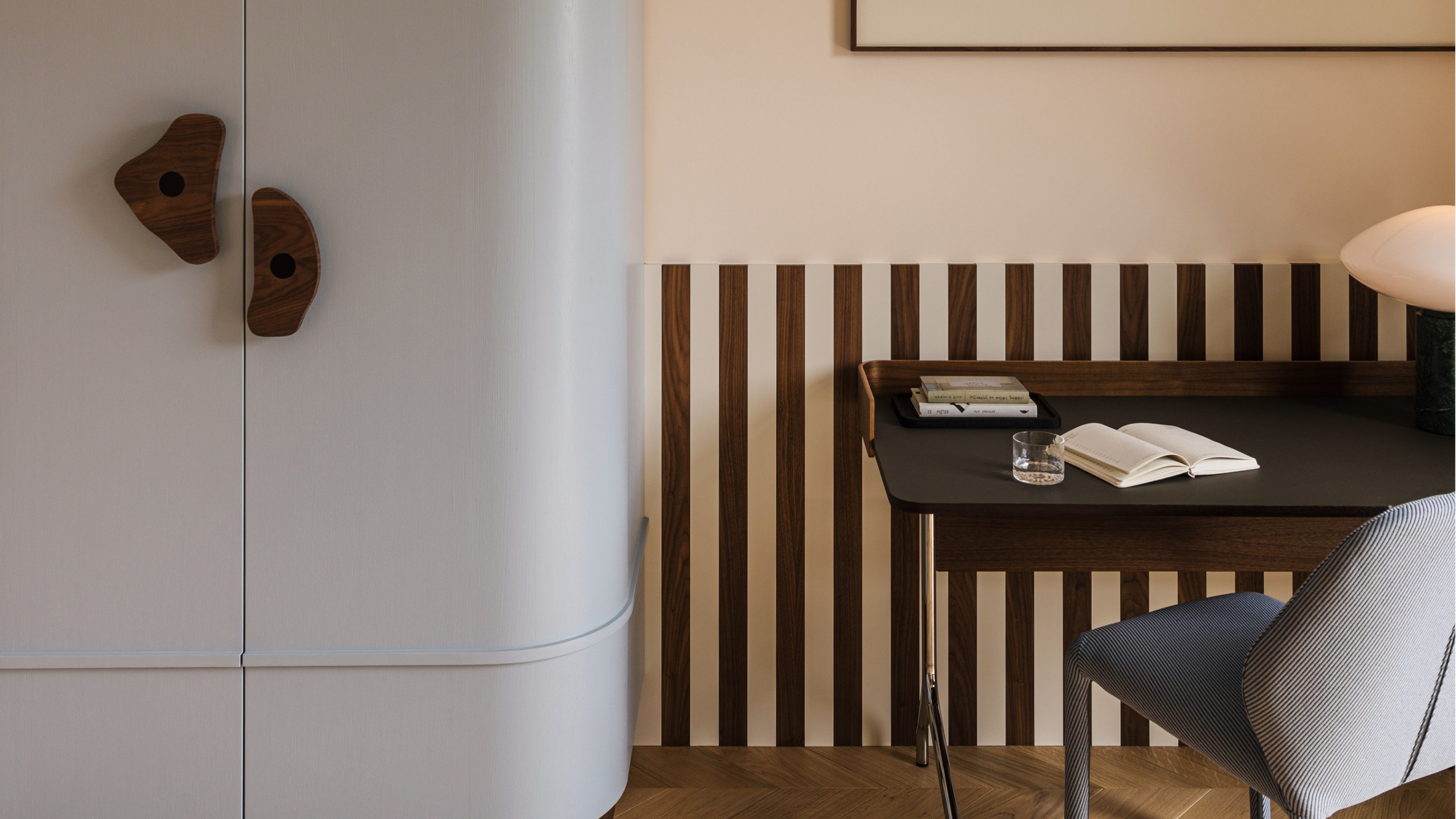
So, why do these two colors work together so well? "Brown has a naturally warm tone, and blue provides an antidote to the depth of the brown," says Celine Erlam, who uses this combination often in her interior design schemes. "The blue cuts through the brown and creates a lightness, and it establishes tension, which adds interest."
Thinking of it in terms of color theory, brown is only a short hop away from being the complementary color of blue, especially in the warmer 'conker' tones you'll often see in this combination.
Celine, however, would probably steer away from light brown as a color that goes with light blue, for the very reason that they're tonally similar, however, there's a growing trend towards these combinations. They're not harmonious, I'd say, but certainly visually striking. You'll also see light blue paired with tones such as red, burgundy, and terracotta, which have a similar effect.
So, how do you translate this color pairing into your interiors? It's often not just a case of combining paint colors, although I think these combinations capture the trend well:
- Farrow & Ball Kakelugn and Wainscot
- Little Greene Brighton and Affogato
- Lick Light Blue 15 and Brown 02
The brown part of the scheme is easy to substitute for in classic finishes for a space, though. "Brown can be found in so many different situations, such as the floor, any wooden furniture, and bronze fixtures and fittings," says Celine. "It can be a good choice for a rug if you're looking to have something dark on the floor."
When it comes to the light blue, it can either be used for color drenching the whole room or used as an accent in a neutral space to bring an element of surprise. Often, you'll see this two colors used as the only hues in an otherwise neutral space, but as designer explain, there are other accents that can complement this combination. "Many colors, such as a deep red, a pale yellow, or a bold green, could be great disrupters," Celine adds.
Light blue and a near terracotta-toned brown gives this vase a real punchy look.
The use of light blue and brown as a checkerboard pattern is one of the most modern approaches to this look.
We've always loved these Henry Holland mugs, but this combination would look particular strong on your kitchen shelves.
Punchy, graphic wall art in our new favorite color combination? This decor is the right vibe for interiors right now.
Colorful glassware is a fun trend to bring to your dinner table, and this color pairing feels like it would be a dinner party talking point.
There are lots of rugs out there that combine light blue and brown — this small mat is great for dressing a hallway.