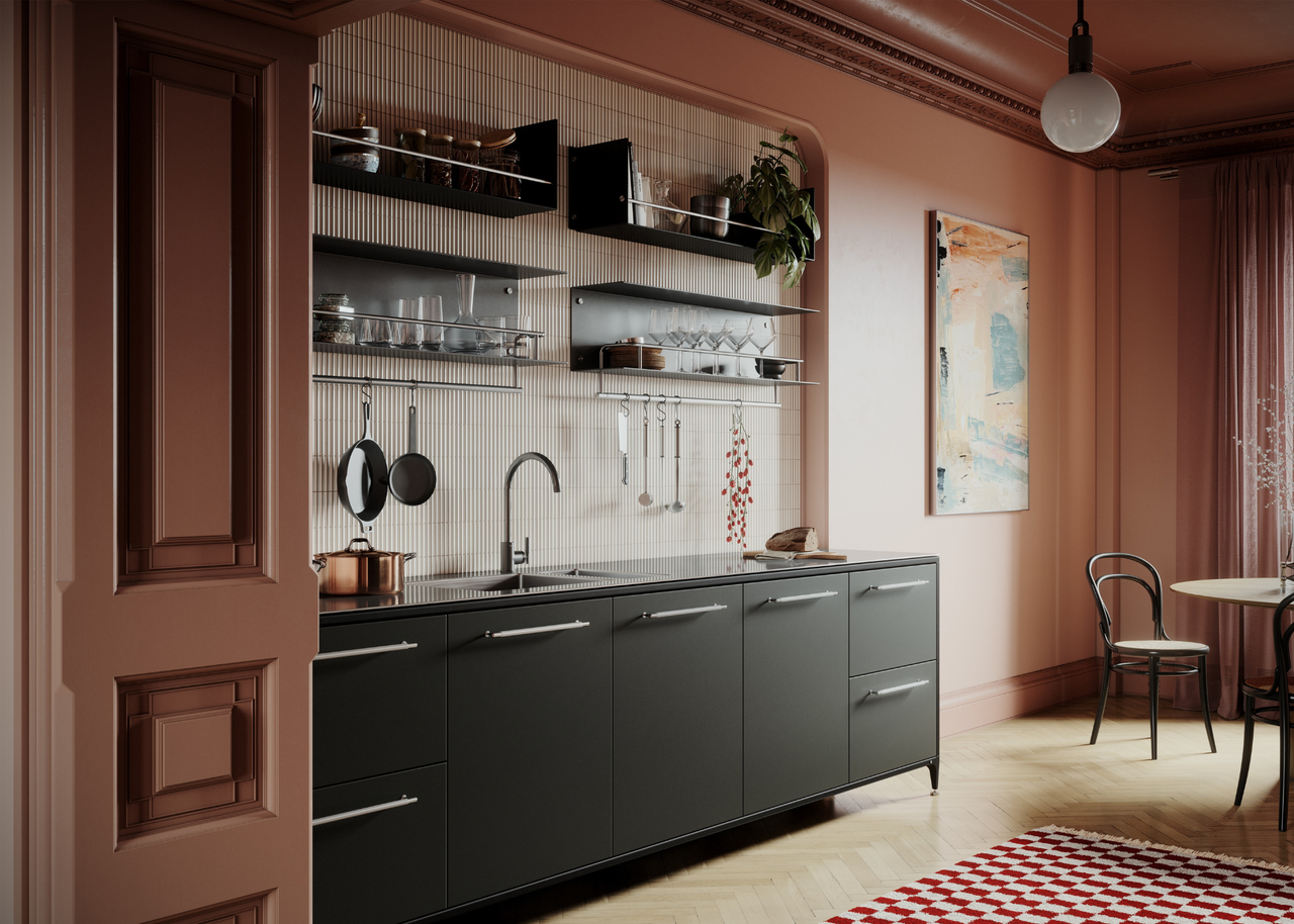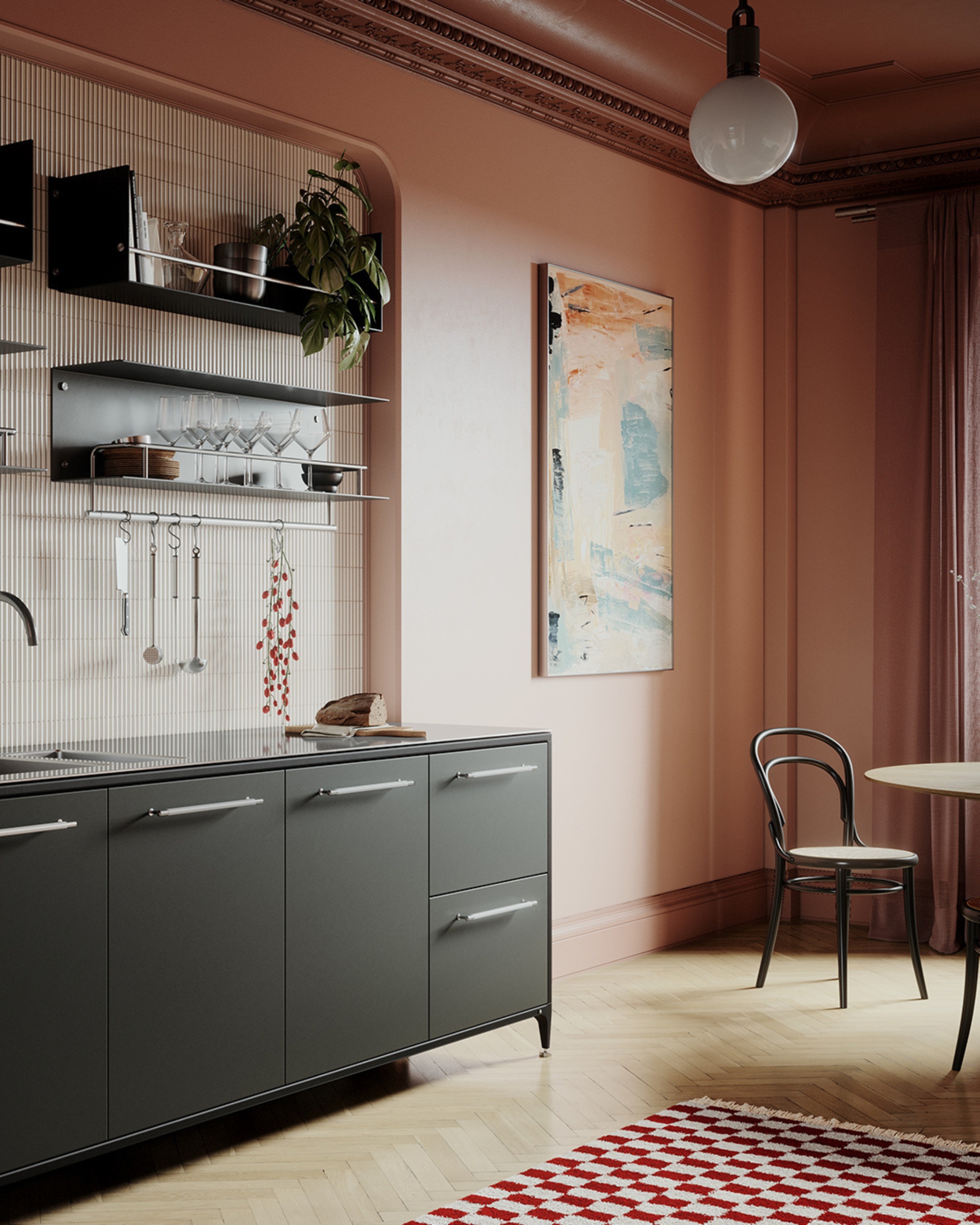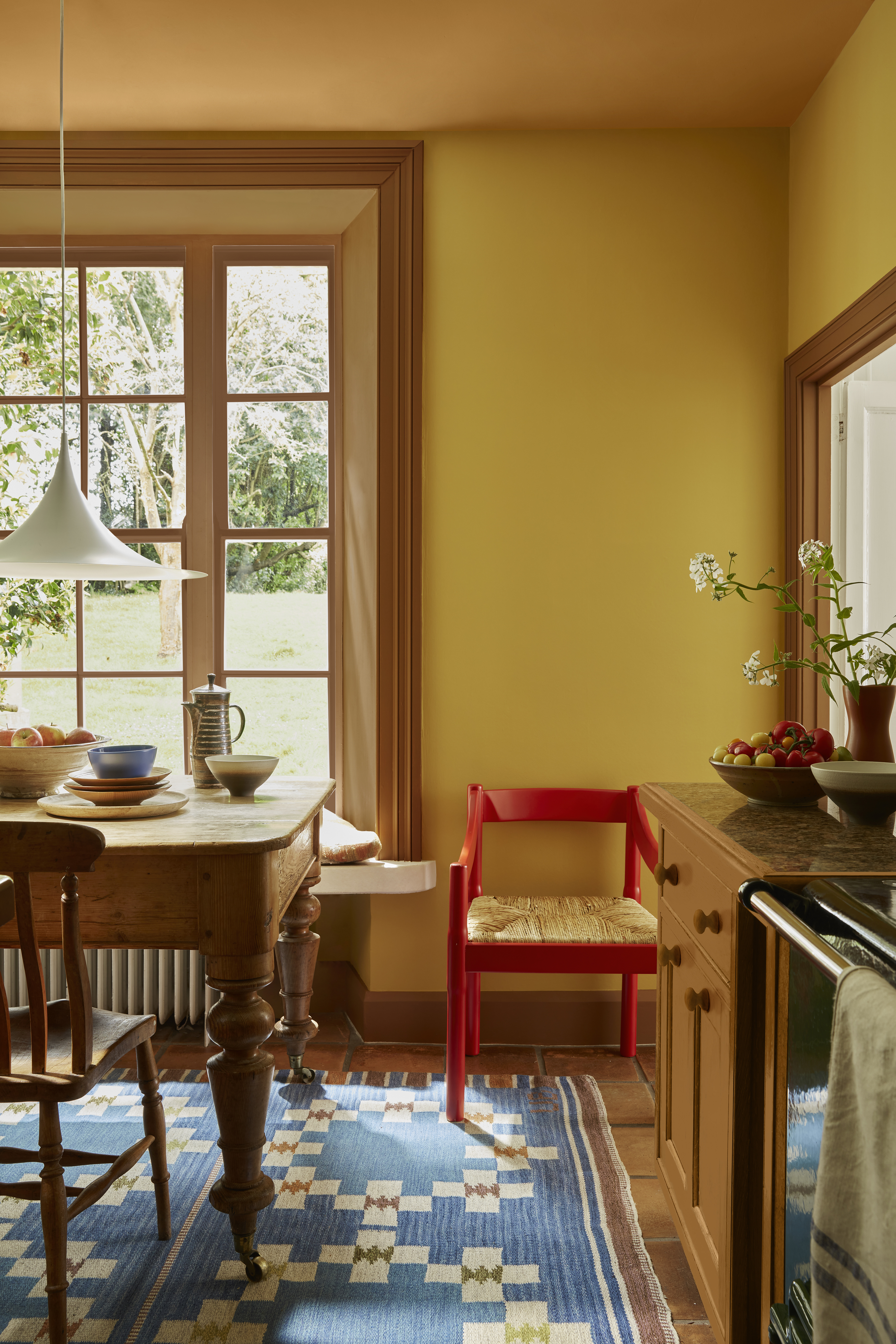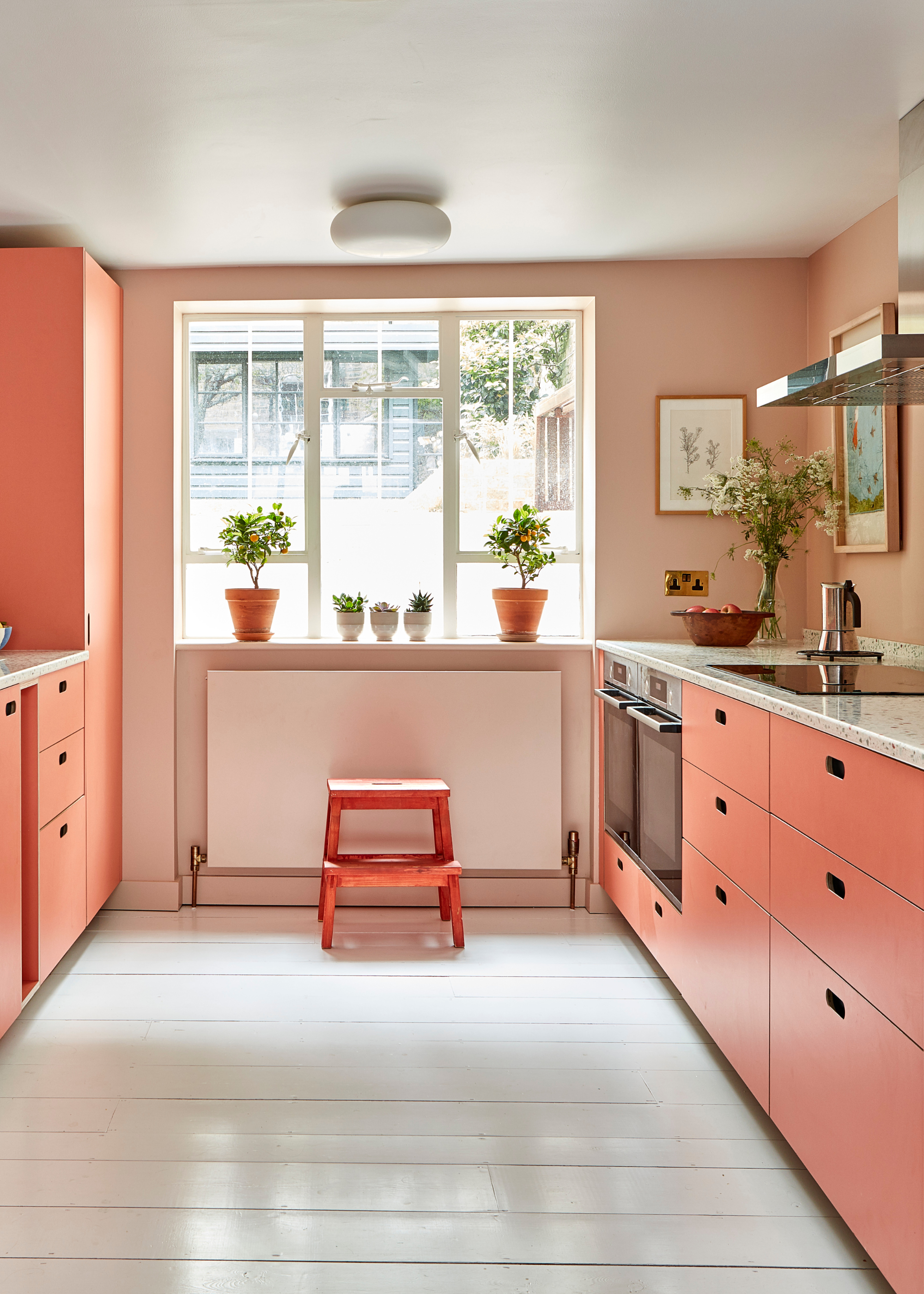
If you're tapped into the design scene, you may have already heard the term color capping doing the rounds over the past couple of months. What may be new to you, however, is how perfect this technique is for making your teeny tiny kitchen feel just that bit bigger.
Unlike similar paint techniques, like the super popular color drenching, this method allows for a slightly more delicate, nuanced touch. And, best of all, it's a perfect small kitchen idea.
Color capping is the idea of using a tonal palette across your walls and up onto your ceiling, transitioning into a darker shade as you go.
As a proud occupant of a minuscule kitchen, I was eager (read: desperate) to get the full lowdown on color capping from the experts, and they did not hold back. So, if you want to know everything about this look, from how it works to how to style it, you may want to keep on reading.
Understanding Color Capping

Before we dive into why this technique is quite so effective in small kitchens, let's begin by fully establishing what we actually mean by 'color capping'.
Essentially, this trend is all about painting your room with varying shades, all within the same color family. In a living room, this typically looks like using one shade for the walls, a slightly deeper variant of the shade for the cornicing, and finally, saving the deepest version of the color for the ceiling, and its quickly becoming a supremely popular decorating method. Helen Shaw, from Benjamin Moore, the originators of this trend, says, "Color capping, where wall color is extended up onto the ceiling in a tonal wash, is fast becoming a go-to design trick for those looking to add subtle polish to their scheme. Rather than treating the ceiling as a forgotten ‘fifth wall’, color capping pulls it into the overall design, creating a space that feels more cohesive and considered."
Picking one color and exploring all the different facets of that shade within your room results in a space that feels both cohesive and multidimensional. Bringing a different color to these varying heights and decorating the ceiling can help to lift the space. However, within the context of a kitchen, this can take a slightly different form.
The kitchen brings with it unique structural properties, introducing new opportunities for how to make the most of this trend. As Richard Davonport, from Davonport, explains, "Color capping is the technique of using one tonal palette across a kitchen, but shifting the shade depending on the height of the room."
Relying on your cabinetry, as opposed to your walls, to make this statement breathes new life into this trend, showing its versatility across the home.
It makes a space feel more considered and homely. As Emma Bestley from YesColours says, "Color capping instantly adds a sense of design intention, giving a kitchen a more architecturally considered feel without the need for a full renovation. It introduces warmth and character while offering a sustainable design approach, which refreshes existing walls with color rather than replacing finishes."
Why Is Color Capping Useful in Small Kitchens?

So, now we know what it is, what exactly makes it so great for making small kitchens look larger?
Well, it's all about tricking the eyes, like an optical illusion of sorts. As Helen explains, "For small kitchens in particular, by blending the upper walls seamlessly into the ceiling, the eye is tricked into perceiving more height. This continuity makes the ceiling appear further away, giving the illusion of a taller, more open room without harsh contrasts or disruptive breaks in color."
Compared to a contrast ceiling, it's a soft transition, so your eye isn't immediately drawn to the boundary of the room, while compared to a color drench ceiling and walls, it doesn't feel quite so flat. "It is a useful approach because it adds depth and visual interest without overwhelming the space or relying on a busy pattern," says Richard.
It doesn't have to be reserved solely for tiny kitchens, too; this technique has merit for all kinds of spaces. "In larger rooms, color capping helps to emphasize the architecture, while in smaller kitchens it can blur boundaries and make the room feel more expansive," Richard adds.
Unlike techniques like color drenching, this offers more softness and dimension. "It’s a simple way to bring definition to a kitchen without covering the whole space in one strong colour," says Camilla Masi, from Otto Tiles.
How to Get the Look

Opting for neutral, classic color palettes can help to keep the whole thing from feeling overwhelming. Plus, with color capping, something like a cashmere kitchen, which can often feel a bit flat, suddenly becomes rich with depth and tone. As Helen explains, "The effect is quietly impactful. Even with a neutral palette, using a slightly deeper or more saturated shade on the ceiling, above off-white or softer wall tones, helps draw attention to period detailing while ensuring the ceiling feels like an intentional part of the décor rather than an afterthought."
This effect of a soft statement means the technique works beautifully with neutrals, but can look equally impactful with rich color combinations too, if that's more your speed. "It also works with bolder, knocked-back jewel tones, creating a modern twist on traditional navy blue or forest green cabinetry - softening the intensity of the dark hues while seamlessly integrating the ceiling into the overall design for a sophisticated, contemporary," Helen adds.
And when it comes to materials, the world is your oyster, but you might find that this paint technique does the bulk of the work, visually, so you may want to choose some more toned-down elements to pair with it. Camilla suggests, "I’d pair a color-capped scheme with natural textures – zellige splashbacks, terrazzo worktops, and wooden cabinetry – to keep it feeling layered rather than flat."
Consistency is key; you want things to feel cohesive and free-flowing. Richard says, "To style the look, keep finishes consistent and allow the color to be the main story. Brassware, handles and worktops can then be chosen to complement the palette rather than compete with it."
Allowing the gradual growth in colors and tone to play the key role will be a useful tool when designing a color-capped kitchen.
For a brown-toned color-capped kitchen, I'd start by painting my ceilings in this lovely soft pinky-brown shade from Benjamin Moore. It's warm enough to bring some coziness to your room, but still light enough to get that desired expansive effect.
Then, moving down to the upper cabinets and walls, I would transition into this warm, dusty brown shade. Santa Fe Tan has a mauvey warmth to it that would perfectly complement the pink tones in Misty Blush.
Finally, for my base cabinetry, I would opt for the rich intensity of Morning Coffee. Warm, enveloping, and deeply brewed, this shade is the perfect way to tie the look together.
Some sleek finishing touches will help to pull this look together, and I love the rough surface of these cabinet pull handles from Hendel & Hendel.
Marble and gold are a classically luxurious combination, and this chic bowl can effortlessly elevate your kitchen design.
The whole vibe of a color capped kitchen is functional but stylish, and this gorgeous trivet nails that brief. Plus, it would look gorgeous alongside some matching brass hardware.
Still not convinced? Allow Richard to summarize this cozy, encompassing look one final time.
"The overall effect is seamless and sophisticated. Color capping can create a cocooning, intimate feel when the ceiling is painted in a darker tonal variation," he says.
But, if cocooning, intimate spaces aren't your thing, here are some cooler, industrial kitchens for you instead.


