When it comes to interiors, green is one of the most go-to colors. Its versatility, grounding tone, and stylish edge make it an easy addition to any room. But with so many paint shades to choose from, how do you decide? We've got an easy answer for you: try Benjamin Moore's Vintage Vogue.
"Vintage Vogue is for any room that you want to be the center of attention," says innterior designer Rachael Gendrolis, founder of New England-based interior design company Penny & Pearl. "It is such a beautiful color that it becomes a talking point and is captivating in all the best ways."
It's not your average green. It's deep, moody, and complex — a soothing mix of olive green and charcoal that shifts and changes throughout the day in differing light. And it's quickly becoming one of Benjamin Moore's most popular paint colors.
It's a naturally calming shade that gives every space it exist in some serious style cred. So, if we've captured your attention, keep reading to discover everything you need to know about using Benjamin Moore's Vintage Vogue in your home.
What Makes Benjamin Moore's Vintage Vogue So Popular?
What we really all want from a green paint color is for it to blend harmoniously in with the rest of our furniture and decor scheme. It's not often a shade you'd select to make a loud statement (unless you're opting for a Brat Green, that is). It's a shade that will act as the perfect backdrop to our homes and lives, while also commanding just the right amount of attention.
Well, that's what Vintage Vogue does. Rich and alluring, "Vintage Vogue infuses any space with a sense of timeless elegance," says Hannah Yeo, a color expert at Benjamin Moore.
Hannah adds that, Vintage Vogue is "a versatile olive green tone that adapts beautifully to a range of design styles, depending on how it’s paired and styled." The soft, deep green feels both heritage and contemporary, as if it would belong in a Parisian apartment just as much as a sleek, modern new build.
Where to Use Benjamin Moore's Vintage Vogue Paint
Vintage Vogue can serve as either a striking accent or the hero of a color-drenched interior, meaning it works almost any way you can imagine using it.
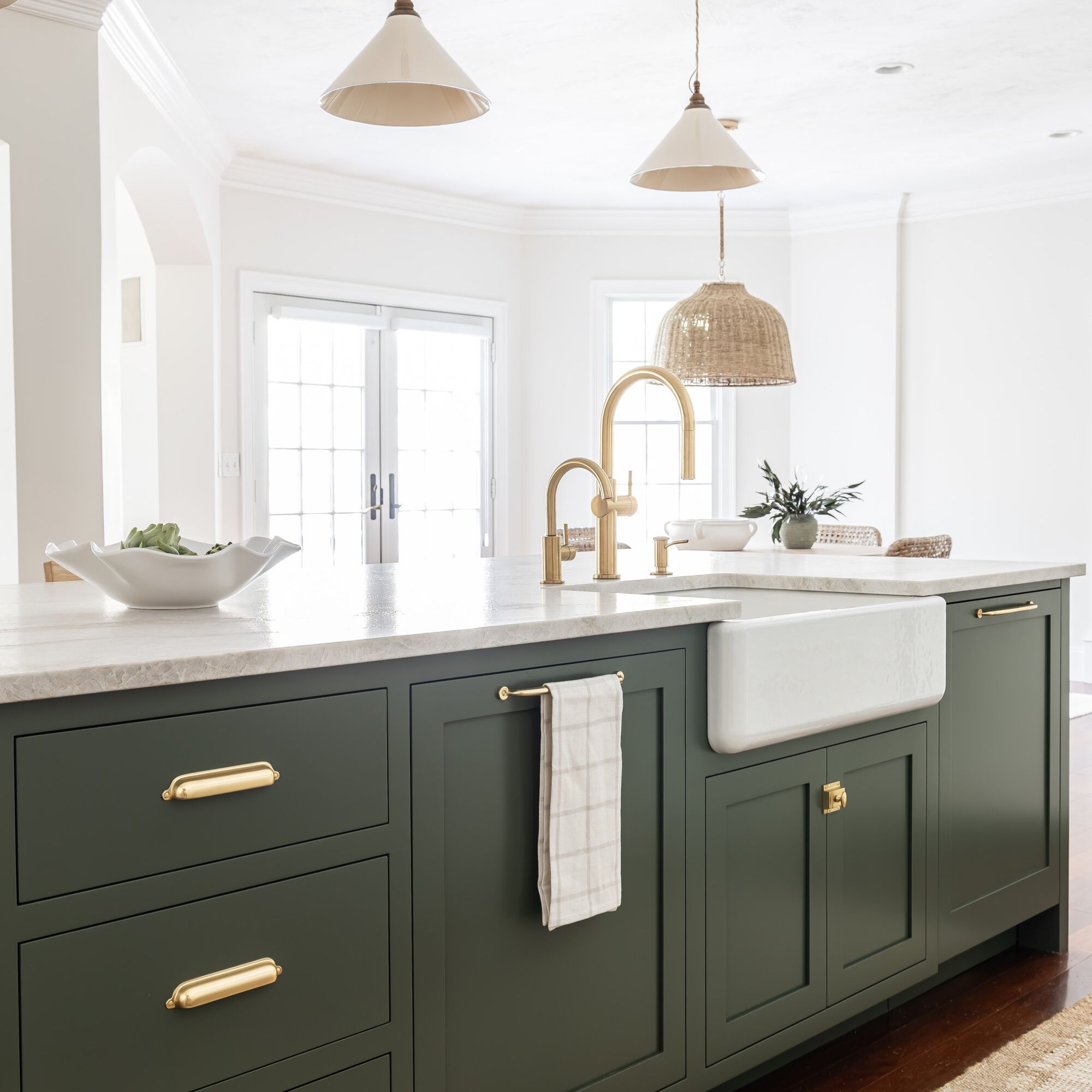
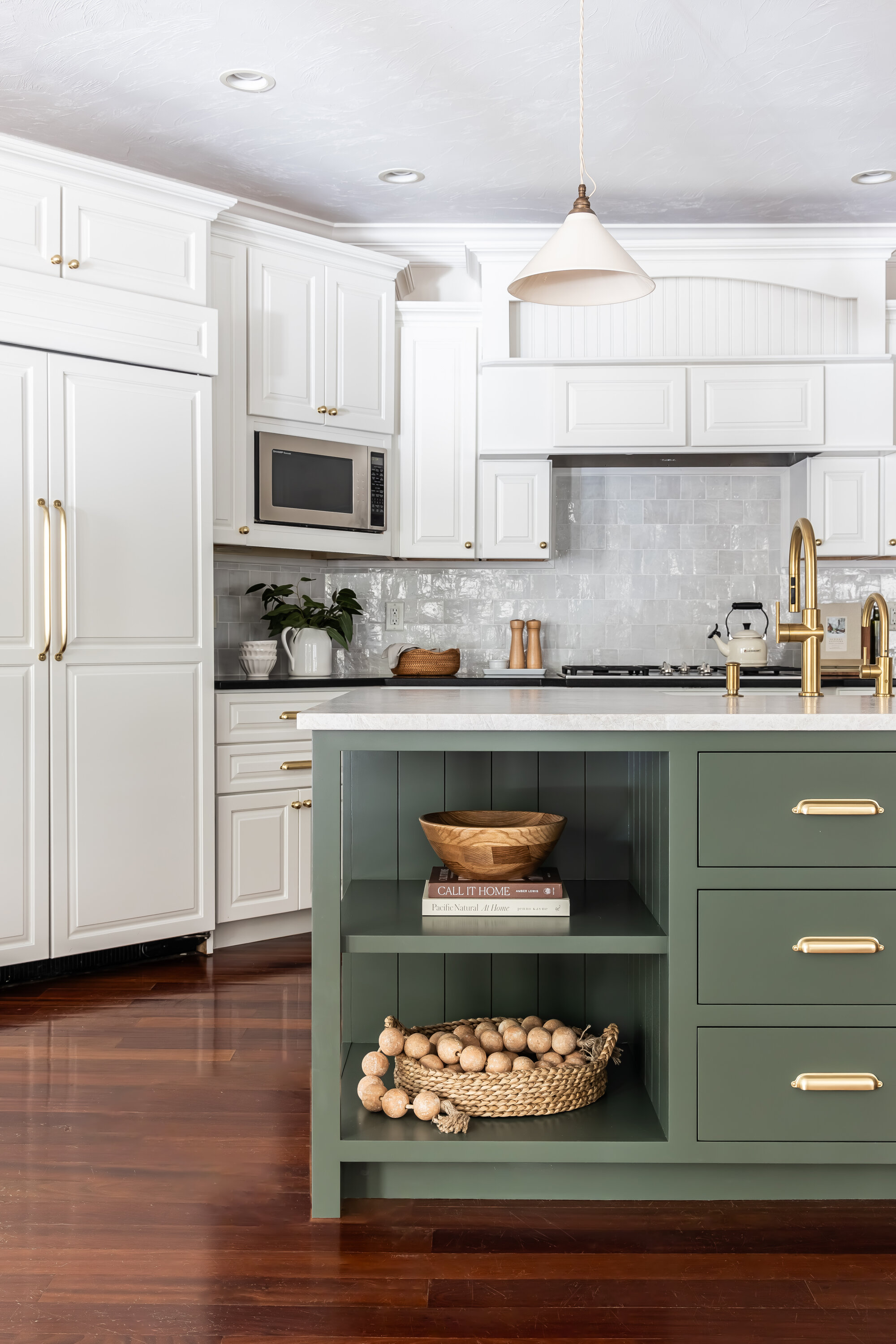
"I selected Vintage Vogue green for this kitchen island (pictured above) because we wanted to achieve an earthy, modern aesthetic for our clients who are a fun, young family," explains interior designer Rachael Gendrolis. "The home is mostly a creamy white canvas, so we wanted the gathering place of the home, the kitchen island, to make a statement."
The deep green against the crisp, creamy white creates contrast in design that ultimately grounds the space. When used as an accent in this way, "Vintage Vogue brings attention to architectural details," adds Hannah. "Whether on built-ins or as kitchen cabinet molding, this rich hue highlights beautiful millwork with sophistication."
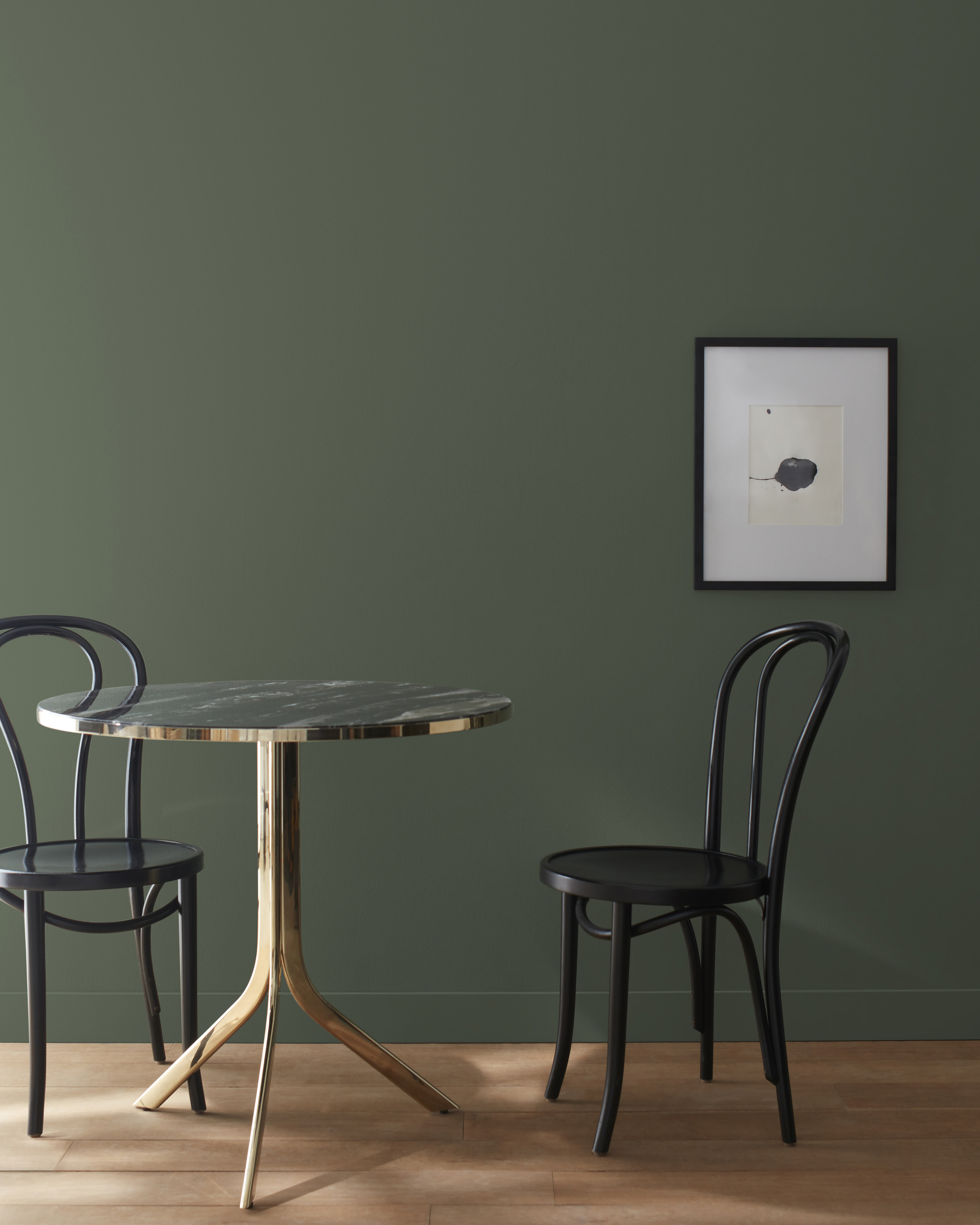
However, don't be afraid to lean into the color's more dramatic side. The softness of Vintage Vogue allows it to play well as a paint color for rooms without much natural light, which is rare.
In brighter rooms, it softens a little, letting more of the olive green hue come through. But in dimmer settings, it gets sultry, almost inky. Perfect for creating a cozy bedroom or living room — just add warm lighting to avoid it feeling too cold.
For a more glamorous approach, experiment with color drenching Benjamin Moore's Vintage Vogue. The luxurious depth of the paint color instantly elevates a space, giving it a custom-designed feel — moody and sophisticated without feeling overwhelming.
As for where to try color-drenching this shade? "Small, enclosed areas, like powder rooms, are ideal for experimenting with deep colors," says Hannah. And don't forget to layer in light-colored accents for a bit of visual interest and dimension.
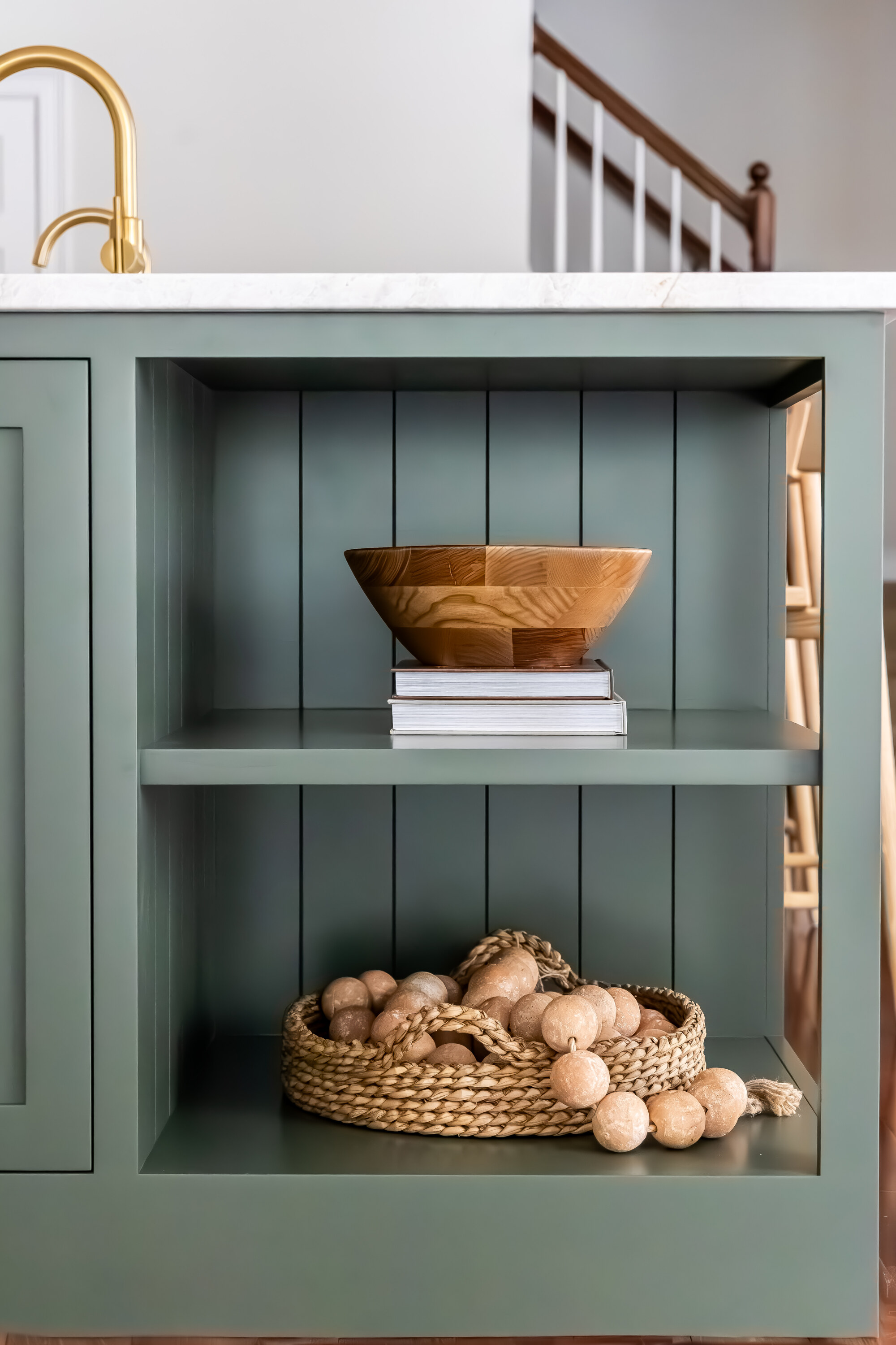
Vintage Vogue is also a great option for a home office or library. Its inherently soothing nature evokes stability and focus, and the soft, gray undertone makes it the perfect sensory-conscious paint color. In spaces like this, "It's an ideal choice for built-ins and bookcases, where it brings a refined, tailored look," says Hannah.
What Colors Pair Well with Benjamin Moore's Vintage Vogue?
Now, it's time to find the palette to bring your green room ideas to life. The most effortless route is to stay with a calming, neutral color scheme. The muted earth tones of Vintage Vogue pair well with warm, creamy whites like Benjamin Moore's Swiss Coffee, or even a muddy taupe like Stone Hearth.
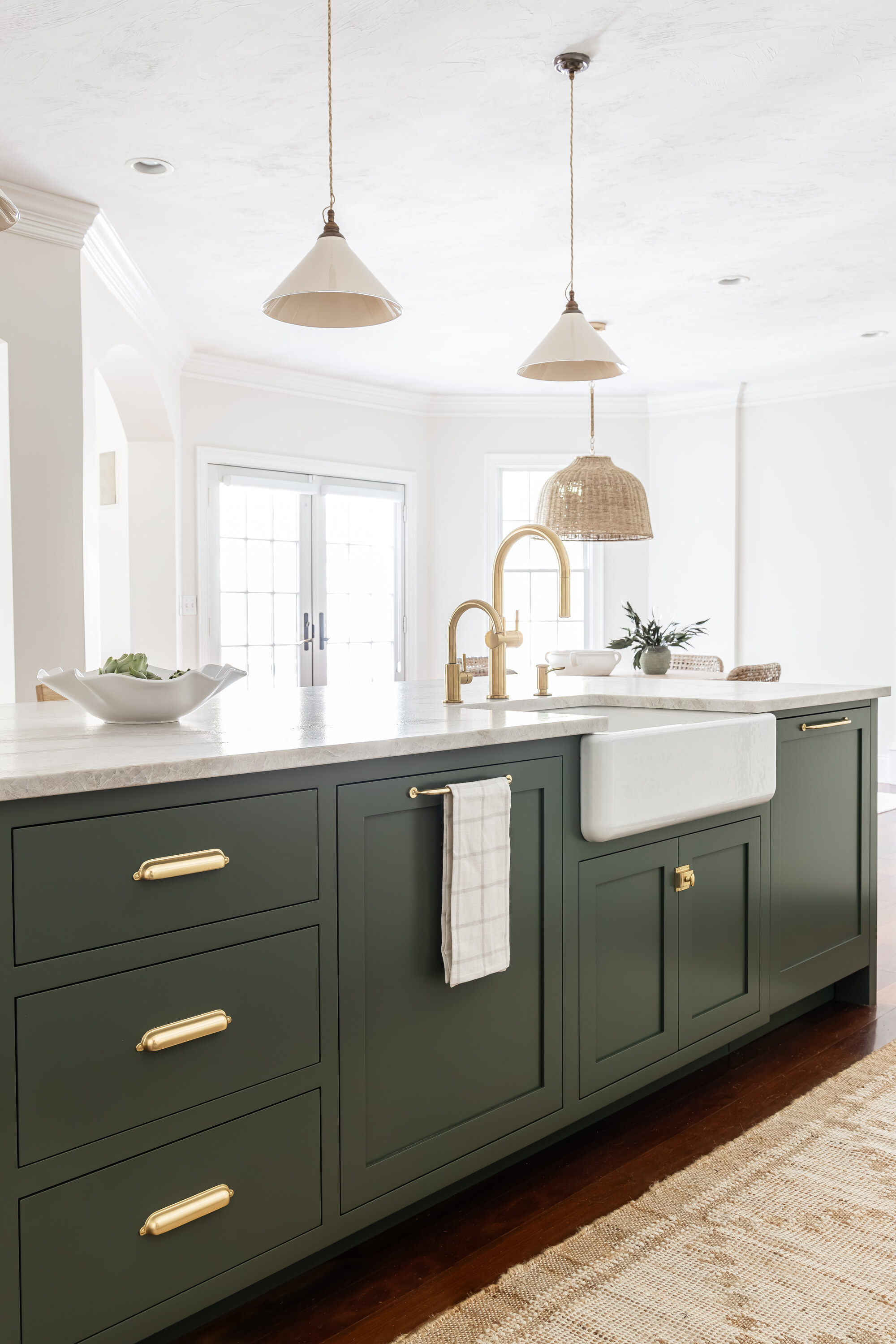
"We paired Vintage Vogue with Benjamin Moore White Dove in this kitchen, and we love the way it stands out against an all-white backdrop," says Rachael. "It would also pair really well with a taupe like Pale Oak or Collingwood."
And if you’re looking to add a little tension, try pairing it with hues that have a bit more color — a soft blush, a muted yellow, or even a dusty purple (like Benjamin Moore's color of the year, Cinnamon Slate) would make Vintage Vogue come alive.
As for the finishing touches, reflective accents, like brushed bronze sconces, metallic finishes, and elegant glassware, "elevate the drama and create a stunning backdrop for entertaining, perfect for dining rooms and kitchens," says Hannah.
However, when paired with tactile elements "like woven textiles or plush fabrics, warm hardwood floors, light linens, and cream-colored rugs," says Hannah, this rich olive hue fosters a sense of comfort and tranquility in the living space.
Like I mentioned earlier, the styling options for a home wearing Vintage Vogue are limitless.
Benjamin Moore's Vintage Vogue brings all the drama without being too loud. It soothes rather than shouts, making it the perfect olive paint color for a timeless home.
Ready to start painting? Make sure to check out all the tips for decorating with green.