Towering over the bustling streets of Saigon is Dạ-Hợp – a new two-story food and beverage destination with a slick visual identity that's good enough to eat. Inspired by the magnolia coco flower and the sultry aesthetics of cabaret, the new concept transcends the confines of design, creating a dynamic identity bursting with creative flavour.
In line with the most iconic brands from across the decades, Dạ-Hợp's identity intricately balances heritage and modern design to create a flexible, timeless appeal. A harmonious blend of cuisine and culture, this sleek identity is a prime example of how a strong concept is the ultimate foundation for stunning design with a big impact.
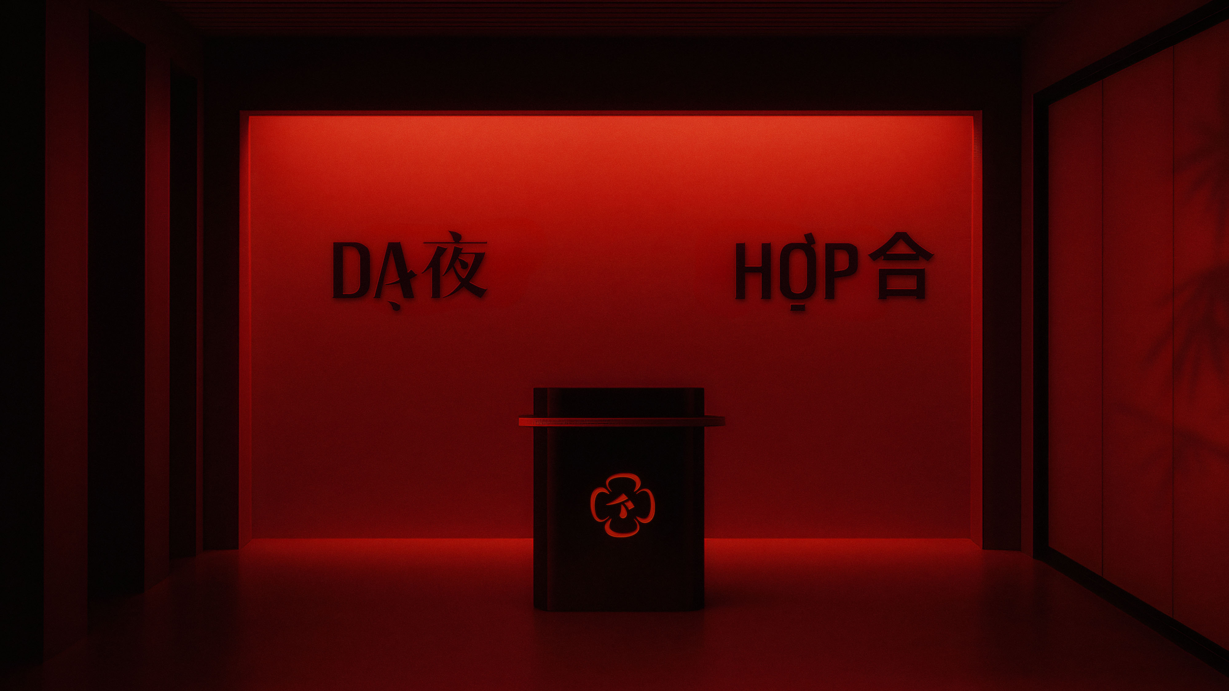
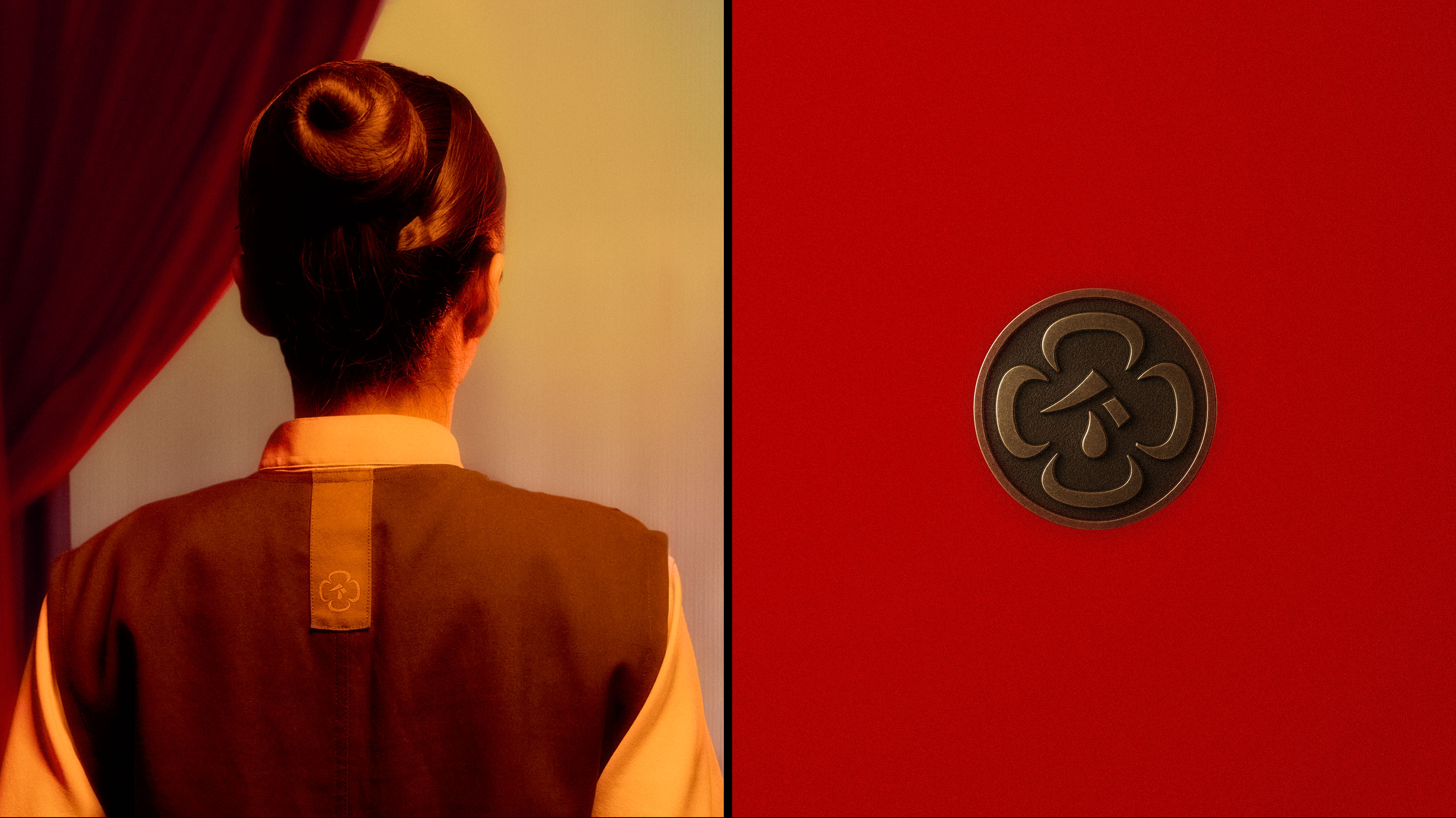
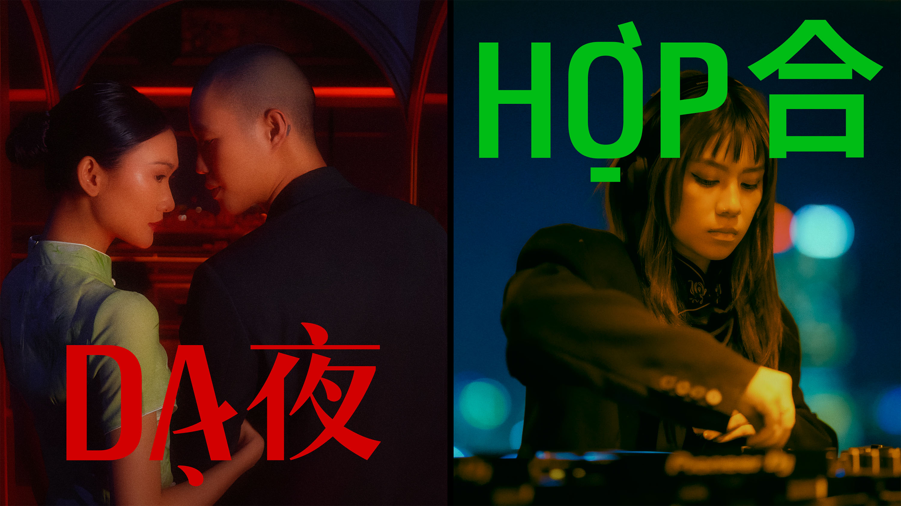
Created by design agency M — N Associates, Dạ-Hợp's new identity is split into two parts. The lower restaurant, “Dạ 夜” (meaning night), is characterised by a sense of serenity and class. Featuring glowing reds and sultry shadows, the aesthetics create a sense of elevated refinement, with a subtle playfulness inspired by the art of cabaret. "Nothing shouts. Everything flows. It complements," the press release explains.
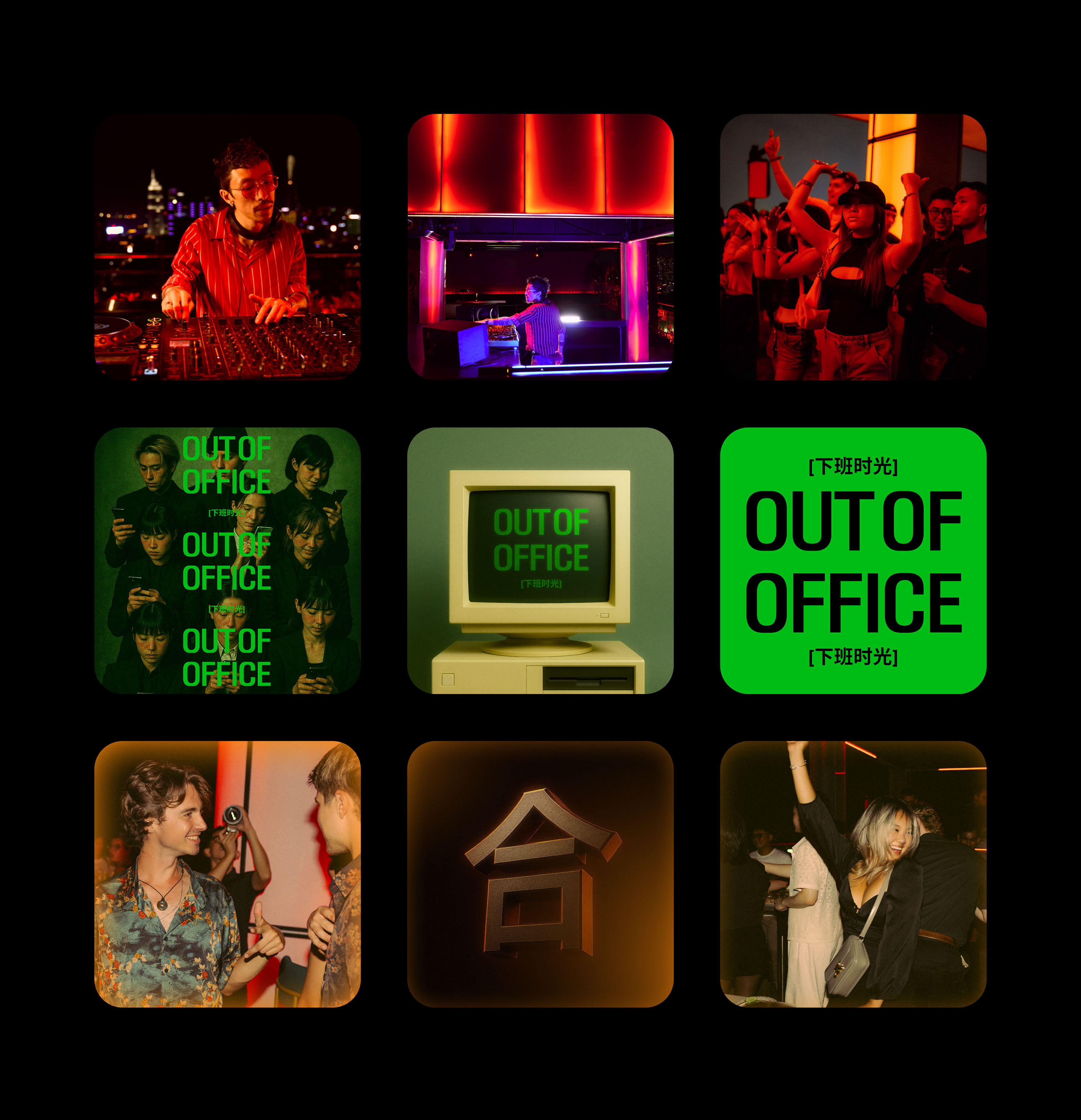
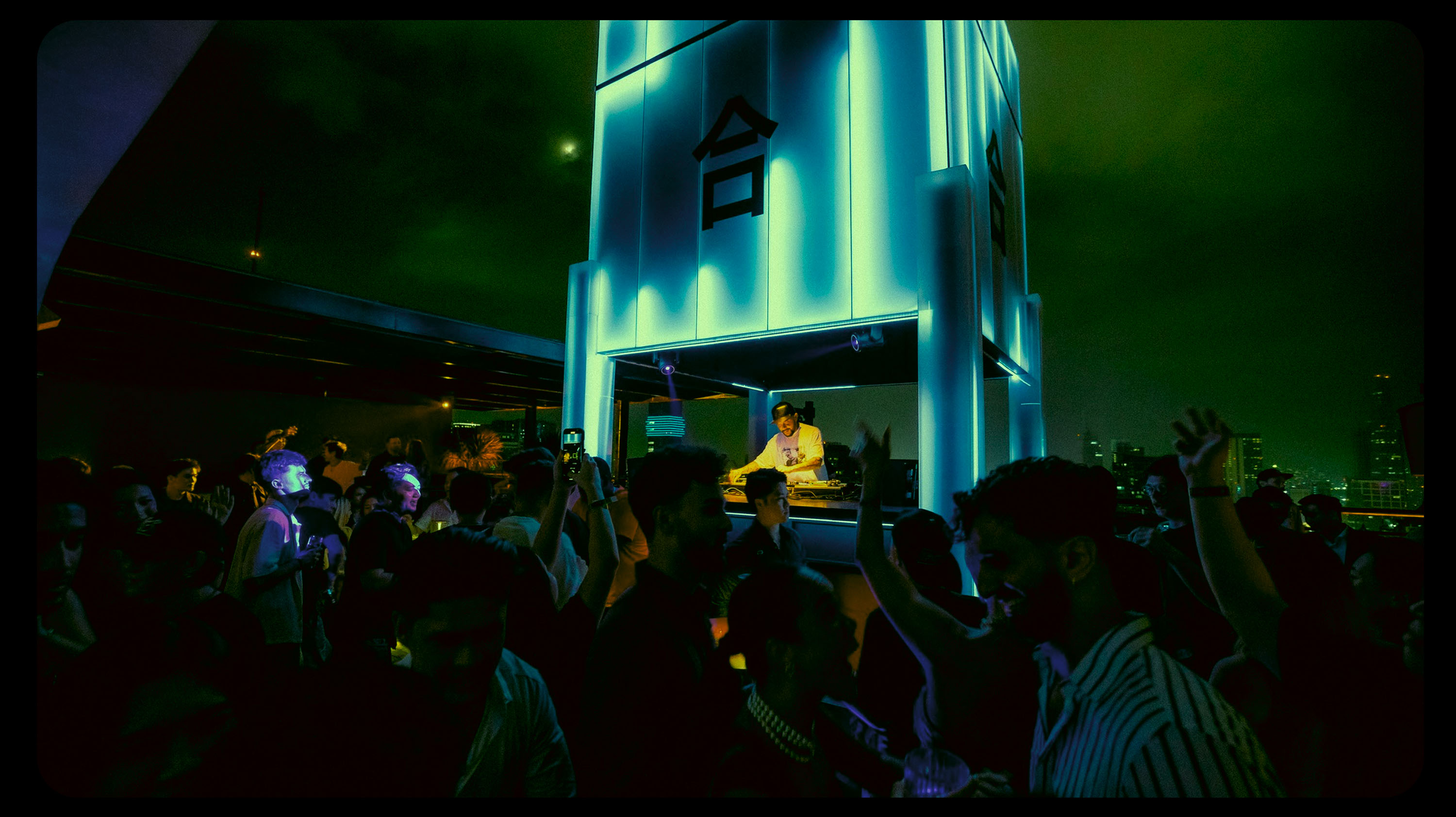
In contrast, the rooftop bar, “Hợp 合” (meaning together), is a beacon of music and energy. The glowing cube-shaped DJ booth is central Hợp's playful energy, grand enough to be seen from the bustling streets below. Balancing out the tranquil vibe of Dạ, Hợp is a "celebration of togetherness, rhythm, and elevation," capturing an electric spirit of festivity.
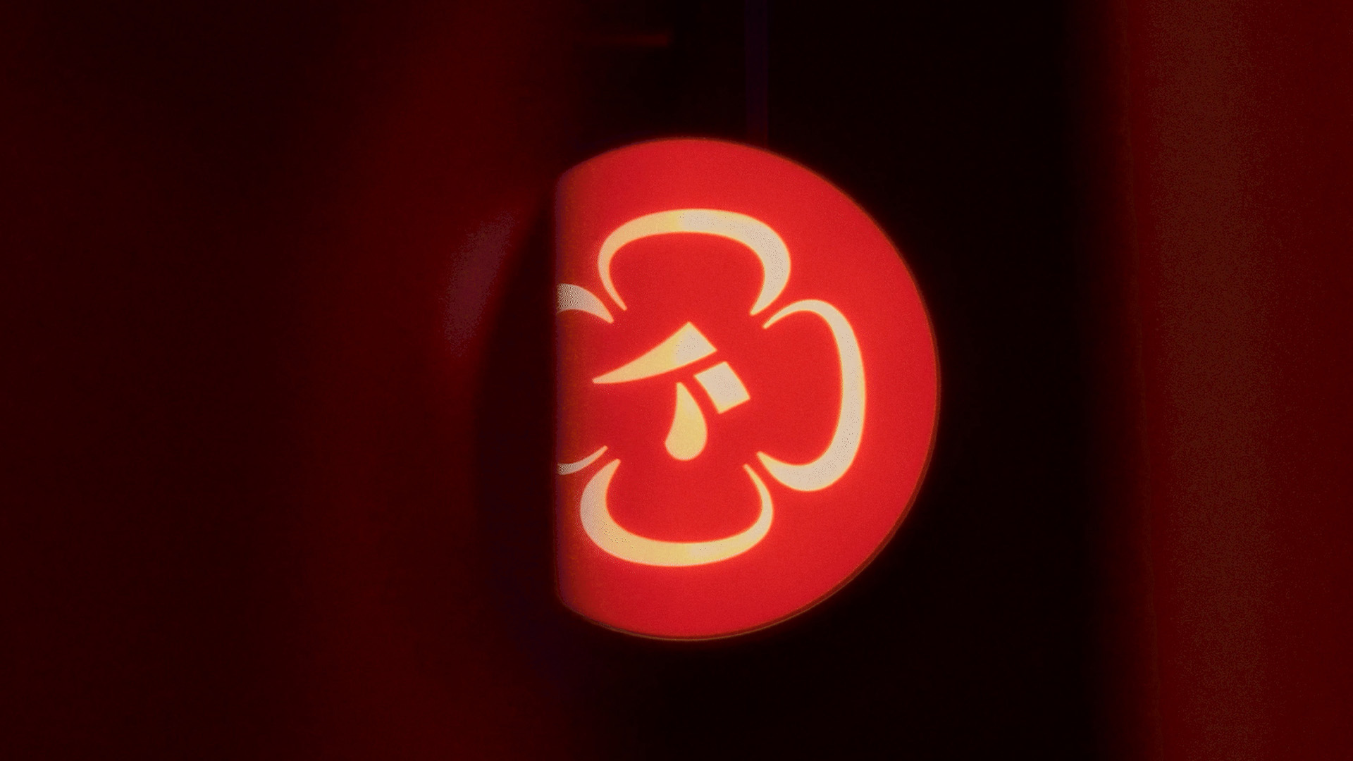
At the centre of the new identity is a stylised logo design "rooted in calligraphic expression and theatrical form." Inspired by traditional brushwork, the design has an organic feel, complemented by the classy colour palette and elevated visuals. This central motif is enclosed by petal-like shapes inspired by the magnolia coco flower – a unique flora that only blooms at night, reflecting the dusky aesthetic of Dạ-Hợp.
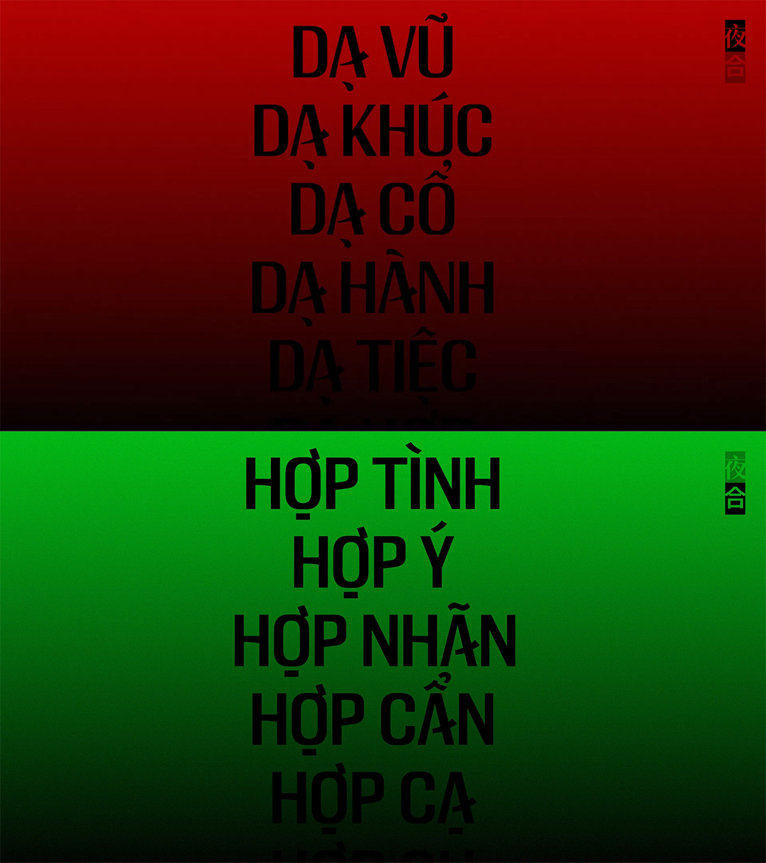
The brand's unique typography was designed to function vertically, reflecting the rising tower that Dạ-Hợp sits upon. Gesturing to the motif of fusion, the traditional Chinese calligraphic-inspired stems and diacritical marks bring a sense of heritage to the contemporary design. While Dạ adopts a high-contrast serif for a slick, sculptural appeal, Hợp's identity features a cleaner sans-serif made for adaptability and modern appeal.
It's no mean feat to create a dual identity that harmonises under one unified brand, yet Dạ-Hợp expertly fuses the two contrasting spaces while giving each its own unique appeal. The stripped-back aesthetics lend to a classy identity on both sides, which combine for a contemporary fusion of playful energy and sensuous design.
For more creative inspiration, take a look at M — N Associates' rebrand for delivery service GHTK. If you're after more branding news, check out The Clios' new sonic identity.