The rule is that a good brand name should roll off the tongue. But that's not always possible when you're a 155-year-old publishing house named after your founders. And Hodder & Stoughton, part of the Hachette group, is one of those brands pronounced wrong by many people.
That's a bad thing for a brand. It generates doubt and anxiety. People might even avoid saying the name for fear of the embarrassment of pronouncing it wrong. So when it came to rebranding, the publisher began to look at whether there was anything it could do to help people out. The result is an ingenious new logo that links the brand's visual identity with its name.
We're delighted to reveal our new branding ahead of a very exciting 2024. And now you know how to pronounce our name, too. https://t.co/B69Tt4K6PV pic.twitter.com/Ral6mLyVa5December 12, 2023
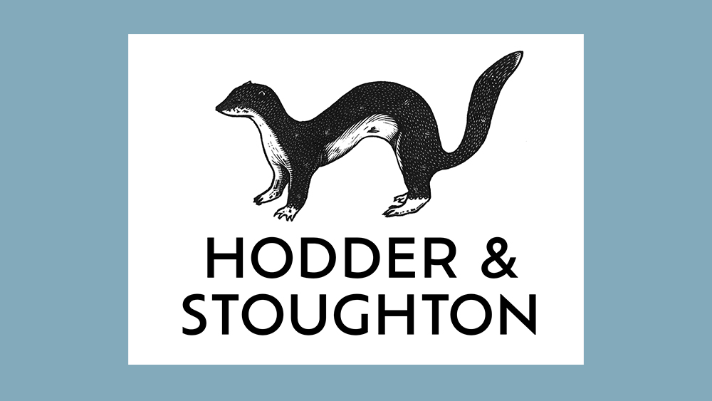
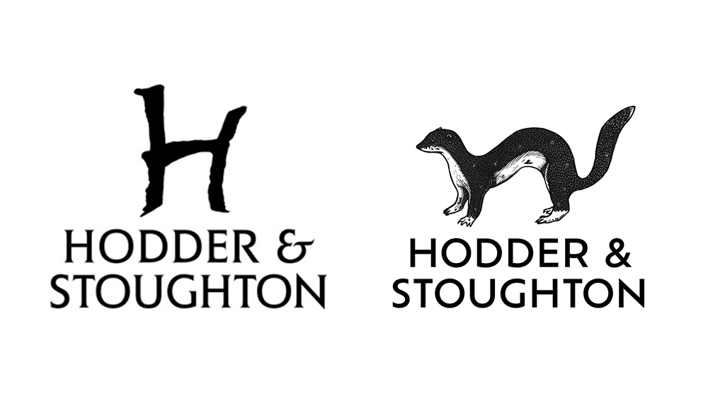
Designed by the publisher's art director Alasdair Oliver with freelance illustrator Jonathan Ashworth, the new Hodder & Stoughton logo features a hand-drawn stoat. What does the cute but lethal Eurasian erminet have to do with a major bookmaker whose history dates back to the 1840s? Well, it's a clever cryptic clue pointing to the correct pronunciation of the brand name. It's 'Stoat-on' (no, not Stout-on, Stuff-ton or anything else).
Even without the clever allusion to the name, the new logo is a win for me. It's a lot more memorable, replacing what was a kind of crooked, jagged 'H' that didn't know if it wanted to be upper or lowercase and looked like it had escaped from a the logo of a metal band. Now, alongside the stoat, the old logo looks like maybe it was intended to be a prehistoric cave painting of an animal of some kind.
Katie Espiner, Hodder & Stoughton's CEO, said in a release about the rebrand: "During Hodder & Stoughton’s many years of success and heritage, one thing has remained elusive: how exactly do you pronounce our company name? Our new logo and visual identity is a playful motif to help solve this conundrum.
"When I first started working here, our non-fiction executive publisher Kirty Topiwala told me that there was a very memorable poem about the correct pronunciation of Stoughton. What Alasdair and Jonathan have created feels timeless but full of energy, perfectly capturing the spirit of Hodder & Stoughton. Above all, our stoat stands for clarity. Clarity in who, how and what we publish, clarity in how we bring expertise, specialist knowledge and first-class market awareness to our publications, and clarity in who we are.”
The design could be a contender for our list of the best new logos of 2023. For more inspiration, see our picks of the best logos of all time and the best 21st century logos.