When the team at Pentagram release new work, we tend to pay attention, so I was pleased to hear news of a new identity created by Marina Willer and her team.
This new work redesigns the identity of an opera company, Glyndebourne, which is housed in a 600-year-old Grade II listed manor house and has been a venue since 1934.
The space is well-known for its magical settings and creative productions, and is both cosmopolitan and at the same time, quintessentially English.
Marina and team were brought on board to redefine Glyndebourne as it approaches its centenary – ensuring it remains "at the forefront of opera's story" for new and loyal audiences and other stakeholders.
Could this be a contender for our best rebrands of 2020s piece?
The identity is centered around the positioning 'Only at Glyndebourne', which represents the unique nature of going to Glyndebourne.
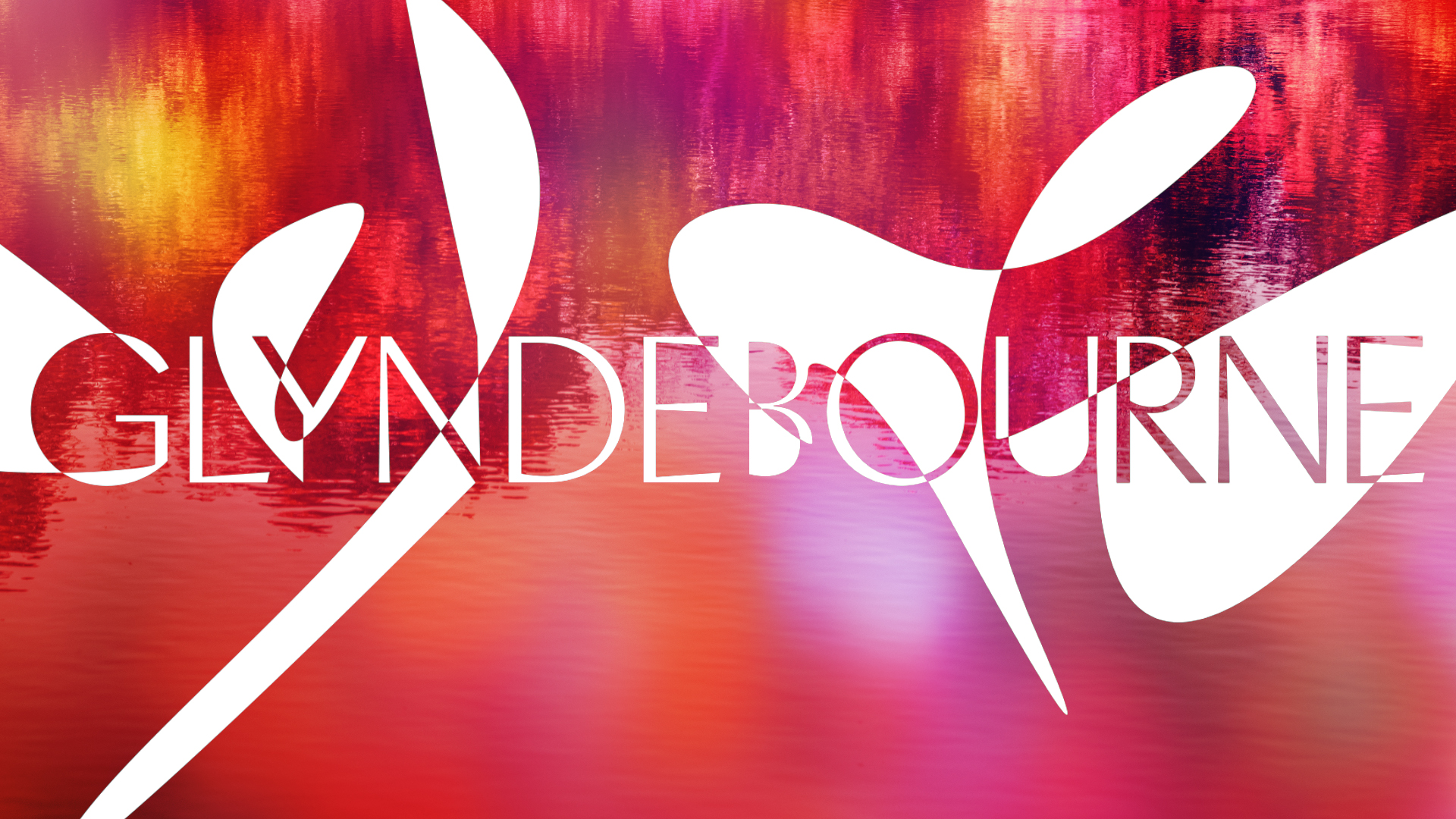
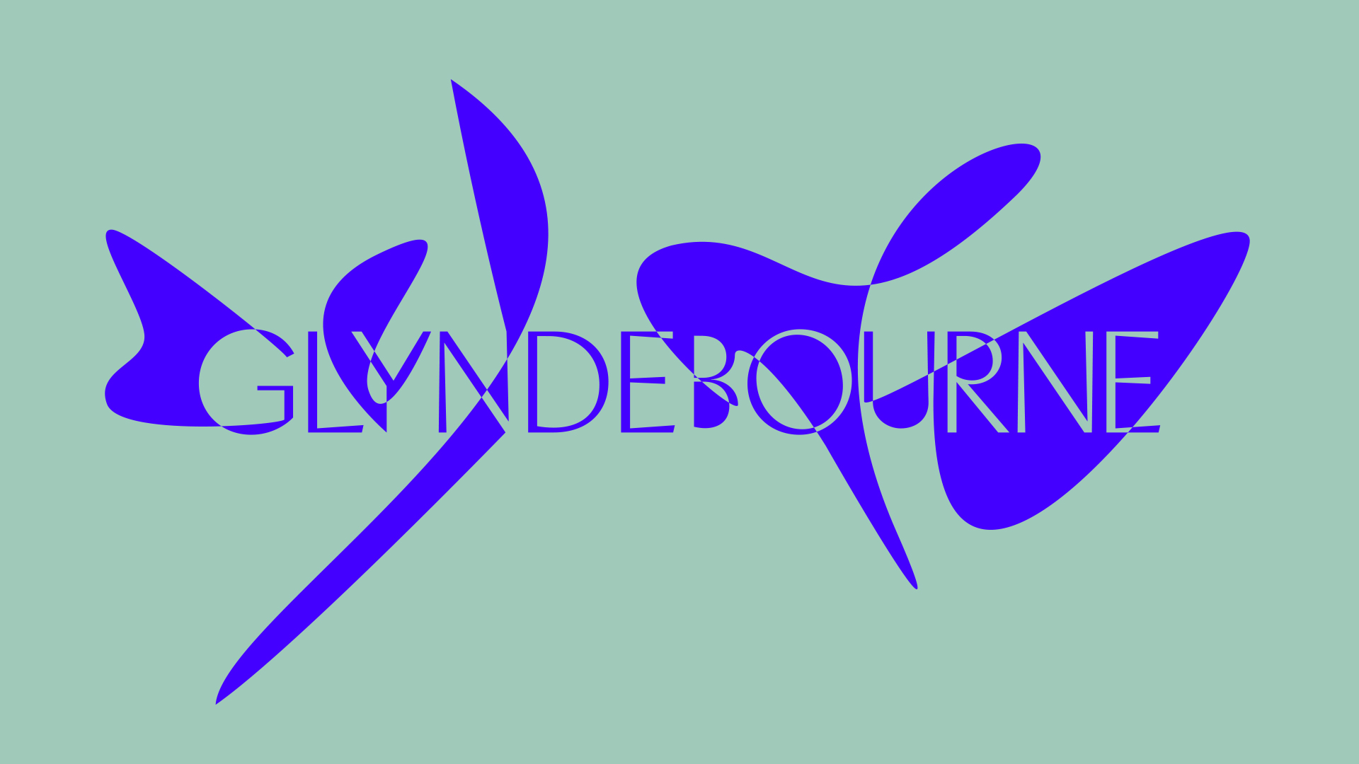
The new identity includes a new monogram and logotype, which uses Heavyweight Digital Type Foundry's Pacific as a headline font family.
The part that particularly caught my attention is the way the logotype moves to music (above) – it looks as if it is responding to a light being shone on it. This adds extra drama and brings a sense of the opera to the scheme.
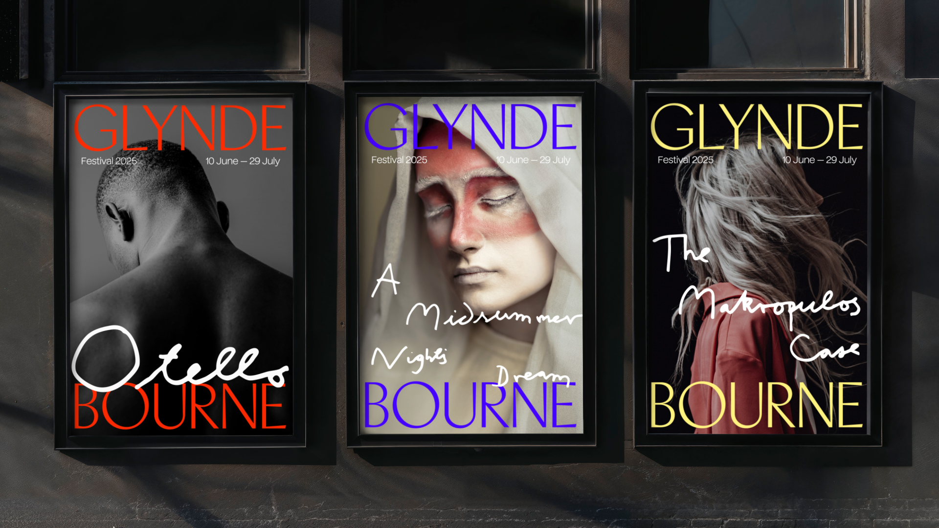
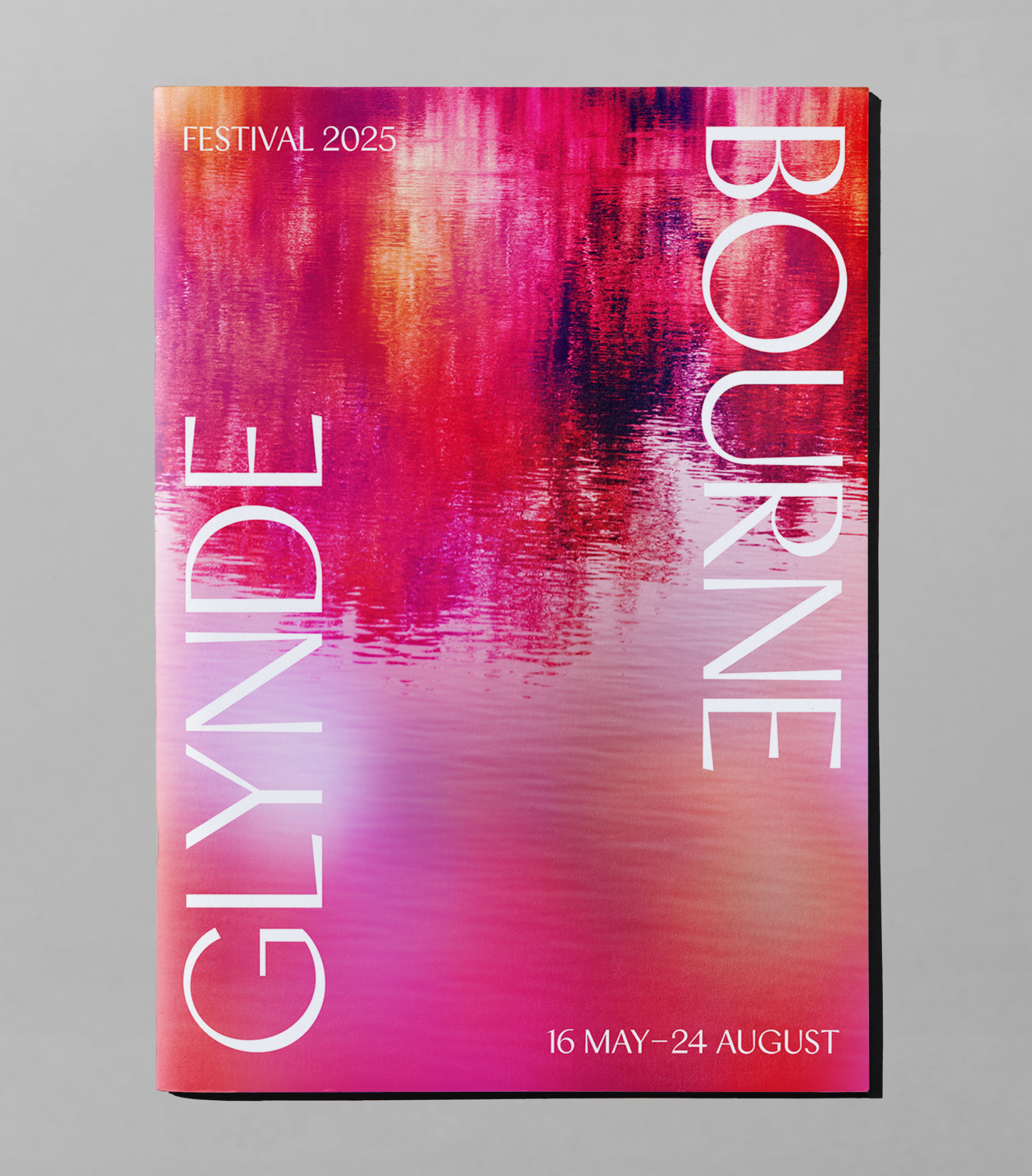
I also like the way that the text Glynde' and 'Bourne' are split up across festival posters and the like.
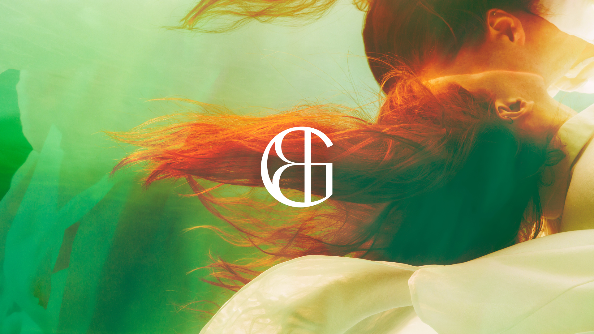
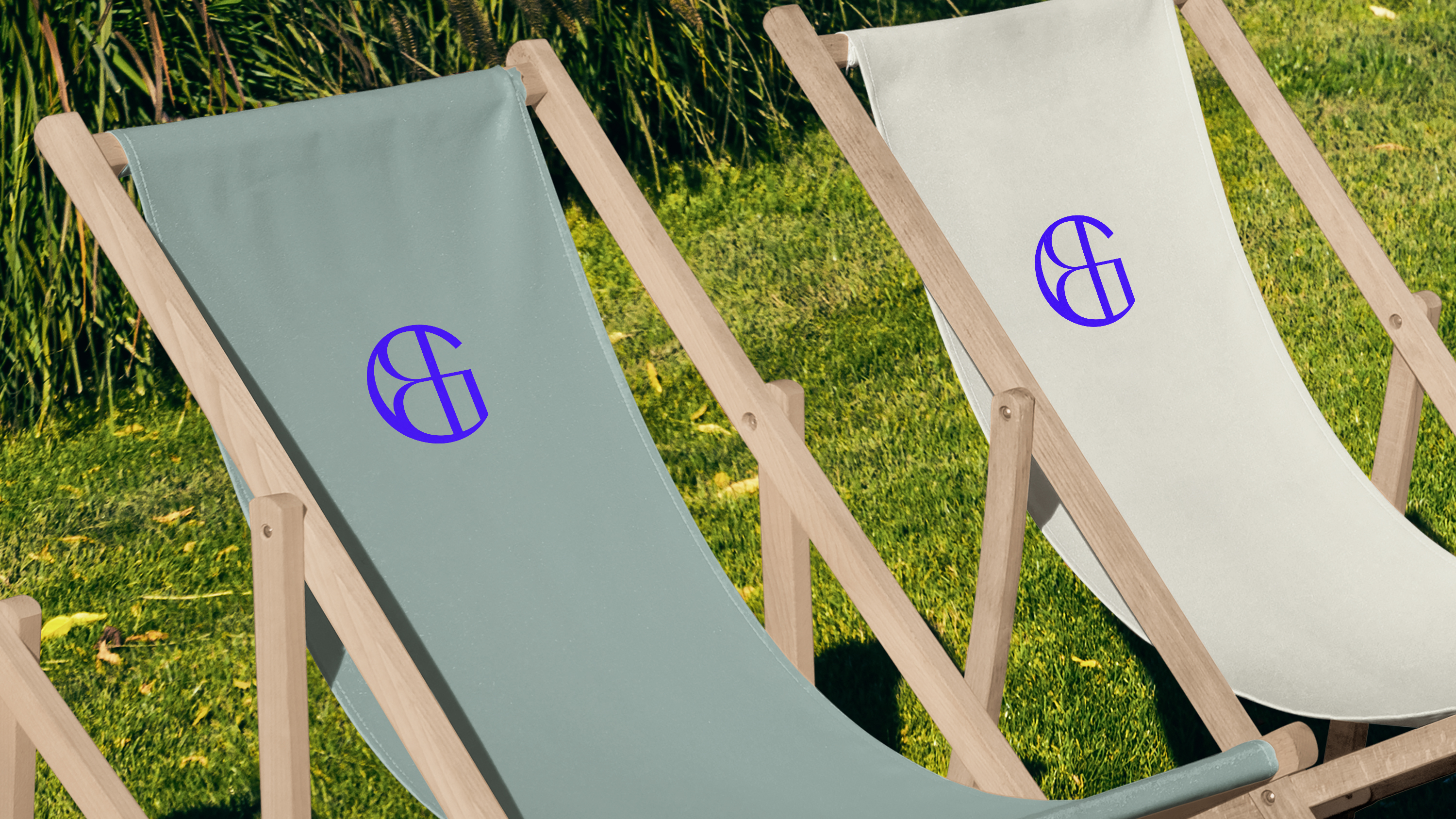
The monogram is also clever – combining the 'G' and the 'B' on Glyndebourne in a smart and sophisticated way that looks particularly good on the likes of deckchairs.
The colour palette draws from a range of elements unique to Glyndebourne, there are references to nature, the fabric of the building and to natural dyes used in the costumes. The hero colour is Klein Blue, which was inspired by local flowers and ties the scheme together.
Glyndebourne hosts an annual summer Festival, which showcases over 70 opera performances in an award-winning opera house. Its attendees famously dress up exuberantly and picnic in the grounds in the long intervals between acts.
For the Festival Opera titles, a specific handmade type style is used to highlight the authorship of those behind each production. The style is based on the handwriting of those who create Glyndebourne productions.
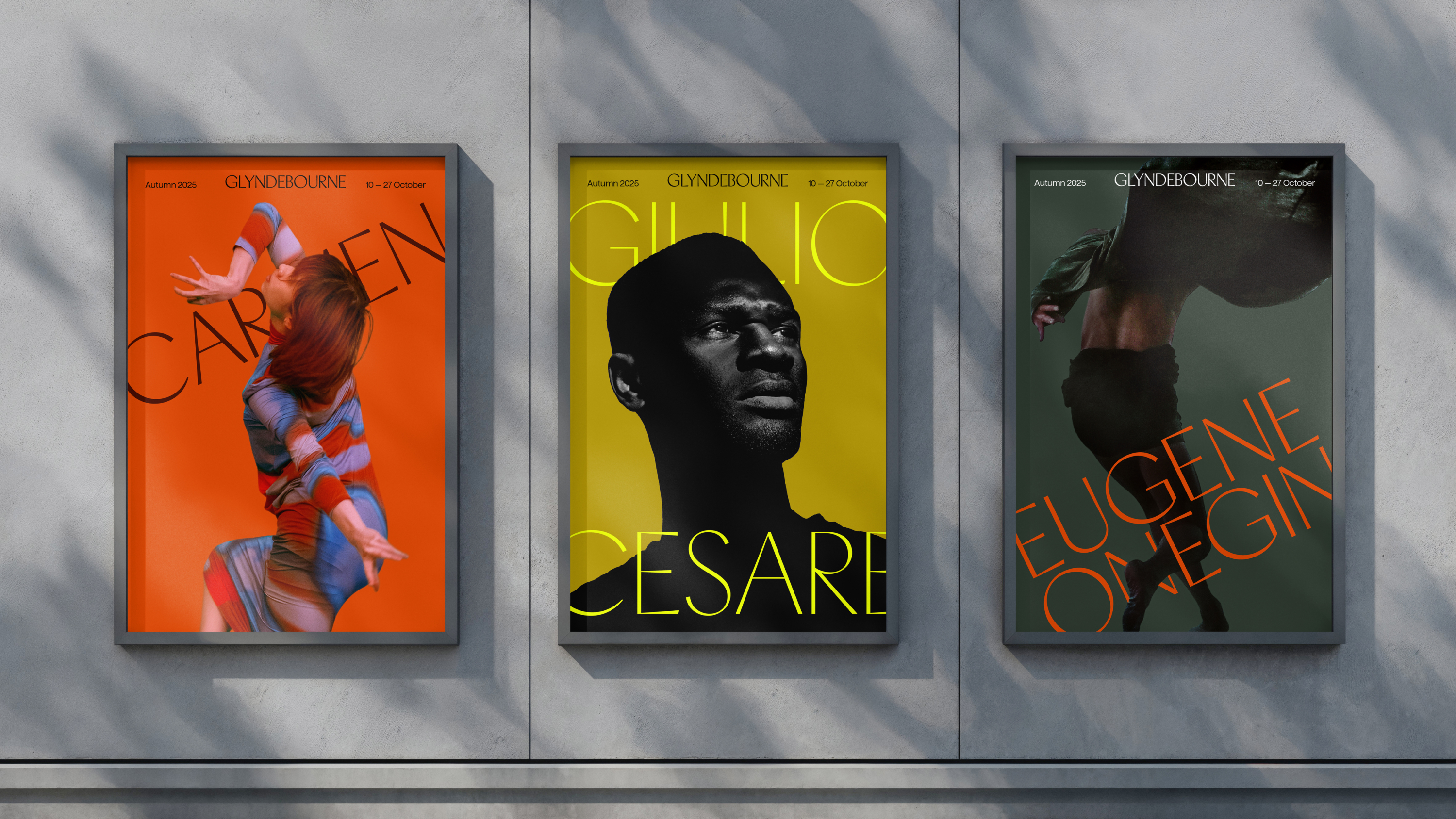
For comms, the Festival design style is more composed and dramatic, while the Autumn season, which has been designed to attract new audiences to the opera, has a more playful and experimental approach.
The same applies to the photography and film style. The Autumn season has a more experimental style while the Summer season collateral is more composed, yet is flexible for different purposes.
Pentagram also created the imagery for the summer Festival 2025 launch campaign, and a brochure design has become part of the new brand guidelines. The brochure is a thing of beauty, with its multi-layered images made up of the theme of each opera combined with textures from Glyndebourne's gardens and lake, and its stylish script font advertising the name of each opera.
The scheme overall feels very fitting for Glydenbourne. It's sophisticated and modern yet steeped in heritage – perfect for the opera.
It reminds me a little of the Brand Impact Award-winning identity for the National Portrait Museum, created by EDIT, which also has a monogram and similar typography.
What do you think of the design? Let us know in the comments.