Quang San Art Museum has just unveiled a slick new rebrand, inspired by Vietnam's rich artistic identity. Based in Ho Chi Minh, the institution celebrates the experience of art, not just their surface-level visual delights, inspiring a new brand identity shaped by dialogue and emotional resonance.
The best rebrands are often the result of carefully balancing heritage and contemporary design, and Quang San Art Museum's new look embodies this. With a sharp new logo, modern typeface and stripped-back, earthy colour palette, the identity effortlessly radiates class and style fit for a new generation of art lovers.
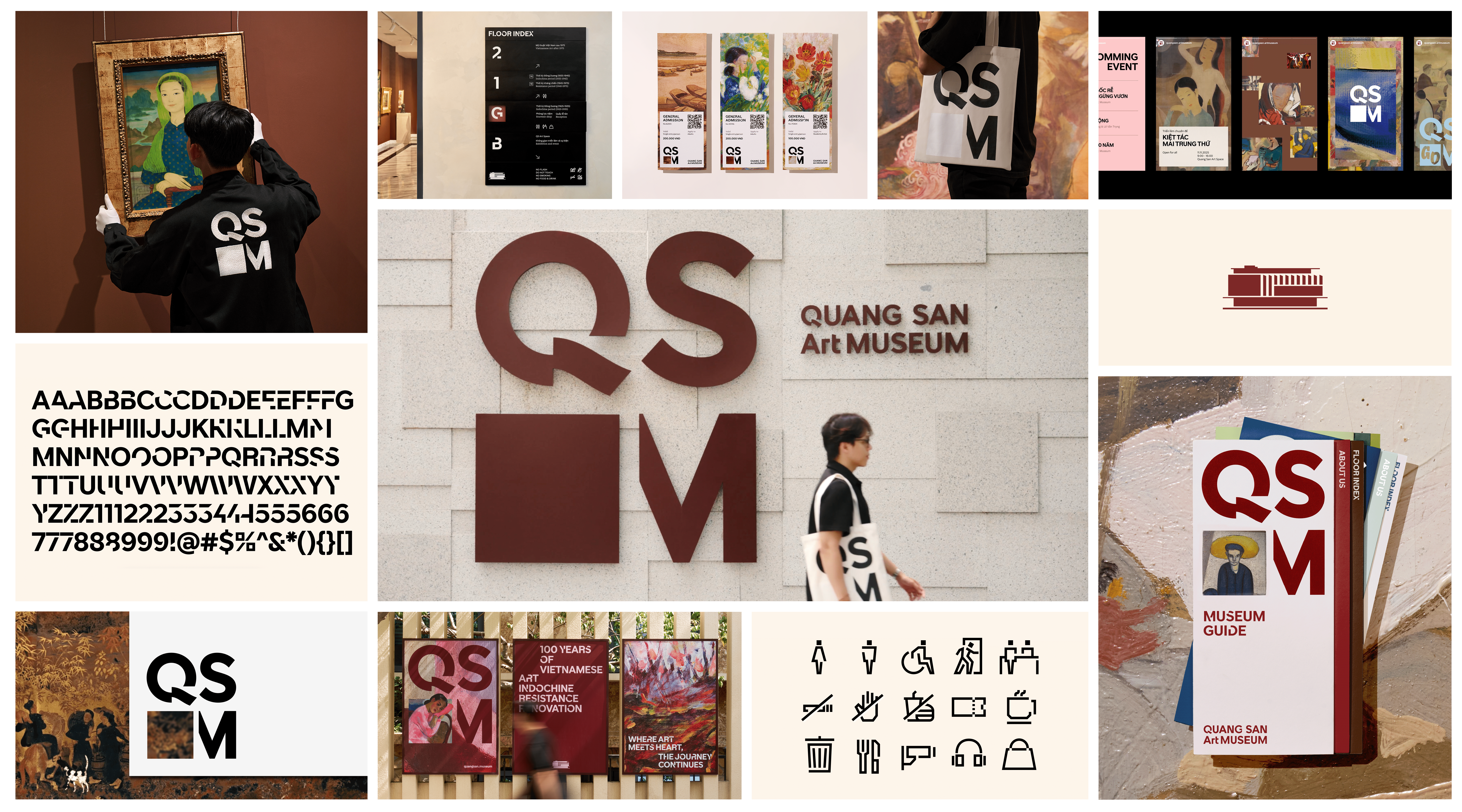
Created by branding studio M — N Associates, the project is shaped by "Layers of Contemplation" – a creative motif inspired by the composition of paintings. Considering the role of canvas, frame, and gesture in forming a unified piece, the identity takes inspiration from the collective harmony of the artwork and the tension of multiple elements constructing a whole.
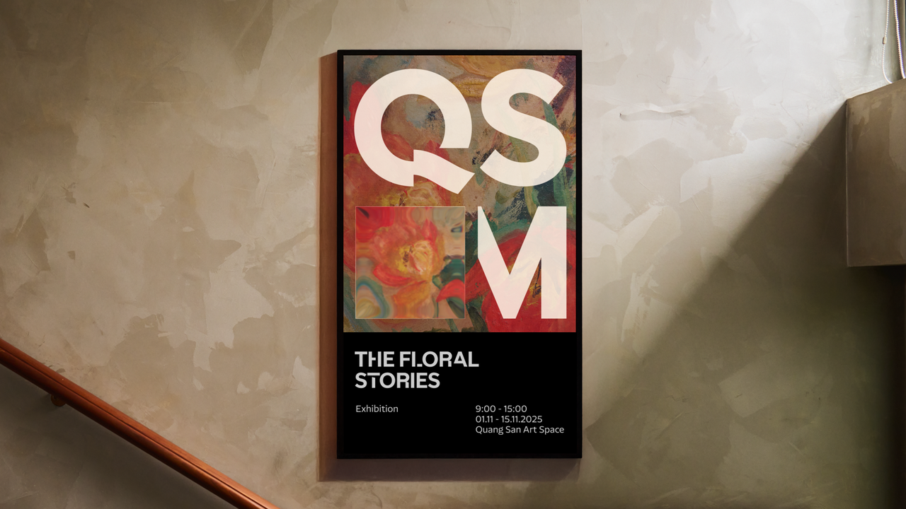
At the centre of the rebrand is the art museum's new logo, featuring the slick acronym QSAM. The design creates a visual structure where the rectangle replaces “A” as "a symbol of art: a blank frame, a window or a canvas." Flexible and contemporary, the logo lockup mimics the frame of a painting, already inviting a quality of contemplation.
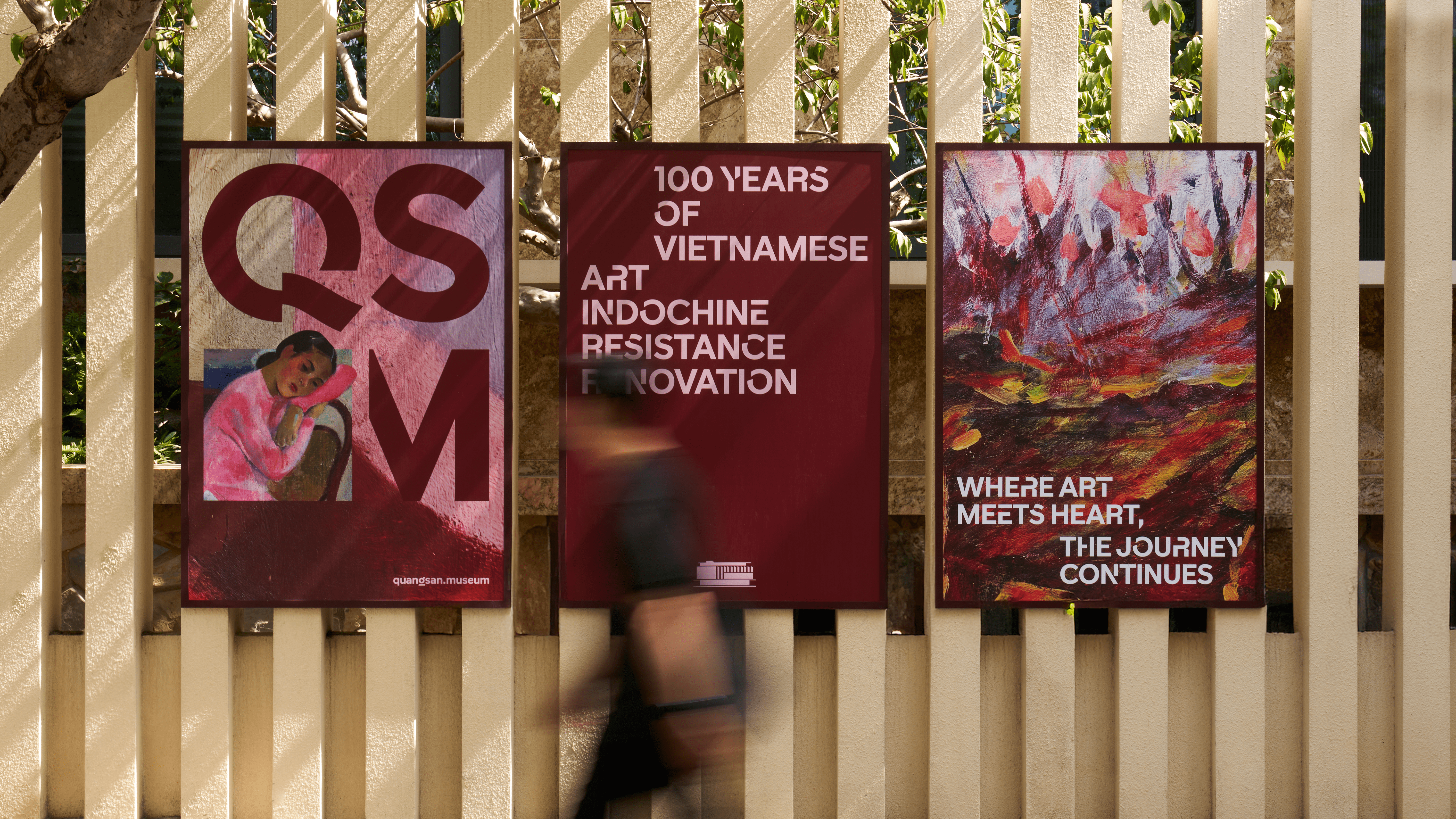
Typography plays a large role in the rebrand, giving the identity a refreshed, modern edge. Custom typeface, QSAM Display, takes inspiration from the museum's architecture, juxtaposing sharp angles with curved, delicate features to create a dynamic, contrasting font. Paired with NaN Serf & NaN Serf Sans for the body text, "Each form is shaped like a brushstroke on canvas, while also drawing directly from the museum’s distinctive column façade."
With a focus on texture, the photography used throughout the rebrand features pieces from the museum's collection, highlighting the stories to be found within the art. "Presented together, these details form a constellation of perspectives, inviting viewers to travel across eras, mediums, and emotional landscapes where each painting becomes its own intimate universe," the case study reads.
Throughout the rebrand is an innate sense of rhythm – a steady, serene flow created through slick motion design. Opting for clean transitions and quiet, functional navigation, the museum's website captures the same sense of serenity found within its walls.
For more inspiring design from M — N Associates, check out their beautiful branding for this stunning fusion restaurant. If you're after more rebrands, take a look at the Guggenheim’s modern masterpiece of a logo.