Petals & Roots is a weekly video series fronted by me, Rachel Bull, Head of Gardens at Homes & Gardens. Every weekend on social, I share my seasonal gardening and flower arranging expertise and advice.
You will often hear me say when I'm working in my home studio, 'you're only as good as your flowers'. And it's true. Selecting the best quality, combinations and colors of flowers and foliage is what is going to set your floral designs apart, whether you're a pro or an amateur arranger.
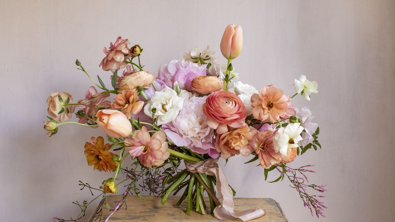
One trick I love to teach people is the art of color washing with flowers. This is when you pink one shade and build a tonal mix around it from all the colors within that spectrum.
In the demonstration for Petals & Roots below, I show you how to achieve a stylish, effortlessly cohesive design for your flower arrangements. And here I'm going to give you more detail about why it works and how to do it.
Why color washing works in floral design
By using flowers in varying tones of the same hue, from the palest tints to the deepest shades, you can build depth and sophistication, while keeping the look cohesive.
Color washing works because it creates harmony and flow, and from this the eye can move effortlessly across an arrangement without it feeling at all jarring or contrasting.
It’s an especially effective technique for evoking mood. For instance, soft tonal washes feel serene and romantic, while stronger, saturated colors can bring drama and intensity to a room or a table setting.
Another thing I love about this approach is that it also highlights texture and form, as you can pick out subtle contrasts in petal shape or foliage color and work with them to pick out different shades, as well as show off their minute details.
How to color wash with flowers
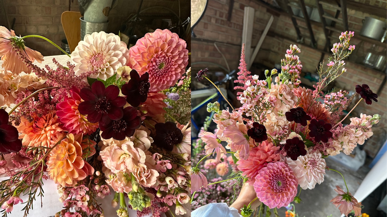
The key concept of color washing with flowers is to pick a shade you love, and simply choose other colors from within the same spectrum.
I demo using pink for Petals & Roots, and have flowers in shades of blush, baby pink, magenta, coral, peach-pink, and burgundy. In my design I use astilbe, dahlias, wax flower, chocolate cosmos, stocks and butterscotch phlox, and apricot cosmos.
The trick is to pick a range of flowers in varying degrees of pale and warmth. For instance, within the pink spectrum you could also have powder pink and shell pink as pale tones; rose and watermelon pink for your mid tones; raspberry and fuchsia make great saturated pink shades; and antique rose, salmon or nude are your muted and dusty variants.
Another spectrum example is purple. For the cool shades pick lilac and periwinkle; mid tones could be violet and amethyst; deeper, richer shades could be mulberry or aubergine; and muted tones would come from dusty mauve and lavender.
Key color theory tips to remember
The essence of colour washing with flowers lies in subtle variation, and being able to pick up on the tiny details in a petal or a leaf and bring those out in your design.
A few more of my key tips are:
Remember to add neutrals as breathers
Adding soft neutrals, such as cream, pale green, or even muted mauve foliage, gives the eye a place to rest and stops your arrangement from feeling too flat or heavy.
You can still play with texture to add dimension
Texture becomes your drama in monochromatic schemes. Mix smooth petals, such as roses and tulips, with frothy ones (astilbe) or feathery fillers such as grasses or Queen Anne’s lace to keep a tonal design lively.
Experiment balancing emotion with your palette
Soft pinks and lilacs evoke romance and calm, while richer purples and magentas feel luxurious and dramatic. Think about the mood you want to set, and choose your tonal range accordingly when planning your design.
This amazing guide uses color theory as inspiration for flower arrangements. The book features 175 arrangements that show myriad ways to combine flowers of different hues, all built around color schemes.
These floristry scissors are very similar to the ones I use every day The ergonomic grip means no strain on my hand or wrist, and they are incredibly sharp.
A color wheel is one of those things you don't really think you need, but when you have one you will use it all the time! I wouldn't be without one for ideas on harmonious palettes and contrasting tones and work effortlessly together.
Understanding color rules and theory is, of course, not limited to floral design. It can be such a useful thing to know how colors work and how to use a color wheel when it comes to your own interior design and fashion ideas, by simplifying and dtreamlinging your decision making.