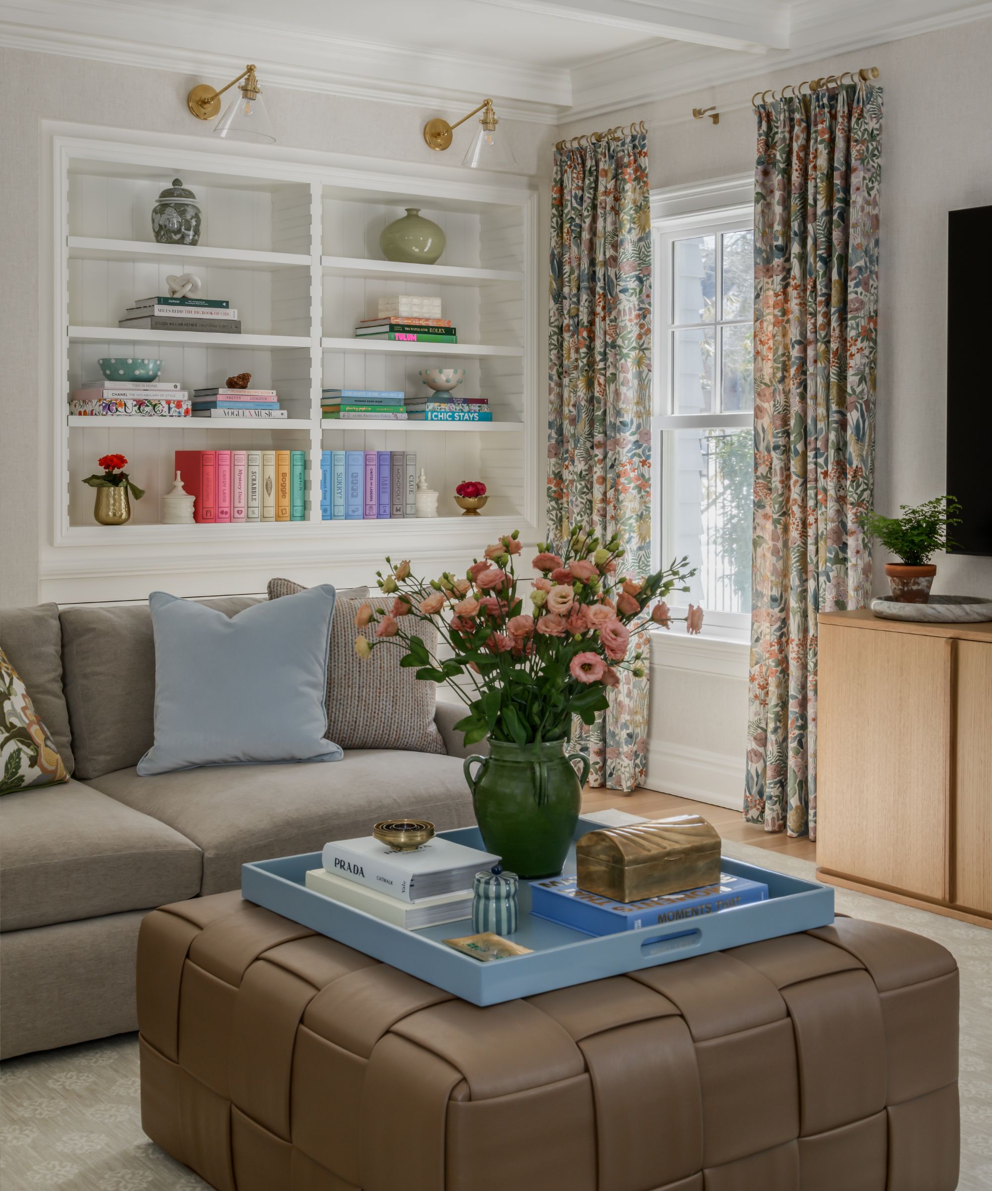
The best color schemes don't just reflect a palette of stylish paint shades; they are in keeping with how the room is used and when it is used, and they acknowledge how the natural light changes from morning to evening.
When color schemes are designed to reflect how a room is used – think light and airy kitchens that enhance the daylight to dark and moody snug rooms used for relaxing in the evenings – there is a notable shift between light and dark; day and night, otherwise known as dual color palettes.
'When picking colors for a whole home, I always look at a mix of light and dark,' says the designer Jessica Hobson. 'You need those dark, dramatic spaces in a home that create special moments and give a big impact, as well as the light and airy spaces that seem more effortless and seamless.'
Here, designers explain how to create daytime and evening room color ideas for a home that feels dynamic across the day.
The 10:00 AM Palette
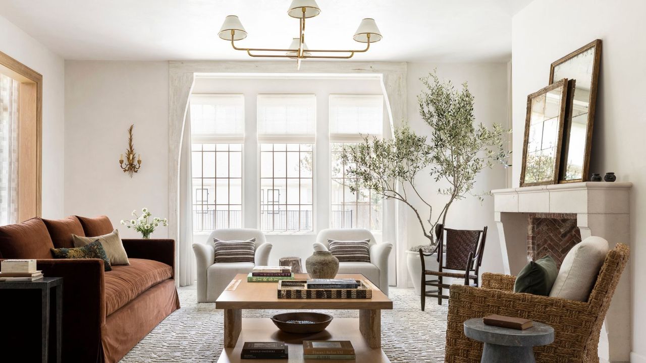
10 am color palettes are for rooms used primarily in the morning: think kitchens, breakfast nooks, and open living spaces. Because these rooms typically receive lots of daylight, they lend themselves to a palette of neutrals and low-saturation colors, where lightness is enhanced.
'My approach to these spaces comes down to how I want the room to feel – it should be welcoming, soft, and easy on the eyes,' says designer Gabrielle Bove of Opaline Interiors. 'I'm drawn towards shades that are found in nature in less saturated hues and stick with warm whites that pair well with other natural materials like wood and linens.'
While light neutrals work well in these rooms, it's important to choose the right undertones to ensure the room feels soft and welcoming. 'The best 10 am palettes feel bright and fresh without feeling cold,' adds Lauren Saab of Saab Studios.
'Morning light is very revealing, so softer whites, warm neutrals, and natural materials tend to work especially well,' says Lauren. 'These palettes work especially well in lighter, airy rooms because they help the space feel calm, open, and naturally energized throughout the day.'
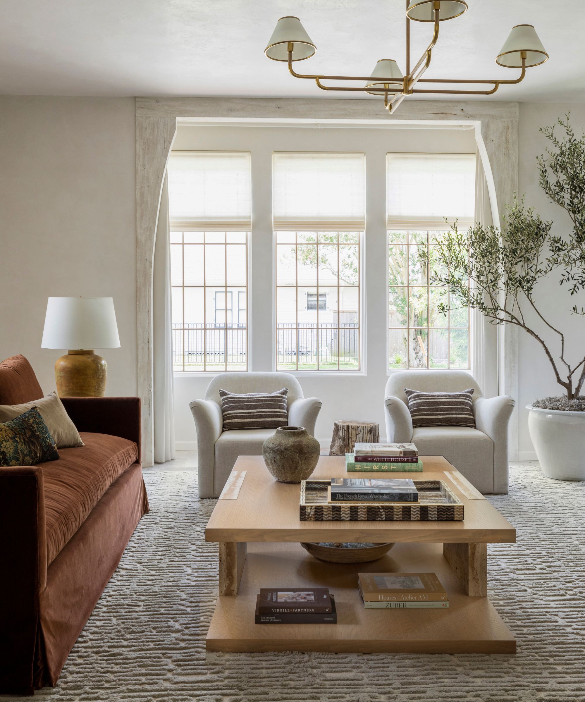
These types of color palettes are a favorite for designer Marie Flanigan, who often turns to decorating with neutrals. 'I gravitate toward palettes that feel luminous, soft, and quietly layered during the day,' she says. 'In light and airy rooms, I prefer to let the walls and natural light create the brightness while warmth and saturation come through materials like wood, linen, leather, and stone.'
'This approach gives a space depth without heaviness and allows the light to move beautifully throughout the day,' she adds. 'The result feels calming, timeless, and deeply connected to the architecture.'
When choosing paint colors for rooms mainly used during the day, it's important to base them on the room's orientation, since this will affect how warm or cool they look. 'Different undertones in a paint color will be revealed depending on the intensity and direction of natural light,' explains designer Sarah Fischer of Sarah & Sons Interiors.
'Elements in a room that I consider 'bossy' can also influence those undertones,' she adds. 'For instance, wood cabinetry could influence a seemingly neutral color to read as more pink or yellow. My goal is to find a paint color that complements existing elements and has a slight muddiness so that it doesn't feel too flat and can handle shifting light throughout the day.'
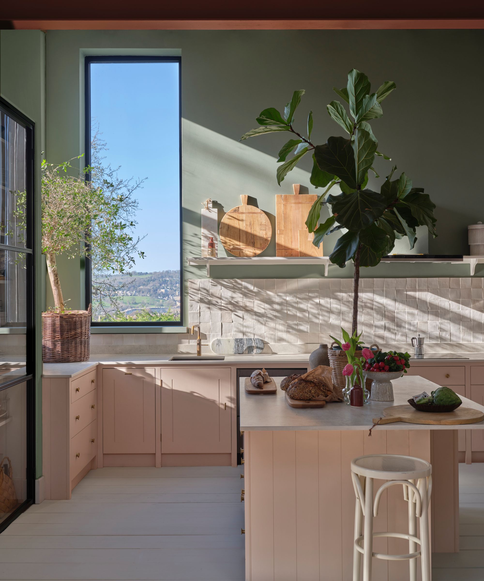
While warm white paints set a clarifying backdrop, something slightly more colorful can add energy to a room. 'The spaces in which you normally spend time in the mornings set the tone for how you start your day,' explains the designer Ashton Taylor. 'We tend to design these spaces to feel simultaneously soothing and energizing.'
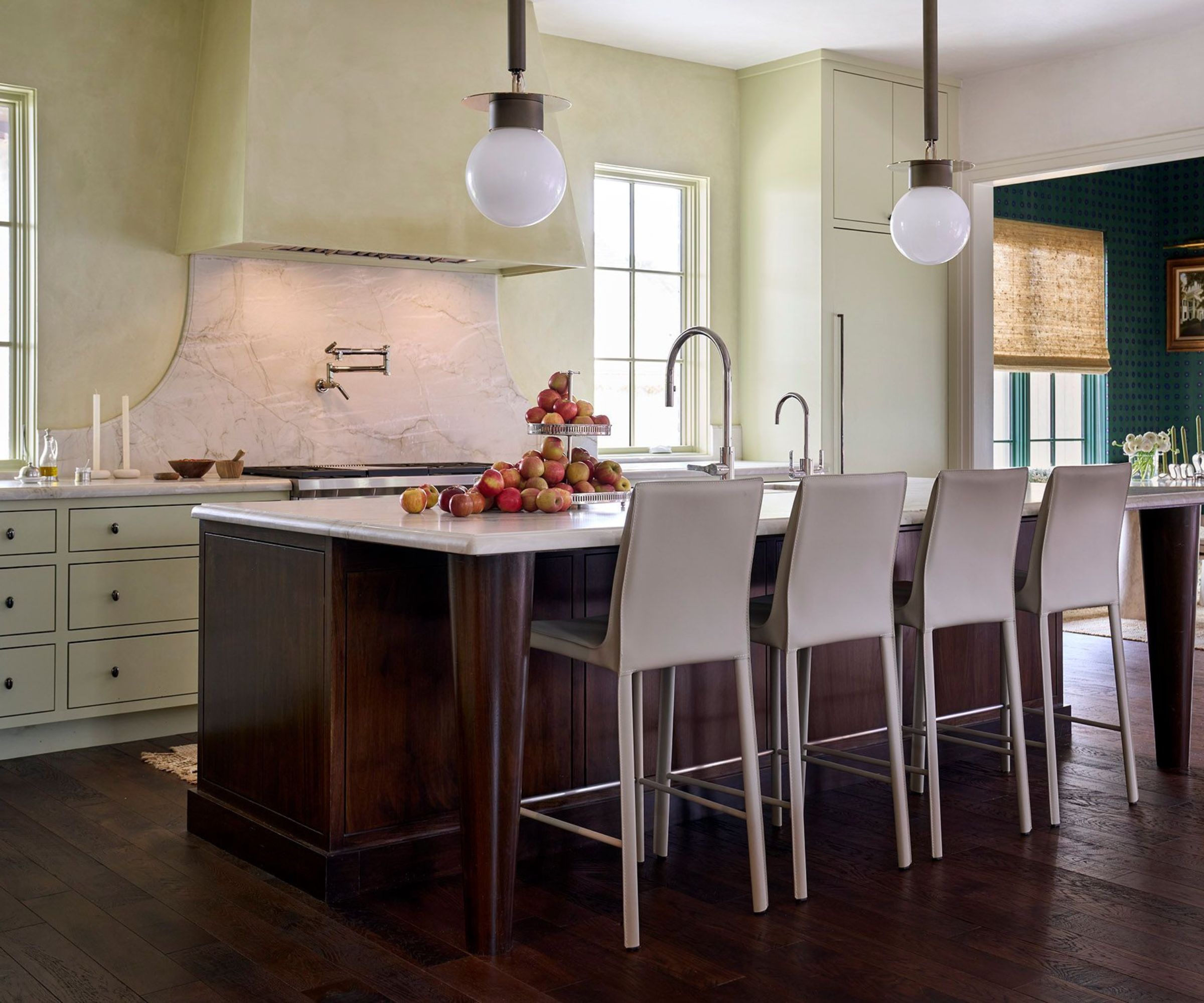
This light green kitchen is light and airy, with extra warmth and optimism. 'It feels like a breath of fresh air first thing in the morning,' explains Ashton. 'It's the perfect backdrop to make a quiet cup of coffee or to cook breakfast with the whole family.'
Beyond paint colors, you should also consider how decor enhances the mood. 'During the high daylight hours, the more light, the better,' explains the designer Jessica Hobson. 'Open those window coverings, turn on the overhead lights, and lamps. This will give you a bright and energetic vibe.'
The 10:00 PM Palette
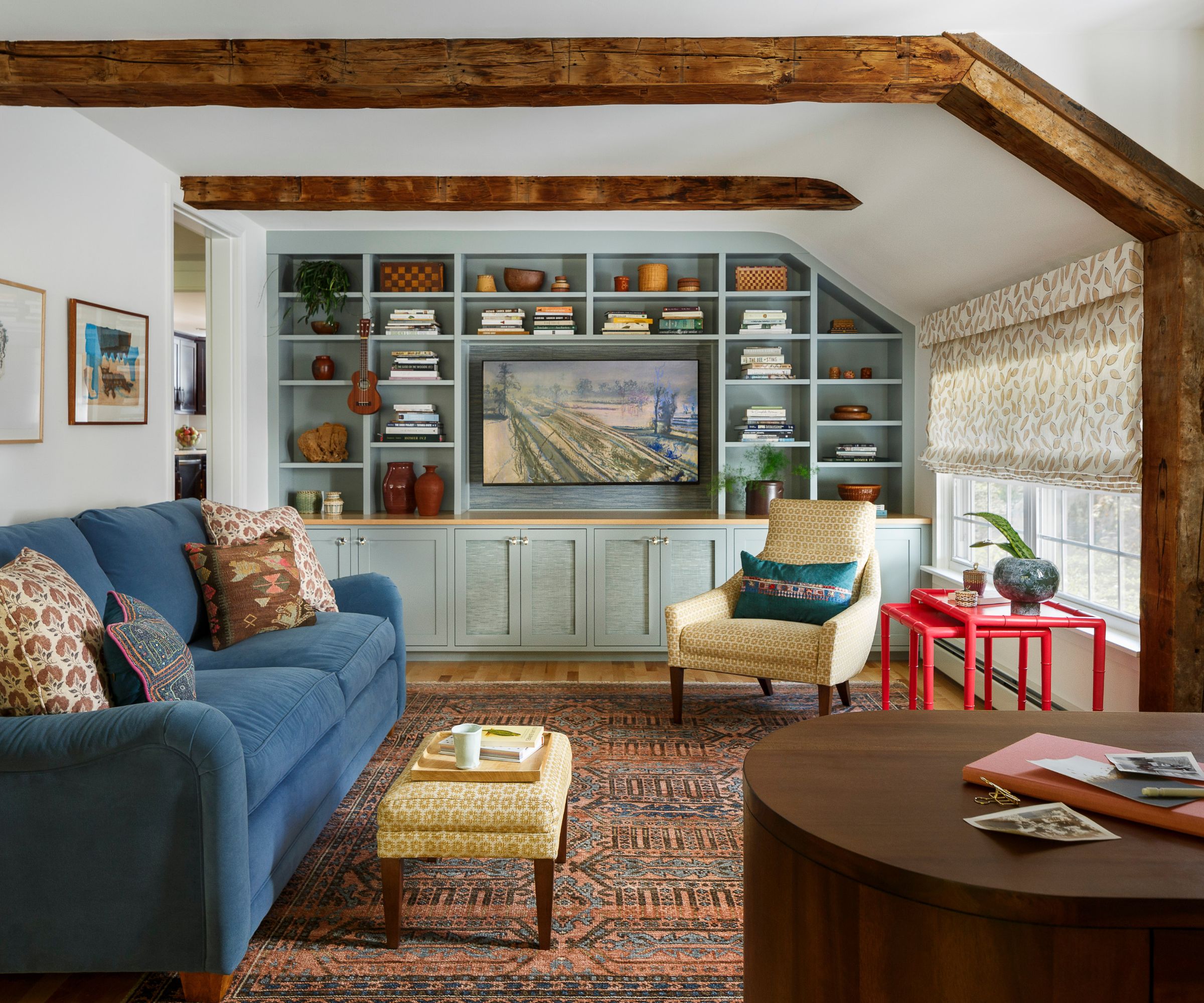
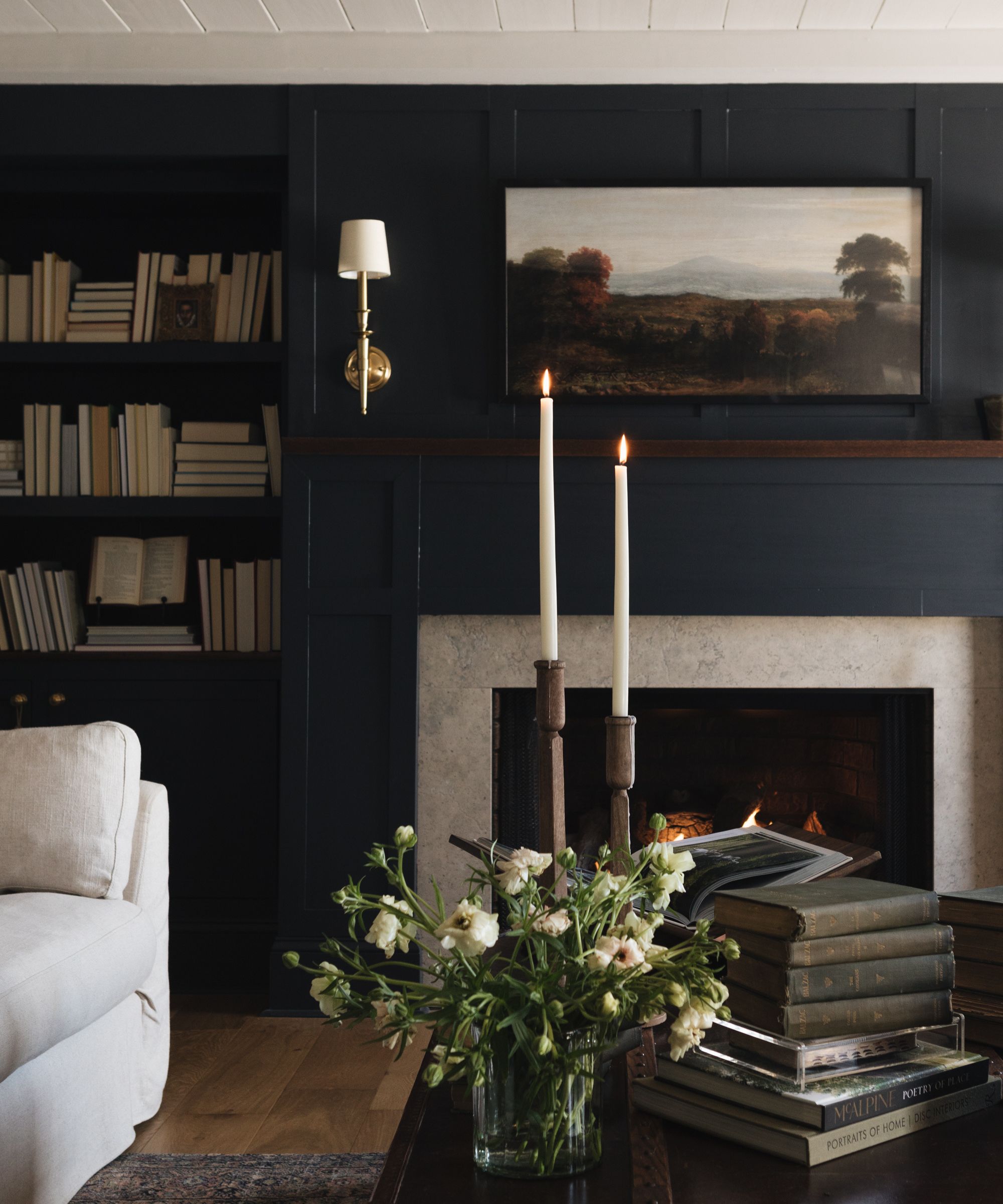
By contrast, 10 pm palettes are for rooms used in the evenings, taking on a much cozier, cocooning feel that nurtures rather than awakens. 'During the day, they can read heavily, but once the lamps are on and the light drops, those deeper tones start to feel softer and much more atmospheric,' says Lauren.
'Darker palettes work especially well in spaces like libraries and powder rooms because they are spaces typically experienced for shorter periods of time,' she says. 'Those deeper tones can create a strong sense of mood there without becoming visually overwhelming.'
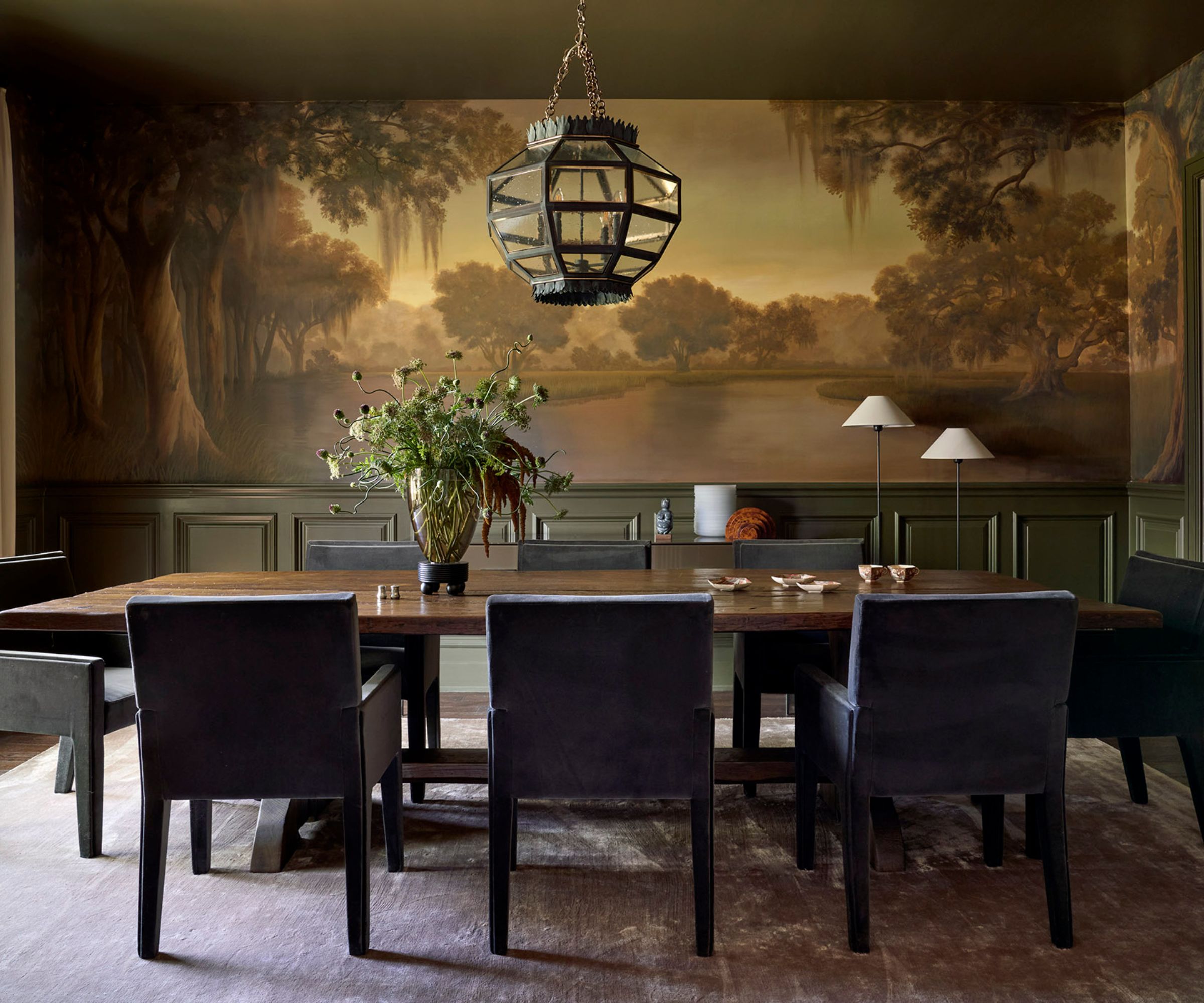
'There is nothing I love more than setting the mood, whether it is a romantic dining room ideal for candlelight or an earthy, neutral living room begging for evening conversations by the fire,' says Ashton.
From dark green to charcoal, rich ochre to muddy neutrals, leaning into dark paint colors is often the best way to set a cozy mood in evening rooms. 'Mixed with luxurious textures and the right lighting, a dark palette feels truly inviting after the sun goes down,' Ashton adds.
Color psychology also comes into play with dark color palettes. 'Richer tones absorb light in a way that makes a room feel grounded, layered, and atmospheric after sunset,' explains Marie. 'I often think about how a home should transition emotionally from 10 am to 10 pm, and deeper finishes help create that shift in mood. Soft lighting against darker materials creates warmth that feels both elegant and comforting.'
When choosing lighting for evening palettes, lean into soft, ambient options. 'Opt for lower wattage with lamps and candles,' advises Jessica. 'A must-have for me in any room is dimmers. Placing fixtures and recessed lighting on dimmers is an easy way to allow you to have full control of the light and overall vibe of the room; I promise they are well worth the upgrade.'
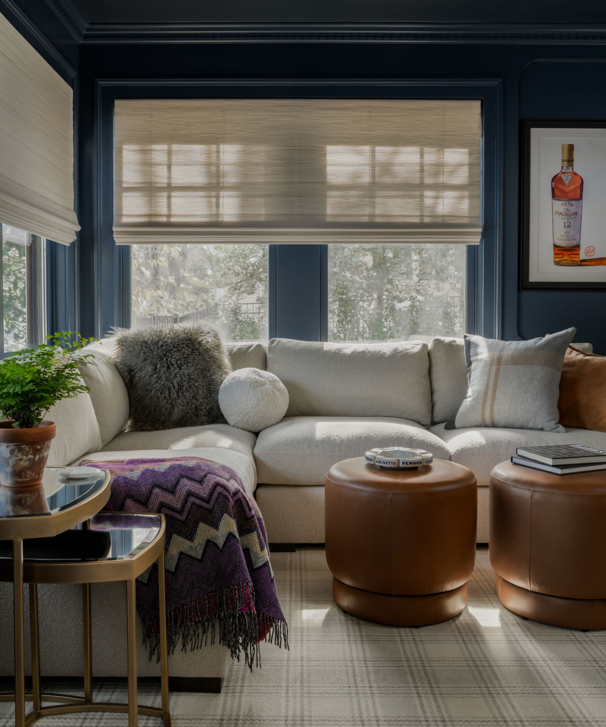
Layering in interior design stops dark rooms from feeling flat. 'I like to layer in darker jewel tones, dark stained wood tones, or different layering techniques like plastered walls or wallpaper,' shares Gabrielle. 'Like in a favorite restaurant or bar, every element in the room aids in the overall experience – a dark velvet sofa, dimmed lighting, sparkle through a gilt mirror, a crystal sconce, a special fabric. All of these layers create an intriguing yet comfortable atmosphere.'
The Transition Zone: Where Day Becomes Night
While it makes sense for morning rooms to embrace lighter palettes and evening rooms darker ones, this can, in practice, create an abrupt contrast between light and dark. To keep things cohesive and ensure a flow throughout your whole home, consider in-between colors in transitional spaces, such as plaster pink paints, earthy neutrals, or mid-tone green paints.
Beyond paint ideas, you can also use clever lighting ideas to shift the mood of a room throughout the day, something that can be needed in open-plan spaces that naturally transition from day to night.
'Perhaps the easiest way to create a change in mood and energy in a room is simply with layered lighting,' Jessica explains. 'I love using multiple light sources in every room: natural light, recessed lighting, hardwired ceiling fixtures and sconces, lamp light, and finally, candlelight. These layers of light allow you to create a mood or feeling in a room without changing anything else.'
How Designers Build Dual-Palette Homes
The best way to design color palettes that work across day and night is to think of your home as a whole. 'I set a vision and concept for the entire home, and then decide on a palette for each room that is dependent on the house, the function of the room, and the overall design direction,' Gabrielle explains.
By doing so, it can help each room within your home to feel connected rather than random. 'A whole home palette should ensure the colors relate and flow from room to room, with the colors complementing each other and the overall design story,' adds Gabrielle.
Aside from rooms that follow an obvious light or dark palette, start with chromatic neutrals in transitional spaces such as entryways that work seamlessly across the day. 'I begin by creating a quiet foundational palette that allows for continuity and flow,' says Marie. 'From there, I layer in moments of depth and contrast in spaces that are meant to feel more intimate or moody.'
Another approach is to start with the hub of the home and build the rest of your schemes around this. 'When designing the color story of a house, we typically start with the room that is the 'heart',' says Nadia Palacios of Nadia Palacios Architecture. 'Whether it’s the kitchen, family room, a bar, or a lounge, whatever the most important room of the house might be, that sets the tone for the whole project. We want colors that complement each other, and we aim to create a balance between richness and neutrality.'
Across all color palettes, remember that lighting is key, helping to set the right mood for the space. 'Lighting and materiality are essential because color is never experienced in isolation,' says Marie. 'Natural light, layered textures, and warm finishes ultimately shape the atmosphere far more than paint alone.'
If you have rooms that are used in equal amounts throughout the day and in the evenings, it's important to find a color that shifts effectively with the changing light – soft in the morning light and cozier in the evenings.
'When selecting a paint color, we consider how the room feels and looks in bright morning sun versus the ambient light needed in the evening,' says Maggie Griesbark of MNG Design. 'We want the space to feel bright and joyful in the morning, but serene and calming in the evening.'
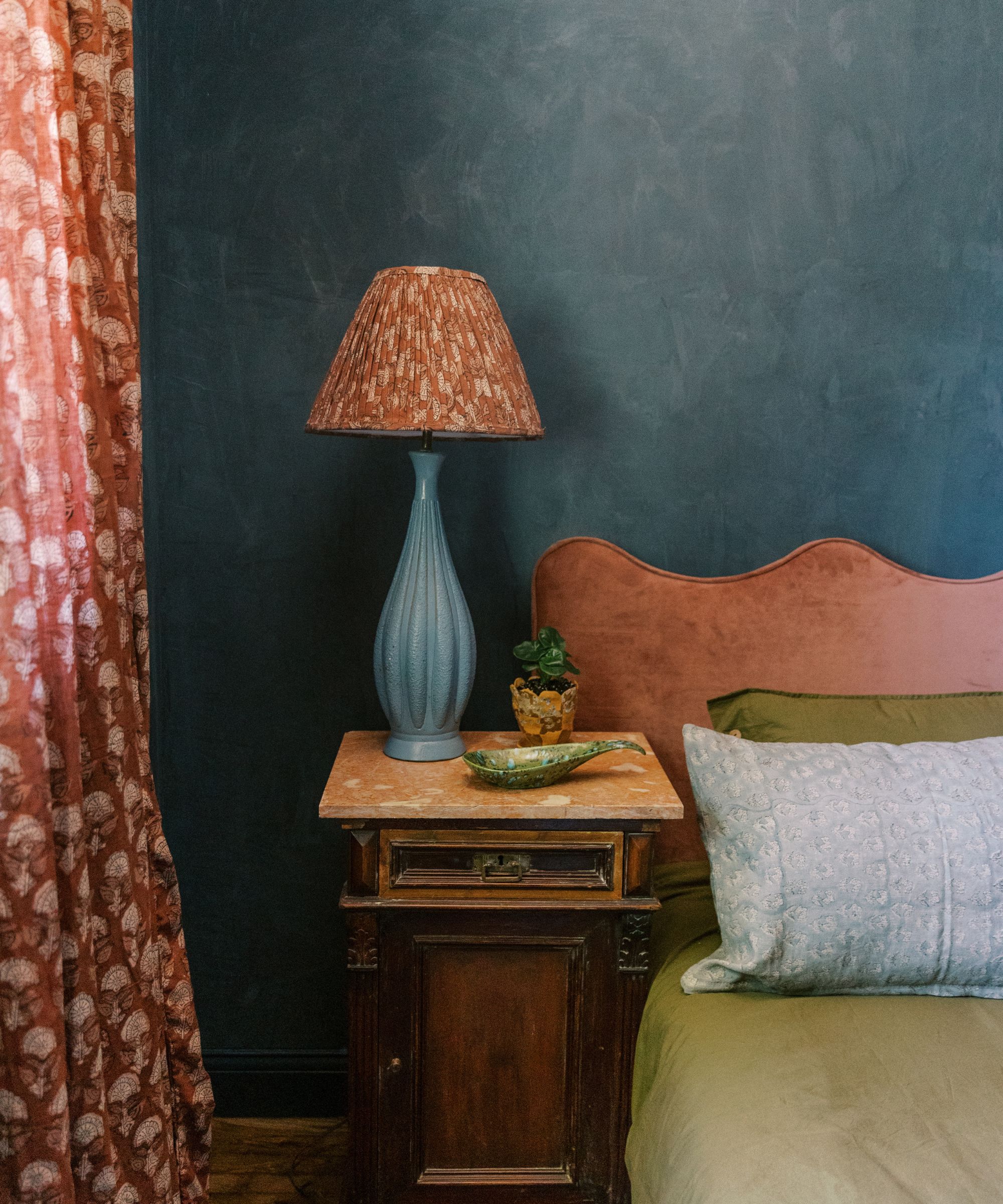
'I find that a soft blue wall paint color mixed with creamy whites and sage greens on upholstery and textiles is a color palette we frequently use in bedrooms,' adds Maggie. 'Additionally, a variety of lighting sources is needed to support the overall mood throughout the day, and window treatments are essential for filtering light properly. All of these elements weave together to create a room that feels welcoming at any time of day.'
Choosing color palettes for your home that are in harmony with the shifting daylight creates balance and helps to define different rooms. Not only do these palettes encourage the intended mood of a room – think a light and airy kitchen or a dark and moody living room – but they also add contrast and interest to a home as it shifts between palettes of varying intensities.