Neutral tones are key for keeping a home's look cohesive, but choosing a color to bring home can prove difficult. Even if you've narrowed down the selection and opted for a tasteful gray-beige shade, perusing the best greige paints on the market can quickly become overwhelming.
Each shade offers subtle differences, bringing its own atmosphere and aesthetic to your home. But interior designers turn to some greige paints again and again, no matter the project – and Benjamin Moore's Light Pewter is a favorite.
A go-to neutral, Light Pewter hue is versatile and complex, and unsurprisingly, one of Benjamin Moore's best sellers. Here's why interior designers favor the shade, and how to incorporate it into your own home.
How to decorate with Benjamin Moore Light Pewter
One of Light Pewter's biggest draws is its ability to accentuate just about any room's design scheme – no matter the lighting, layout, or color palette. Arianna Barone, color marketing manager at Benjamin Moore, says the shade is a 'versatile light warm gray' that works well as a 'foundational' shade.
'Offering the comforting and welcoming vibes of beiges and the modern, fresh touch of grays, Light Pewter 1464 is a very adaptable hue, making it fit seamlessly into a variety of color palettes and design styles,' says Arianna. 'It is a color with true staying power that you will love for years to come.'
1. Anchor your home's aesthetic with Light Pewter
Lauren Saab, founder of Texas-based Saab Studios, recommends using Light Pewter to set the groundwork, allowing it to establish a color scheme for your whole home. She says the shade is her 'go-to neutral when a space needs softness without skewing too warm'.
'Light Pewter is incredibly versatile, which makes it ideal for anchoring a home’s palette,' says Lauren. 'It shifts effortlessly between palettes, anchoring both warm and cool tones without feeling rigid or flat.'
Lauren prefers to use the hue in open-plan homes and shared living spaces, where she says 'cohesion matters most'. Pairing Light Pewter with Benjamin Moore's Saybrook Sage for a 'tonal, grounded scheme' or the brand's Stillwater shade for a 'cooler' look, she has used this neutral time and time again.
'It has a quiet depth, neither beige nor gray, that reads differently throughout the day but always feels grounded,' says Lauren. 'It doesn’t scream for attention, which makes it ideal for rooms meant to exhale in. It has that rare ability to make a space feel both calm and composed.'
2. Add contrast without excess color
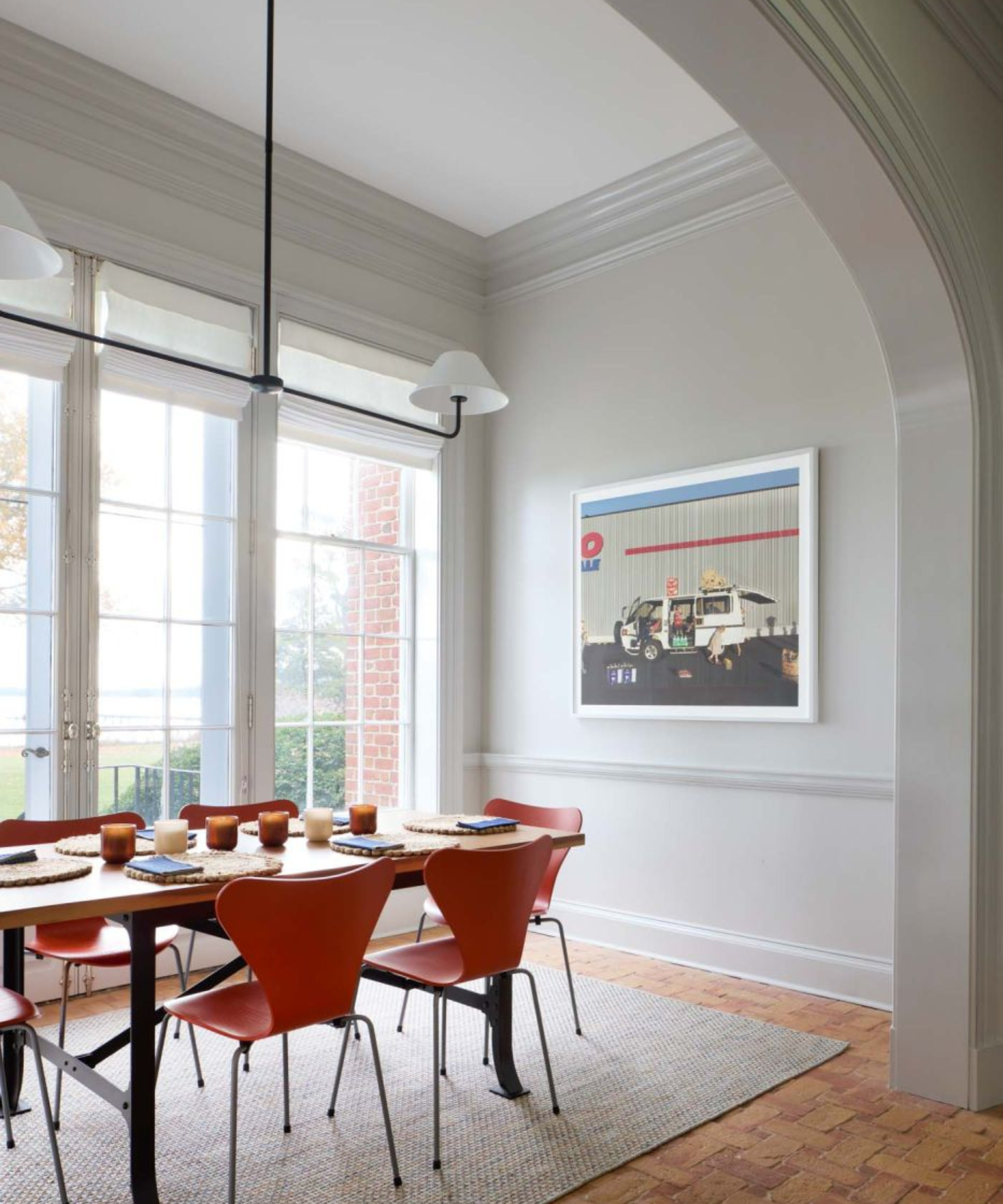
Jennifer Carter, principal designer of New Jersey-based Studio Envie, has used this chameleon shade in multiple projects. She says it's the perfect hue to opt for if you'd like to avoid a stark white or dull gray, but don't have room in your design scheme for another bold color. In this kitchen, she picked Light Pewter for its comforting undertones.
'In the checkered floor kitchen, we used Light Pewter on the walls because we wanted some contrast to the white perimeter cabinets without adding another color into the mix,' she says. 'We wanted it to be a touch warm against the gray flooring and blues in the cabinets and bench seat.'
'The amazing thing about Light Pewter is that it is able to hold its own when paired with blues, greens, pinks, and whites,' Jennifer continues. 'It allows designers and clients alike to pair it with a variety of other colors without it being limiting.'
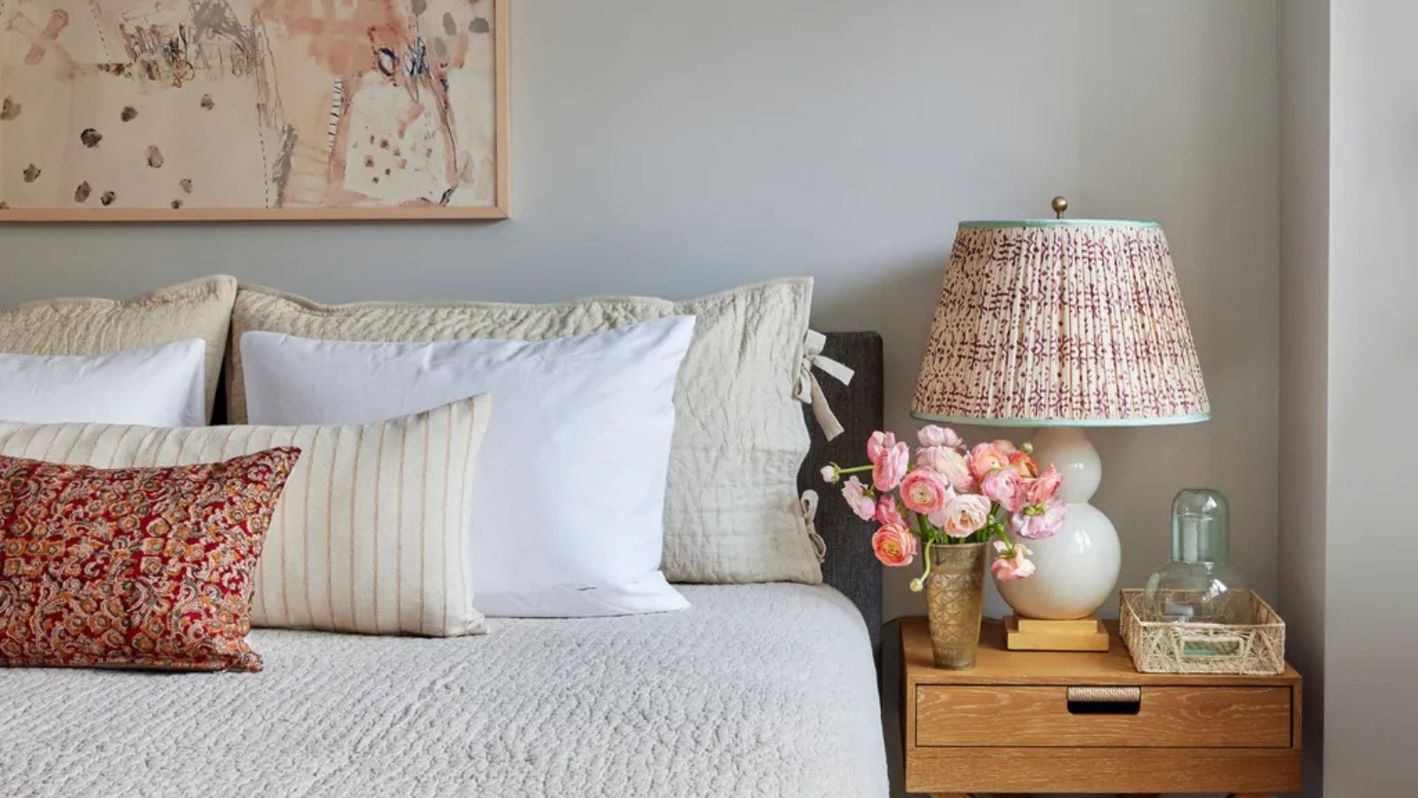
3. Layer Light Pewter with pattern and texture
Light Pewter's ability to establish a calming foundation and truly ground a space makes it the perfect shade to experiment with. Rebecca Amir, founder of New York-based Rebecca Amir Design, suggests layering the hue with eye-catching colors and textures – whether you're after a bold look, or something a bit more serene.
In this bedroom, located in Brooklyn's Cobble Hill neighborhood, Rebecca leaned into the color's pewter undertones, pairing it with blue accents and a patterned headboard. She says she wanted to create a calming backdrop, and allow the textures, details, patterns, and art 'to unfold without competition.'
'I love the way it pairs with a nice crisp white on the trim or millwork – in the Cobble Hill bedroom, we did all of the trim and doors in Benjamin Moore Baby's Breath,' she says.
'Think of Light Pewter as your canvas,' Rebecca continues. 'It's not a color to be afraid of. While I've used it in past projects to create serene bedrooms, I think it would be really nice in a living space as well as where it can be layered upon with patterns and textures that come from the furniture and fabrics.'
4. Experiment with different finishes
Light Pewter shines bright in any single application, but Kathy Heiner – founder of Virginia-based KLH Designs – recommends using the shade in multiple finishes for a dynamic and unexpected design scheme. She uses the greige shade often, even opting for it in her own home, and says she appreciates its ability to blend with a wide range of colors and textures.
'My favorite application is to use high gloss on the trim and flat on the walls,' she says. 'This can really accentuate gorgeous trim in an old house, like this one in Gloucester, Virginia.'
'This color is an excellent neutral as it works well with both warm and cool elements,' she continues. 'I have used it in spaces with heart pine flooring, a blond oak floor, or a grey stained floor. It also looks lovely with most stone and tile selections.'
5. Use Light Pewter as a backdrop for artwork
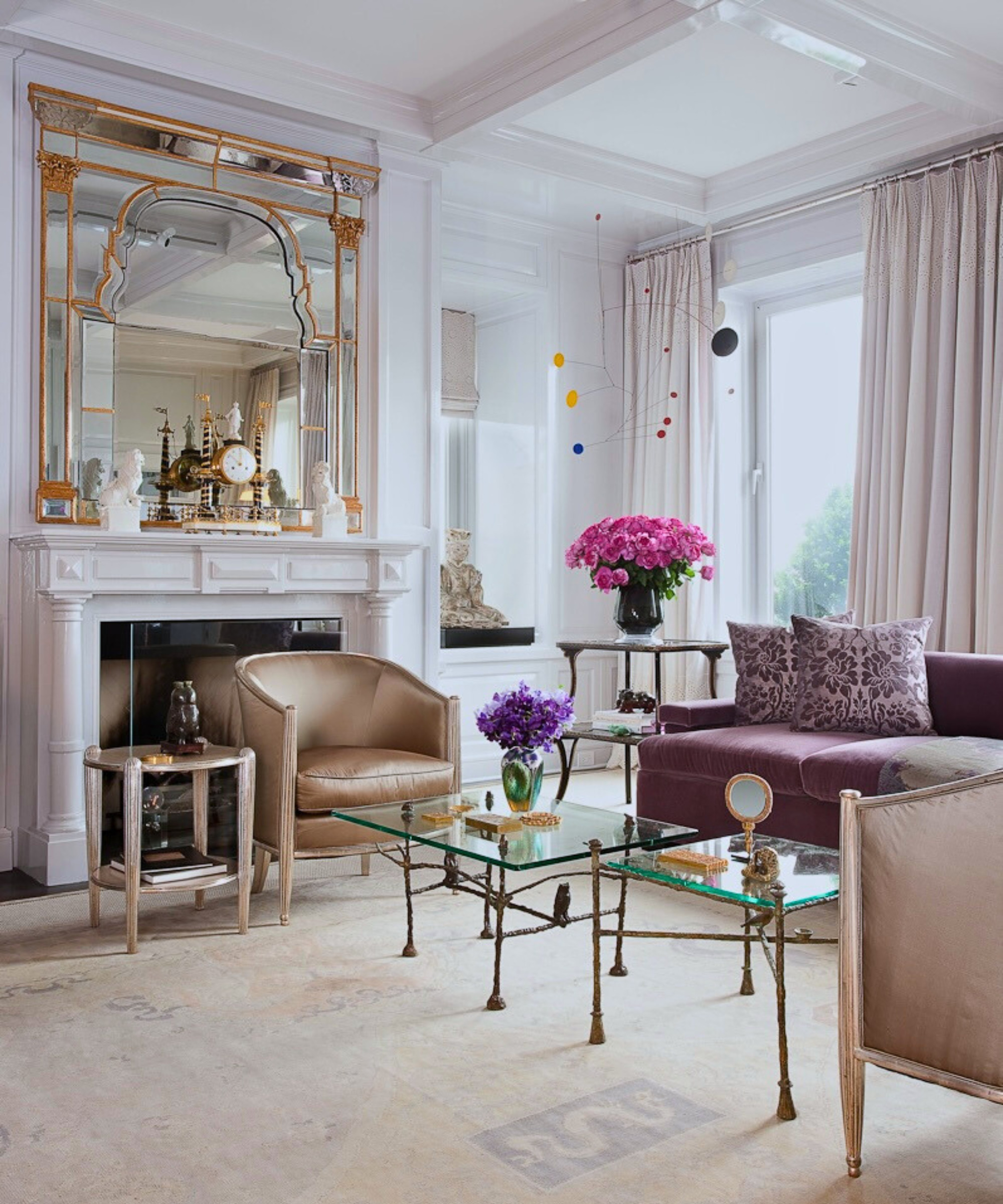
James Aman, co-founder of New York-based Aman & Meeks, says Light Pewter is the perfect hue to choose if you're looking to enhance your collection of artwork. It offers 'more character than standard white' when used as a base for gallery walls, he says.
'It's an excellent base tone that remains impactful,' says James. 'We particularly love pairing it with lavender or light blue accents.' In this living room, Light Pewter provides a neutral, serene backdrop for a statement mirror and bold pops of color. The color is 'ideal for spaces you want to highlight or make an impact,' says James.
6. Try the shade in transitional areas
Because Light Pewter blends so effortlessly with such a wide range of shades, it acts as a go-to transitional choice for designers. Caroline Kopp, founder and principal of her eponymous Connecticut-based design firm, says the shade is 'tasteful and refined', working well in sunny spaces, as well as those relying on artificial light.
'Light Pewter is a great transition color alongside other soft whites like Benjamin Moore’s Seapearl,' says Caroline. 'For a ceiling color to go with Light Pewter I would do Super White. If you want to do your trim in an updated way you can apply Light Pewter all across your baseboard, wall, and crown.'
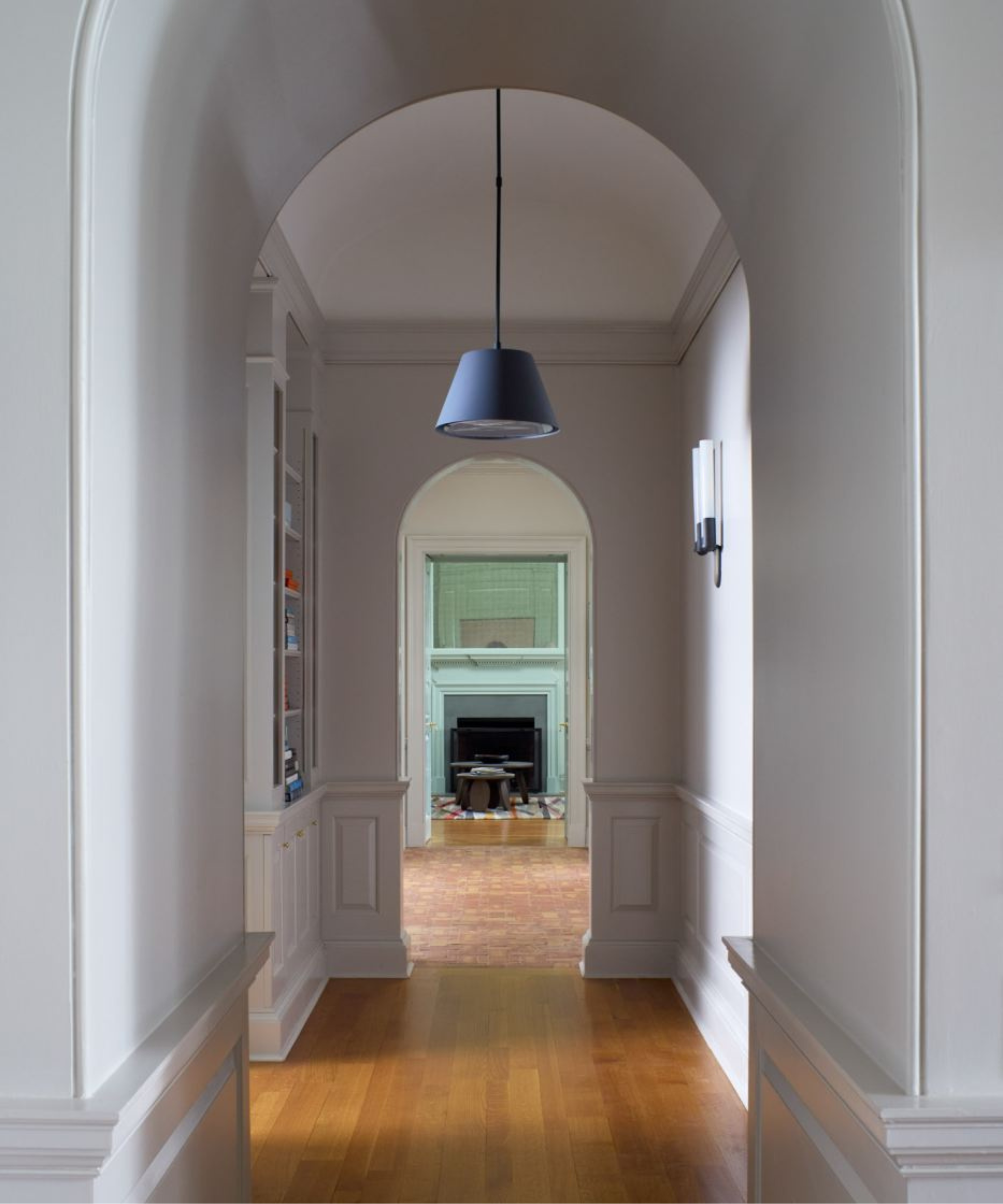
Pictured above, KLH Designs has used Light Pewter in two finishes to line an elegant arched hallway, connecting various areas of the home. Caroline says she's used the shade in a similar application – to coat a paneled hallway leading into her primary bedroom. 'I live with it and love it,' she says.
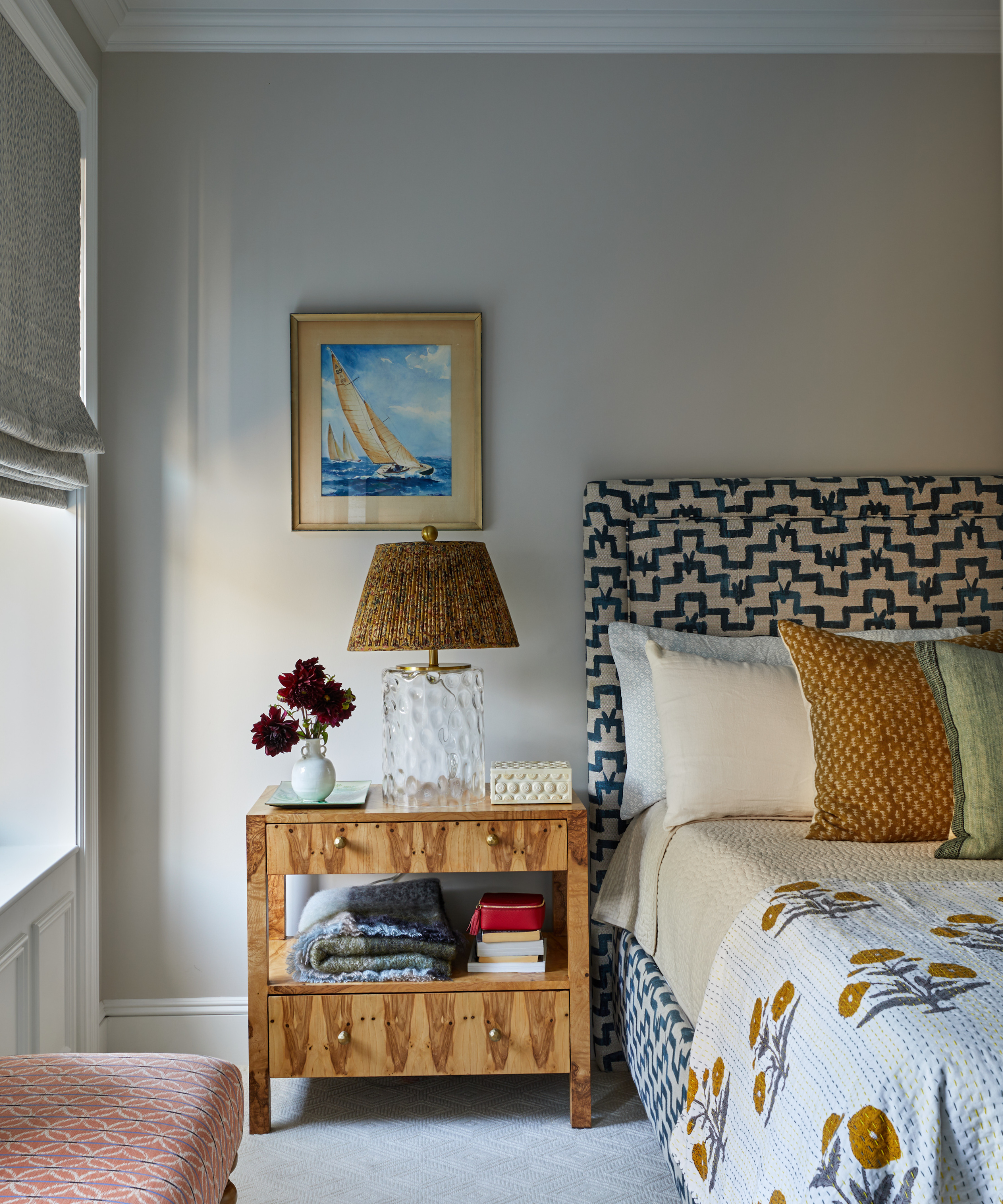
7. Add subtle warmth to your space with Light Pewter
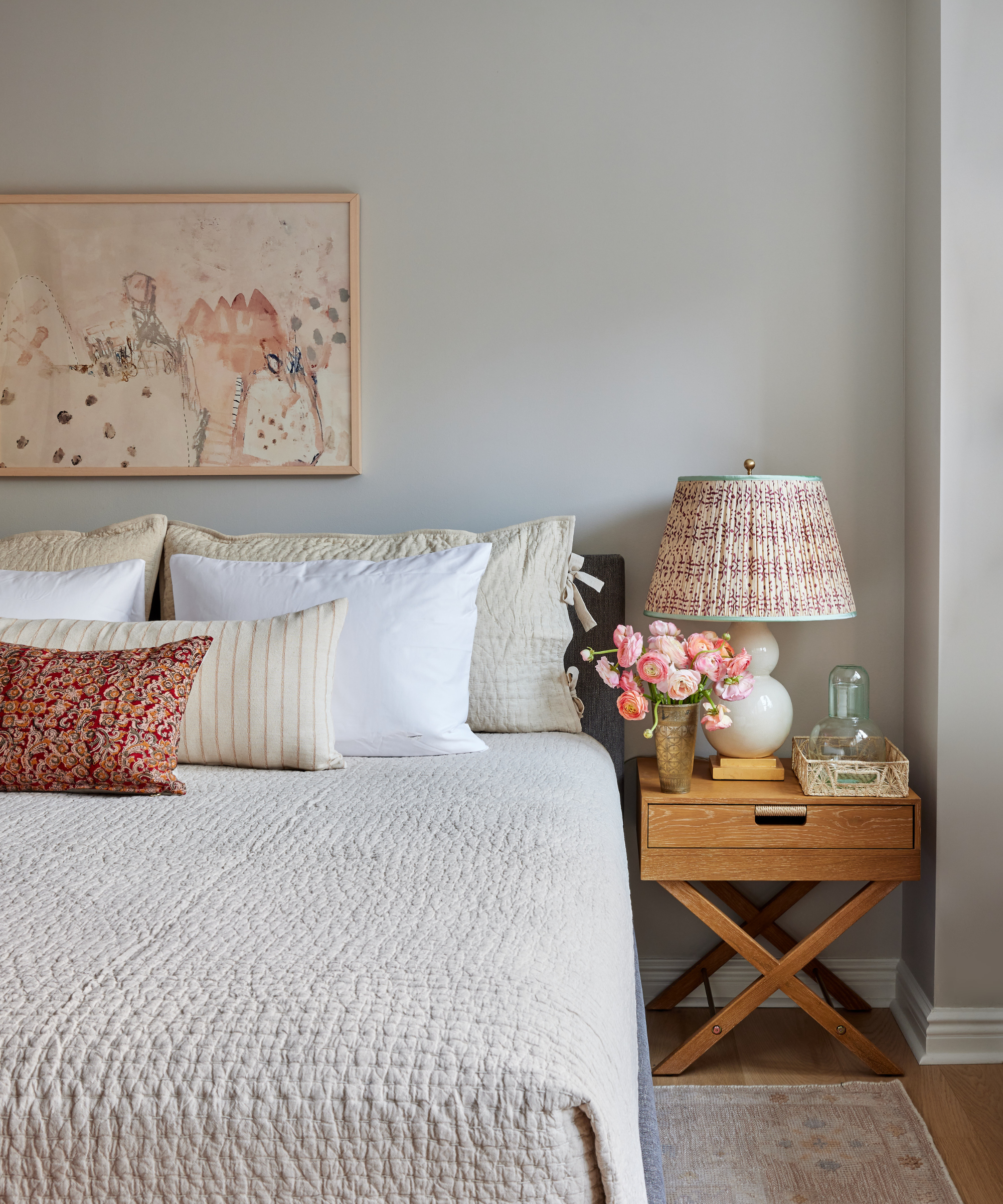
'I love that it's not a cold gray or beige that feels too yellow (two things I always try to avoid),' says Rebecca of Light Pewter. 'It has a beautiful warmth that makes the room feel comfortable, and a subtle creaminess that prevents it from ever feeling stark.'
In this bedroom, located on the Upper West Side of New York City, she took advantage of the color's creamy tones to place it alongside other beiges, mauves, and rosey hues. 'It's also a chameleon,' she says. 'It can read as soft, almost ethereal off-white, while under the glow of a lamp, it reads a bit deeper and more pewter-like.'
Bring a touch of Light Pewter home
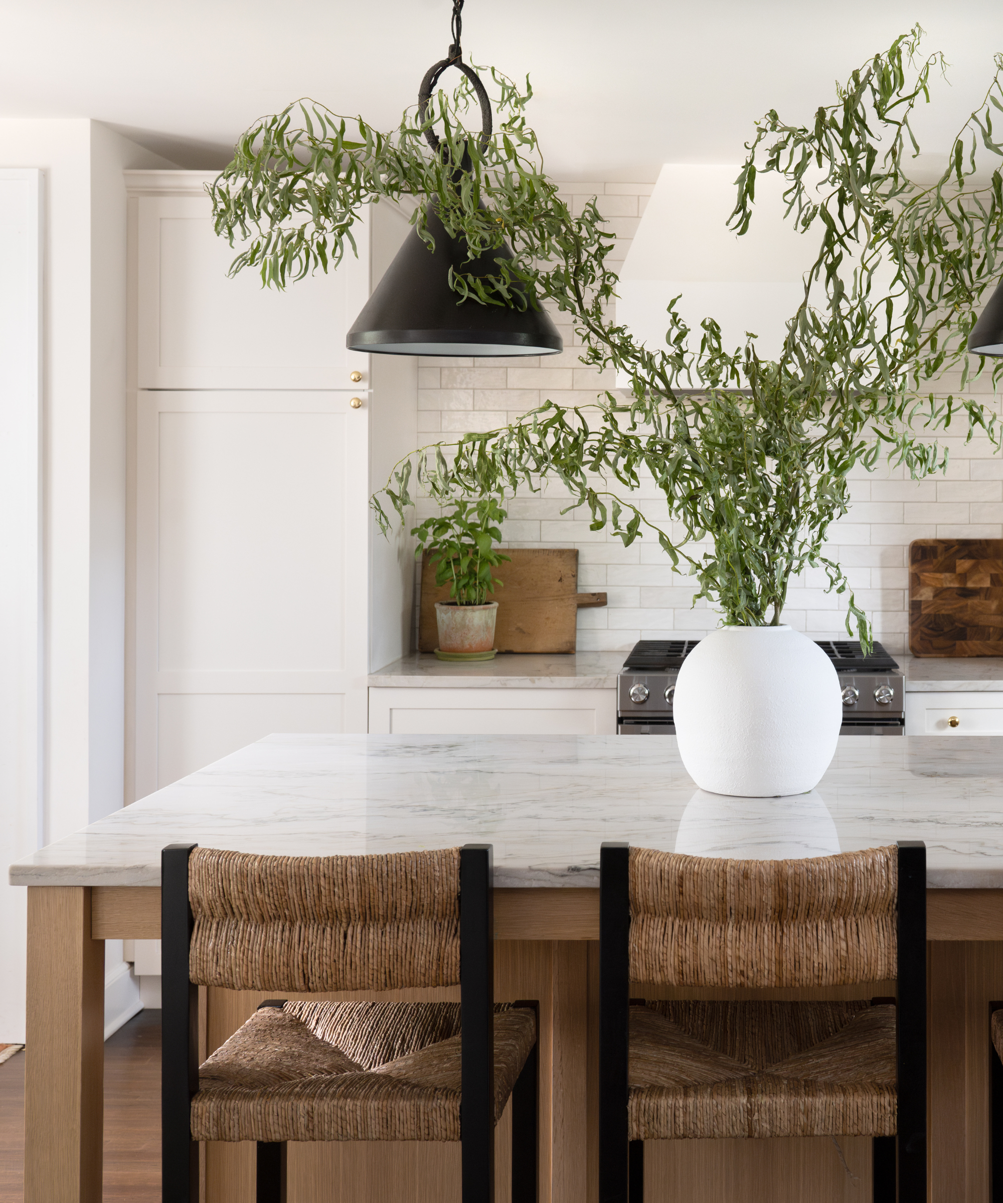
Love the look of Light Pewter, but not ready to paint? The versatile gray-beige shade also serves the home well in small doses, adding texture and depth all across the house.
These plant pots bring creamy color and eye-catching texture to your space, accentuating warm and cool accents alike.
Add greige to your walls in a different way, and control the room's light scheme all at the same time with curtains in this reliable neutral tone.
With an elegant shape and soothing color scheme, this lamp is the perfect addition to design schemes of any aesthetic.
This grounding, greige rug brings a sense of comfort and peace to the living room, with the added benefit of pared-back pattern.
This simple yet stunning bedside table mimics Light Pewter's calming tones, and would pair with the designer-favorite shade perfectly.
Little touches of greige, like this gorgeous picture frame, carry the color scheme all the way through the room.
Using Light Pewter as a neutral (yet complex) foundation opens up near-endless options for color pairing, one reason of many that designers cite for relying on this shade. Whether pairing with white for contrast, or something a bit bolder, it serves as a reliable go-to hue.
'My favorite color pairings include layering in other warm grays like Smoke Embers 1466 and Seattle Mist 1535,' says Arianna Barone, color marketing manager at Benjamin Moore. 'To bring in more saturated hues, incorporate colors like Van Courtland Blue HC-145, Atmospheric AF-500 and Dusk to Dawn 1446.'