Few blue paints have been talked about as much as Farrow & Ball's Yonder. A soothing yet impactful shade of blue, Yonder is proving to be a modern take on decorating with blue – lighter and brighter than once-loved navy yet packing more of a punch than icy, pale blues.
From the much-loved living room of the London-based style and interiors content creator Lucy Williams, which is drenched in Yonder, to more subtle applications of this blue paint, it has earned its spot as a Farrow & Ball best seller and designer favorite, and here, we're exploring why.
Whether you're intrigued to use this popular blue paint for your next decorating project or are simply curious to see why it stands out, designers explain all you need to know about Farrow & Ball's Yonder below.
What Color Is Farrow & Ball Yonder?
'Yonder is the crispest and freshest of our light blues,' says Patrick O’Donnell, brand ambassador at Farrow & Ball. 'It’s reminiscent of morning coastal skies of the northern hemisphere – bright and joyful. As with all our colors, it contains a little dose of black to stop it from feeling too sharp or clean.'
While this blue paint works well in different lighting conditions, Patrick says that it comes alive in south-facing spaces: 'When drenched in natural light, it will feel endlessly optimistic and joyful.'
Since blue is a soothing color, there are plenty of rooms to Yonder in, from living rooms to bedrooms. 'It's lovely for a guest bedroom or child’s room that has good natural light,' says Patrick. 'It would also look great on cabinetry in a sunny, bright kitchen.'
How To Decorate with Farrow & Ball's Yonder
1. Color Drench the Room in Yonder
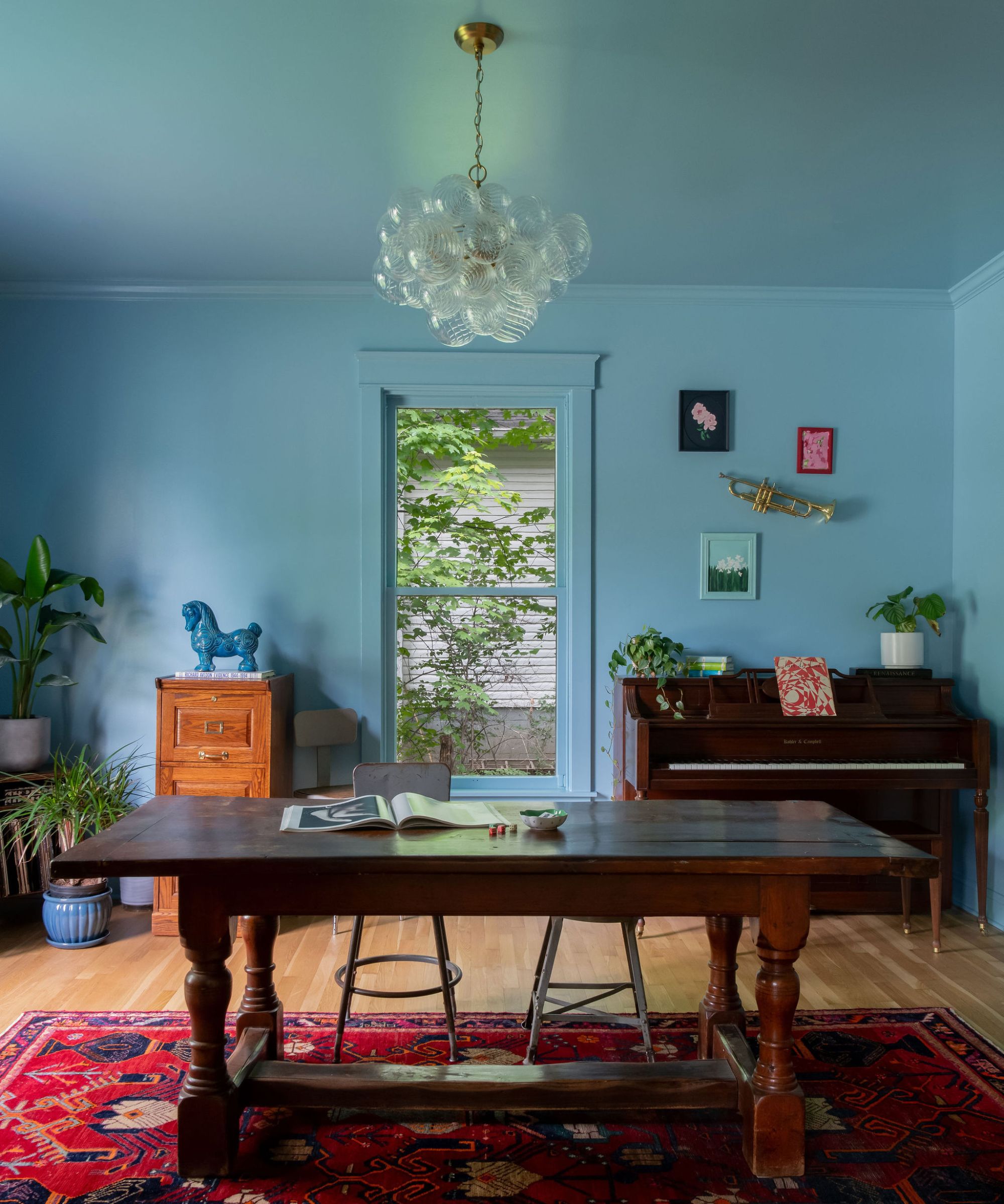
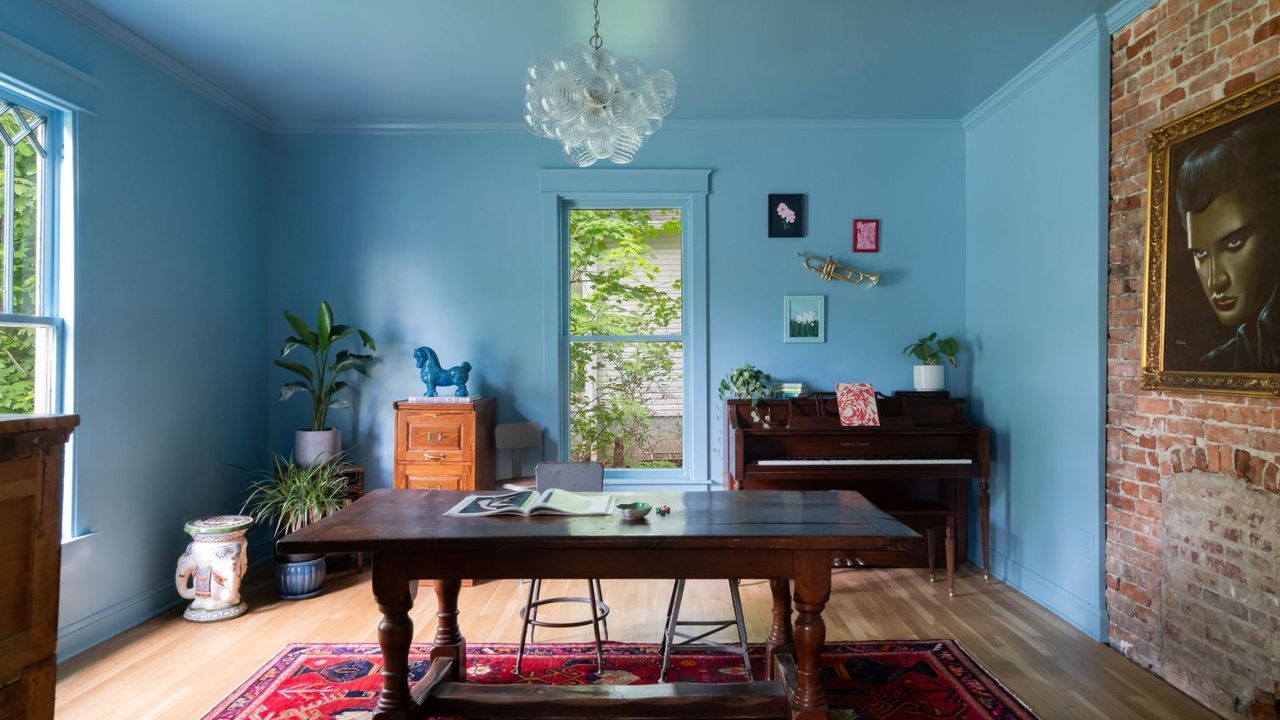
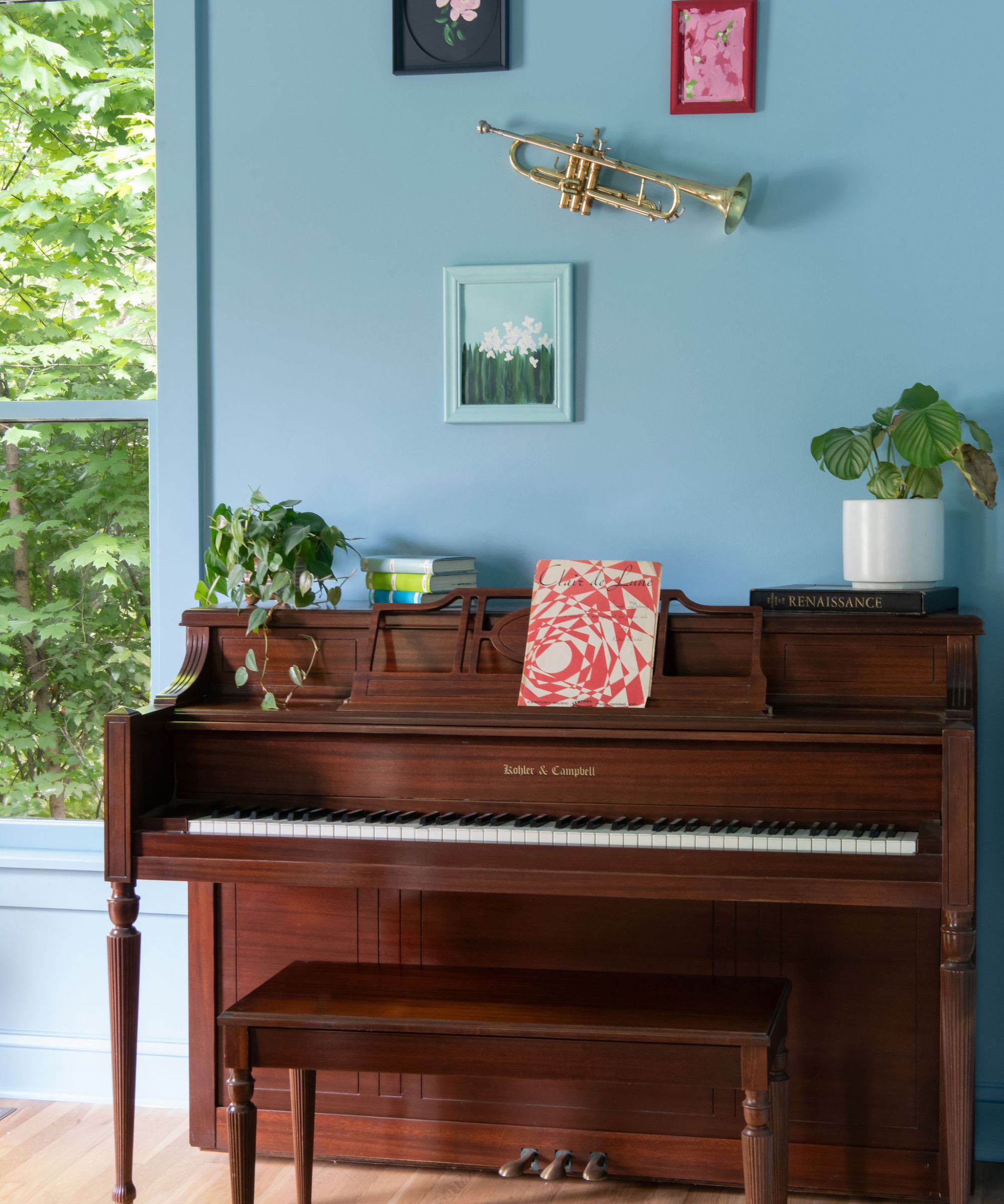
In this parlor, Kristin Bock of Nashville-based Bock Building Co. found Yonder to be the perfect shade of blue to color-drench the room. 'The centerpiece of this room is my beloved Velvet Elvis that I found while thrifting in Maine,' she says. 'I knew I wanted this room to be fun, and so I chose to find a blue that would play off of Elvis's eyes. I found Yonder by Farrow & Ball and fell in love.'
The reason Kristin was drawn to Yonder is that it doesn't lean too cool nor too warm. 'It is a playful take on French blue,' she says. 'I can't not feel happy when I walk through this room. I even added a mirror in our living room that gives me a reflection of the walls from where I sit on the couch.'
2. Create a Chic but Cozy Style
Taking a similar approach, but in a living room, Lucy Williams of Lucy Williams Home went bold with Yonder used all-over, and the result is every bit snug and unexpected. Teamed with warm wood, a rich, tobacco-colored sofa, and plenty of pattern, the blue feels balanced and surprisingly warm.
While blue paints as bold as Yonder may not be the first to come to mind for living room paint ideas, Lucy's snug room proves how much richness it can add while ensuring a livable look and feel. Experts add that this paint shade maintains appeal throughout the day as the lighting changes, making it even more suitable for frequently-used spaces like living rooms. 'There is a lot of depth to this color (as with all Farrow & Ball colors), and so it looks beautiful at many different times of day, from bright light to dim candlelight,' says Kristin Bock.
3. Highlight a Room’s Features
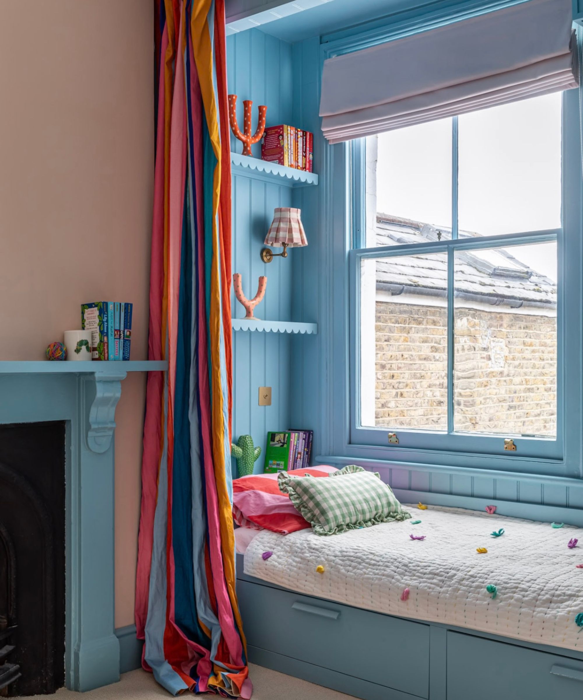
'I love the bright blue of Yonder – it adds such a joyful lift to any space and brings a vibrant pop of color that instantly energizes the room,' says the interior designer Sarah Southwell of Sarah Southwell Design, who used this blue paint for this cabin bed.
'It’s the perfect shade for a cabin bed – cheerful, uplifting, and full of character,' she says. 'It brings a playful warmth to a child’s nook, instantly brightening the space and creating that happy, welcoming feel that makes everyone smile.'
4. Use Yonder as an Accent Color
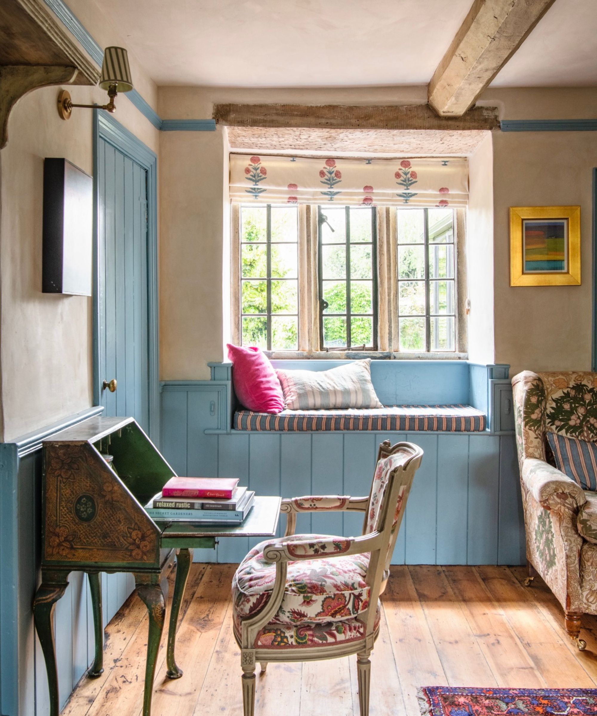
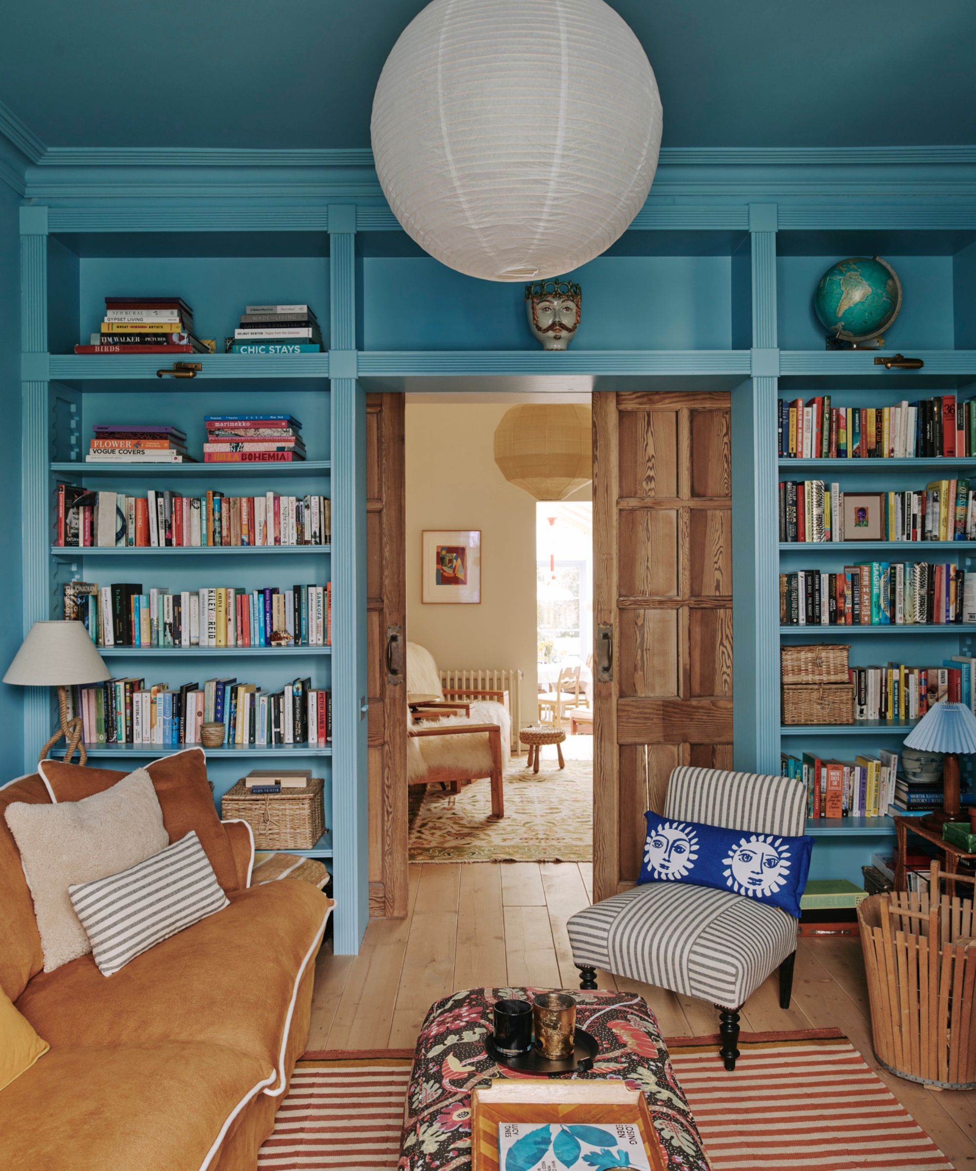
Not only does Yonder make a wonderful wall color when used to drench a room, but it's also an effective accent color. Here, it was used on the woodwork, including the wall paneling, picture rail, and doors. Alongside the soft beige walls, it goes from feeling playful to timeless, and is a more livable take on decorating with this happy shade of blue.
When using Yonder as an accent, it's important to team it with the right neutrals to create a cohesive look. 'For a clean look, pair it with a pure white like All White,' says Patrick. 'To add weight to a scheme, add in a splash of brown such as our classic archived Cola, or play with the blue scale and mix it with something slightly stronger like Stone Blue or the bolder green-blue of Arsenic.'
Bring Yonder-Inspired Blue to Your Home
Bring soothing blue to your tablescapes this hosting season with this linen tablecloth.
This vase color appears to be a strong match for Yonder, and would look wonderful styled in a living room or entryway.
Add a modern touch to your home with this blue scented candle that is made completely from wax.
In guest bedrooms, this White Lotus-inspired pillow cover would bring plenty of richness.
Just in time for the holidays, this blue serving bowl with a scalloped edge is a contemporary take on serveware.
Bathrooms are another place to introduce calming blue into the color palette, and these cotton towels feature a green striped edge for extra design flair.
From cozy living rooms to bedrooms, Yonder has proven to be a hardworking paint shade that's a firm favorite among designers and homeowners. Although it feels very 'in' at the moment, the spaces above lead us to believe it's a timeless color that will endure since they have each been designed with personality at the fore, rather than a trend-led approach.