They say April showers bring May flowers, and if you're in the mood for a floral arrangement of poppies, crimson tulips, and camellia, my latest color crush is for you. Pomegranate Pop is one of the juiciest shades of red. It's fiery and warm with pink tones that bring to mind succulent berries and the flirtatious vibe of summer sun, and in the home, it looks so, so good.
Warmer weather means color trends (and our home color schemes) tend to get a little brighter, a little more saturated, and a little more playful. Pomegranate Pop is all that and more. It's a bright red with a bit more bite — a bold accent color, but also one that can ooze with sophistication when used right. A hit of hot pink peeks out from under the surface (without screaming for attention), making Pomegranate Pop feel more well-rounded.
April's color crush, Soft Celeste, a charming baby blue, was reminiscent of the soft dewy drops of spring showers, making way for Pomegranate Pop's fully blossomed red. It's a poetic passing of the bouton. I've always been into decorating with red, myself, but this shade definitely makes a strong case for the bold shade.
What Color Is Pomegranate Pop?
So, what makes this alluring shade unique in the rich red color family? First and foremost, Pomegranate Pop isn't just any bright red. Sure, you could categorize it that way, but the world of color becomes so much deeper when you lean into the nuances of different undertones, hues, tints, and shades.
Where a red like postbox red is bold and uncompromising, Pomegranate Pop is more saturated, moody, and changes with the light, giving it more complexity. There is a juicy and flirtatious pink that lies just beneath the surface of this month's color crush, hence the fruit from which it gets its name.
"Pomegranate Pop is rich and full of drama," explains Milan-based color expert and color consultant Charlotte Cropper. "The berry undertones add depth, elevating it beyond a primary red into something more expressive and versatile, working perfectly in rooms craving the wow factor."
So while this shade is definitely on the warm side of the color wheel, it has a touch of coolness that helps round out Pomegranate Pop into a color that can be used in a variety of different ways and spaces.
How to Use Pomegranate Pop in Interiors
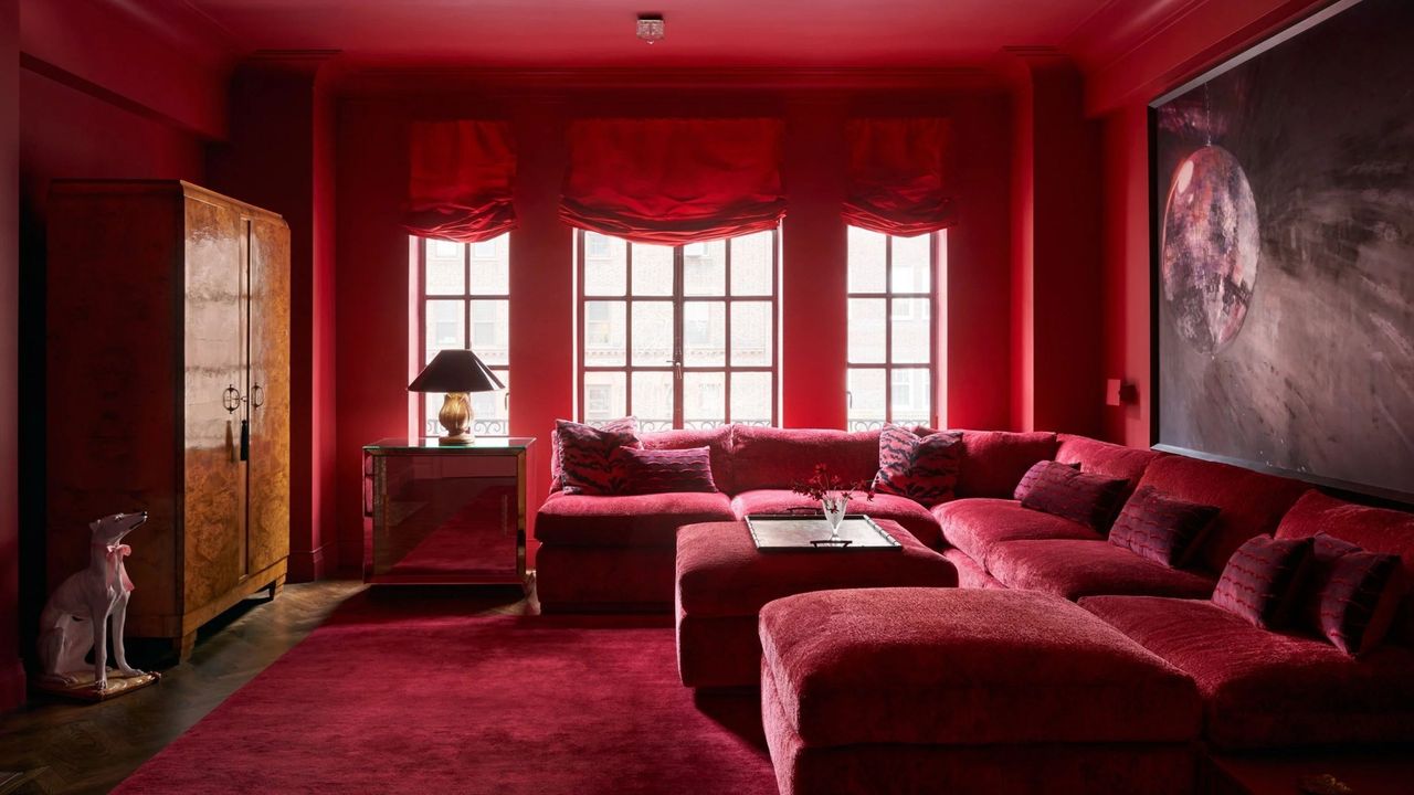
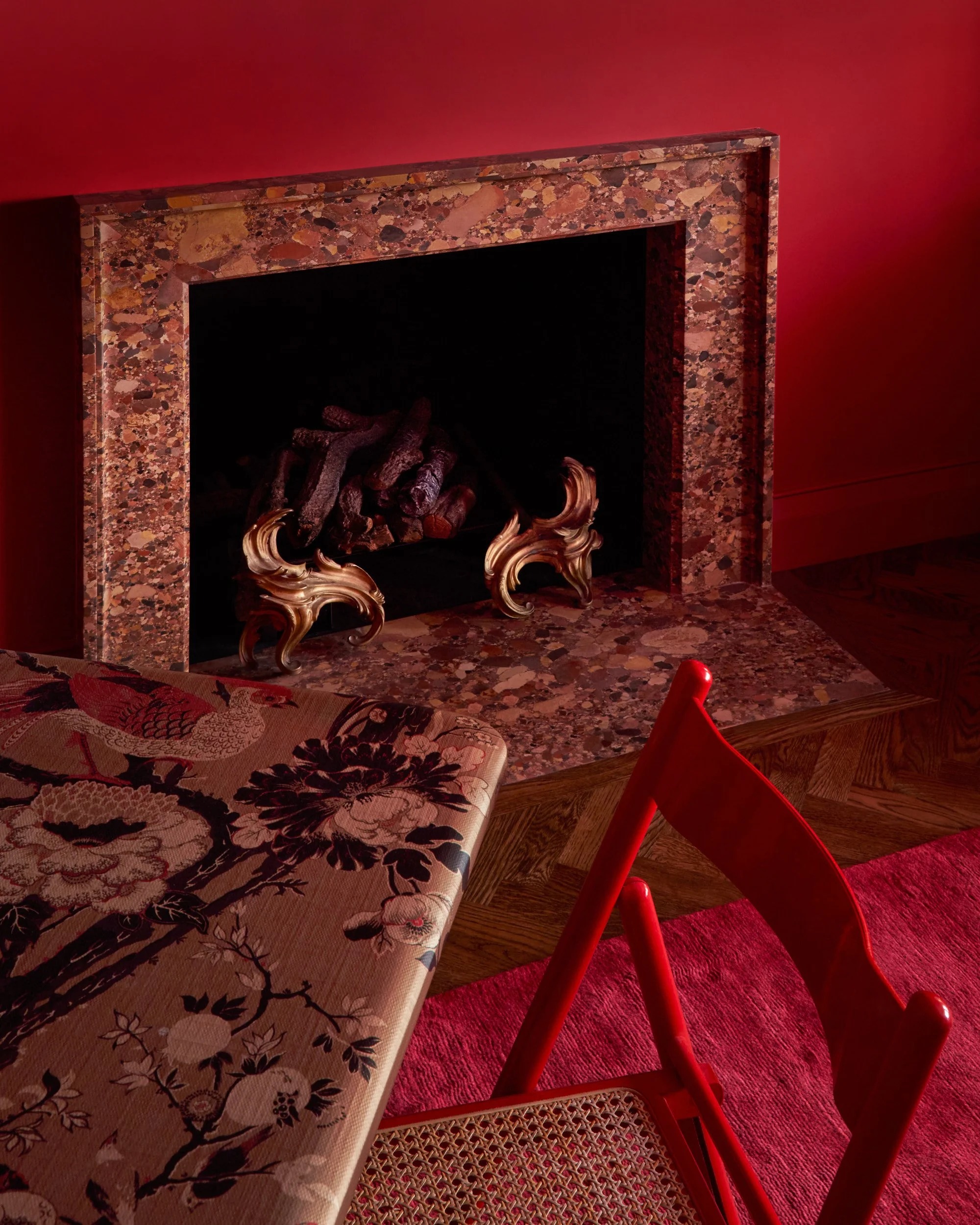
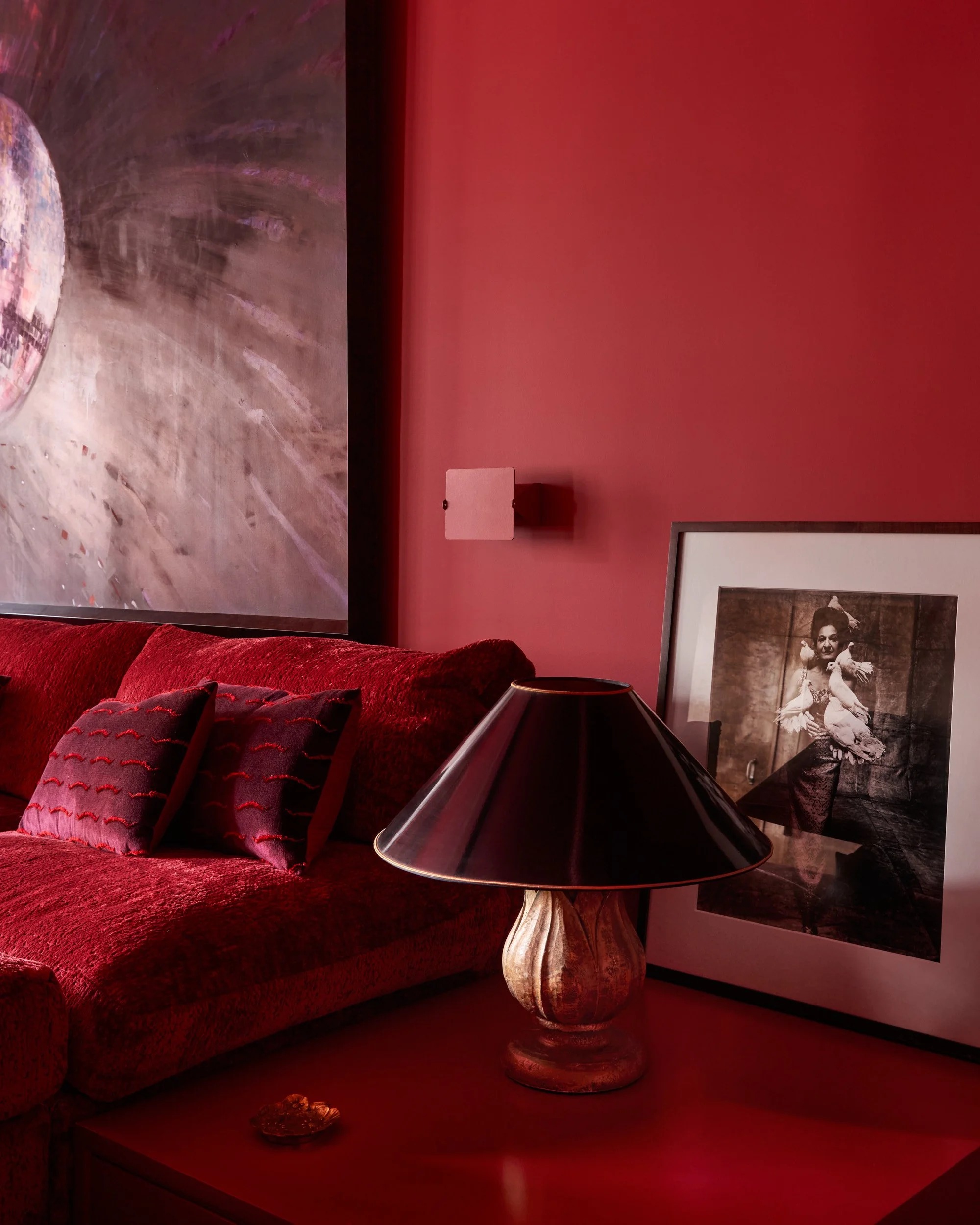
Your first thought may be to shy away from decorating with color like this as your predominant wall color (it's definitely a bold, bright paint color), but that shouldn't be the case. Pomegranate Pop is positively delicious when applied with confidence.
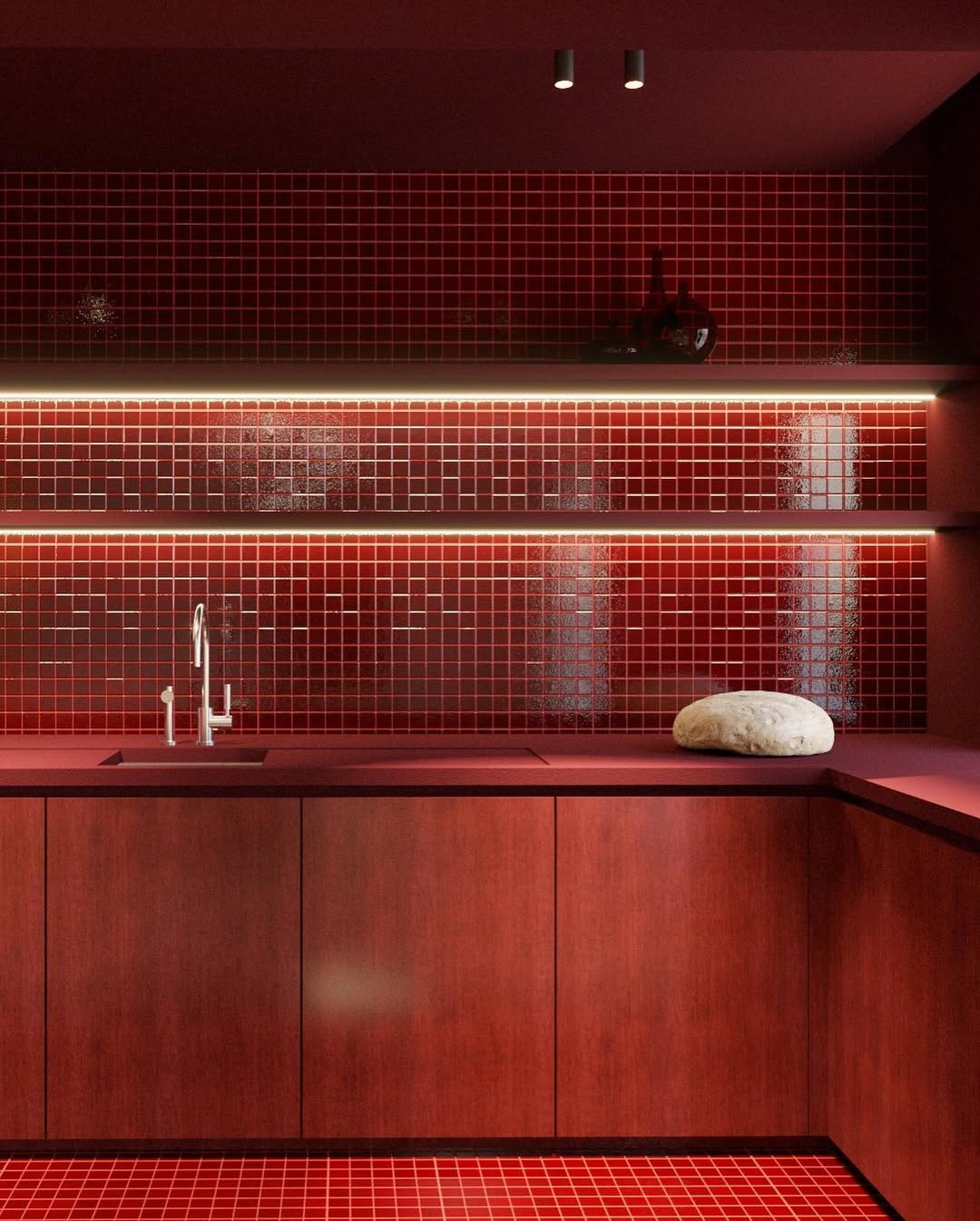
"Pomegranate Pop works beautifully as a color drench or even paired with a patterned wallpaper to create a luxurious and impactful design moment," says Charlotte. To help this juicy red feel a little more stylized, try mixing and matching the paint finishes. For instance, a matte wall with a semi-gloss trim would look stunning and much more visually complex.
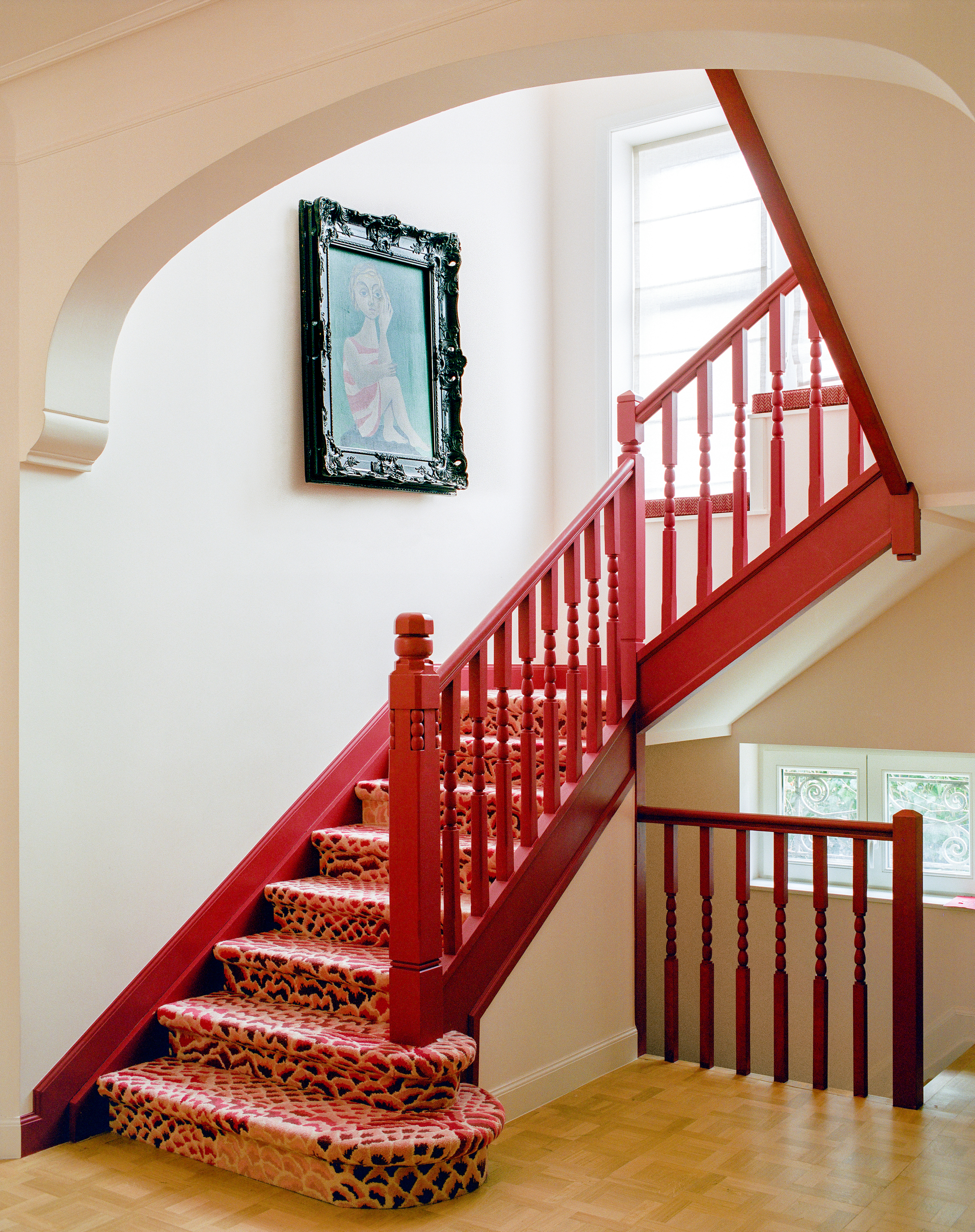
When painting Pomegranate Pop on the walls, consider how to coordinate this paint color with the rest of your home's color scheme. This dynamic red would make a great color for a media room, powder room, or hallway without taking over your home. Then you can dot unexpected red pops in other places throughout your interiors.
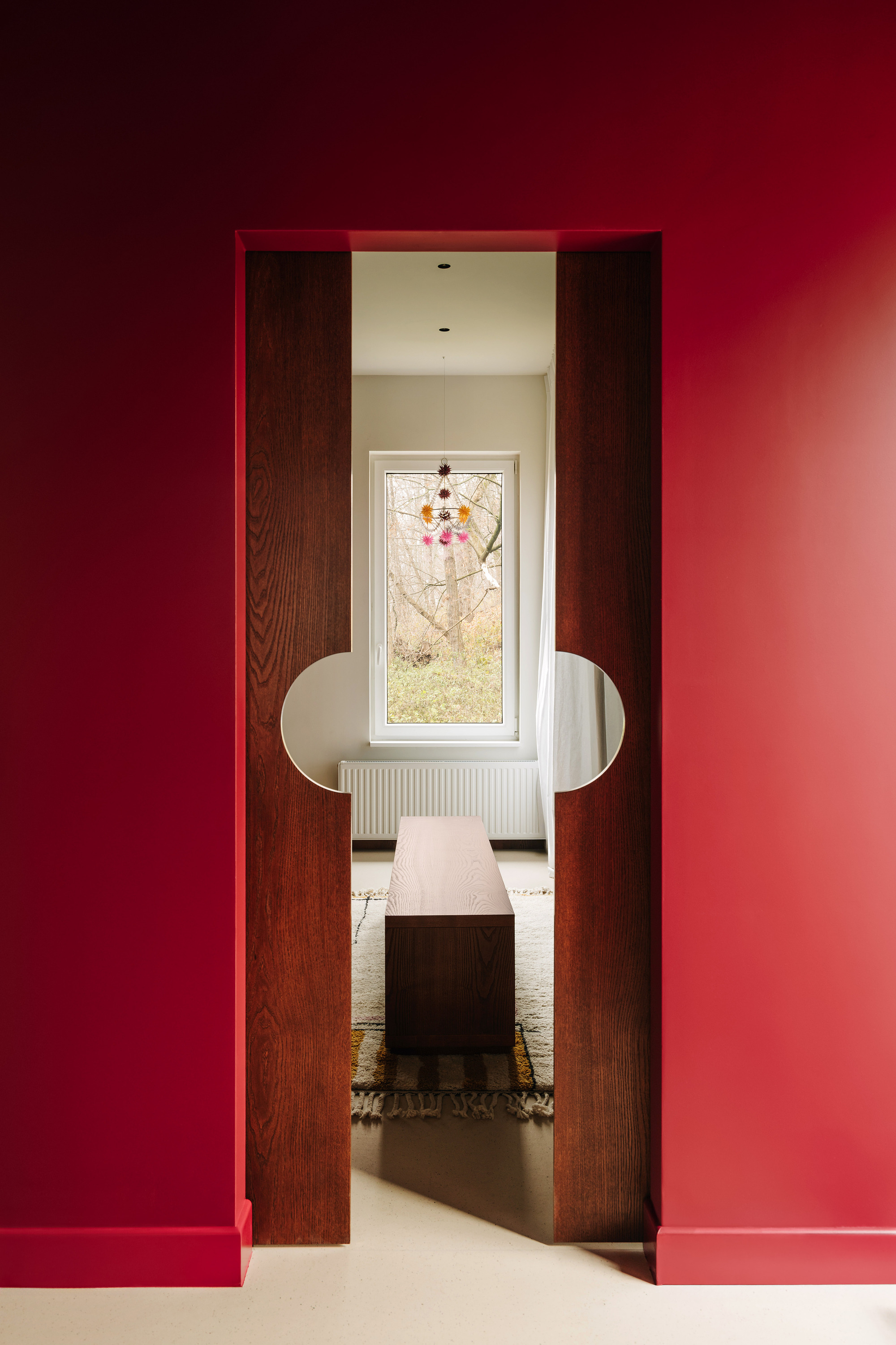
Of course, you can always ease into decorating with bold hues like Pomegranate Pop. "It also works particularly well as a hidden accent: inside a bar, cabinet, or storage cupboard, where it delivers a joyful pop each time it's revealed," says Charlotte. And it's true — a painted cabinet interior is one of my favorite design details this year.
And because red is a primary color, this shade really will go with anything. Last month's soft, powdery blue, a calm butter-yellow, or bright olive greens — there are virtually endless colors that go with red.
Color is one of the most satisfying ways to bring personality to your home, especially when decorating with a saturated color like Pomegranate Pop. I may have a different color crush each month to share, but you don't necessarily have to switch up your decor monthly. It's about finding the right shades that speak to you and your home, and blending them with a few surprising pops.
For more color inspiration, don't forget to sign up for the Livingetc newsletter.