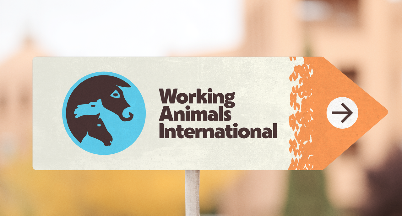
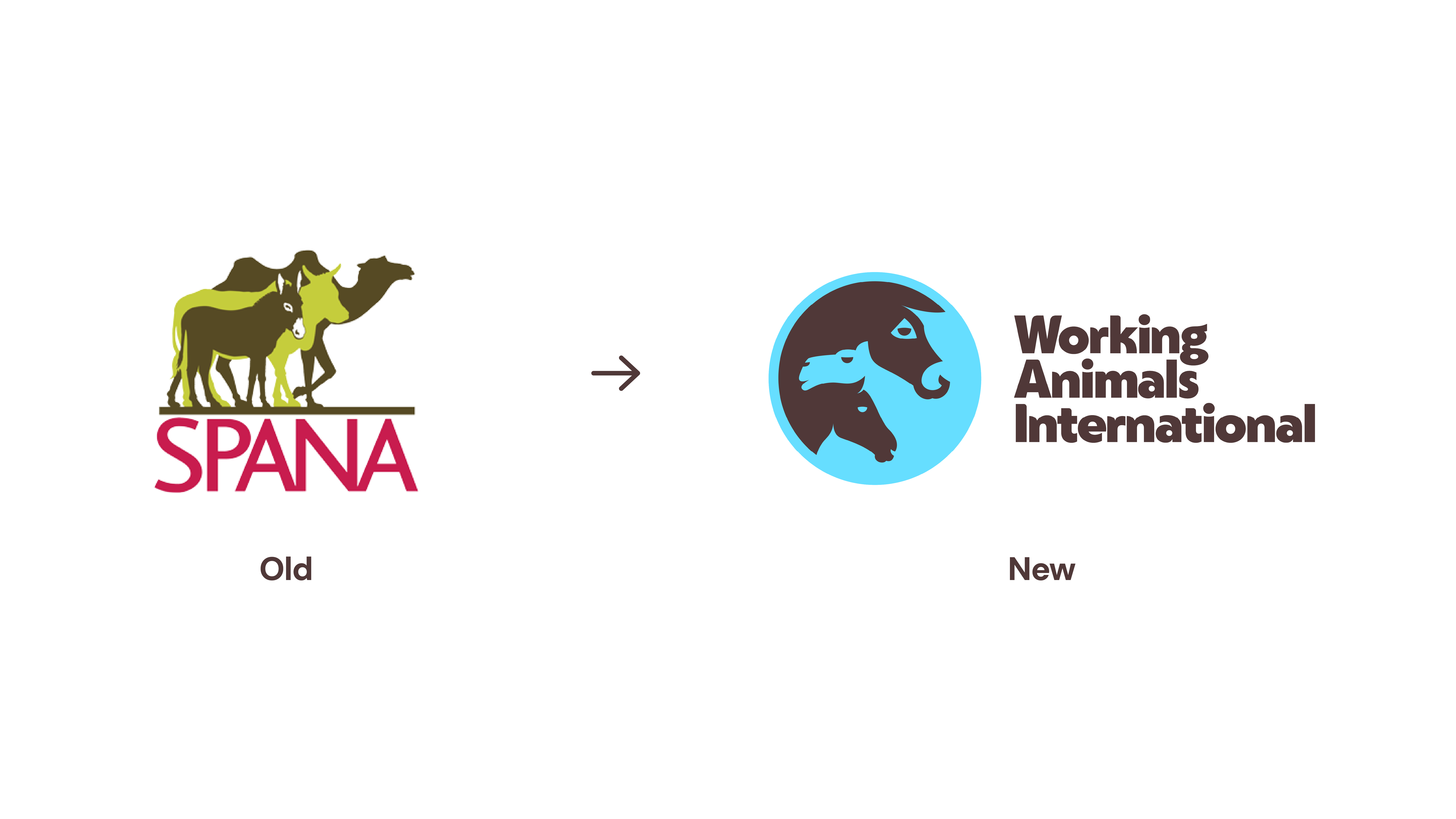
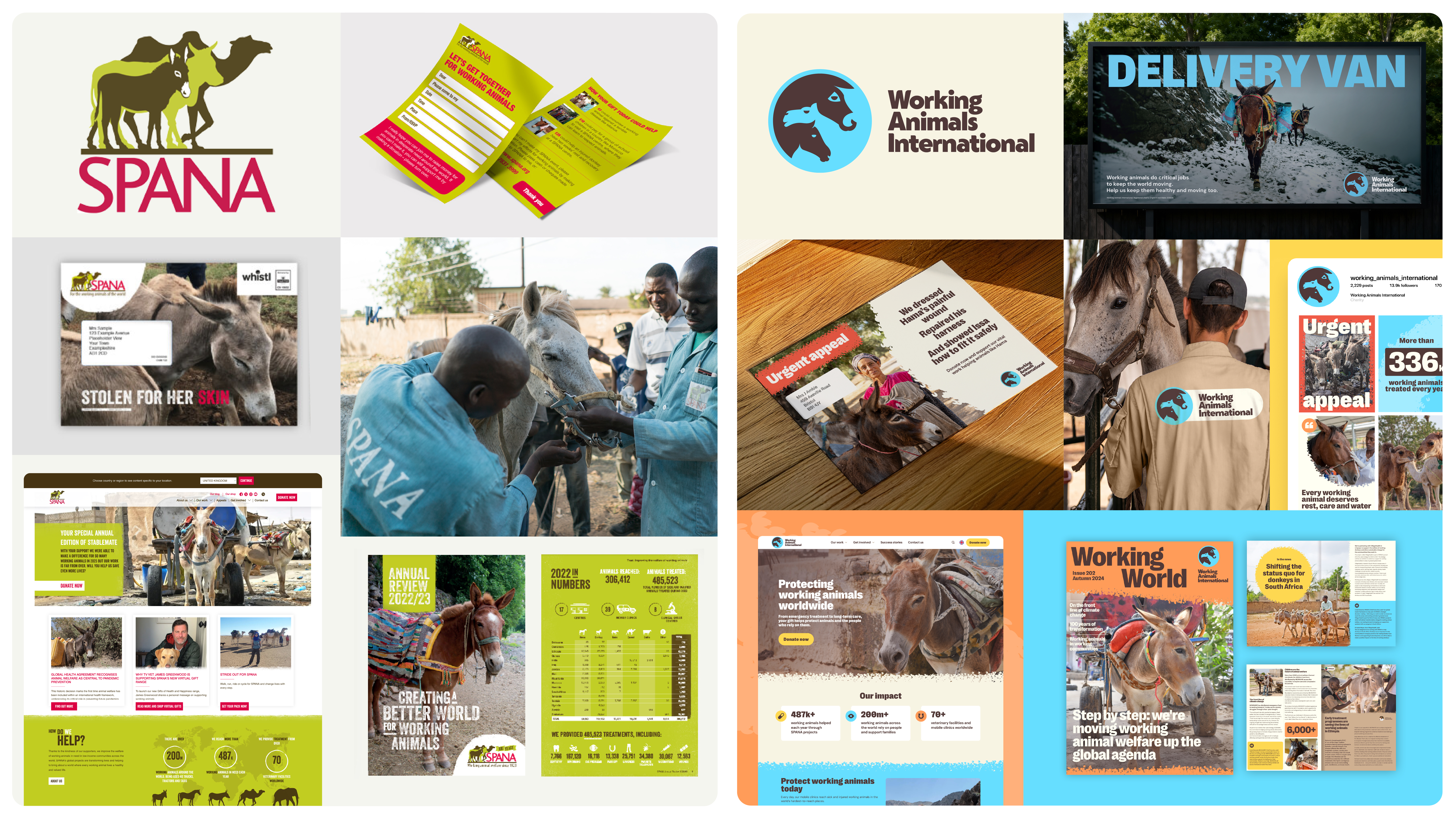
Animal welfare charity SPANA has rebranded as Working Animals International, a change that more clearly reflects what the charity does.
Working Animals International works with a series of locally based partners who protect the welfare of working animals such as horses, donkeys and camels. Such animals support an estimated 600 million people around the world to earn a living and access food, water and transport.
The new positioning, developed in partnership with The Clearing, includes a new name, new strategy and an identity system. Enviral agency also helped to produce and roll out a new above-the-line UK advertising campaign.
For more top rebrands, see our best rebrands of all time piece.
At the heart of the identity is the brand promise, 'impossible to overlook'. This reflects the suffering of working animals and is both attention grabbing and a call to action.
While the previous identity looked a little dated, the new look includes a new globe logo, which includes the intertwined profiles of a horse, camel and a donkey, which fit together with a beautiful use of negative space.
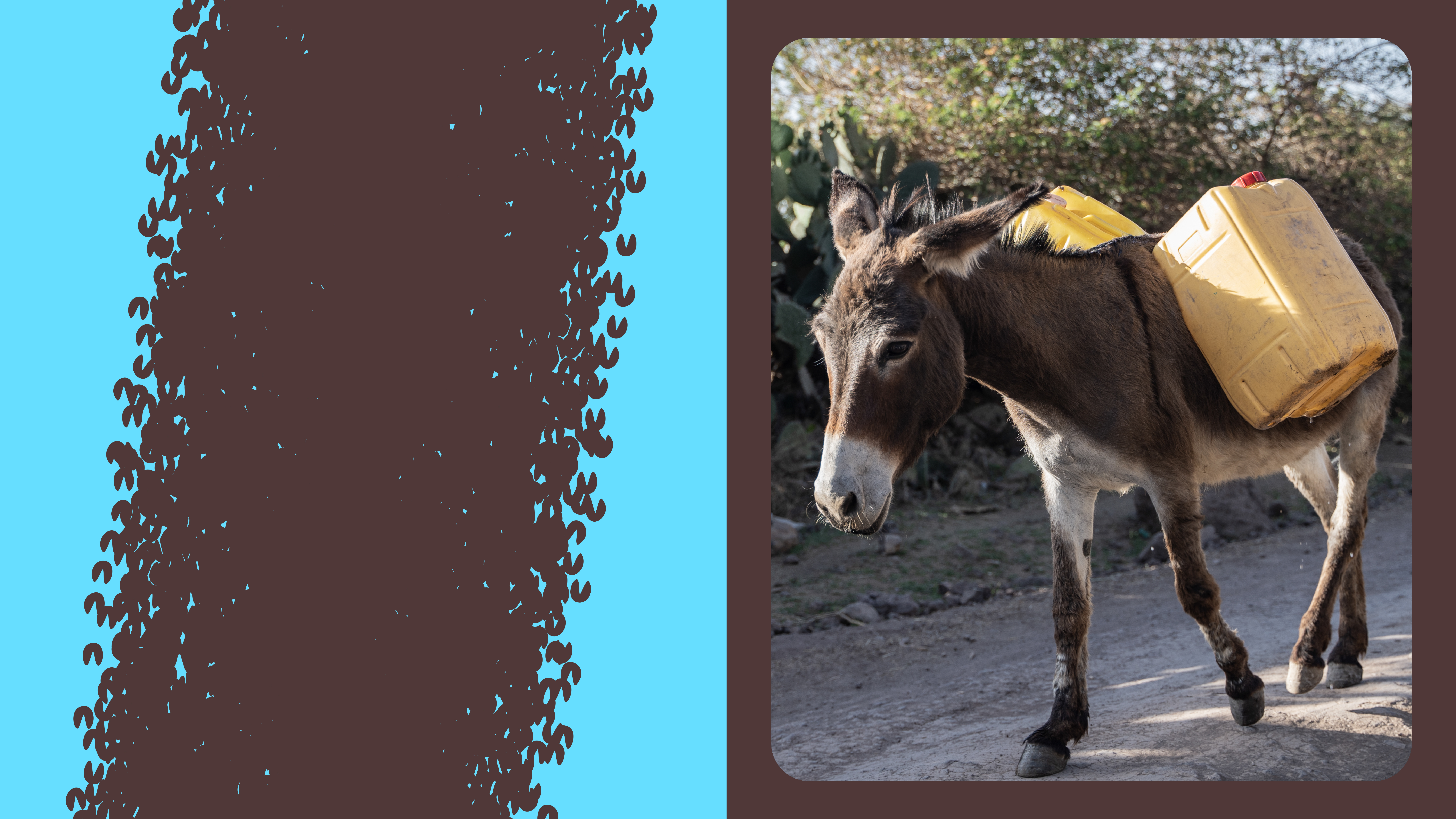
The colour scheme represents nature while the tone of voice reflects the brand's attributes: resolute, illuminating and transformative. Elsewhere, the primary font Right Grotesk Casual portrays stature, scale and urgency. This is paired with open source font DM Sans.
To emphasise the animals the charity works with, a hoof-like graphic pattern runs throughout the scheme.
“We are proud to launch our new name and brand," says Linda Edwards, chief executive at Working Animals International. "Our mission remains the same, but our new identity makes it clearer, more recognisable and easier for people to engage with and support."
"Our approach to designing the brand was to tell that story in a simple and clear way that would resonate with the local partners and communities the charity wants to engage with, as well as potential donors and other supporters," says Jonathan Hubbard, co-founder and creative director of The Clearing.
"For fundraising audiences we needed to highlight the vital role working animals play for communities living in some of the most challenging environments, a concept lost in our high-tech and mechanised world. This became the basis for the advertising campaign supporting the launch."
“As climate pressures and economic uncertainty grow, working animals and the communities who rely on them are under increasing strain," adds Linda. "We must be in the strongest possible position to support them, and this new identity allows us to do exactly that."