Google recently revamped its app icons, much to the joy of users who had grown tired of the brand's 'unified' (a.k.a. indistinguishable) old designs. While anything would've been an improvement, the new icons have been surprisingly well received, prompting some X users to share their own alternative designs.
Ranging from playful to ridiculous, these alternative logo designs take a hilariously literal approach to icon design. While admittedly some are pretty silly, they're instantly recognisable, demonstrating the visual power of skeuomorphic design.
hear me out https://t.co/GG2X4Ix7MC pic.twitter.com/feukMMBMcIMay 24, 2026
It began with a simple tweet from X user Amichai Mantinband, who shared a simple reworking of the new Google Sheets logo with the caption "hear me out". Transforming the simple rectangular green icon into crumpled bed sheets, the literalisation of the design is surprisingly slick (although arguably impractical for scalability, as we've learned from Spotify's controversial disco logo).
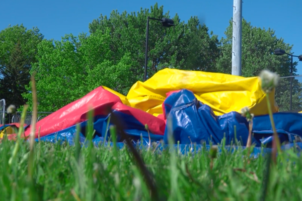
Hold my beer pic.twitter.com/kE4rCLtBCYMay 27, 2026
The tweet launched a trend on X, with users putting their own spin on other Google app icons, such as Google Earth (a pile of dirt) and Slides (a pair of slider sandals). With the designs going for realism over flat design, the trend coincides with the return of skeuomorphic design, marking a shift from decades of contemporary minimalism.
For more design inspiration, check out the new Google logos in all their glory or take a look at the logo design trends dominating 2026.