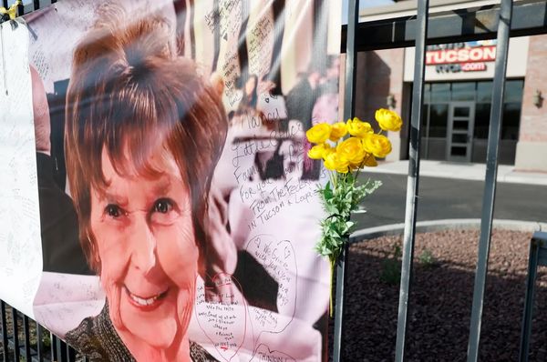
I like to use a comic inking and rendering style when creating quick concepts, often done for video game or animation projects. I'm using Photoshop, but this workflow works especially well when paired with any of the best digital art software and one of the best drawing tablets, giving you precision and control that mimics traditional inking while staying fully digital.
This particular style has a host of benefits, one of which is almost immediately creating high contrast in key areas. This forces you into good habits such as breaking down the image into value groups, creating strong key lighting, and crafting well-defined forms, which can be difficult for a lot of beginner artists.
I’ll be discussing how I laid down the foundations for this kind of rendering and how each early step you take sets the foundation for the later ones to be completed more efficiently. Of course, there are many alternative routes to the same outcome, but I’ve found following this process particularly effective for getting a final rendered image completed quickly.
The biggest difference might come from understanding that the black ink work can do a lot of the heavy lifting when it comes to rendering. But while that’s true, there are simple tricks we can use to push and pull that ink shadowing around that will benefit the final image. You’ll find this particularly in the latter stages when we get to masking, overlays, and additional polishing layers.
If you're keen to refine your skills in Photoshop, learn more from our list of Photoshop tutorials, where you’ll find tips that pair perfectly with this comic-style workflow.
Hopefully, you’ll find yourself adopting some of these techniques into your workflow!
1. Create an initial sketch and thumbnail
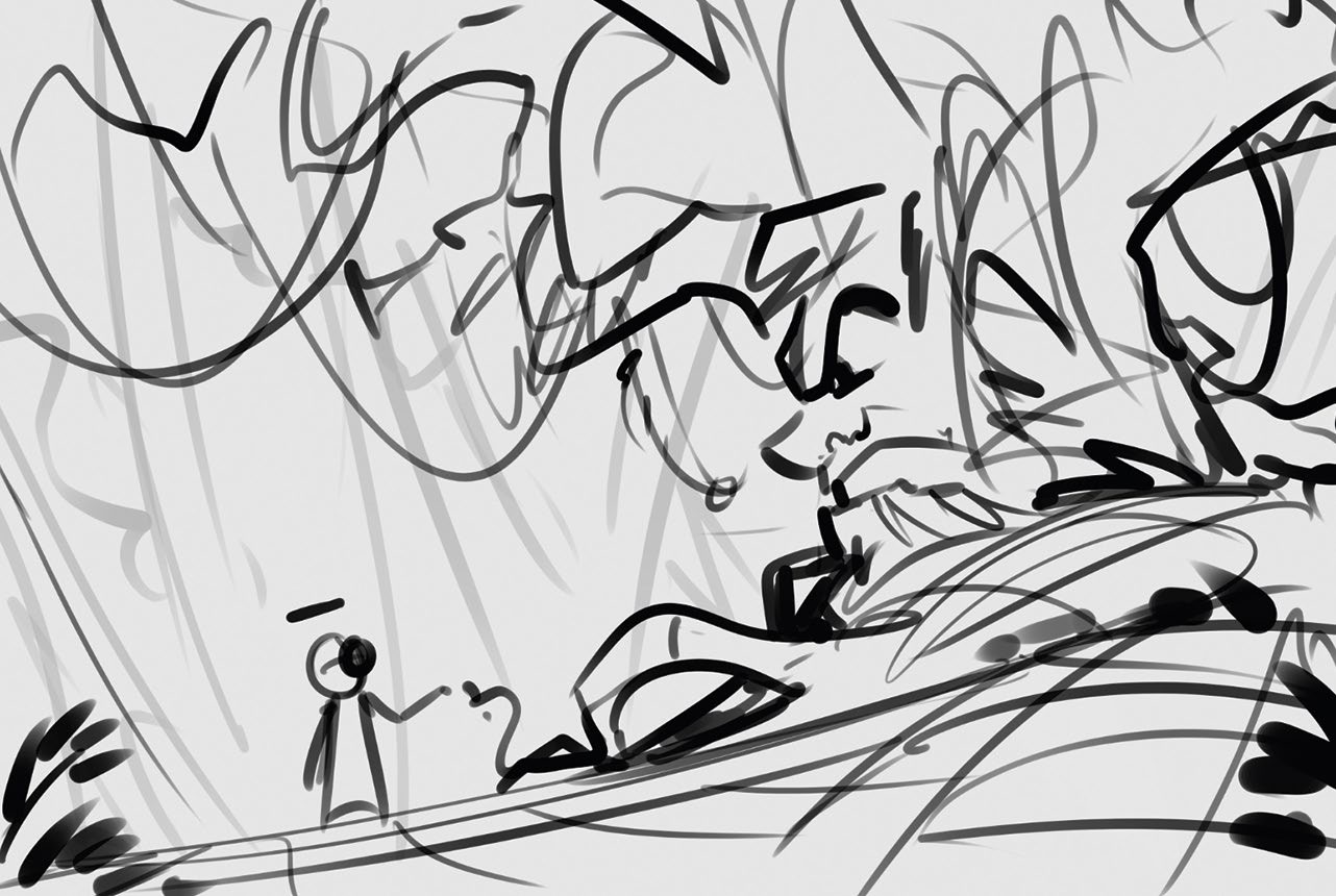
Ideas can come from anywhere and it’s wise to draw several thumbnails to conceptualise an initial idea or brief. Getting the first five or so ideas down on paper is beneficial, although in this case I already had a good idea of what I wanted to go for. I used my Main Boi brush to get a sketch of a botanist robot collecting flowers that grow around a mischievous ancient tree.
2. Consider the value key and lighting
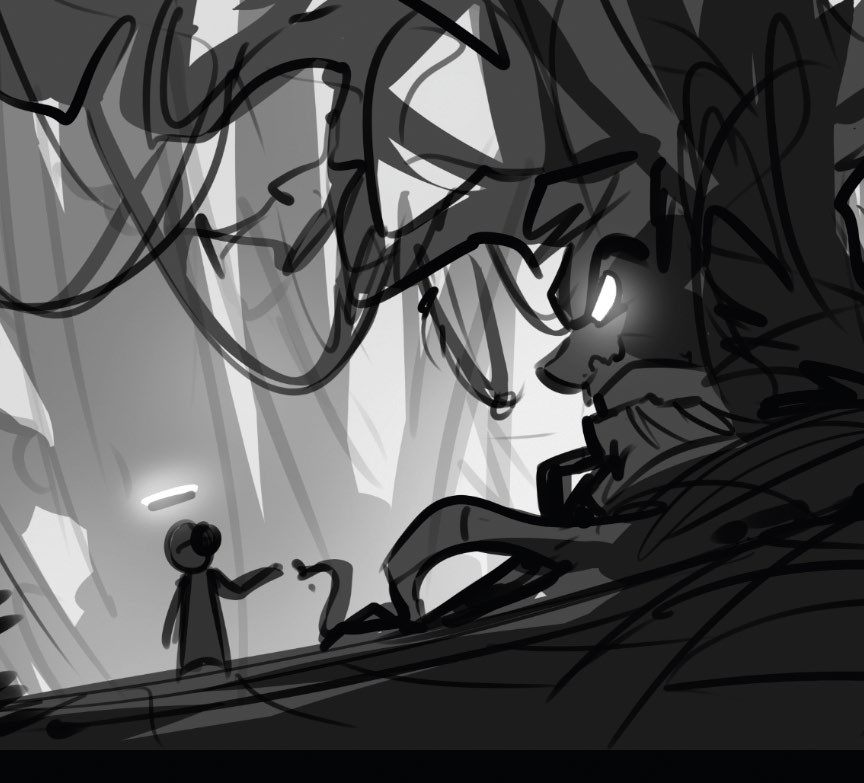
Using the same sketch, create two or three new layers and started separating the values into groups. This creates a defined background and middle, and potentially a foreground. By keeping the values to a simplified range of 2-3 per layer, we can ensure the value layers remain visually separated too.
3. Develop a colour key for tone
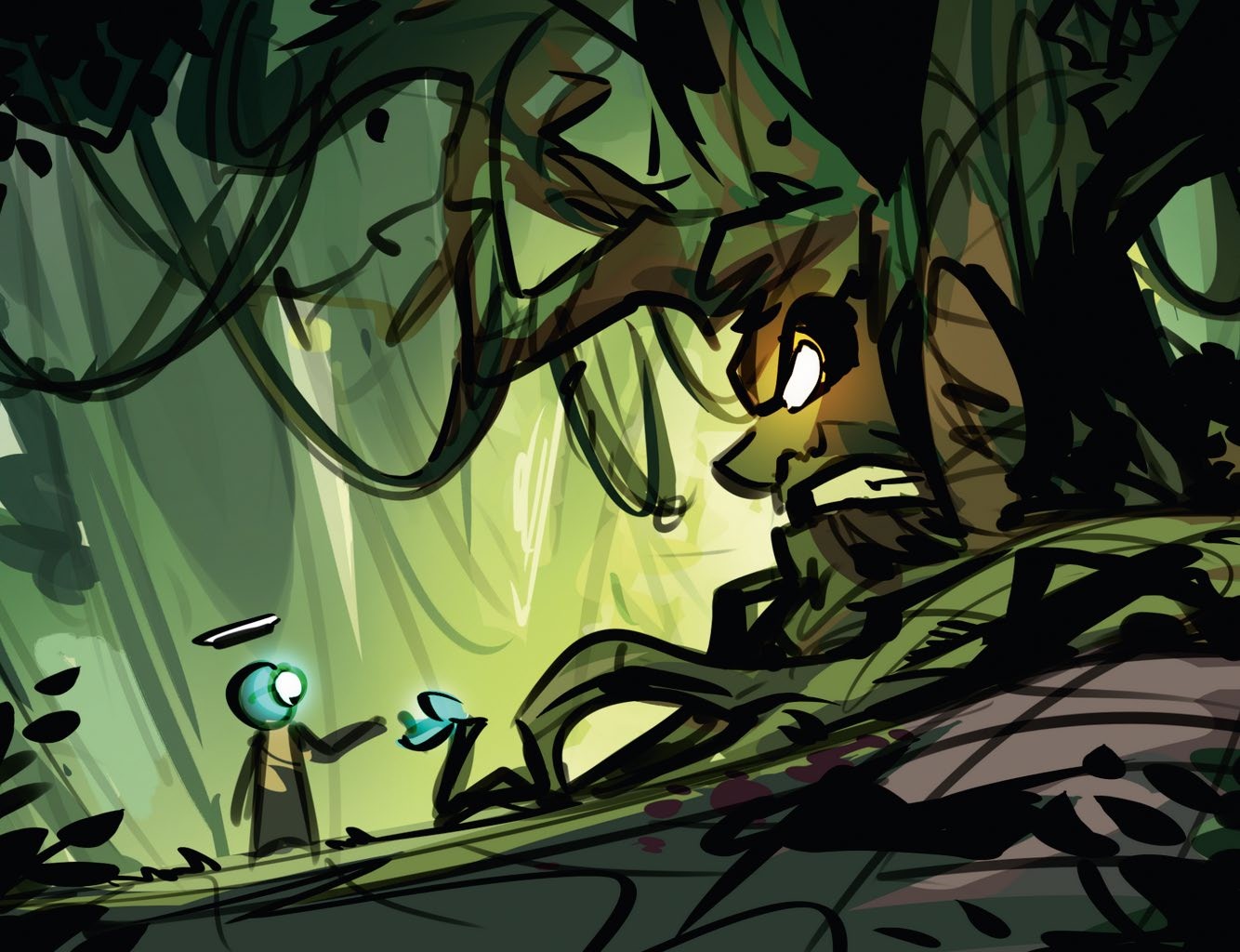
Colour keys are great for setting the tone alongside the previous value key for lighting. For my piece, I stuck with a simple triadic palette of a range of greens and dipped into complementary accents for the blue and orange elements, which will be focused on glowing areas. You can also start incorporating alternative brushes at this stage to make the colour variation easier. Also start to think about the shadow placement.
4. Draw a line sketch
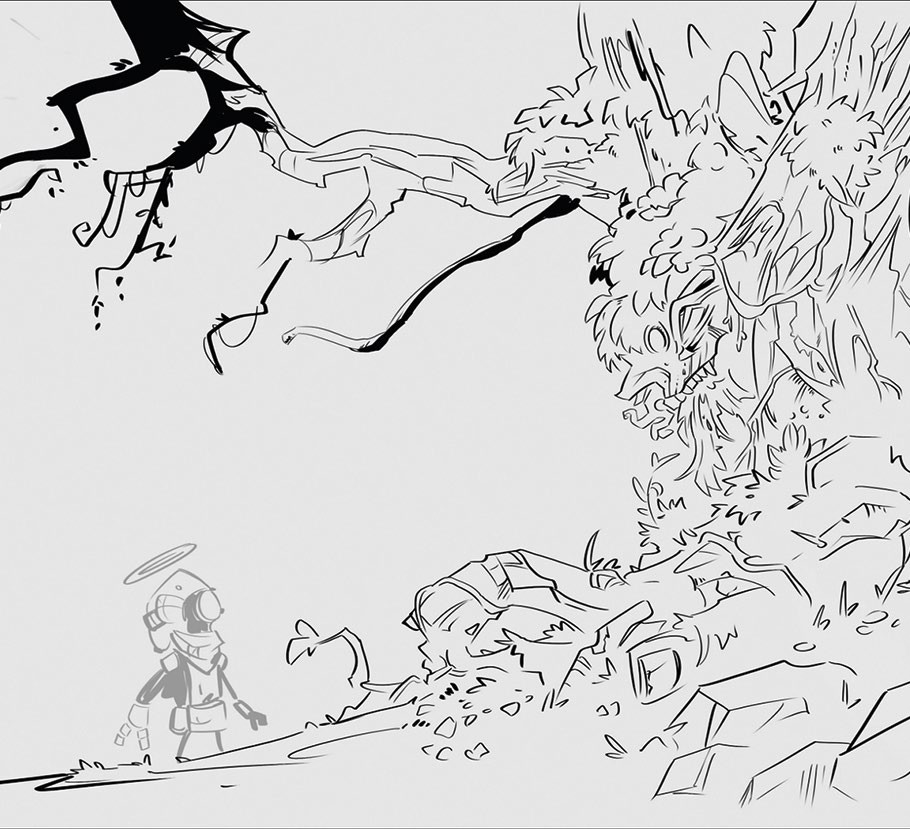
The clean line sketch is probably the most important early-stage step. This is where the design solidifies and is usually part of the final render. That’s why we should take our time here, using line drawing techniques to finalise the design in its simplest form so it has the strongest foundations for the later stages.
5. Begin the inking
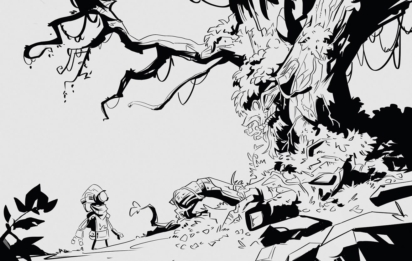
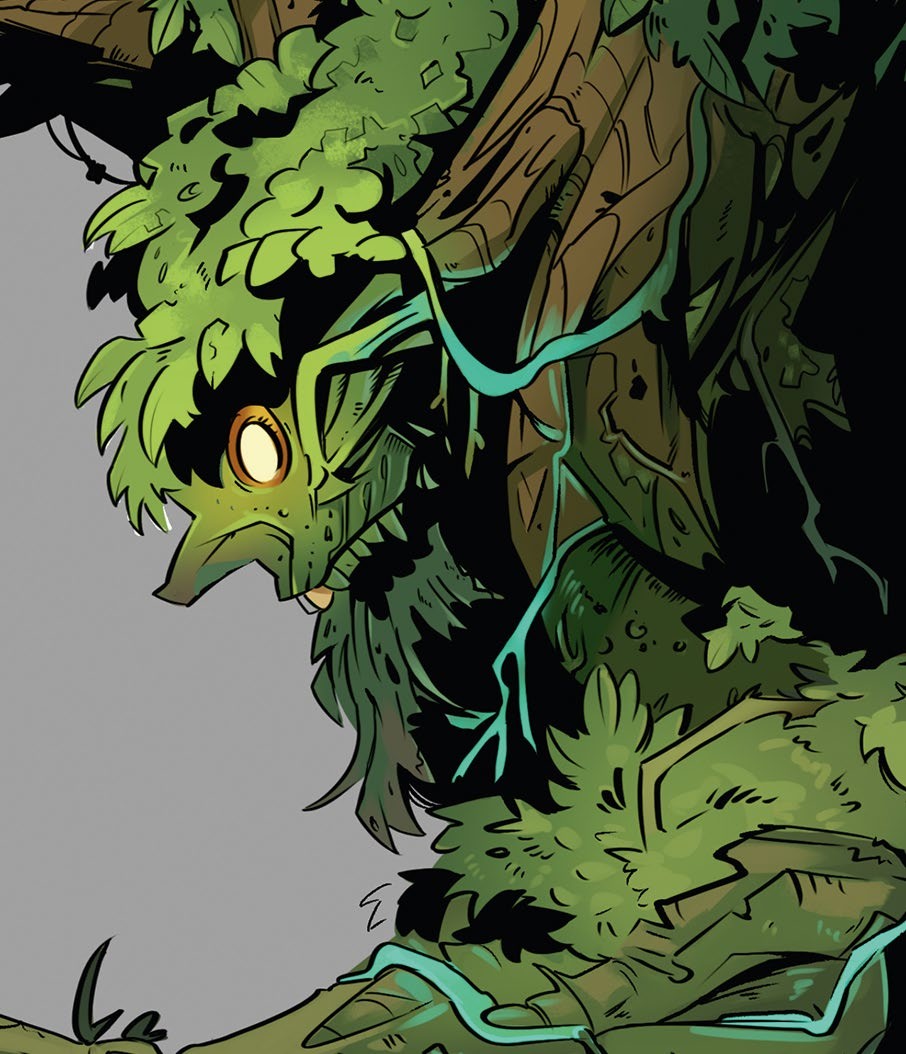
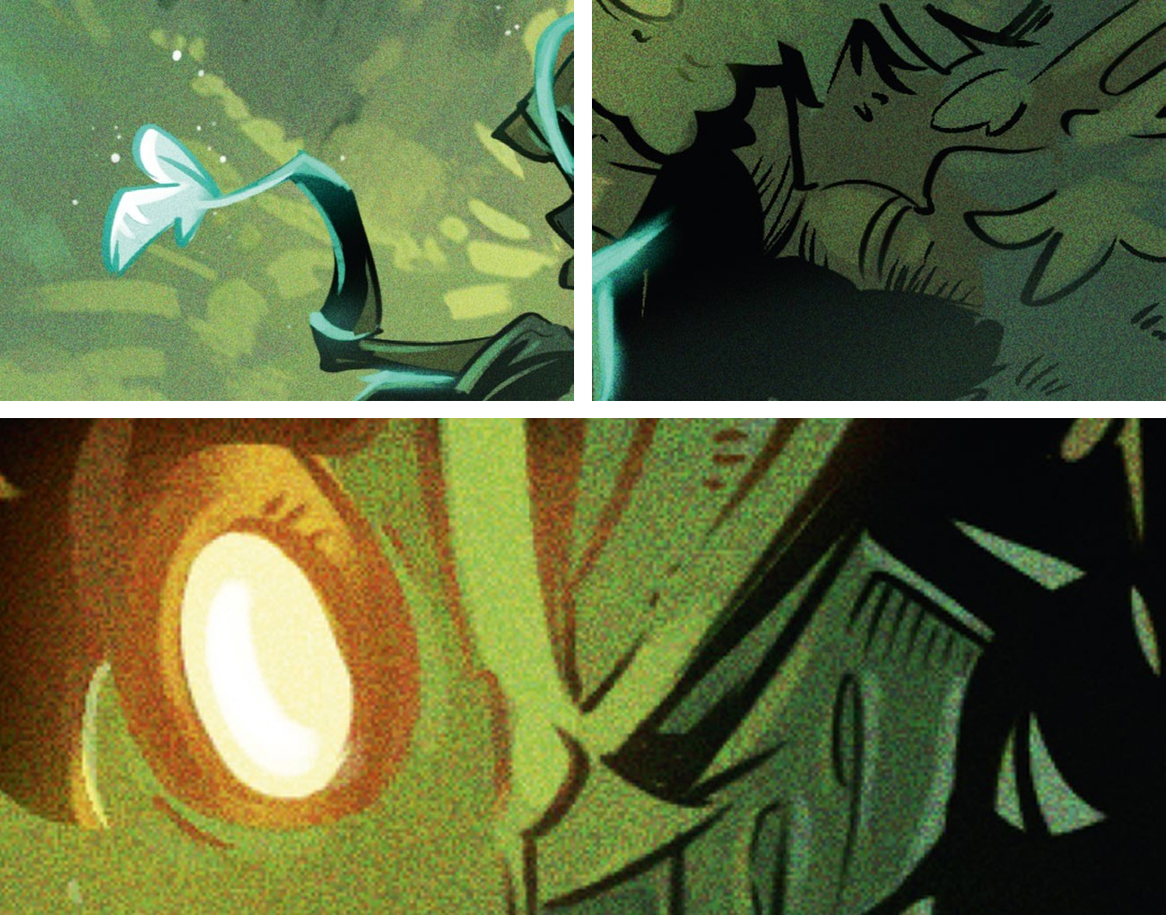
The style really comes to life here. By concentrating on inking the shadows, which is essentially ambient occlusion, we can use huge sections of black to reduce the amount of rendering needed and solidify the form through silhouettes. Focus on creating dynamic mini shapes within the larger composition and always bear in mind the direction of your lighting. Since my piece is somewhat backlit, I also added shapes in the foreground that were filled with ink.
6. Clean up
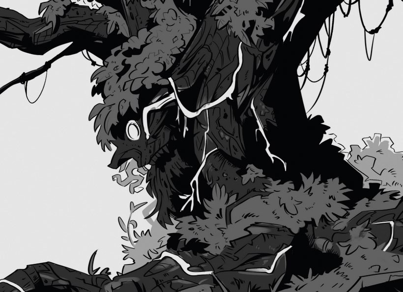
Now we have our ink, it’s time to clean it up and lay out our basic masks and layers ready for painting. Break these into key shapes followed by material separation. For example, my larger tree character will be one big shape and layer, while the vines, moss, eyes and leaves are placed on top with an alpha channel mask.
7. Fill out shapes with flat colours
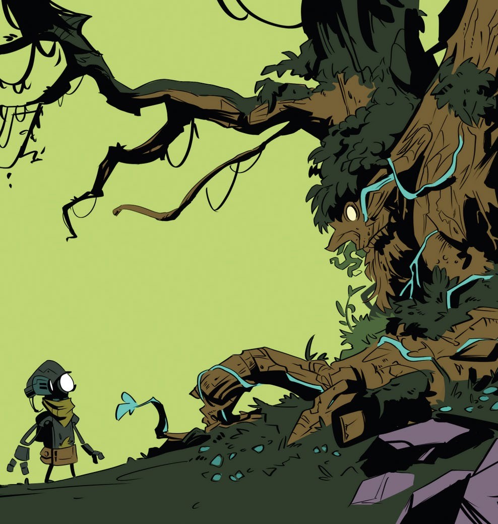
Next, efficiently apply flat local colours to the layers. Using the colour key as a guide in the top-left corner, you can keep a constant reminder of where you want the piece to end up. Sometimes things can change during this organic process; for example, I added the blue vines growing out from the tree to add more connection and leading lines between it and the robot character.
8. Add colours and initial tones
Now comes the start of the real painting process! Using a soft round brush, start playing with your values and tones. For me, that meant applying illuminated tones, dappling additional lighting to the grass floor, and adding some soft glows around the blue flower. I also started to block out the least important part of the image, the background, to get a sense of the level of detail required.
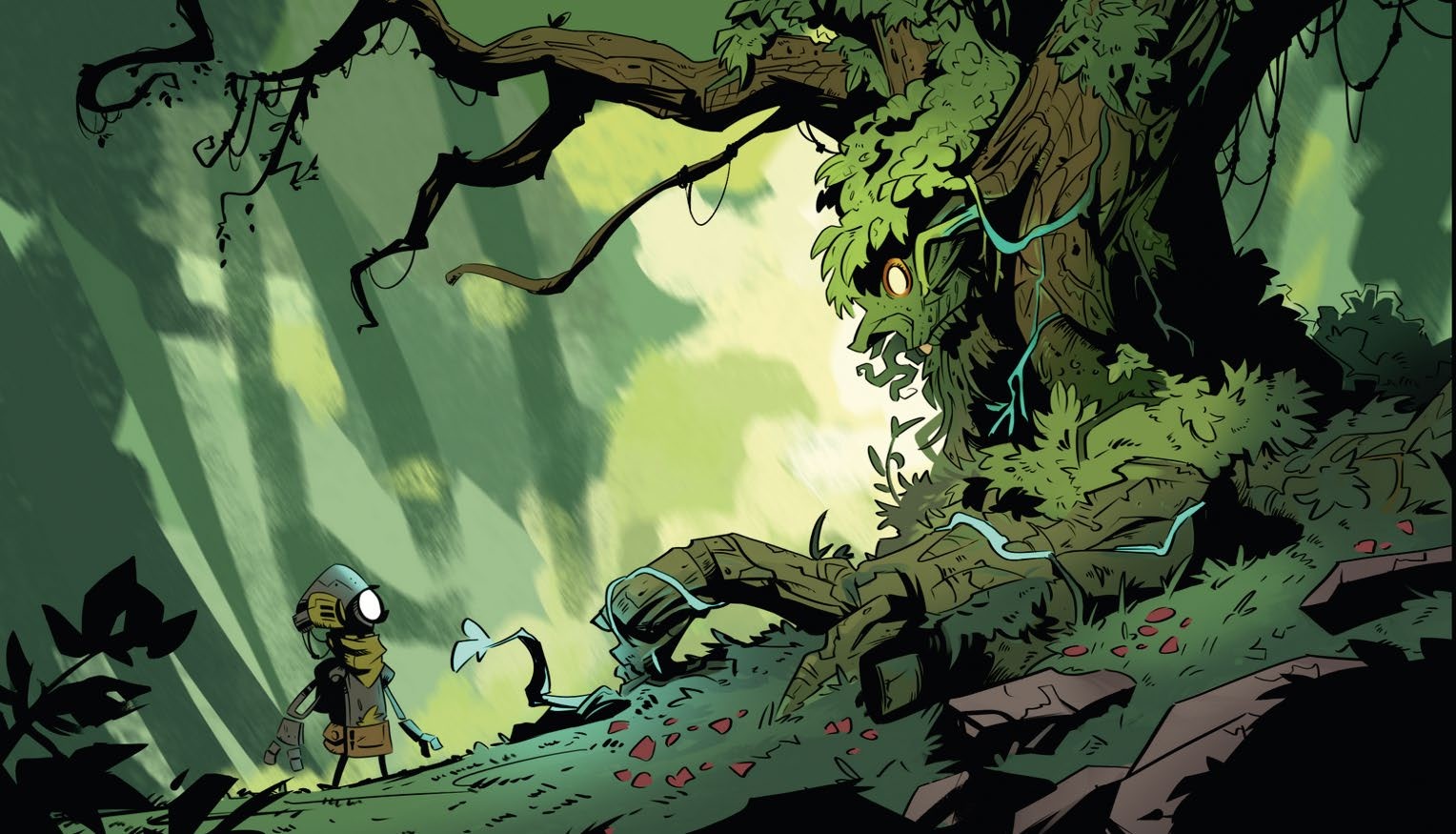
9. Render the background
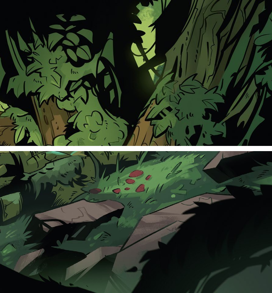
Duplicate and flatten the non-essential layers here so you don’t paint more than you need. By simply filling them in with black, it allows you to focus on the background rendering. I wanted my background to be super painterly, so I mostly used the Onibi_Mattsanz brush and wasn’t very precise about the accuracy of the details, as I knew it would benefit from contrasting with the main focus layers.
10. Soften the ink
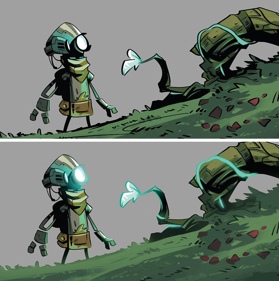
This is where we sell the style. By creating an alpha channel mask on top of the line-art and ink layer, we can now fill it with colour while keeping the shape. I often do this to reduce focus by softening the heavy black, or artificially creating a sense of illumination by having the object be so bright that it illuminates its own line-art. Play around with the Linear Dodge, Overlay or Colour Dodge blends to find what works best for you!
11. Tweak in between values
Some actual painting comes into play here. Now that everything is well on its way, we can paint in some colour variation such as lighting direction details. I don’t usually paint much variation, and almost keep to a three-band cel shading look, as it helps contrast against the busy background and stands out. My Main Boi brush is great here just for blending transfer colours. Pick the colours to ensure you don’t lose saturation!
12. Polish the glows and materials
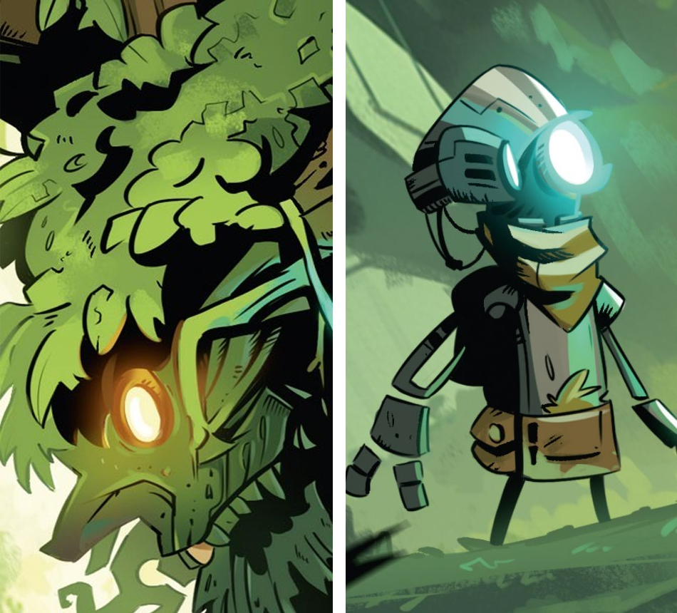
Once the bulk of the painting work is complete, you can turn to the layer options again to create glow on some of the lighting areas using Colour Dodge. Make sure to repeat the same effect on the ink layer so the glow really burns into the black ink and shines. Any metal areas would react slightly differently, but as you can see, I still kept to a simple amount of colours and values.
13. Break the mould
Because we’ve kept everything on such clean layers, we can now select the main ink layer and use black to break up the silhouette a little more with additional details, like the vines, leaves and so on in my artwork. Keep pushing and pulling to see what feels right in your piece. You can even push back with some black ink in the softening layer, as I did for the vine in the foreground.
14. Add the last elements
With one final layer on top of everything else, completely ignore the foundations we built and simply and efficiently go over the entire piece with the Pencil brush, adding in extra details without the restrictions of the existing layers. This allows for creative, expressionist details to be created without your layers getting out of hand. You can also add a noise layer to cement the comic-style rendering as it would appear in the printing process.