January is the perfect time for a home refresh. Not only is this a great way to update your home for the new year, but it’s also wonderful for beating the January blues. And what better way to do this than by bringing some mood-boosting colours into your space?
Whether you’re looking to completely change your living room colour scheme or just add some pops of colour throughout your home with accessories, the experts recommend opting for one or more of these 4 shades in order to start 2026 right.
‘For a mood-boosting, fresh start to the year, look to colour palettes that feel joyful, energising and a little playful,’ says Helen Shaw, international director of marketing at Benjamin Moore. ‘Don’t be afraid of colour, even in small doses. If you’re more colour-shy, start with bright accents on a single wall, the ceiling or painted woodwork to create an uplifting focal point without overwhelming the room.’
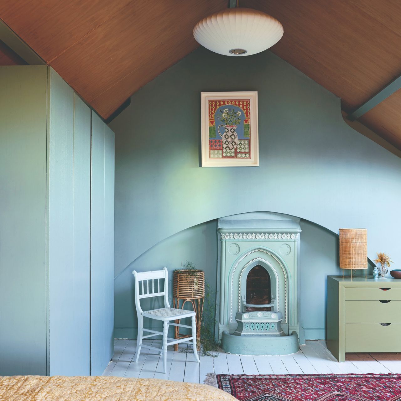
1. Muted greens
It’s no coincidence that green is one of the happy colours for bedrooms that pros turn to time and time again. It’s also the shade that interior designer Bilal Rehman swears by when redecorating at the start of the year.
‘At the start of the year, I love working with colours that feel grounding yet uplifting,’ he says. ‘Muted green in particular is timeless, it represents growth and balance. I always recommend layering rather than committing too heavily in one place especially if you’re still experimenting and not 100% dedicated. Introduce these tones through textiles; cushions, throws, or rugs or through natural materials like stone, wood, or ceramics.’
A muted green paint shade like Farrow & Ball's Vert de Terre is a timeless choice that also won't overpower any space, whether you use it for colour drenching or to upcycle a piece of furniture.
This chic planter just launched as part of H&M Home's spring collection. And I need this asap. As Bilal suggests, ceramics are a great way to incorporate pops of colour.
Muted greens look particularly fresh and calming when paired with white and off-whites. And it lends itself beautifully to a gingham pattern as seen on this budget-friendly bedding set.
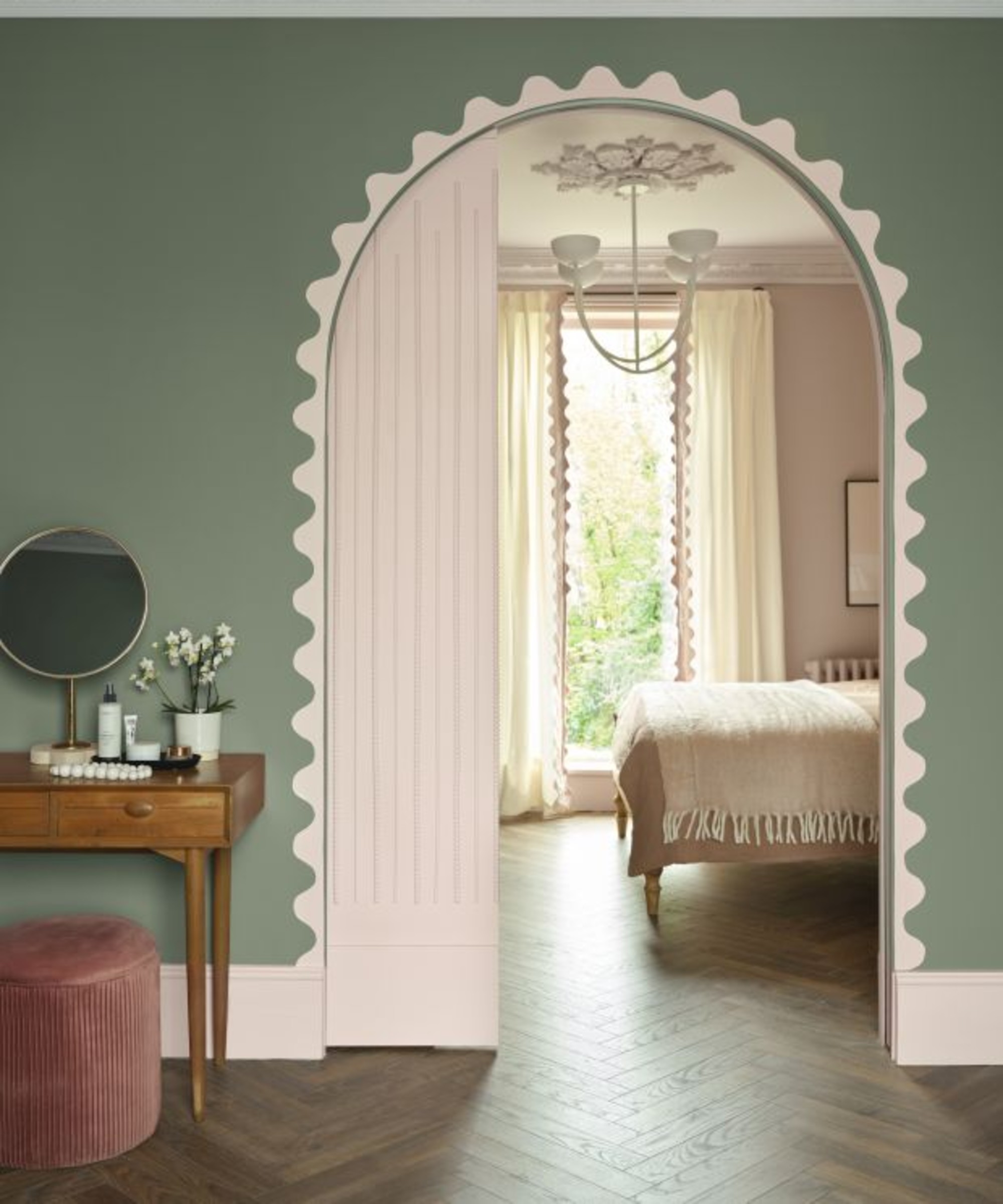
2. Soft blues

Blue is one of the biggest colour trends of 2026, especially the lighter blue shades. But it’s also the colour of calm, peace and relaxation – which is also partly why it’s become such a big home decor trend. So you won’t regret incorporating soft blue shades into your home right now.
‘Soft blues evoke calm and mental reset, which feels especially relevant after the holidays and actually a colour I've introduced in our new office space. Colour is one of the most powerful tools we have to shape how a space feels, and when it’s used with restraint and intention, it can be both deeply personal and one of the best ways to effortlessly elevate a space,’ Bilal Rehman explains.
Perfect for a serene bedroom or a blue living room idea, Lick's Blue 04 is a soft blue shade with a slight grey undertone that makes it more sophisticated yet it still feels warm, too.
Not only does this Dunelm rug come in the perfect soothing blue shade, but it also features the kind of contrasting, patterned border that inspired by high-end designs that are starting to pop up everywhere.
Incorporating pops of colour through art is one of the best ways to do it. And you can't go wrong with an art print by the iconic Mark Rothko, especially since colour was this great artist's focus.
3. Warming shades of orange
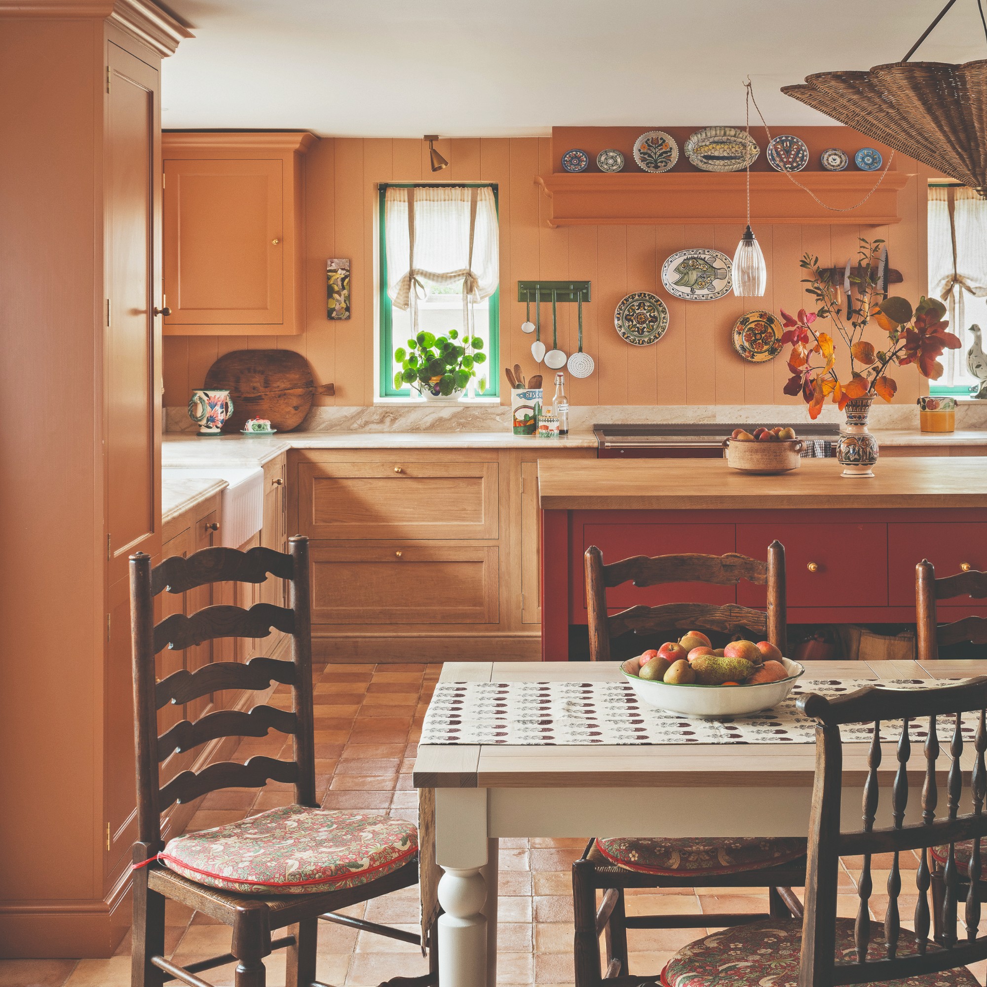
‘The colours around us have a powerful impact on our mood, so starting with shades that make you feel happy is a simple way to make your house feel like home,’ says Michael Rolland, managing director at The Paint Shed. ‘Bright, warm tones such as oranges are particularly charming.’
Now I know that bright orange can be a little ‘too much’ for many people to commit to in their homes. So if that applies to you, you can opt for an earthy, terracotta shade instead, which will feel even warmer and cosier.
‘Farrow & Ball’s Charlotte's Locks and Dulux Trade’s Tuscan Terracotta are excellent examples,’ Michael continues. ‘They have the effect of energising us and making us feel more lively and enthusiastic. Using happy shades through colour capping is a clever way to give your interiors a much-needed lift. By layering different tones of a bright, uplifting colour - using the deepest shade on the ceiling - you can turn the often-overlooked “fifth wall” into another feature that brings happy energy to the entire room.’
This paint shade by Dulux Trade perfectly mimics the colour of fired clay and is sure to warm up any space you use it in.
Varied texture is key when making a space feel cosy and elevated at the same time. And that's exactly what this chequered cushion in rusty orange will bring to your lounge or bedroom.
Lighting in orange glass is perfect as it will produce warm, golden light once it gets dark. And during the day, a lamp like this Habitat design provides a lovely pop of colour.
4. Joyful yellows
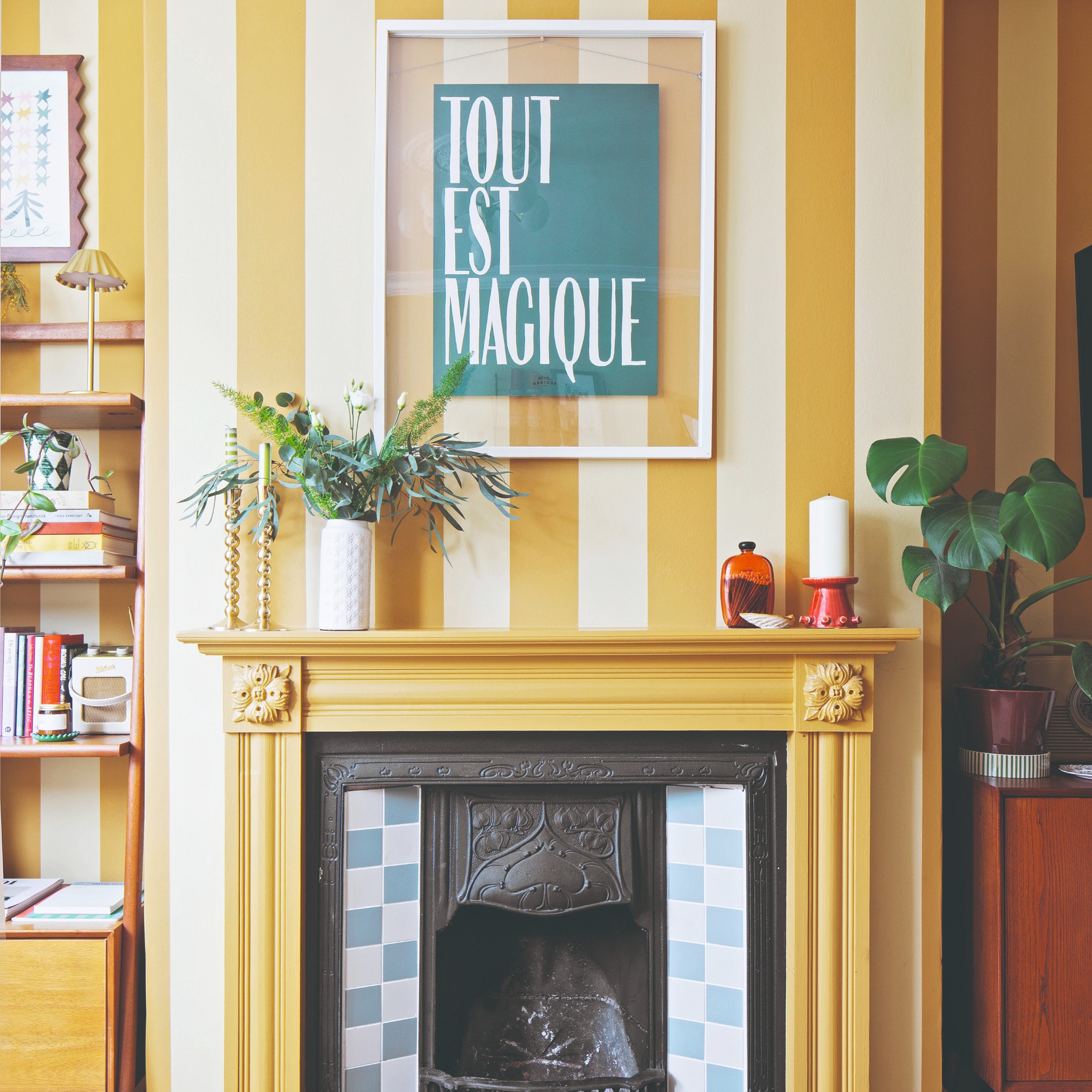
For Dulux, 2025 was all about the joyful yellow as the brand named True Joy its colour of the year. But yellow is not going anywhere in 2026 with everything from the on-trend butter yellows to the more saturated shades still enjoying much popularity. And the fact that it’s such a happy colour makes it all the more perfect to use at this time of year.
‘For a truly energising effect, yellow is hard to beat. As the brightest colour in the visible spectrum, it’s naturally uplifting and works beautifully with everything from crisp whites to deep charcoal. A full colour-drench, walls and woodwork included, delivers an instant hit of sunshine, while a single yellow feature area can be just as effective for a subtler approach,’ Helen at Benjamin Moore suggests.
Next is one of the best places to shop for swivel chairs much like the Lucca design. It comes in a wide range of colours but this golden ochre yellow will put a smile on your face everytime you see it.
This fabric table lamp looks so much more expensive than its £10 price tag. The yellow colourway is joyful, while the irregular stripes are chic.
Buying a bunch of pretty yet inexpensive supermarket flowers is the perfect treat during January. And what better thing to put it in than something as joyful as this yellow vase?!
Which of these mood-boosting colours are you going to decorate with this month to give your home a much needed refresh?