I would love for every room in my home to be large, bright and airy – as I’m sure you would too. Sadly, that is simply not the case, and UK homes in particular tend to come with rooms that are on the smaller side, some of which also don’t get a whole lot of light. Luckily, colour is a very effective tool to remedy that, as long as you choose your colour scheme wisely and opt for colour combinations that make a room look bigger rather than the opposite.
While choosing the right main colour for your space is very important, going for the best colour combinations that pull the room together and create a harmonious and enlarging effect is just as key. You can do this with the help of paint ideas - combining two different colours on your walls, or by choosing furniture and accessories in complementary colours to your wall shade.
‘It's not just about single colours, how colours interact with each other can affect spatial perception,’ says Josh Branigan, furniture and home interiors expert at Bed Kingdom.
Ruth Mottershead, creative director at Little Greene, adds how you can approach these colour combinations through paint, ‘In small spaces, stick to the dark-to-light rule – keep the darkest colours towards the floor, disappearing to a shade of white by the time the colours reach the ceiling.'
'Lighter ceiling colours give an open and airy, cloud-like feel to the room. Rather than opting for a brilliant white ceiling, which I find can look very harsh, choose a ceiling colour from the same colour family as your walls.’ In fact, the ceiling is one of the surprising places you shouldn’t ideally paint bright white.
But without further ado, let’s get to the best colour combinations to make any room look bigger than it actually is.
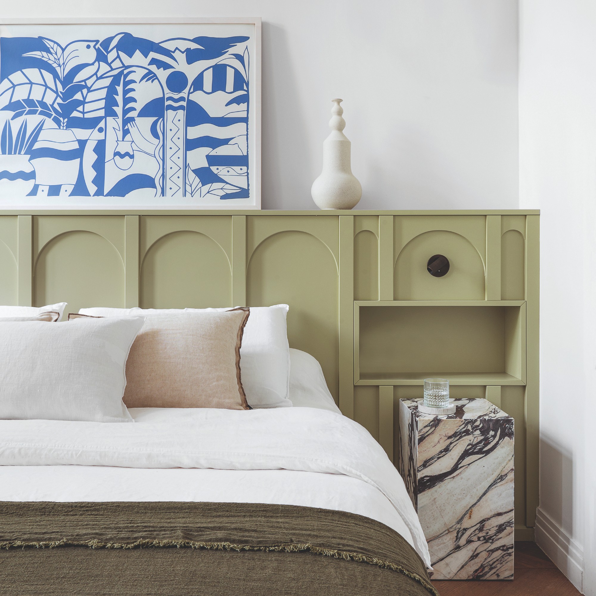
1. Taupe and white
There is something very elegant and elevating about taupe. But while combining it with white can make a room look more expensive, it will also create an optical illusion of a larger space.
‘I love using taupe with wainscoting in white,’ says Colleen Bennett, interior designer and founder of CBB Design Firm. ‘I feel that white crowns always make things feel bigger. Anything that's going to be those two colors is going to make things feel bigger.’
Tash Bradley, Lick’s director of interior design, adds that taupe is also a shade that’s recently been replacing beige in interiors, ‘We have seen that taupes generally are replacing beige in 2025. One of the biggest things I have noticed is that we are seeing a huge shift from using grey-based beiges towards warm-toned taupes with a pink undertone.’
Boasting over 100 five-star reviews on the B&Q website, this warm taupe paint shade will look super sophisticated when paired with white.
Just because you're opting for white doesn't mean you have to settle for something boring. Instead, invest in something with a fun and creative detail like this scalloped-edge bed linen from DUSK.
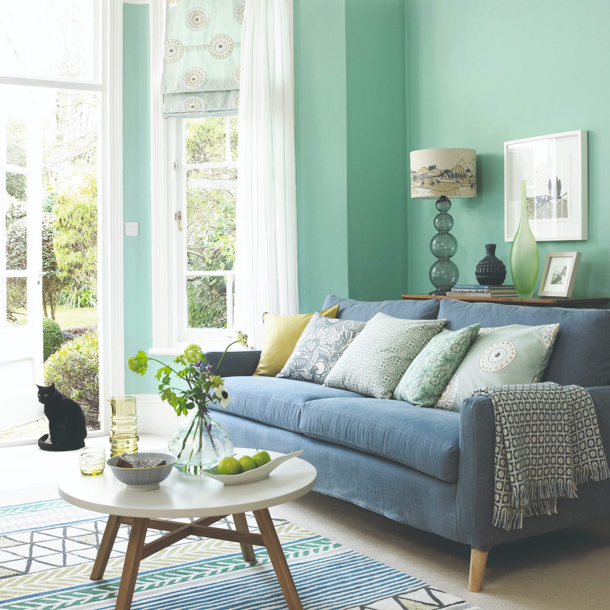
2. Sage green and neutrals
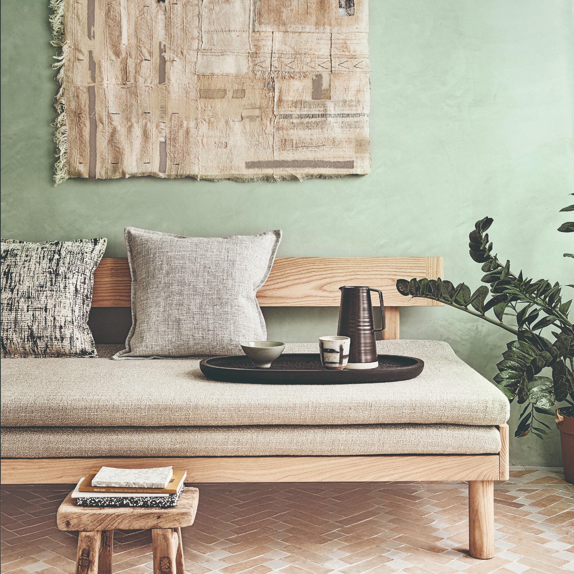
Green is becoming an increasingly more popular colour in interiors – last year, the spring and summer seasons were defined not by one but four different shades of green. And this year, some green shades are almost seen as new neutrals.
But if making your space look bigger is what you’re after, opting for a soft sage green and pairing it with a neutral tone like taupe, beige or cream will work wonders.
‘You could opt for a gentle sage, such as Willow Breeze, and pair this with a lighter, earthy neutral like Gentle Hush to create a palette that not only makes the room feel larger but also evokes calm through their associations with nature,’ says Kathryn Lloyd, Crown colour specialist.
‘A brilliant technique for combining these lighter shades in a way that enlarges a space is by painting in vertical stripes, creating the illusion of a taller, elongated wall.’
Launched just last month, Crown's Willow Breeze is a gentle green shade that is made for small spaces - especially for the likes of bedrooms.
Extra storage space is always welcome - because now matter how much of it you have, it's never enough. So this chic ottoman bed from Habitat in a neutral colourway will not only bring style but also practicality to your bedroom.
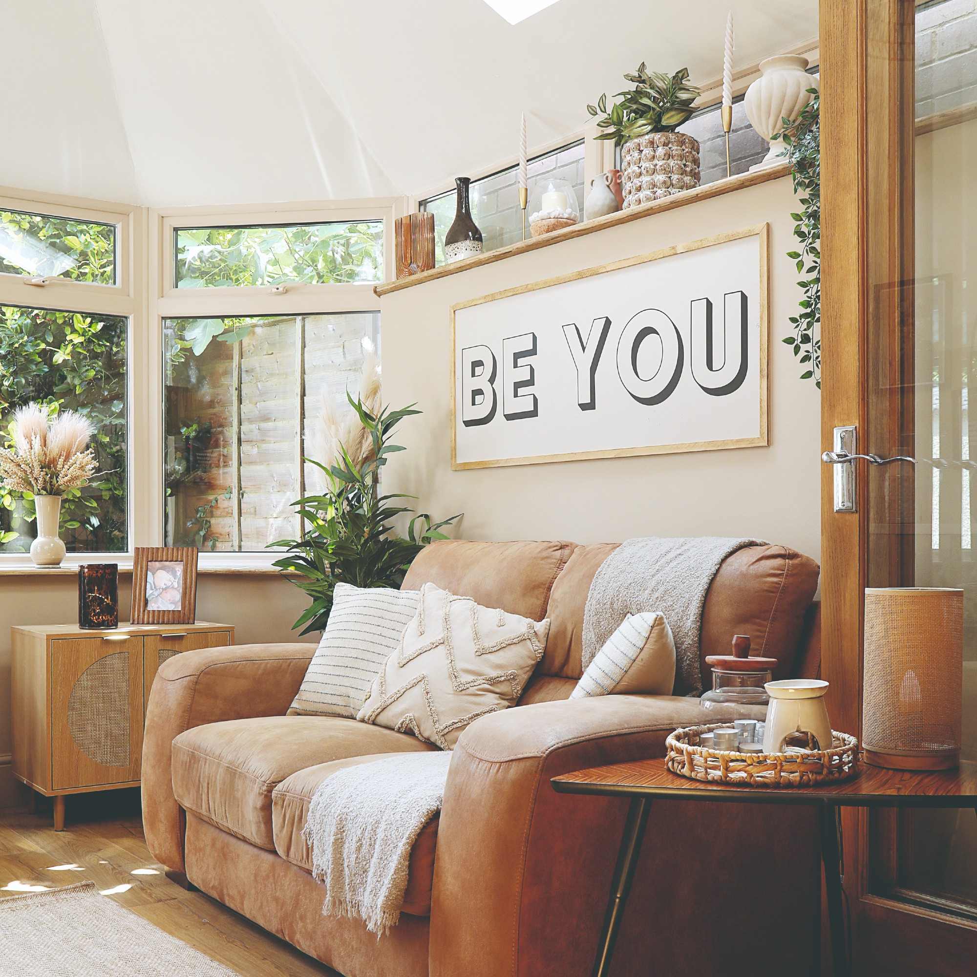
3. Tonal neutral scheme
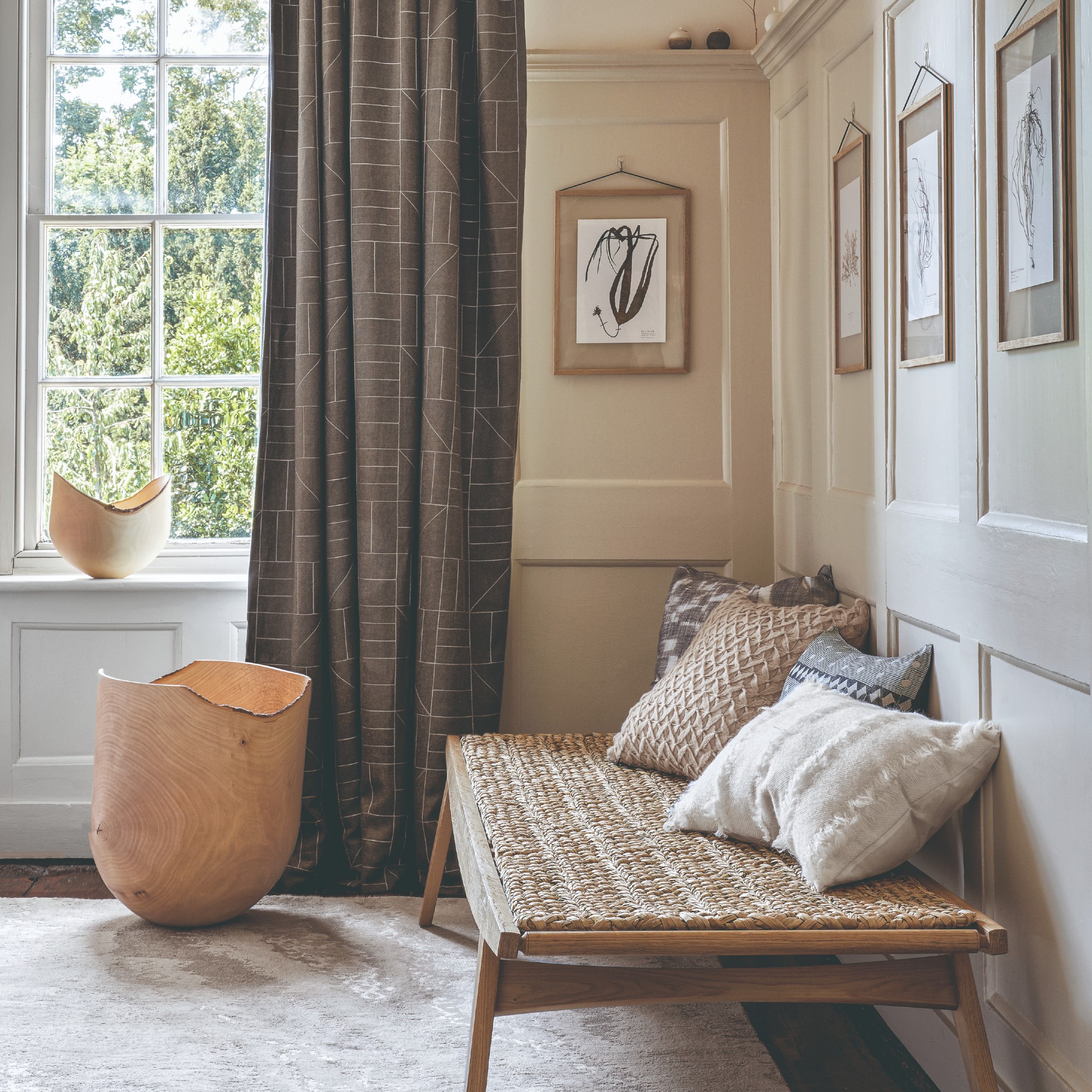
While neutral living room ideas might not be for everyone, combining neutral shades in a bedroom - especially if it’s on the smaller side - is not only going to have a calming effect, but it will also make the room look bigger and brighter.
‘While an obvious choice, opting for calming and neutral tones will automatically transform your room into a light and airy space,’ says Bailey Oates, colour expert at Earthborn.
‘Many opt to use bright white in small spaces with the aim of making the room appear larger,' agrees Ruth from Little Greene. 'Light neutrals used in a tonal scheme will have the same effect whilst not appearing too stark. If there is a lot of natural light in a small room then using sift, light tones will make the room feel more spacious.’
I sat on this chic boucle chair at a Dunelm press preview and Instantly fell in love with its stylish curved design and comfortable feel.
Skimming Stone is not only one of Farrow & Ball's most popular paint shades, but also its bestselling neutral that goes with pretty much anything.
4. Double drenching
‘Sticking to similar shades, like a monochromatic scheme, can also help increase the space,' explains Josh from Bed Kingdom. 'Think walls in a light shade of pink with a pink bed frame in a slightly darker shade and deeper tones of pink flooring, which creates visual interest without unnecessary clutter.'
'If you want to change how the height of the room feels, you can paint your ceiling the same colour, just 20% lighter in shade. It creates a subtle lift that keeps everything feeling seamless.'
As of this year, this decorating approach is called ‘double drenching’ – combining two or more tones of the same colour in a room, rather than going for the simple colour drenching which covers the room in a single shade.
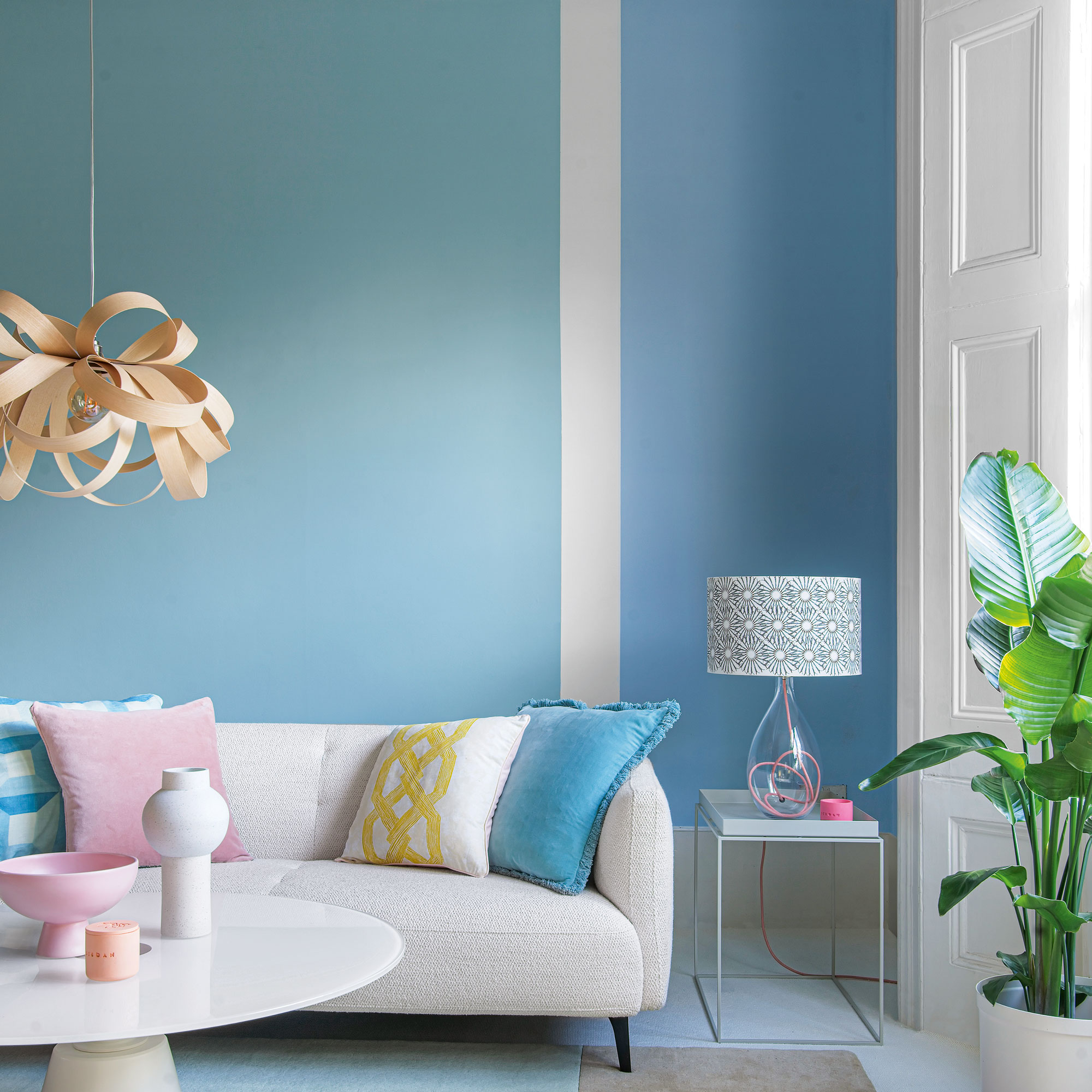
5. Light blue and soft green
A lot of room-expanding and brightening colour combinations are inspired by nature. And this is especially true when it comes to pairing soft blues and greens.
‘If you want something calming that still lifts the room, consider pairing light blues and greens together; these tones create a refreshing feel while opening up the space,’ says Josh from Bed Kingdom.
‘As a rule, light, muted shades such as delicate blues or sage greens are a great choice for smaller rooms as they make walls look taller,' adds Kathryn from Crown. 'They can also make a room feel larger by reflecting the natural light that comes through.’
The Sacha is one of Habitat's new made-to-order sofa designs this year. And its curved design instantly caught my eye earlier this year at the brand's press showcase. And this lovely soft blue would look lovely in a small living room.
Not only that this sage green shade would pair well with the sky blue of the Sacha sofa, but its wiggle-shaped base also references the sofa's curved design perfectly.
6. Pastel colour palette
If you want to give your room an airier look and feel but also like colour, so the idea of neutrals is not very exciting, you could go for a pastel colour scheme instead. It’s more fun and colourful than neutrals but it has the same light-reflecting benefits and effect.
‘To create a more whimsical look, opt for pastel hues such as pinks, blues, and lilacs. These colours help open the walls up, making the room appear bigger,’ Josh at Bed Kingdom says.
Not only that this rug features a lovely pastel lilac shade but its chequered pattern is right on trend.
Lick's Blue 04 is the perfect baby blue shade. And it's so loved by the brand and customers alike that it's made its way into the Lick colour palette for 2025.
Ruth at Little Greene concludes, saying that making your space look larger is not the only way – you can just as well lean into its compact nature and create a cosy room.
‘Light colours are not the only option for a small space. I love to embrace a small room and create a dramatic and intimate interior, with intense cocooning colours.’