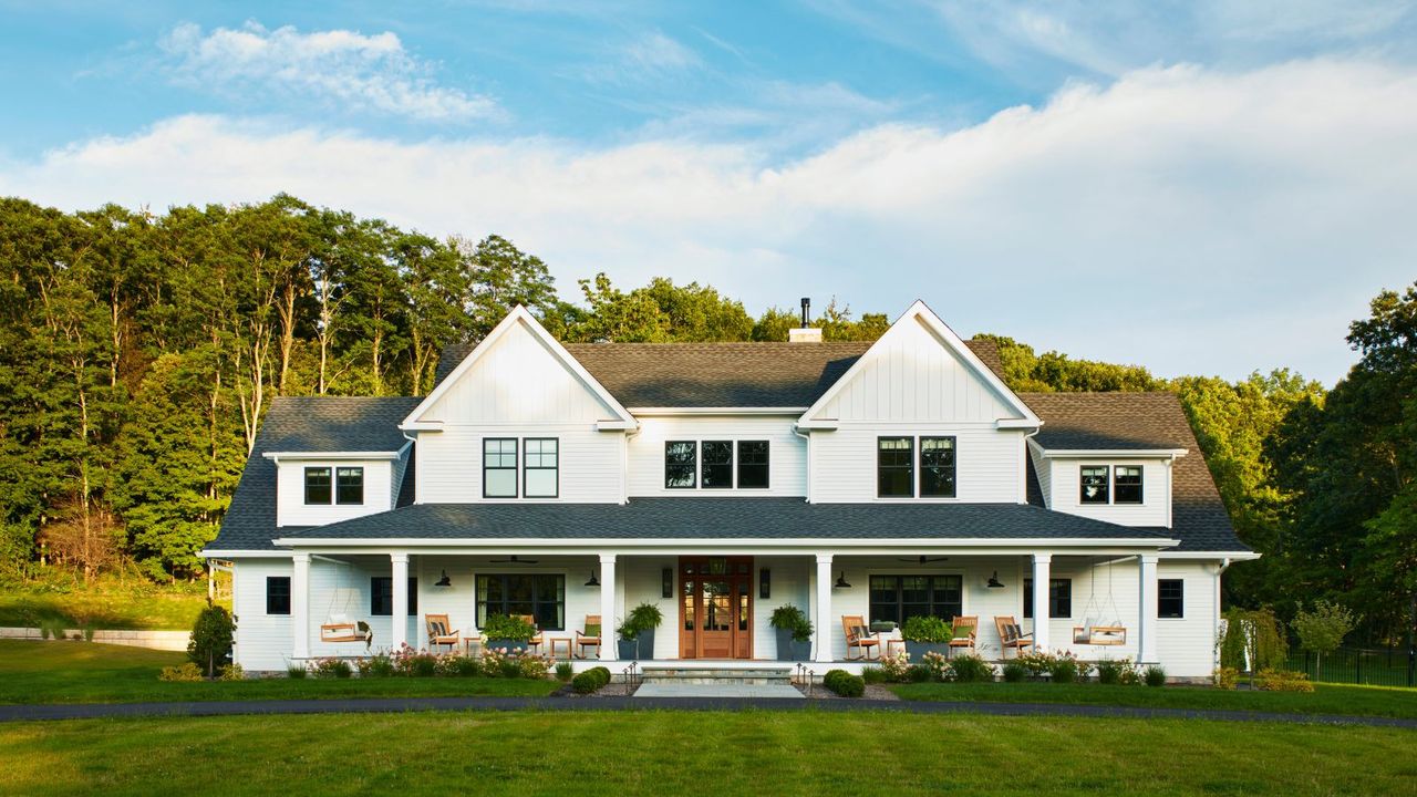
I’ve remodeled two homes, and if there’s one phrase that haunts every renovation, it’s this: builder basic. Not because it’s offensive (I love a builder) – but because it’s almost always unintentional. No one sets out to create a home that feels flat or straight from a spec sheet. And yet, without meaning to, it’s surprisingly easy to end up there.
What I’ve learned the hard way from my own home renovations is that avoiding creating a 'basic' home isn’t about budget. I’ve plenty of extravagant new builds that still feel generic, and small homes made entirely of thrifted finds feel far from flat.
More often than not, it’s the accumulation of safe choices that, together, can leave a home feeling unfinished and a little basic. Here, designers share the 4 things they think stand out as 'builder basics' – and how to change them.
4 Things in Your Home Giving Builder Basic
One thing I’ve come to realize is that homes rarely look builder-grade because of one catastrophic choice. As Jen Dean of Jede Interiors puts it, 'it's rarely one thing – it’s the accumulation of defaults.'
'Flush-mount lighting everywhere, safe finishes across the board, hardware that technically works but doesn’t add anything,' she adds. 'None of it is wrong, it just feels unfinished.'
Kailee Blalock of House of Hive Design Co. agrees, adding that 'What reads as 'builder basic' is rarely about cost, it’s about uniformity and lack of material variation.'
The good news? The difference between standard and standout is usually in the details. Designers aren’t recommending gutting your home, just editing a few things here and there, swapping, re-scaling, and layering. Subtle shifts that move a home from bland to design-led. Here's how.
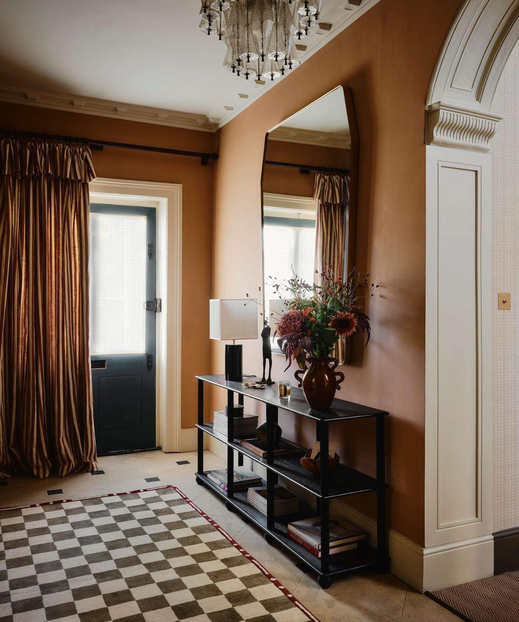
1. Plain Drywall and No Architectural Details
When walls and trim are treated as background instead of architectural features, a home can feel flat and unfinished. I’ve noticed this especially in new builds – often, it’s not the proportions or layout that’s the issue but the absence of details like ceiling trim, moldings, and decorative woodwork that give a home character.
Designer Bethany Adams says that she gets the ick from 'drywall walls as far as the eye can see. Nothing says 'builder grade' like miles of drywall with nothing to break it up.'
And it doesn’t stop at the walls. Kailee Blalock points out that features like 'hollow-core doors' and 'standard baseboards' are often selected for efficiency rather than impact. 'Upgrading to solid-core or applied-molding doors are subtle upgrades that shift perception,' she suggests.
'To get a more custom look, finish out those uncased drywall openings with painted millwork, add wainscoting or molding, or even just a dash of wallpaper here and there,' Bethany suggests. 'Even replacing standard baseboards with taller, more detailed profiles can dramatically elevate a space,' Kailee agrees.
2. Basic and Recessed Lighting
If there’s one detail that can instantly tip a home into 'builder basic' territory, it’s lighting. I say this as someone who has stood in my newly finished kitchen and then looked up with regret.
As Bethany Adams explains, 'there is a time and place for recessed lighting, but I've been in multi-million dollar new builds with giant, cheap can lights and let me tell you, no matter how expensive your marble countertops are, the whole house just looks cheap with these eyesores dotted along your ceiling.'
Kailee adds that 'standard flush-mount dome lights' are another utilitarian choice that reads purely practical, rather than being chosen for aesthetics.
The fix isn’t to eliminate recessed lighting entirely, but refine it. 'If you're building and must use recessed lights, choose a 2-3" recessed cone light,' Bethany advises. 'But if you've already built, LUSA has a conversion kit you can buy to make your 6" cans into 4" cans.' Beyond that, it’s about embracing fewer, better lights to create a layered lighting scheme.
This unique chandelier is a masterclass in how to replace default lighting with something sculptural and stylish. The warm wood frame and perforated ceramic shades introduce texture and softness, while the sweeping arms create movement overhead.
Proof that flush mount lighting doesn’t have to feel flat or forgettable. This perforated brass design casts a subtle pattern of light and shadow, instantly adding depth to ceilings. It’s a refined upgrade for spaces with recessed cans.
With its softly pleated silhouette and warm cream tone, this pendant brings dimension to a space without overwhelming it. Hanging over a dining table or in a bedroom, it adds warmth and visual interest while still reading timeless and neutral.
3. Low-Quality Flooring
Flooring is one of those elements that makes a huge impact on the feeling of a room. And when it’s been chosen purely on price or speed of installation, it can quietly undermine everything else in a room. Texture, underfoot comfort, and even sound all contribute to how elevated a space feels.
When it comes to bedrooms and cozy spaces, Bethany is clear to point out that not all carpet is the villain – quality is. 'I prefer to use 100% wool for a look that is as luxurious as it is durable. There are very high-quality nylon carpets, but they will have a tighter weave (wiggle your thumb into the carpet, and if it gets to the bottom easily, your carpet is low quality), and most builders will choose price over quality.'
The same principle applies across all flooring types. Builder-grade laminate with a repeating print, poorly chosen floor boards, or plain tile: sure, they all do the job, but they don’t add depth, warmth, or intrigue. Flooring covers a huge footprint, so when it lacks variation, warmth, or quality materials, the entire room can feel less considered.
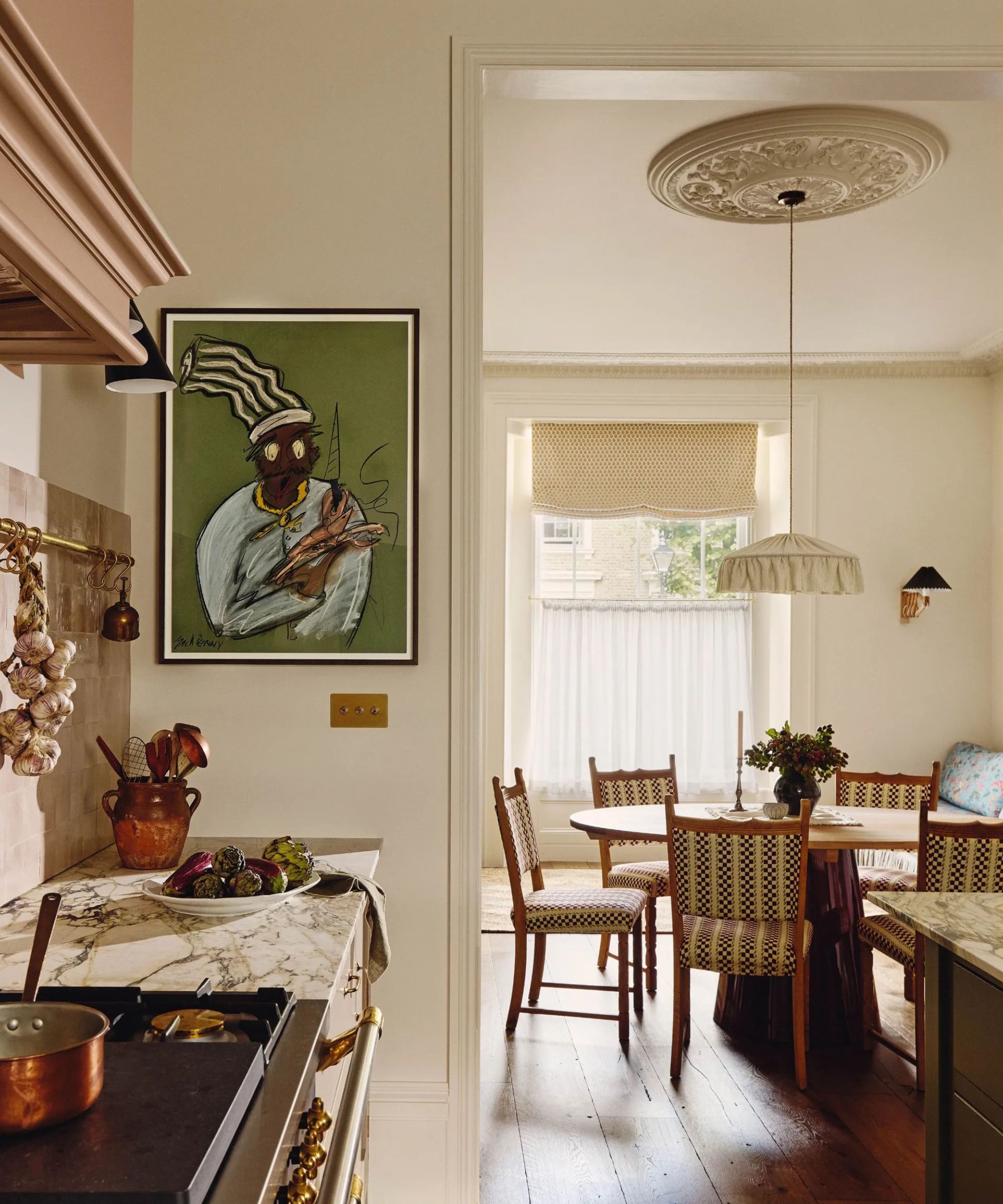
4. Flat Finishes and One-Note Color Palettes
When every finish matches and every wall is painted flat white, the result isn’t cohesive – it’s monotonous. Of course, there’s a moment in every renovation where playing it safe feels sensible, but that can quickly slide into boring.
'Flat, cool white paint applied throughout an entire home without tonal variation can also flatten architectural depth,' Kailee adds. 'Designers combat this by introducing material contrast, swapping thin pulls for substantial unlacquered brass or aged bronze hardware, and layering warm whites and complex neutrals that change slightlyfrom room to room.'
Designer Kathy Kuo points out that one of the things that instantly reads 'basic' is all-matching finishes, such as using only one metal finish across hardware, plumbing, and light fixtures. 'While you want your finishes to complement each other, you don’t want them to fall flat or feel monotonous in their repetition,' she explains.
'Try choosing one core finish that’s used most often through a given space, and accent it with one or two additional finishes,' Kathy suggests. 'In a kitchen design, a classic pairing is unlacquered brass hardware and light fixtures with polished nickel faucets for a look that’s timeless and cohesive but never boring.'
Hardware is such a small but mighty swap. The unlacquered brass ribbon-shaped backplate introduces a playful touch that elevates even the simplest cabinetry, while the warm brass finish adds patina.
As used by Oho Interiors in the kitchen pantry seen above, Farrow & Ball's Cola is a deep, warm brown with red undertones that reads rich and warm. Used in smaller spaces like a pantry, powder room, or on cabinetry, it adds depth to neutral schemes.
Classic, but far from boring. This polished nickel knob takes cues from traditional hardware, but the finely detailed backplate and solid brass construction give it a special quality that builder-grade chrome lacks.
If there’s one thing renovating has taught me personally, it’s that avoiding 'builder basic' isn’t about chasing trends or spending more. The homes that feel layered and lived-in are rarely the ones with the biggest budgets; they’re the ones where each choice feels intentional rather than boring or safe.
And the best part is, the fix isn't a total overhaul. As Jen Dean says: 'Often it’s as simple as swapping in lighting with better scale, choosing hardware with some weight, or introducing one material that brings depth – plaster, stone with movement, a warmer wood tone.'