The Opening Note
As Digital Editor at Homes & Gardens, I’ve spent years immersed in the world of interiors – curating designer projects, exploring remarkable homes, and uncovering the details that make a space feel truly lived-in. My training in color theory at KLC Design School has only deepened my appreciation for just how transformative color can be. It’s never simply about choosing a shade you like; it’s about shaping atmosphere, defining character, and creating emotion within a room.
For the third issue of My Very British Edit, I’m turning my attention to one of the most powerful – and often most personal – elements of design: room color ideas. British homes, in particular, have long embraced color with a confidence that feels both bold and deeply considered. From earthy heritage greens to rich oxbloods, from moody blues to warm plaster pinks, these hues carry history and soul. They anchor a room, tell a story, and – when chosen thoughtfully – stand the test of time.
What I admire most about English decorating is its bravery. For generations, homeowners and designers alike have turned to palettes inspired by landscape, architecture, and tradition. These aren’t fleeting, trend-driven tones; they are colors with lineage. Colors that feel rooted. Colors that make a home feel loved, lived-in, and genuinely expressive.
My background in color theory has taught me that the shades we choose don’t just decorate a home – they shape how we feel within it. The right palette can soften a space, lift its mood, or give it structure and sophistication. Layering hues with intention – pairing deep, saturated tones with gentle neutrals, or offsetting warm undertones with cooler accents – is what creates rooms that feel harmonious, inviting, and timeless.
Choosing color is an act of confidence, and this issue celebrates exactly that. It’s about embracing the shades that speak to you, trusting your instincts, and understanding that the most compelling rooms are often those that blend bravery with heritage. When color feels authentic – when it’s rooted in story, craft, and personal connection – it elevates a home in ways no trend ever could.
This edition is a celebration of color at its most meaningful: historic, expressive, soulful, and deeply British.
The Edit: Wow With Heritage Colors
Spotlight: Farrow & Ball
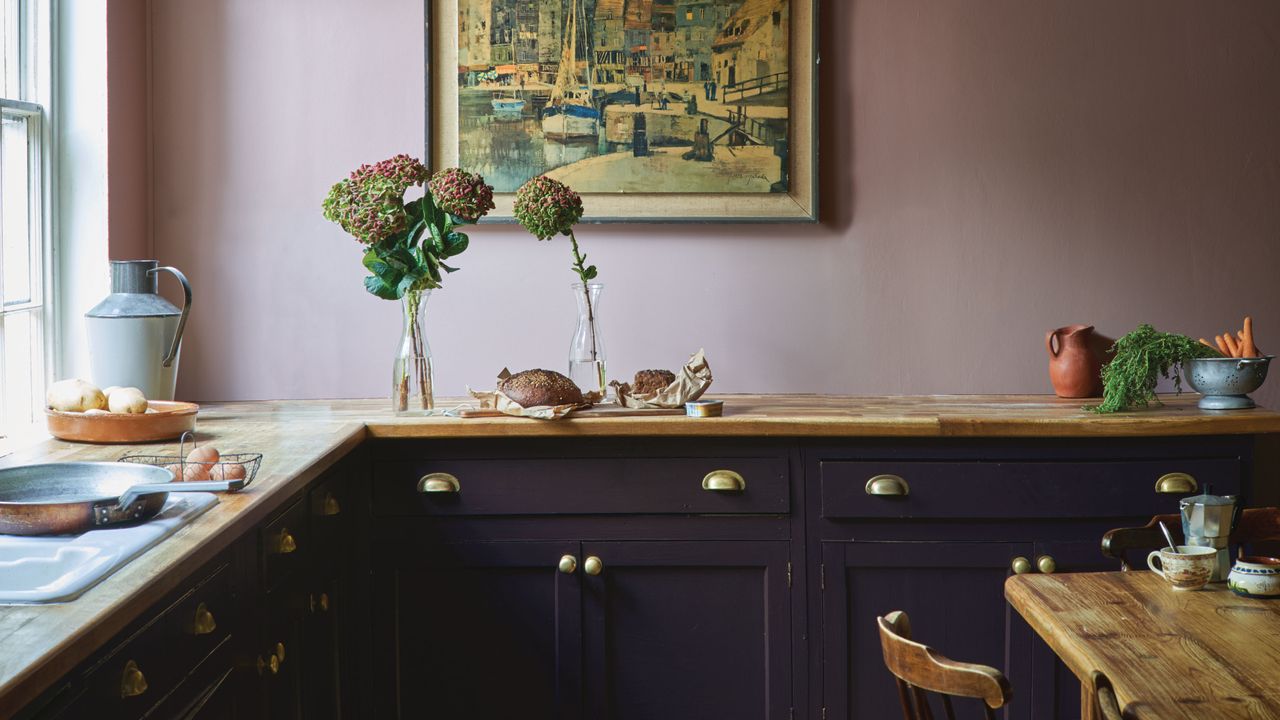
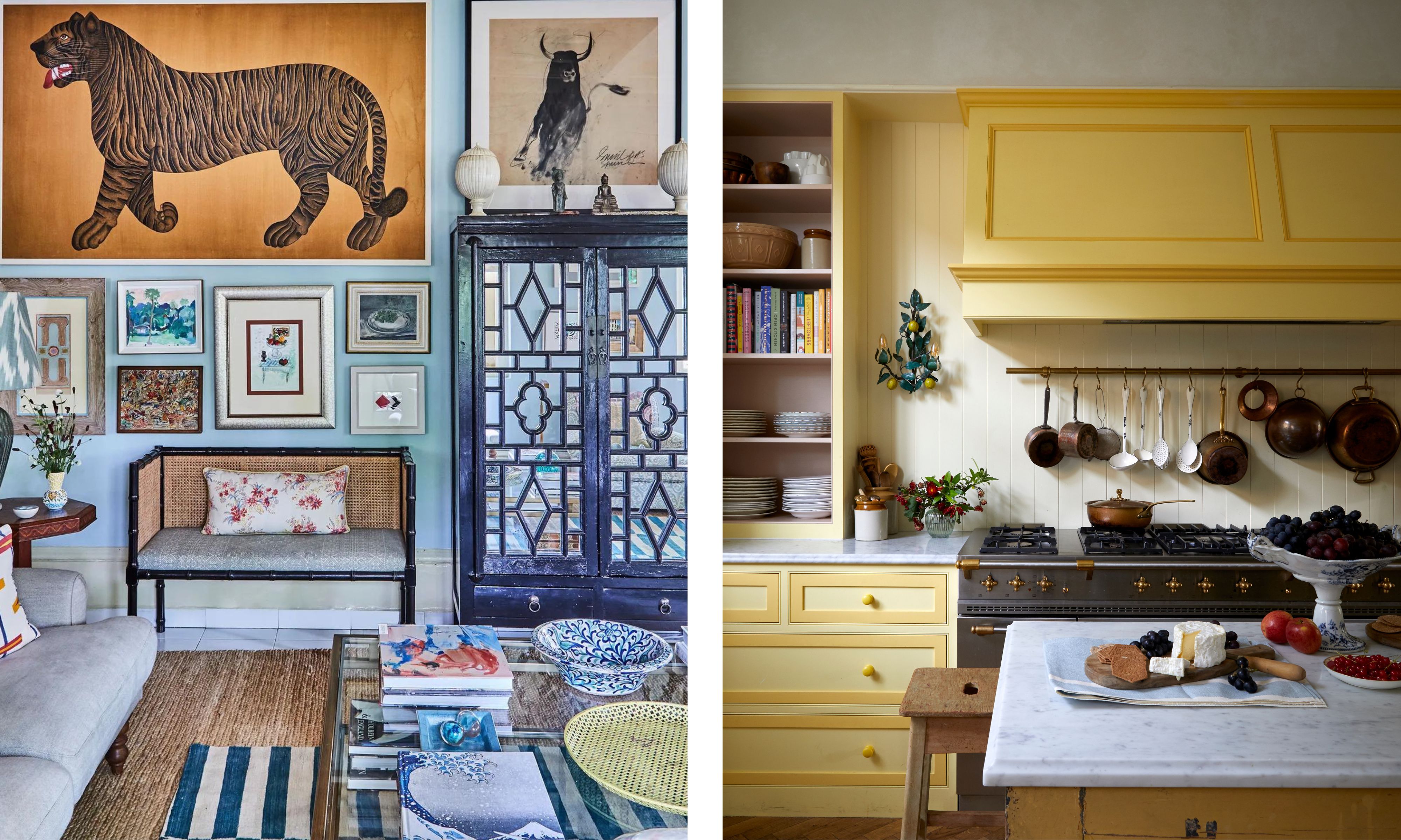
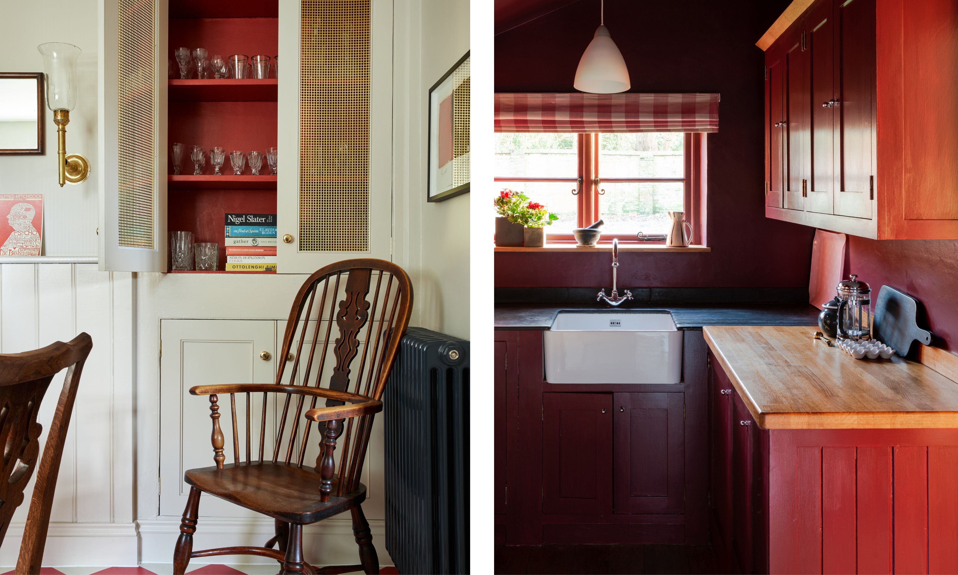
Few brands have shaped the way I think about color in the home quite like Farrow & Ball. Since 1946, this Dorset-based company has been crafting paints and wallpapers that do more than cover walls – they transform spaces and give them profound personality. Every shade responds to light in such a subtle and beautiful way, and every finish, from the ultra-matt Dead Flat to the mold-protected Modern Emulsion, feels carefully considered, thoughtful, and enduring. This dedication to quality is why the brand’s influence is only growing stronger as we prioritize authentic design.
Color isn’t just decoration; it’s storytelling. The way a room feels – calm, cozy, energizing, or playful – is often dictated by the hues we choose. I’ve always admired how British homes embrace color boldly yet thoughtfully, layering heritage tones with playful accents that reflect who lives there. Farrow & Ball’s curated palette makes this approach effortless, offering rich, directional shades that feel both timeless and utterly personal.
Using color thoughtfully is how I bring a space to life. I love seeing how a muted Vert de Terre can feel warm and grounded, how a Belvedere Blue can transform a sitting room into a cocoon, or how a touch of vibrant Charlotte's Lock can give an entrance unexpected energy. With Farrow & Ball, it’s not just about following trends – it’s about creating interiors that feel lived-in, authentic, and entirely yours.
Even beyond the UK, Farrow & Ball’s presence is growing, thanks to an exciting series of brand collaborations that bring these heritage colors to homes across the USA. Designer partnerships such as Kelly Wearstler’s California Collection, Christopher John Rogers’ curated palette, Tala’s Muse lighting colors, and Framebridge’s handcrafted Italian frames inspired by Farrow & Ball shades showcase the brand’s versatility and high-profile appeal. Meanwhile, organizational collaborations, such as the adornment of Vital Voices’ Washington D.C. headquarters with Ashley Maddox, highlight how Farrow & Ball’s timeless colors can elevate any space, regardless of its function.
Whether through personal interiors, high-profile design collaborations, or thoughtful public projects, Farrow & Ball proves that color is universal – but the way it is applied is profoundly personal. A well-chosen hue can transform a house into a home, infusing personality, heritage, and soul into every corner.
In the Queue
Next week on The Very British Edit, I’ll be turning my attention to one of the most timeless elements of the home – wood. Old or new, dark or pale, the warm and tactile nature of timber ensures it enhances any home. From well-loved furniture to everyday objects, wood brings natural beauty, enduring practicality, and a quiet, lived-in charm that makes a space feel truly inviting.
I’ll be exploring the pieces that showcase wood’s versatility and character – the ones that grow more beautiful with age, tell a story, and feel like old friends. Whether it’s a sturdy table, a cherished chair, or a small household object, wooden staples embody the comfort, craftsmanship, and heritage that define a home filled with personality and warmth.
The Very British Edit is a shoppable guide to beautiful living with a distinctly British twist. From heritage patterns to timeless decor inspirations, each edition blends personal insight, design expertise, and a love of craftsmanship. It is stylish, trustworthy, and endlessly inspiring.