Personality-led designs are dominating kitchens this year, and one clear shift we're seeing is the return to color. But it's not predictable palettes that are emerging most prominently – it's unexpected pairings that are proving the most sought-after.
Your kitchen color ideas dictate the look and feel of your scheme, and choosing an unconventional duo can take your design from basic to playfully stylish. But how can you ensure you choose colors that actually work?
Fear not – interior designers have a few unexpected kitchen color pairings they say are not only totally stylish, but they're about to be the most coveted for 2026 and beyond. From pops of red to muted hues, these are the combinations worth considering.
8 Unexpected Kitchen Color Duos to Consider This Year
Choosing your kitchen color scheme can be an arduous task, especially with so many shade variations to consider, and then thinking about complementary tones on top of that. But these designer-approved kitchen color pairings make the job easier while giving you some more unique suggestions.
1. Brown and Blue
In a bid to create a more unique scheme with moody color palettes, one emerging pairing that's proving unexpectedly complementary is rich, chocolatey browns with brighter shades of blue.
'We’re moving away from kitchens that rely on one dominant color or overly safe neutral schemes. In projects like Highgate, we’ve paired deep chocolate tones with teal and jewel-like accents to create something much richer and more layered,' says interior designer Laura Stephens.
'The contrast feels unexpected, but it’s what gives the kitchen its depth – it stops the space feeling flat and instead makes it feel more like a room you want to spend time in, not just a functional backdrop.'
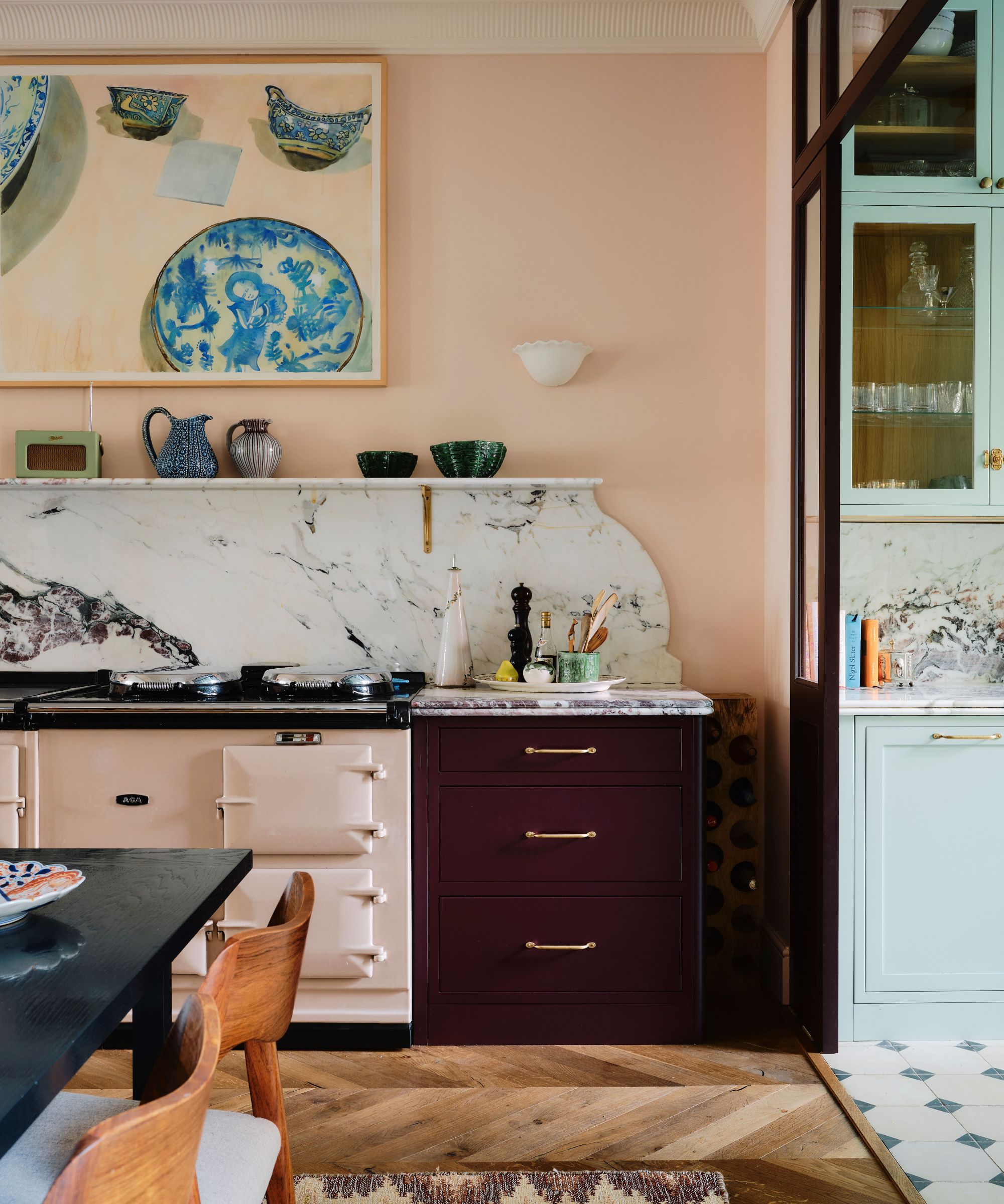
2. Deep Red and Golden Yellow
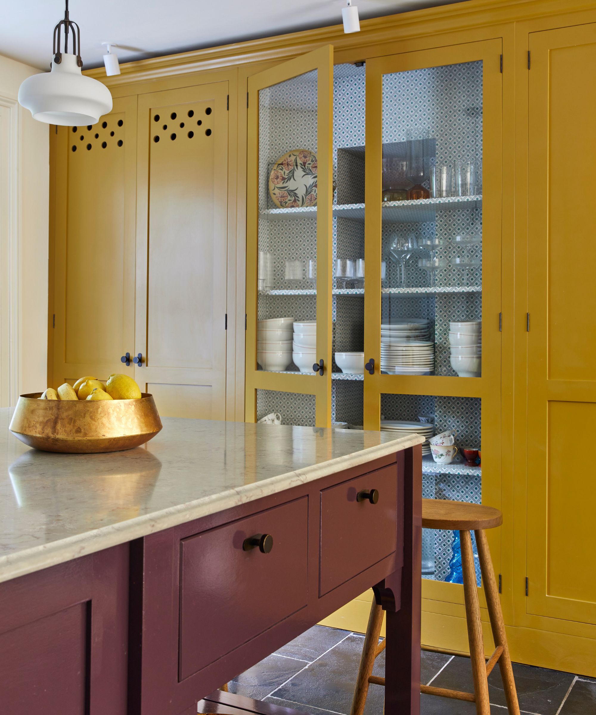
There's no denying the enduring appeal of a burgundy kitchen, but if you want to bring an unexpected twist on this classic look, designers say golden shades of yellow are the perfect companion for a more playful look. It's a color that still brings brightness and warmth, but without the predictability.
'I have a feeling we’re on the verge of a burgundy-and-gold mustard moment. It’s fascinating how the colors of our childhood continue to resurface, only this time with a more refined and sophisticated perspective. A deep burgundy lacquered kitchen paired with gold-mustard walls or wallcoverings and anchored by a striking quartzite feels instantly sexy and artful,' says Joe Waroquier of Joe Waroquier Home.
'For a fresh twist, the mustard could move overhead as a lacquered ceiling, balanced by warm burgundy cabinetry below. These rich, warm hues bring personality, depth, and a touch of nostalgia, and I wouldn’t be surprised to see them making a statement in kitchens, cocktail rooms, and butler’s pantries in the near future.'
3. Butter Yellow and Walnut
Butter yellow kitchens are proving enduringly popular, but there's often a temptation to stick to whites and creams alongside these soft hues. However, designers say that richer, darker tones of brown are a great way to create contrast within your scheme.
'Butter yellow and walnut brown is one unexpected pairing likely to gain momentum in 2026. After years of stark white kitchens and cool gray palettes, homeowners are craving spaces that feel softer and more welcoming. Butter yellow brings a sense of lightness while walnut adds richness and depth. The combination brings personality into the kitchen without relying on the bold color combinations that are already starting to feel tired,' says interior designer Lauren Saab.
'One of the easiest ways to use this pairing is with walnut cabinetry and butter yellow walls. Another option is a walnut island paired with butter yellow perimeter cabinets. The key is keeping the yellow soft and creamy rather than bright. When both tones have a muted quality, the combination feels comfortable, sophisticated, and easy to enjoy for years.'
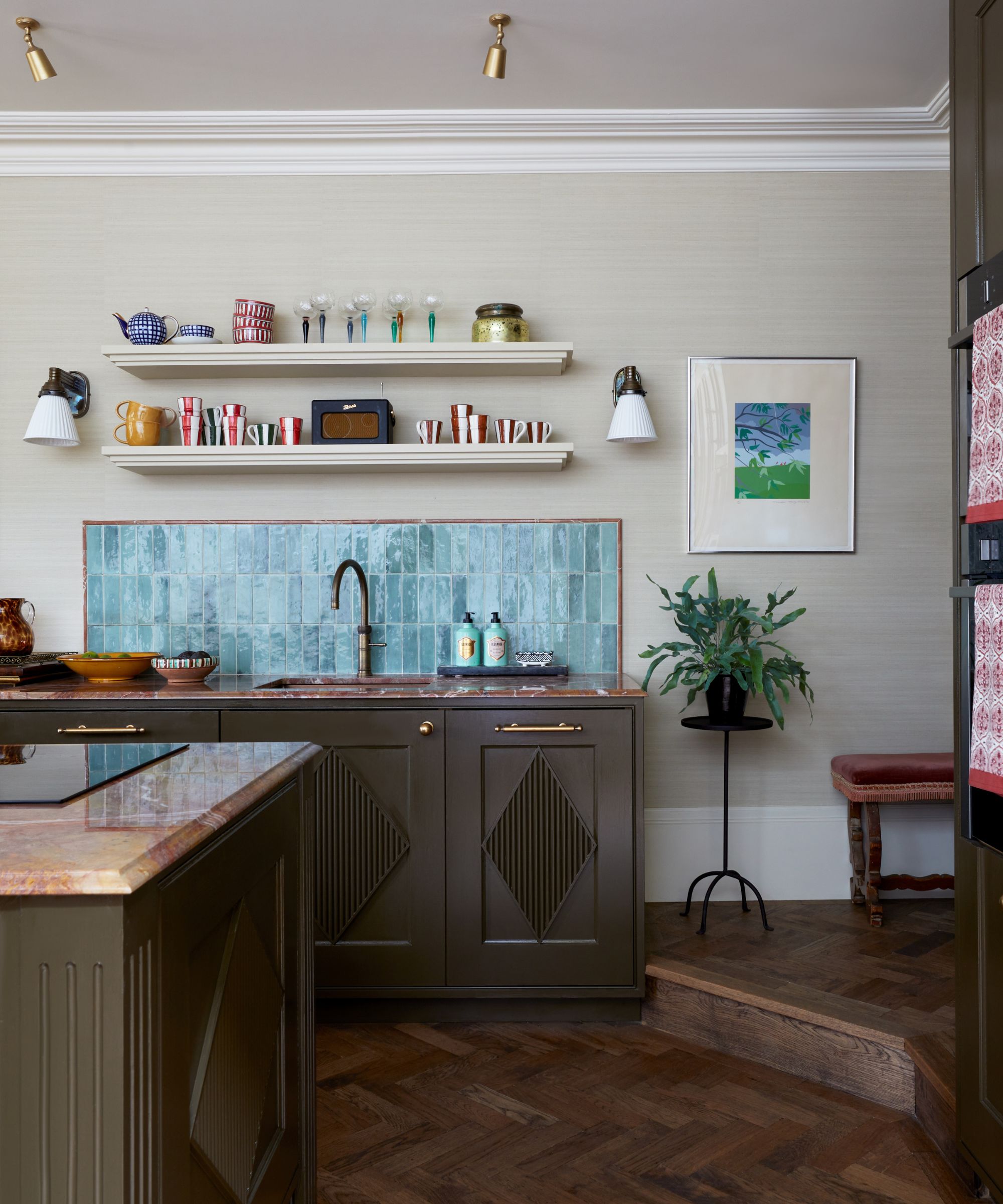
4. Merlot and Oak
Can't decide between a merlot kitchen and a wooden kitchen? Pairing two dark colors might conjure images of a dingy scheme, but when done well, these two shades are the recipe for a deliciously moody and immersive design.
'We’ve been seeing a lot more merlot and aubergine tones showing up in kitchens lately, often in unexpected applications like tiled range hoods or statement millwork. At the same time, mid-tone and lighter oak finishes are making a comeback,' Heather French, Founder of French & French Interiors, notes.
'The contrast between the richness of those deep wine hues and the warmth of natural oak feels incredibly fresh and grounded. They bring both color and texture to a space, so I wouldn't be surprised if we start seeing these two trends paired together in 2026 and beyond,' she explains.
'One approach is to use a merlot or aubergine for lower cabinetry and then go for the lighter or mid-tone oak as your upper cabinetry color. The warmth of the wood helps soften the depth of the color, creating a palette that feels balanced rather than overpowering.'
5. Pale Yellow and Light Blue
Softer, muted hues feel just as relevant right now as deep, moody ones, and as far as kitchen color pairs go, soft yellow and pale blue feel like the perfect balance of playful and classic. And in this design, it's accompanied by hints of red for a truly layered scheme.
'In a recent project, we embraced soft blue and terracotta, paired with buttery yellow accents throughout our client's kitchen and orangery. It's a playful combination that feels fresh and uplifting, creating a space full of personality while still drawing on classic heritage colors,' says interior designer Lauren Gilberthorpe.
'We like to use the softer tone as the foundation and introduce warmer colors through furniture, joinery, and decorative details. In this project, the blue cabinetry provided a calming backdrop, while the yellow added warmth and character.'
6. Deep Red and Airy Blue
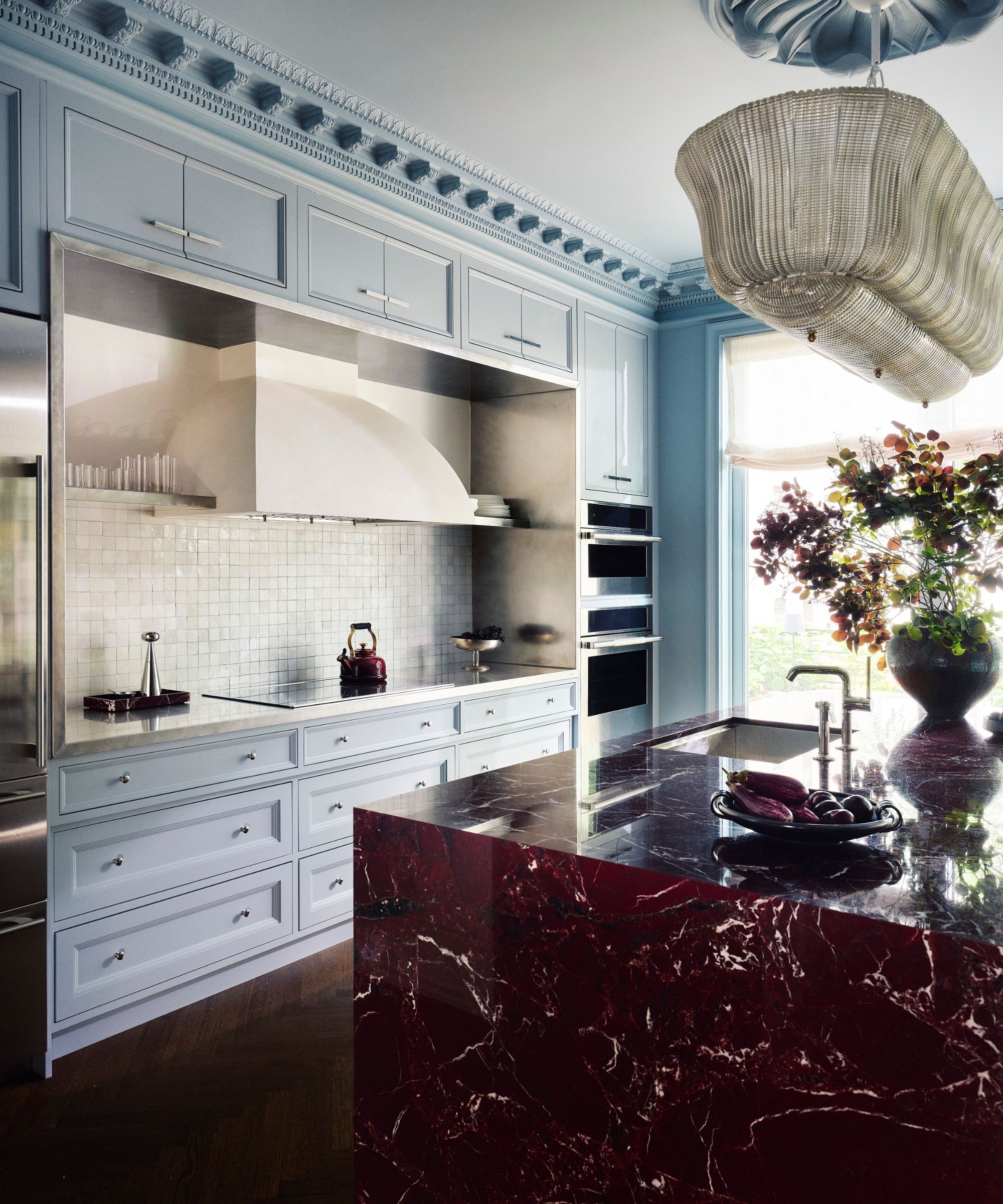
Reds are proving a favored color, whether they are used alone or as part of a bold pairing. And if there's one pairing that really seems to be making waves, it's red and blue. There are several tones you can combine, but designers are focusing on the juxtaposition between rich reds and soft blues.
'We've explored a really subtle balance between burgundy red and softer blue tones, which on paper might feel like an unusual pairing for a kitchen, but in practice feels incredibly grounded and natural,' says Laura, explaining that the red brings richness while the blue softens and adds dimension.
'For 2026, I think we’ll see more of these quiet contrasts – color combinations that aren’t about matching, but about creating depth through carefully considered tension between warm and cool tones,' she adds. Here, light blue cabinetry pairs with a burgundy marble island for a striking look.
7. Pale Pink and Oxblood
The return of pink kitchens has proved that even the most unexpected hues can have a redemption, and it's being paired with some truly striking colors. Another hue that's enduringly popular, deep oxblood and muted pinks are a bold yet elegant way to add personality to your cooking space.
'One color pairing I think we'll see much more of in 2026 is pale pink with deep oxblood red. In our Chiswick project, we used very pale soft blush-pink on the cabinetry as a warm, almost neutral backdrop, then introduced a rich red island to create contrast and give the room a stronger sense of identity,' says Sophie Pringle, Interior Designer and Founder of Pringle & Pringle.
'The combination feels far more sophisticated than people often expect; the pink brings softness and light, while the oxblood red adds depth, warmth, and a touch of drama. As we move away from cooler, more clinical kitchen schemes, I think people are increasingly drawn to colors that feel layered, welcoming, and full of personality, and this pairing delivers exactly that.'
8. Greek Blue and Blackened Oak
A bold blue can be tricky to get right in a kitchen. Paired with white, it feels decidedly coastal, and with gray, it can feel outdated. But combined with blackened wood? That's an unexpected combination that feels truly luxurious.
'One of the color combinations I expect to see more of in 2026 is bold blue paired with blackened timber. In our Queens Park kitchen, we used a bold Greek blue across the joinery, contrasting it with black-stained oak, white quartz, tiled island, and brass accents,' says Sophie.
'The deeper timber tones add richness and contrast, preventing the blue from feeling overly coastal or decorative, while the pale stone keeps the scheme feeling fresh and balanced. People are becoming more confident with color, but they're also looking for longevity, and combining saturated blues with natural materials creates a look that feels both timeless and full of character.'
If these unexpected kitchen color pairings prove anything, it's that you don't have to follow the obvious schemes to create a kitchen that is both characterful and enduring. If you're unsure where to start, this year's kitchen cabinet color trends offer plenty of inspiration.
Love beautiful design ideas, expert advice, and inspiring decor trends? Sign up for our newsletter and get the latest features delivered straight to your inbox.