Have you spotted the new logo on the UK government website, gov.uk? It seems few people noticed until the government pointed it out, and some people are still struggling to see it, but there's a reason for the design change.
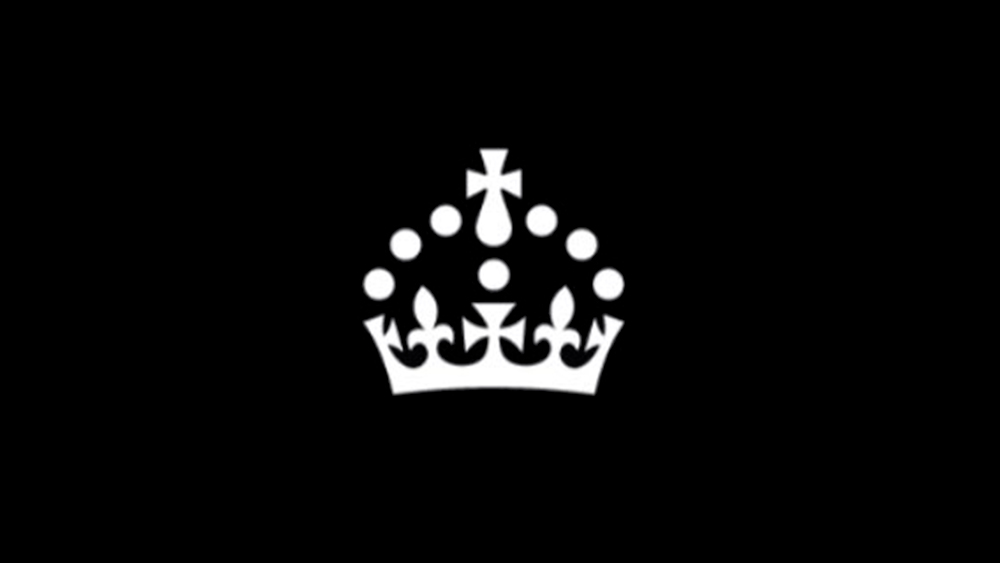
The crown logo used across the site has been updated to bring it in line with King Charles III's preferences when it comes to royal headgear. See if you can you spot the difference below. (For more regal inspiration, see our pick of the best crown logo designs).

The previous Gov.uk logo was based on the shape of the St Edward's Crown, which was the preferred royal headress of Queen Elizabeth II. However, King Charles has opted to go for the Tudor Crown in his royal cypher, the monogram-like device used to indicate his reign. The new cypher will eventually appear on post boxes and the like. In the meantime, the government has got things rolling with a minimalist interpretation of the crown that works at small enough sizes to update the favicon and the header image across its site.
If you're still struggling to spot the difference, the Tudor Crown is the new log is more domed. The chains are expected to be complete on the website by the start of next month, while post boxes will take longer since last year there were still new EIIR models being installed since they were already in production when Queen Elizabeth II died.
Of course, it's causing controversy, as did the King Charles III coronation logo design. Some have raised concerns about how much the changes will cost, although, hopefully, if the website is set up well, the update should only have required a single image to be changed.
"You're not saying that - in the middle of a cost of living crisis - we're going to re-brand everything, for the sake of a differently shaped crown?" one person asked on Twitter. "Hi @OliverDowden how much did you spaff up the wall with this new logo. Tell me it wasn't more than £2.50."
As of today, @GOVUK has a new crown in its logo. The crown is being gradually updated across government to reflect King Charles III's chosen crown, featured in His Majesty’s Royal Cypher. 👑: https://t.co/p2z7xMMKEbFebruary 19, 2024
Deputy Prime Minister Oliver Dowden said: 'Following the accession of His Majesty The King, we are updating the symbols of state to reflect the new design of the Tudor Crown. The digital realm is now an integral part of our lives, and as His Majesty's Government we take pride in this change to Gov.uk today, honouring the chosen crown of our King.'
Cabinet Office minister Alex Burghart said: 'Gov.uk is an essential part of living, studying and working in the UK. It is used by millions of people weekly for both routine and sometimes life-changing reasons such as getting access to benefits or finding a job. Whilst we are importantly updating the Gov.uk logo to reflect the new monarch's choice of crown, this site remains the same trusted and official digital home of the UK Government.'
For more very British recent design controversies, see the new London Overground rebrand.


.png?w=600)