In an era when watches double as phones, phones double as computers, and computers double as our entire workspace, we’ve come to expect a certain level of duality. Interiors are no exception, a truth elegantly illustrated by designer Claire Sá’s duplex project at 60 Curzon, where a home office and dressing room coexist, divided (and defined) by what she calls a 'threshold.'
It’s an approach that redefines what a ‘room’ even is, giving open spaces both intention and ease. Claire’s work asks: why should a dressing room orbit the bedroom if your mornings begin in meetings rather than makeup? Because with multifunctionality top of the modern mind, what we need isn’t more rooms – it’s smarter ones. Spaces that separate and connect in equal measure, syncing Zoom calls with zipping up.
Ahead, the De Rosee Sa cofounder breaks down the work–dress–repeat rhythm behind her design – plus three hidden thresholds making the Wayfair residence flow.
Hallway
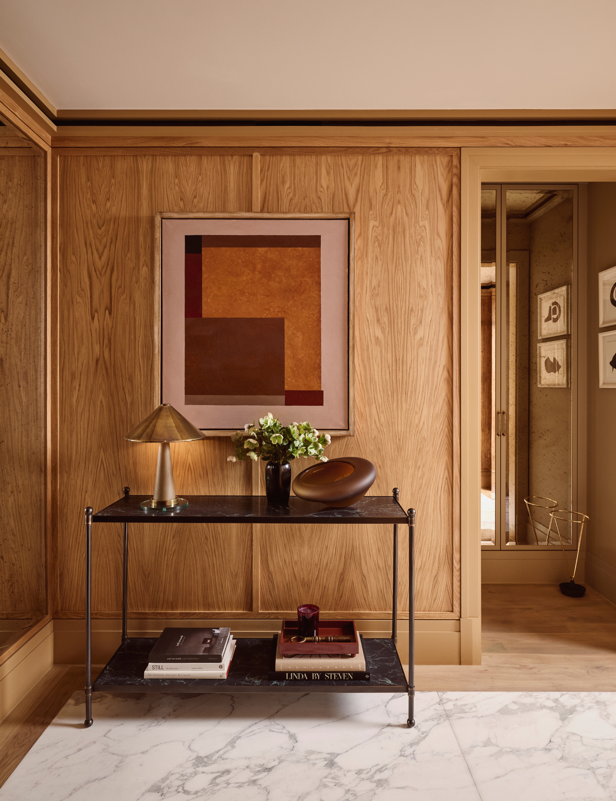
When you live in an apartment – no matter how glossy the address or high-spec the amenities – carving out a space that feels distinctly yours becomes its own little luxury. For Claire, that sense of ‘mine’ begins before you even step inside.
‘We lined the small hall lobby in oak with a stone floor to clearly mark the transition between the building’s shared corridors and the private interior. It’s that sense of stepping over or into a different atmosphere,’ she says of the entryway.
‘The moment you pivot 90 degrees and turn into the living space, you pass another subtle threshold,’ Claire explains. ‘By changing the wall and floor materials, you can signal that shift without needing a doorway or a step. The transition in surface materials alone gives you the feeling of moving into another zone.’
Living Space
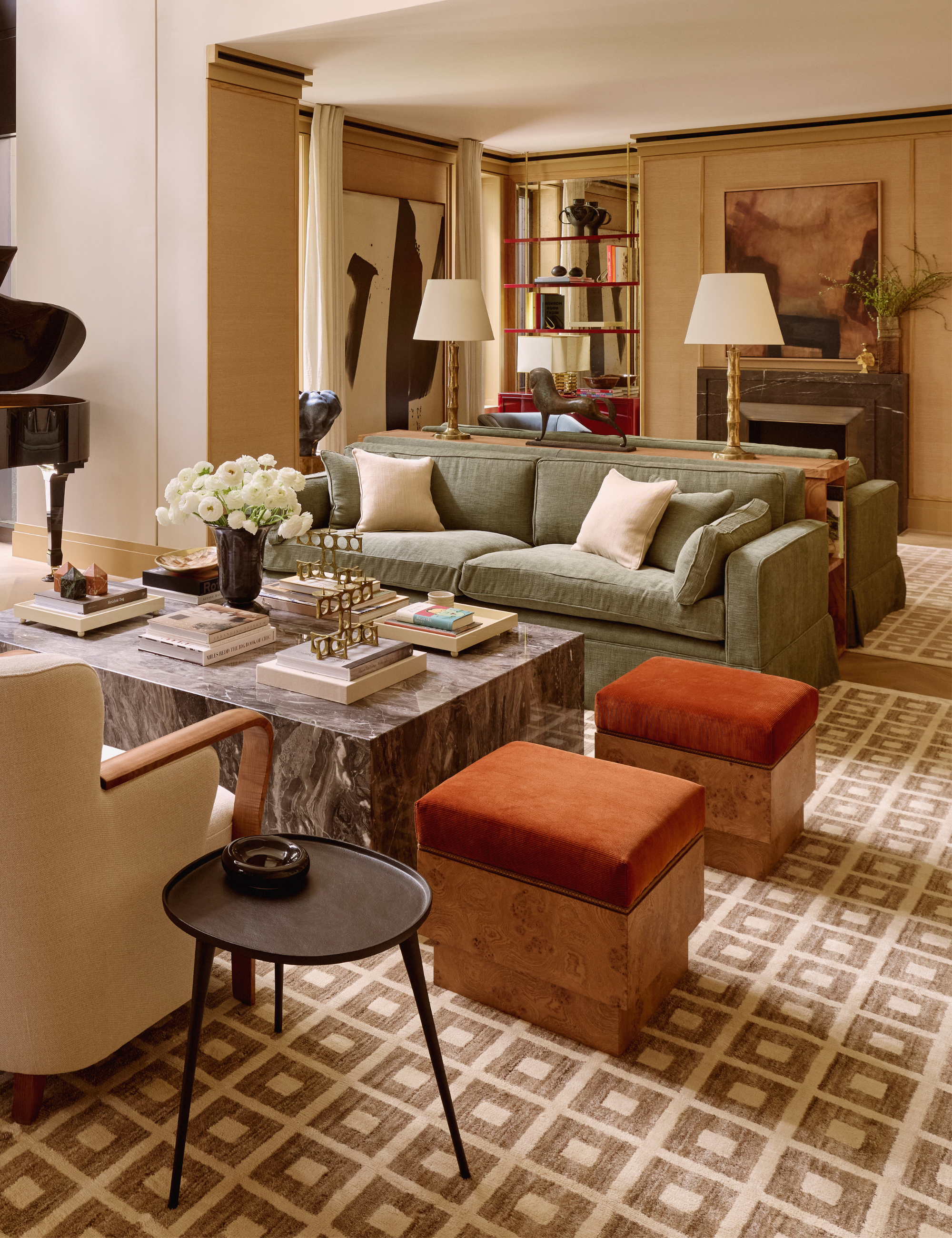
The living room practically announces itself – light-flooded, sky-high, and almost intimidating in its perfection. The ceilings stretch taller than the rooms it flanks, the sort of space that could easily read sterile if not handled with care. But Claire knows how to soften a grand gesture. Here, the threshold isn’t about separation; it’s about grounding.
‘In the large living room, we divided the space into two social seating areas separated by a console with back-to-back sofas and two statement lamps on top. It creates a soft threshold within a single open room – not closing it off, but giving it layers,’ she says of the strategic setup.
‘One side feels slightly more formal, a place to read the paper or have a quiet conversation, while the other is more open and social, where you might gather with friends,’ Claire notes. ‘That sense of gentle division gives the space rhythm and purpose without introducing walls.’
In Claire’s living room, a slim wooden console bridges the backs of two facing sofas. It’s proof that a dividing line doesn’t have to be obvious. That said, a little texture never hurts: pieces like the burl wood veneer console by Australian designer Ceci Thompson for CB2 add movement and intrigue with their swirling grain alone.
Office-Dressing Room
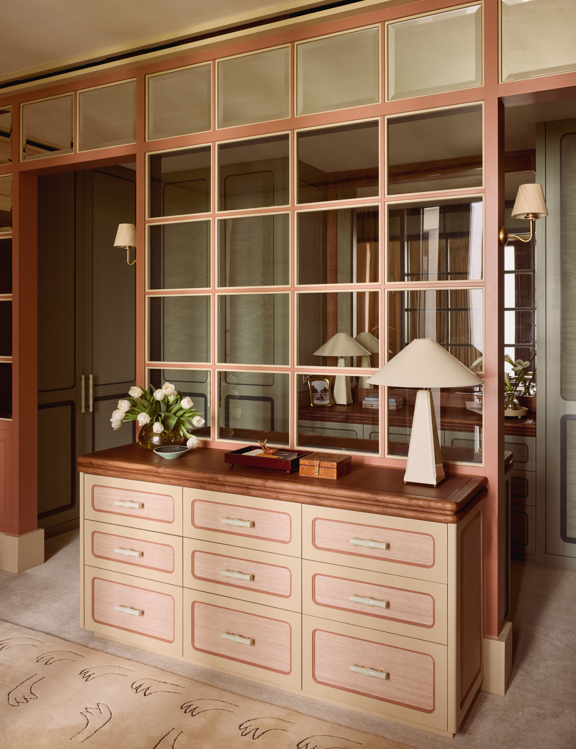
It always circles back to the hybrid – Claire's quietly genius home office–meets–dressing room. Not just for its practicality, but for its poetry. A single pane of windowed glass, balanced above a bespoke dresser, becomes the mediator between two worlds: one buttoned-up, one undone.
‘In the dressing room, the glass screen creates a clear division without visual obstruction,’ says Claire. ‘A solid wall or door would have felt too heavy, especially in a London apartment where space is limited. The screen keeps the room feeling open but still defines a distinct area – a subtle way to create threshold and structure without losing light or flow. It’s a way of dividing space that feels elegant rather than restrictive.’
It’s a clever kind of privacy – one that encourages you to lose the silk folding screens and heavy curtains in favor of something sheer, semi-opaque, or better yet, glass.
Glass doesn’t need to mean ‘window.’ Floor-to-ceiling dividers, like these gems on Etsy, can feel light, artful, and opaque enough to suggest privacy without killing the circulation. And if you were curious – yes, you can have them customized to accommodate a dresser, just like Claire’s.
Snug
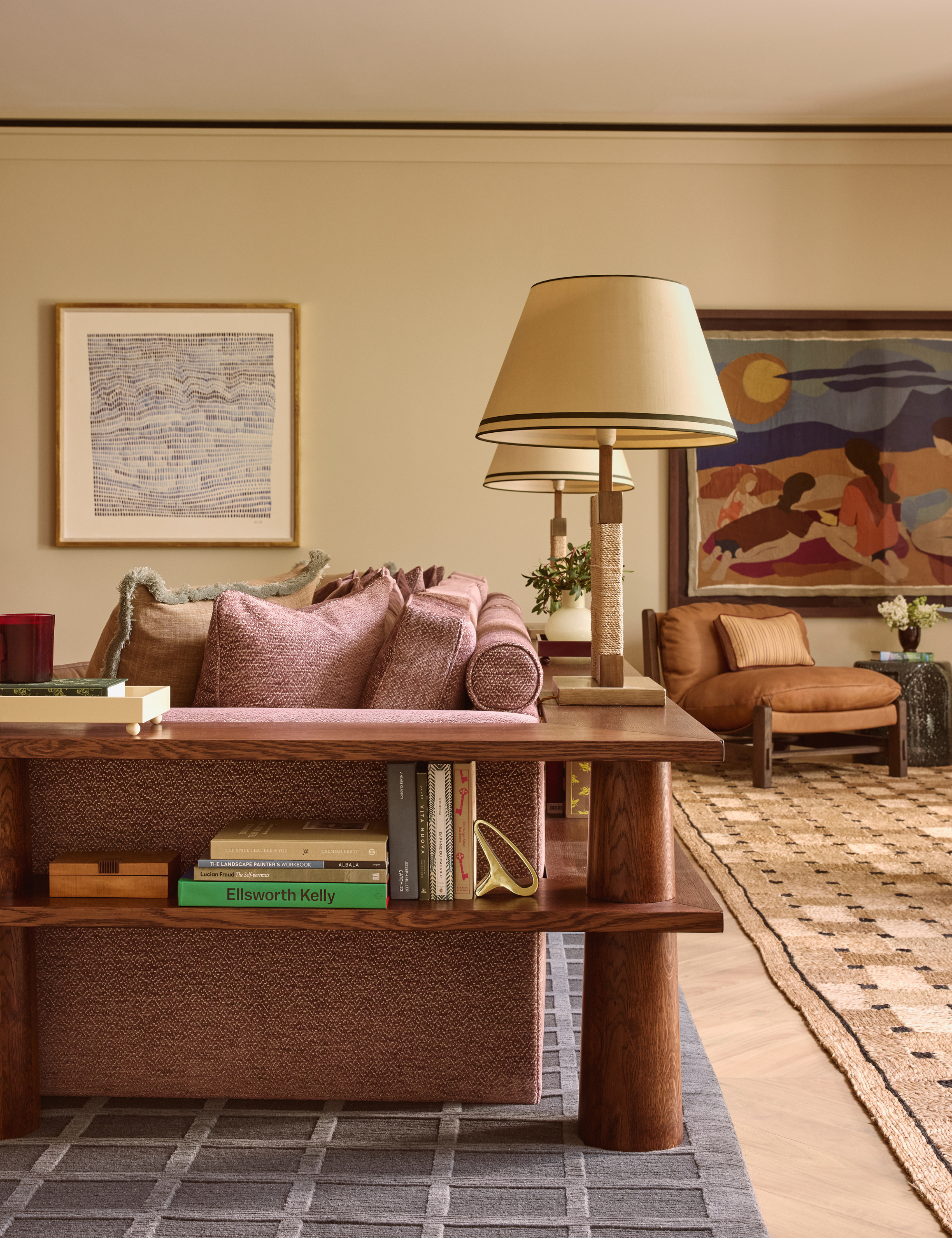
There are living rooms, and then there are snugs – which, for the Americans among us, are smaller, self-contained retreats designed for the moments between moments. More private than the formal living room, more relaxed than the den, it’s the kind of space a TV is forgiven, even encouraged.
‘In the snug, the goal was to make a large room feel more intimate,’ Claire explains. ‘We designed a bespoke piece of joinery around the back of the sofa so that it wasn’t just a dead surface facing the other direction.’
It’s part architecture, part embrace. ‘The joinery holds books and objects, giving the sofa depth and purpose while linking visually to the rest of the space,’ Claire says. ‘It helps blur the boundary between the TV area and the dining or games area beyond. That ambiguity – where one zone ends and the other begins – is what makes the space feel dynamic and lived in.’
Custom joinery is, of course, the dream – but clever furniture placement can pull off the illusion. Try hugging a sectional with low-slung shelving or a pair of sculptural consoles. Joon Loloi’s Toshiro Tables, pushed together in an L-shape, offer the perfect cheat with their commanding forms.
Like the ‘threshold,’ the best interior design ideas are so simple they leave you dumbfounded you didn’t think of them first – a sentiment that hit us hard after viewing the Kips Bay 2025 NYC Show House. Discover the interior design trends designers follow that you don’t, but absolutely should.