Pastels are often associated with florals, babies or your grandma’s sitting room, and that’s probably because they are calming, traditionally feminine colours to work with. Whilst there is nothing wrong with embracing the neutral feel of a pastel interior, they do have much more to offer than a soothing touch.
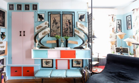
Pastels can be bold and punchy, fitting right in with contemporary, minimalist and Scandinavian interiors, without even the slightest nod to Hyacinth Bouquet. The artful blend of pastels and vivid hues expressed through wall colours, cushions and floor coverings results in warm, contemporary and inviting spaces.
Keeping it neutral
You don’t have to stick to white if you’re in a small space or planning on using prints and patterns, any block colour works just as well, as Will Taylor from Bright Bazaar rightly champions. The same applies to pastels. A room painted in a soft hue of blue, pink or grey acts as the perfect neutral backdrop for other, bolder colours, patterns and textures.
There is a pastel variety of every colour imaginable, so the options are unending. A very light minty green is the paler, younger brother of cooking apple green, and a soft misty grey is the paler version of graphite grey or chalk board black. The key to creating a contemporary pastel theme is to vary the tone and intensity of these colours to create depth and interest.
All white, minimalist interiors are experiencing a surge in popularity, but even here, pastels have a role to play. Barely-there pastel shades add a very subtle warmth and gentle pop of colour to a neutral scheme. A feature wall, door frame or rug with the slightest hint of pastel blue or pink can be a surprising, yet satisfying addition to a minimalist space. Consider allowing subtle pastel hints of colour in the art prints, blankets, upholstery and plant pots too.
Accessorising with pastels
As with any space, how you accesorise is key. Pastels are easy to work with, and look especially lovely combined with wood and natural materials, particularly light coloured oak, sea grass, rattan and basketry. Plants also look lovely in a pastel theme; there is something about the bold green hue of a beautiful potted plant that really brings out the subtle colour of a pastel wall.
A contemporary watercolour painting or print is another delicate way to introduce pastels to a room as, by its very nature, a watercolour will often feature softer, pastel colours.
A pastel theme is a great excuse to introduce the ombre or dip dye trend. Ombre refers to the slow graduation of colours from dark shades through to light, with each shade blended into the next with a watercolour painterliness that naturally features the in-between pastel shades. This effect as expressed on bed linen, tea towels and cushions is a wonderful way to incorporate this trend to your space.
The pastel and ombre trend is easy to DIY too. Painting the bottom third of the legs of a sofa, bed, or dining chairs adds a quiet charm, and DIY dip dyed fabric for cushions or curtains is relatively easy too. Painting the ends of all of your mismatched wooden kitchen utensils or painting half of plain plant pots is a quicker way to introduce a subtle injection of colour.
Bright flashes
While it is tempting to keep things light and floaty with pastels, they are really enlivened when used alongside bold colours. Brilliant, reflective white can be a zingy edition to pale pastels, but the magic really happens with the addition of very dark or black accents. In fact, the single most effective way to keep your pastels contemporary and cool is to introduce black.
Anchoring pastels with bold splashes of black helps to keep a pastel theme from feeling too candy sweet and cloying. A good balance of bright white and bold black mixed in with your pastels will actually amplify the subtlety of the pastel shades.
Another way to keep light pastel rooms grounded is to incorporate darker colours in hard surfaces like dark oak floors or granite worktops and tiles. This furnishes a variety of contrasts, textures and colours, and again helps to add depth.
Similarly to brilliant white and black, the addition of some flashes of neon also adds a surprise element of fun and colour, augmenting the colours of the pastel shades. So whether you combine light pastel shades with bold neon, monochrome accessories, crisp white or bright colours, your space is certain to wow.
Introducing Valspar paint
Valspar can create as many colours as the eye can see – that’s 2.2 million shades, so if your heart is set on a colour, Valspar can match it. What’s more you can save your colour preferences on Valspar’s system, so whether it’s the ideal shade for Laura’s bathroom, or dad’s study, you’ll remember for future reference.
Available exclusively at B&Q, Valspar’s Premium paints feature a super scrub formula so paint won’t fade or chip off when cleaned and it comes in a range of wide range of high quality interior and exterior paints in a variety of finishes. Visit valsparpaint.co.uk to see how you can start colouring outside the lines, or see the range at B&Q.