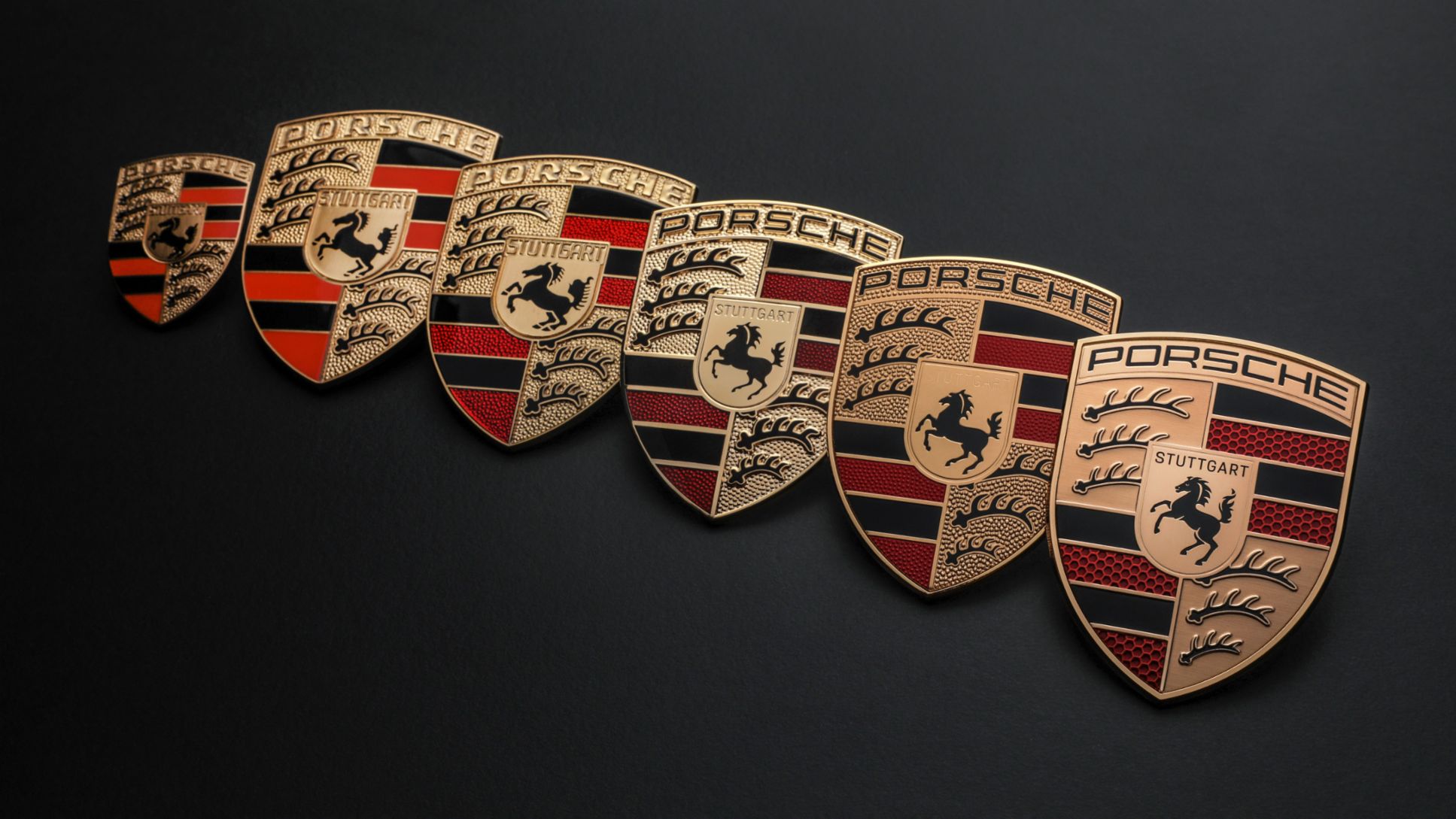
The Porsche logo has changed little in recent decades. Despite a design update this year, its overall composition remains similar to the design chosen back in the 1950s. Like many car logos of its era, it carries significant influence from local heraldic crests and coats of arms
But it could have been very different. Early sketches show that Porsche was considering a logo that would have been very distinct from other car brands at the time – and today (see our pick of the best car logos for more examples.
While we saw the design of a new Porsche logo earlier this year,
three key features that have remained present since the 1950s: a black horse from the coat of arms of the German city of Stuttgart, the crest of the former Free People's State of Württemberg and, of course, the carmaker's name.
But it turns out that several very different designs were considered before Porsche chose its famous crest. It seems that when they founded the company in 1948, Ferdinand Porsche and his son Ferry were initially of the mind that all they needed in a logo was the word 'Porsche' written in simple typography. It was apparently a customer who convinced them otherwise.
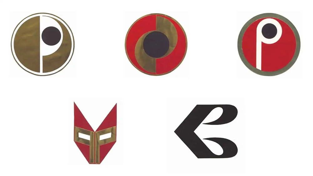
According to the Porsche website, the psychiatrist, film director and art collector Dr Ottomar Domnick launched a design competition in 1951 to find a logo for the new car brand. Entries submitted from German art academies included various circles and stylised 'P's, and even something that looks a little like Iron Man or a lucha libre mask. Wisely, the Porsches finally decided they weren't convinced by any of the submissions.
A year later, Max Hoffman, an Austrian-born US car importer who specialised in European sportscars, suggested that the brand's logo should reflect its geographic roots. Some accounts say Ferry himself drafted a design with that idea in mind and had it flashed out by Erwin Komenda, but today the company says Porsche (which you're probably pronouncing wrong) gave the task to Franz Reimspiess, the designer and engineer who created the VW logo.
Reimspiess' successful logo proposal was intended to symbolise Porsche's commitment to manufacturing in Zuffenhausen. However, it did cause problems initially. Colour printing was far from omnipresent in the 1950s, and the design didn't work well in black and white. There were also some of the same kinds of criticisms that new logos often face today, with some saying that it was too busy (for recent controversial logo designs, see Elon Musk's new xAI logo and the Glassdoor logo.