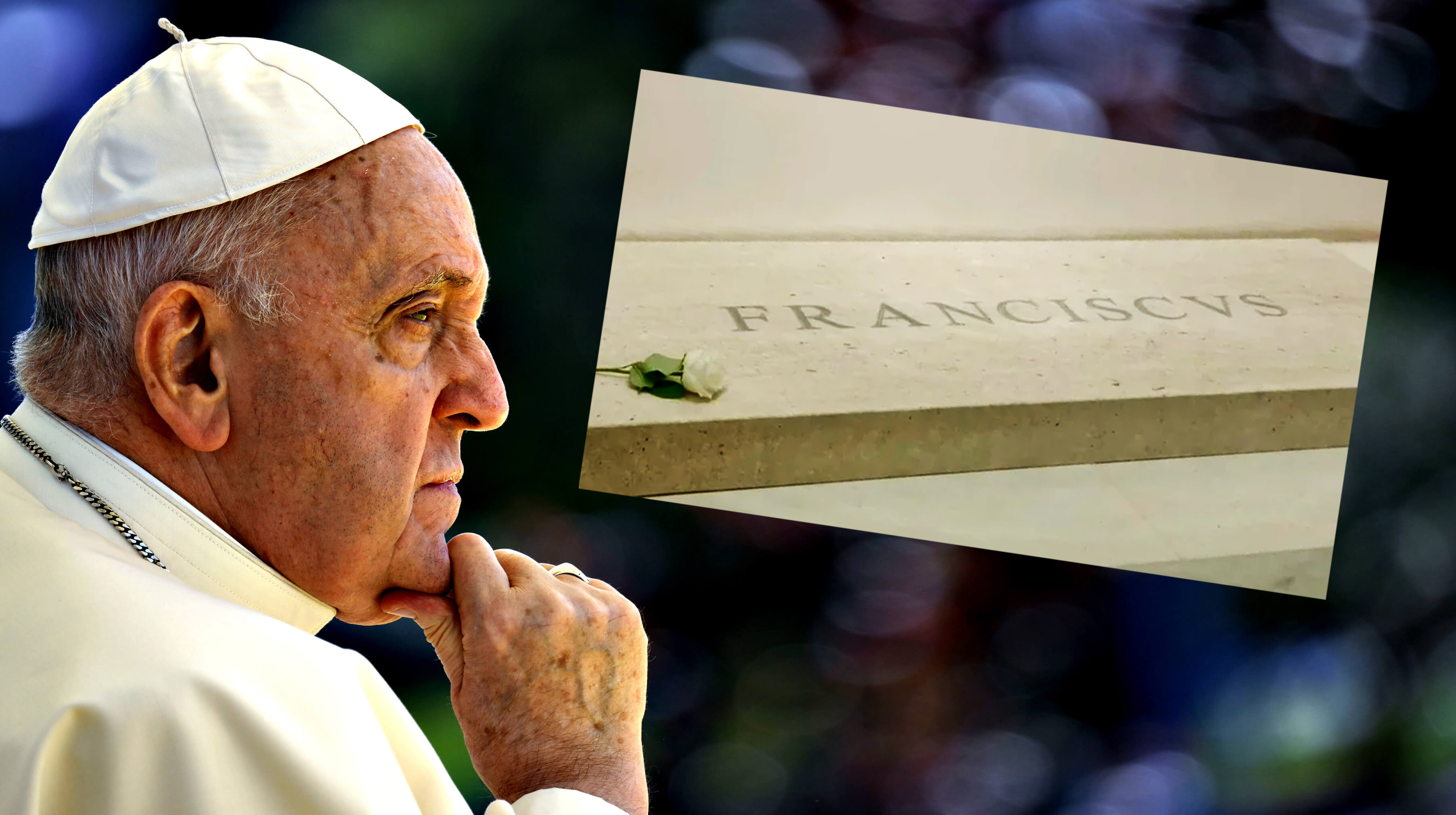
Nothing rankles designers more than bad kerning. The spacing between letters can make or break text and logos, and if it's either too big or too small – or worse, a combination of both – the results can look decidedly amateurish. Which probably isn't quite the right vibe for the Pope's tomb.
Indeed, the kerning on Pope Francis’s tomb has drawn widespread condemnation – from designers, at least. Reddit and X are ablaze with threads asking why, exactly, the name carved into the stone appears to read: FR A NCISCVS. (Looking for typographical inspiration? Check out the best free fonts).
"Seriously, I find this kinda stuff so strange, especially on such a high-profile job. This'll be one of the most important engravings of the decade and they let someone f**k it up," one Redditor comments, while another adds, "Egregious. Even to the untrained eye that must look wrong!?" Another posits, "Maybe they hit the spacebar twice?"
Kerning on The Pope’s tombstone from r/typography
But while some have tried to suggest the bad kerning is deliberate, perhaps in an attempt to convey a sense of humility (come on, guys), several experts disagree. "No, there is no historical or aesthetic reason why the kerning is so poor," Christopher Calderhead, editor and designer of Letter Arts Review tells Fast Company, while calligrapher Cheryl Jacobsen tells the website, "there is no historical reason for spacing that bad.”
Unfortunately bad kerning on Pope Francis' gravestone. Looks like the designer basically measured the space between the extreme edges of the letters rather than account for each letter's distinct shape. I did a very quick fix (tricky from this oblique angle). #kerning #typography pic.twitter.com/xY9Dah0EZsApril 28, 2025
So there we have it. A typography debate surrounding the Pope's tomb was not on my design news bingo card for 2025. But as we know all too well, kerning and legibility couldn't be more important when it comes to text and wordmarks. Just ask Kia.