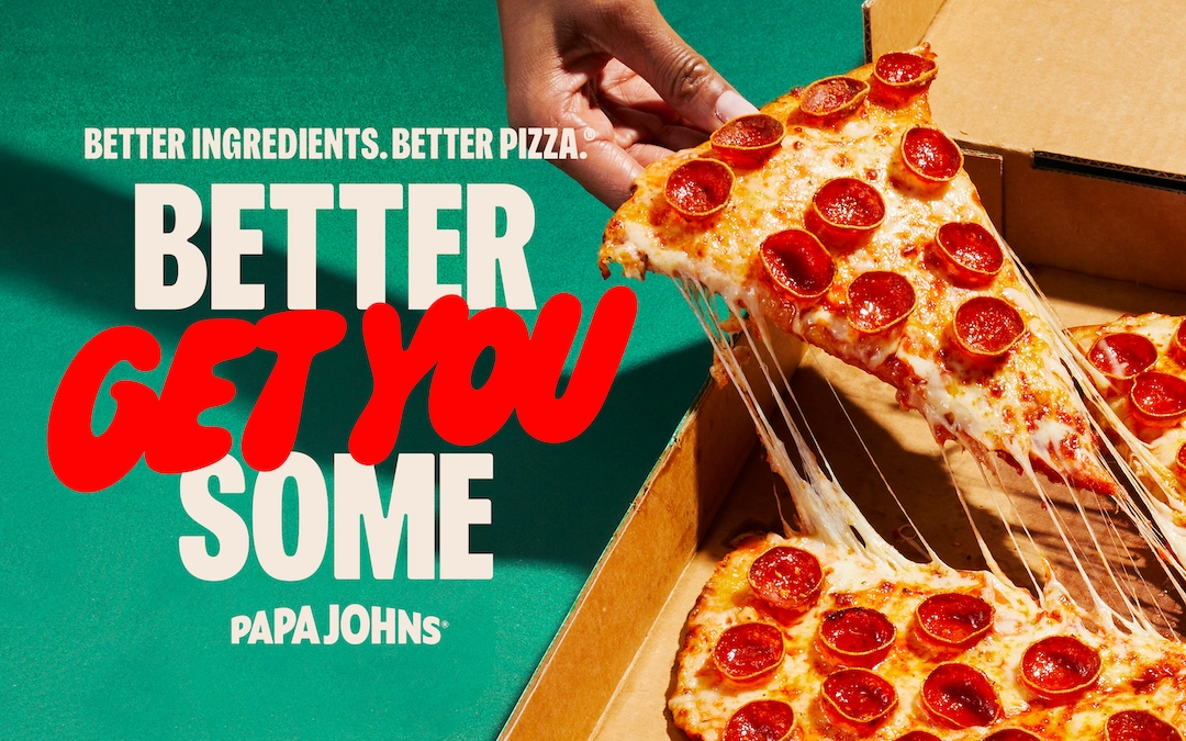
Papa Johns has a new look, new typeface and new additional tagline. The retro 90s nostalgia is all present and correct, along with a hip hop soundtrack courtesy of Big Boi and an amusing mix of high-brow and pop culture artistic references.
The existing tagline 'Better Ingredients. Better Pizza' is still being used, but it's echoed by a the bigger bolder claim of 'Better Get You Some', adding a call to action that plays on that key word 'better'.
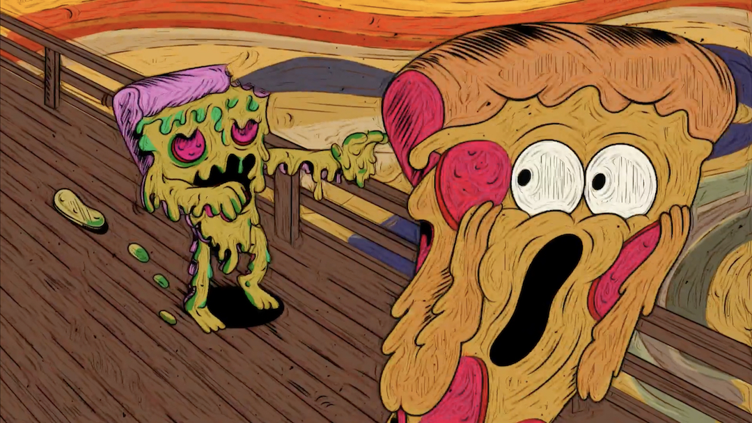
The work of Martin, the rebranding also includes a punchy new typeface appropriately named ‘Pappy’, and vibrant, visceral evocations of drizzly, doughy, cheesy pizza. There's also a wacky surreal side to the latest campaign, with the Dave Meyers-directed ad above adopting a steam-of-consciousness approach that takes in UFOs and Pizza-fied references ranging from Munch's The Scream to Hitchcockesque noir. And it all makes sense since, along with burgers, pizza is perhaps the ultimate pop icon foodstuff.
There's a host of talent involved, so I'm looking forward to the next spots. Pet gripe though: it still annoys me that they did away with the apostrophe in the Papa John's logo in the previous rebrand. What on Earth is a Papa John and how many are there?It's more confusing than Levi's renaming as Levii's Jeans.