While last week's new Wicked: For Good trailer enchanted fans, sadly, the same can't be said for the film's posters. After a lacklustre first design last month, the new poster was an opportunity to win back fans, but it seems it hasn't quite hit the right notes.
From the start, it has seemed like Wicked's poster designs were cursed with controversy after lead actress Cynthia Erivo clapped back at critical fans who attempted to 'fix' the botched design. Since then, the new posters have failed to fly with fans thanks to their lacklustre visuals and wonky editing. Despite the controversy, I'm still hopeful the upcoming sequel can defy expectations.
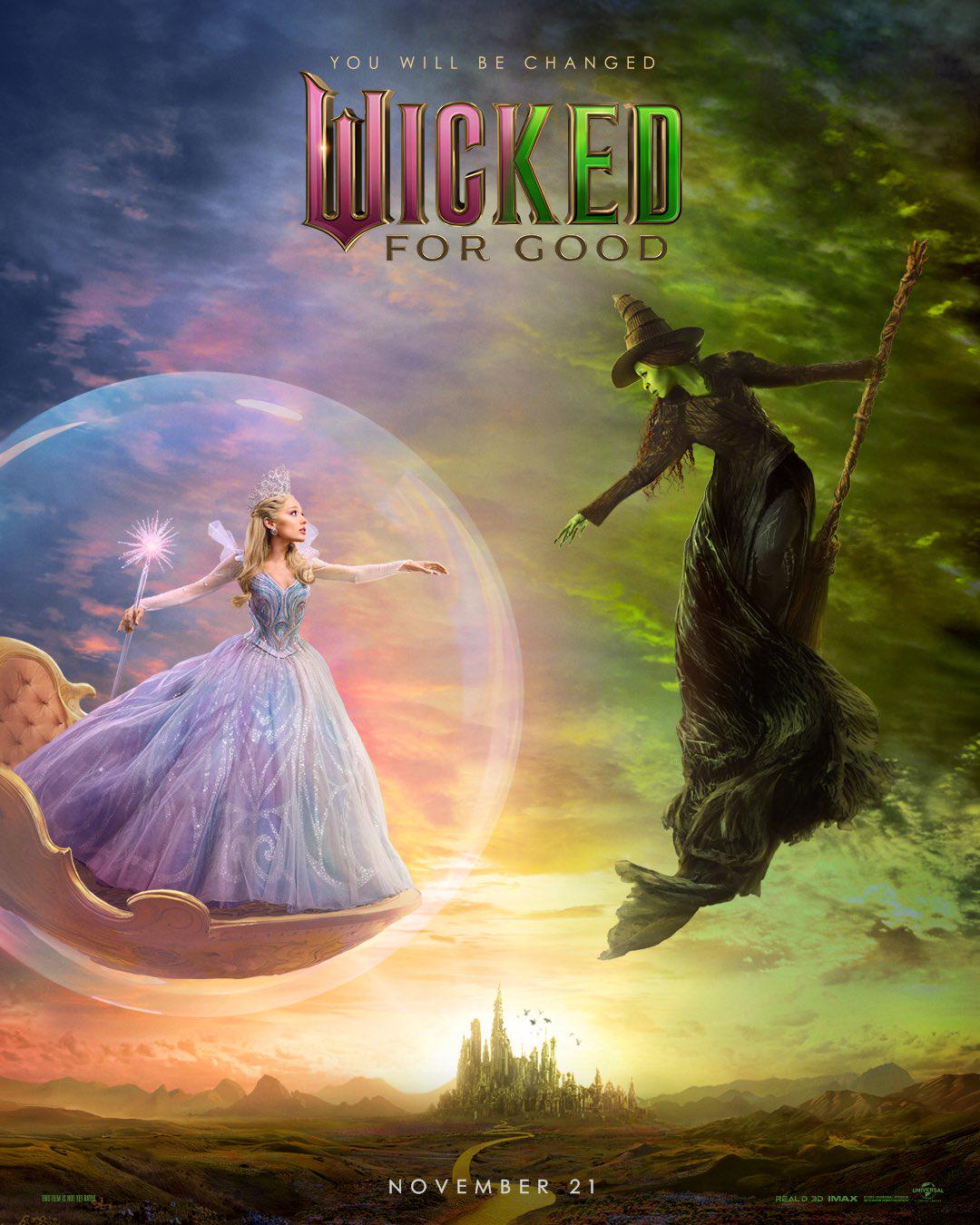
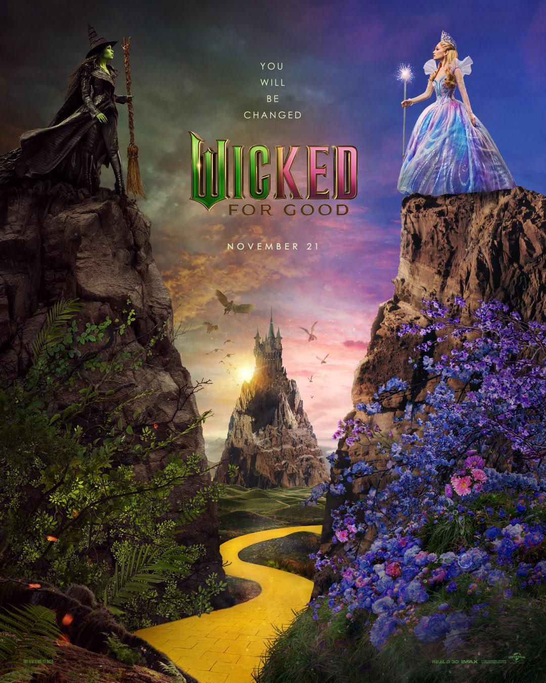
The latest Wicked poster features a split design, similar to For Good's (unpopular) first design. Featuring a broom-riding Elphaba floating above Glinda, encased in her protective bubble, the contrasting backgrounds have an almost painterly appeal. While the simpler design is an improvement on the previous poster, small details like the messy composition of Elphie's dress and Glinda's bubble haven't evaded eagle-eyed fans.
"Elphaba’s cape and hair should have more movement to better convey that she’s flying rather than just copy-pasted onto the background," one fan on the r/wicked subreddit suggested. "It's still not up to par for a blockbuster film," another added, while one fan scathingly wrote, "whoever is in charge of making the part 2 posters needs to be fired."
As we've seen with fan-made Wicked posters, taking a more graphic approach inspired by the original Broadway production has been resoundingly popular among fans. While the new For Good posters have been disappointing so far, at least the latest design is an improvement. With a boundless world of creativity to play with, I hope any future posters can capture the magic of Oz and finally ditch that CG, copy-and-paste aesthetic.