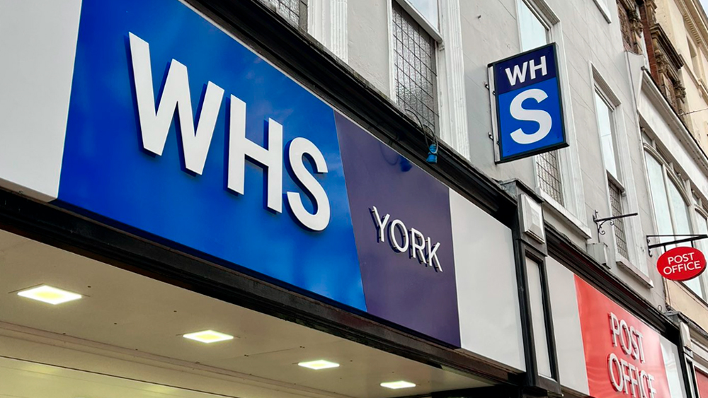
There's only a week left of 2023, but it seems we have a late contender for the worst logo of the year. Shoppers in the UK have been expressing confusion and astonishment on social media after spotting a new logo for the high-street chain WHSmith, now apparently just WHS.
UPDATE: WHSmith has since clarified that the new logo design is a trial being tested i signage at a "small number of locations". It said the pilot is intended to "localise our offer and highlight the key product categories customers can always find at WHSmith." The old logo is still being used on WHSmith's website and social media.
We'll see what the brand concludes from the trial, but for now it seems that customers are confused. Many think the new logo resembles a very different British institution and wonder if the newsagent and stationery brand is going to start offering medical check ups. It's already clear which side this design would fall in our pick of the best and worst logo designs of 2023.


Sometimes subtle rebrands get a big fanfare. We've seen plenty of brands roll out big press releases and behind-the-scenes 'making of' videos because they reduced the kerning in their logo by an imperceptible degree. But post-Christmas shoppers in the UK were surprised to discover that WHSmith appeared to have changed its name entirely at some stores.
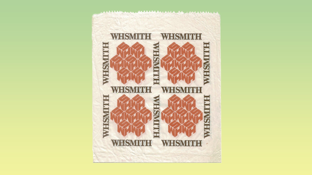
Changing to a three-letter logo would be a curious decision. Although WHSmith did have a logo back in the 1970s and 80s that used just those three letters – the classic cube logo – it was always accompanied by the full name of the brand, which is the name that customers use. Stranger still is the bland font in the new logo, which has many people saying that the brand now looks confusingly like the National Health Service (NHS).
The new WHSmith logo doesn't used italics like the NHS, but it uses white on blue in a sans serif all caps. That's enough to cause confusion when there's only one letter difference. Even the decision to add the name of each store's location beside the logo on signage feels more in keeping with a state institution. It seems the brand wants to put an emphasis on local-ness, but it feels more like a move intended to help anyone who forgets where they are because high streets have become so bland and similar looking.
The @WHSmith rebrand is unbelievably bad...Like someone typed WHS in Word and called it a day. pic.twitter.com/keJynYdBsLDecember 23, 2023
The worst rebrand I’ve ever seen. Just why? @WHSmith https://t.co/g1vX0fjfbuDecember 23, 2023
What in the name of all that's holy is this!@WHSmith#WHSmith pic.twitter.com/HFZvRvUhd9December 25, 2023
I think I worked out how @WHSmith created their new logo pic.twitter.com/rsAqHoB8YbDecember 25, 2023
Some think the new look is the nail in the coffin for a brand in decline. "The nearby crematorium has a more pleasing atmosphere. It’s a store that doesn’t know what it’s for: stationery? Chocolate? Kids toys? The only thing they had going from them was name recognition. They have now destroyed that," one person wrote on X.
"When growing up WHSmith used to be one of the first places to get magazines and VHS releases. Where did it all go so wrong? The stores are so tatty now and this rebrand is baffling," someone else wrote. Others have been putting forward their own suggestions for how the rebrand could have been done better.
If WHSmiths want a rebrand…. This is what they should have gone with over that ugly “WHS” thing.(Colours taken from old cube logo that lots of people remember - coupled with a modern clean font or a modern retro style.) #WHSMITH #WHS #WHSMITHS #ReBrand I’m available @WHSmith pic.twitter.com/WMPagdmpDrDecember 26, 2023
WHSmith may have needed to find a new sense of direction after losing its way amid the decline in print media and the rise of online competition, but the strange new logo seems almost intended to finish off what brand recognition the high-street chain still retained. For more misses (and hits) from the past year, see our pick of the best and worst rebrands of 2023.