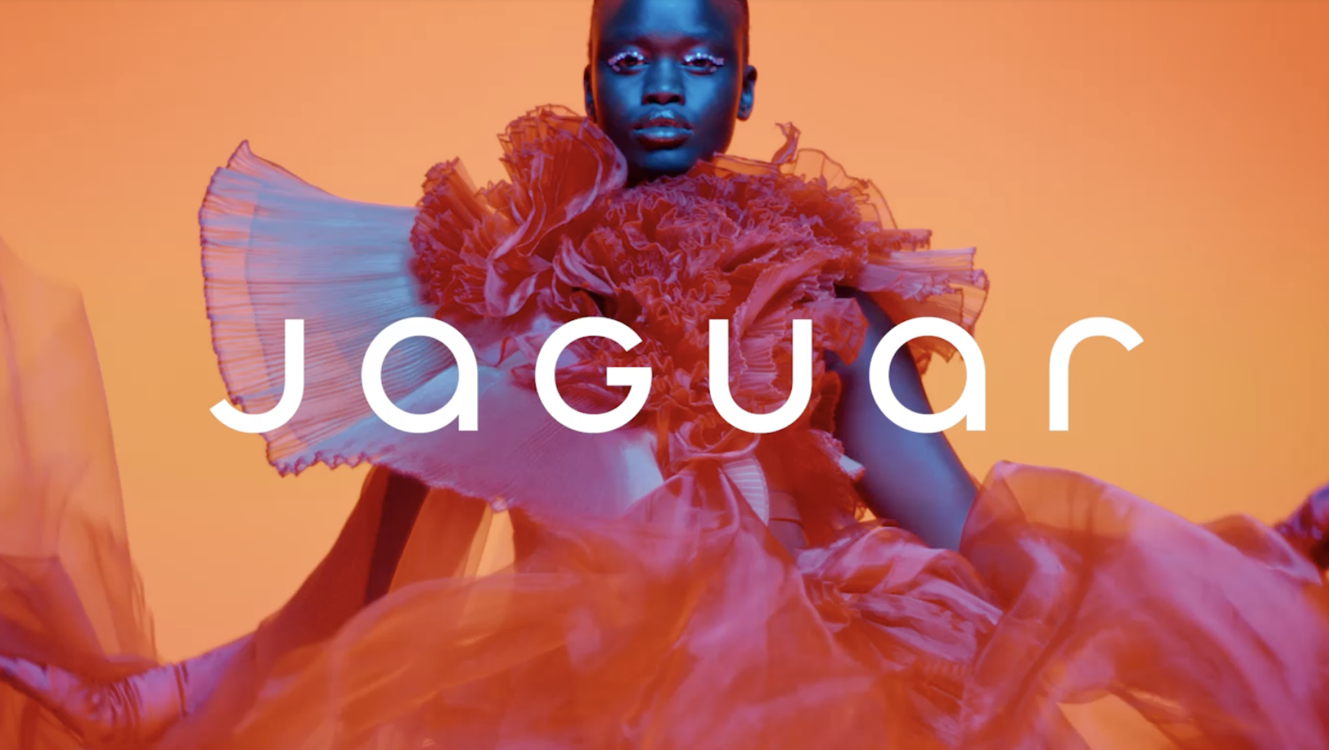
Last year there was one branding story that hogged more headlines than the rest. News of Jaguar's colourful (or as some called it, 'woke') rebrand was derided by everyone from Elon Musk to, er, Nigel Farage – and reportedly led to the brand ditching its ad agency. So what has parent company Jaguar Land Rover (JLR) decided to do next? Why, give its other heritage car brand a new logo, of course.
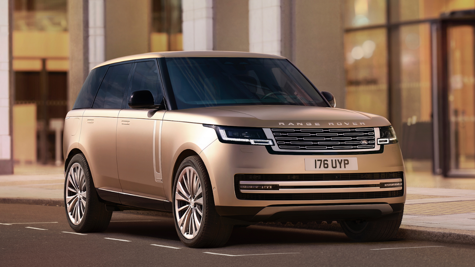
Autocar has spotted a new Range Rover emblem, which appeared in a recent presentation to investors. While the first bespoke emblem for the brand in its 55 year history isn't designed to replace the Range Rover wordmark, it's still a radical aesthetic departure, and one that's already drawn a strong reaction from fans. It probably won't be hitting our best logos roundup in a hurry.

Featuring a pair of 'R's going toe-to-toe, the new logo ends up forming a single shape that certainly looks... interesting (or as Motor1 puts it, "goofy as hell"). "The Range Rover Motif has been developed as a smaller symbol for where our familiar Range Rover device mark does not fit, such as on a label or as part of a repeating pattern, and within event spaces where an emblem is more appropriate," the brand told Autocar.
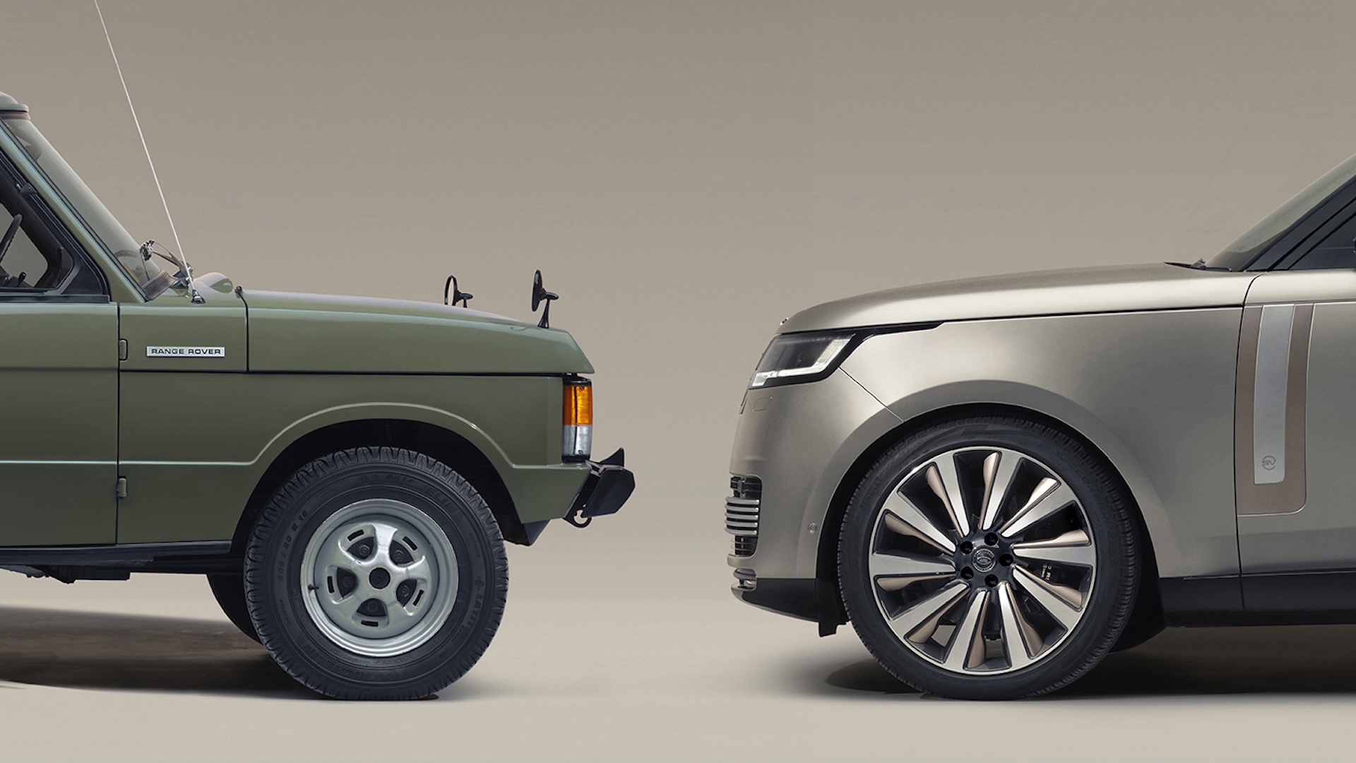
But even if it's unlikely to adorn the front of the cars, a new car symbol needs to represent the heritage of the brand itself. Bentley recently got it right with its subtly tweaked identity, wheres too bold a departure (Jaguar) can turn heads for the wrong reasons. And judging by the response online, Range Rover's new symbol might be a little too topsy-turvy.
It's also drawing one of the same criticisms that was levelled at the Jaguar rebrand – that it looks like it isn't designed for a car brand. From jewellery brands to hip hop artists, plenty of social media users have suggested the new symbol looks like it was made for anything but a luxury SUV brand.
Someone said the new range rover logo looks like a belt buckle and i cant unsee it pic.twitter.com/Rg0qvg3ABaJuly 10, 2025
You’ve got to wonder who runs JLR nowadays with shit like the Jaguar launch and this nonsense https://t.co/FbnSab4sk8July 9, 2025
Make. It. Stop.Are these clowns still selling cars or overpriced aftershave now? Because that logo would be right at home on a big, tacky-looking bottle of something stupidly expensive promoted by David Beckham. https://t.co/W1BnfyNHapJuly 9, 2025
"Good morning year 5. Today we are going to design a new Range Rover logo. Everyone get out a crayon and sheet of paper," One Redditor pithily puts it, while another adds, "Looks like something a dance artist from the early noughties would use for their debut album cover."
If anything, the response goes to show the challenge faced by car brands – with such loyal and invested customers, even a logo that's unlikely to hit the car bonnet can be a serious source of contention. And a ill-advised rebrand can have lasting effects – just look at the Kia logo debacle.